Designing a high-converting landing page hinges on presenting your offer clearly and directly to visitors. This involves guiding their attention towards your desired elements. Employing whitespace to declutter and incorporating a contrasting CTA button are just two of many techniques. Ultimately, landing page design is not solely about aesthetics, but about the message conveyed to visitors. Visual appeal is only one aspect – the interaction and flow of page elements determine visitor engagement and ultimately, conversion rates. This is where visual hierarchy becomes paramount.
What is visual hierarchy?
Visual hierarchy dictates which elements initially capture the visitor’s attention and the order in which they interact with other elements on the page. By establishing a clear visual hierarchy, you facilitate seamless communication between the visitor and the landing page. Several techniques can be employed to achieve this:
- Scale: Larger elements naturally draw more attention than smaller ones, guiding the user’s focus.
- Color: Bold, contrasting colors inherently attract the human eye.
- Contrast: Strategic color shifts can be used to highlight specific elements against their surroundings, drawing attention.
- Alignment: Columns and grids create visual order and structure, making elements stand out.
- Proximity: Grouping or separating elements helps establish relationships and distinctions between them.
- Page scanning patterns: Eye-tracking studies provide insights into how visitors visually navigate a web page, revealing common patterns. While all these design elements are crucial, this article will delve into the page scanning patterns – specifically the F and Z patterns – that eye-tracking studies have identified as significant in online reading behavior.
The F Pattern
The Nielsen Norman Group’s 2006 study, considered one of the most useful and most cited eye-tracking studies today, observed the viewing habits of 232 users across thousands of websites. The results demonstrated a consistent reading pattern across various sites and tasks. This pattern, termed the F-pattern, revealed that users initially read horizontally across the upper portion of the content area, followed by a downward movement to scan a second horizontal line. Finally, they would scan vertically down the left side of the content. This movement is typically illustrated as follows:
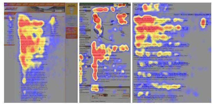
The three heatmaps above, derived from eye-tracking studies on different websites, illustrate this pattern. Notably, the F-pattern doesn’t always strictly adhere to a two-stem horizontal structure (see the rightmost heatmap). The color key decodes the level of attention:
- Red: Most viewed and fixated area.
- Yellow: Some views, less fixation.
- Blue: Least viewed, minimal fixations.
- Grey: Negligible views, no fixations. The critical takeaway is the user’s tendency to start at the top left, move horizontally, and then scan down for engaging elements. Placing crucial elements (like images) along this F-pattern on text-heavy pages increases their visibility. Hootsuite leverages the F-pattern on their landing page to emphasize key elements above the fold:
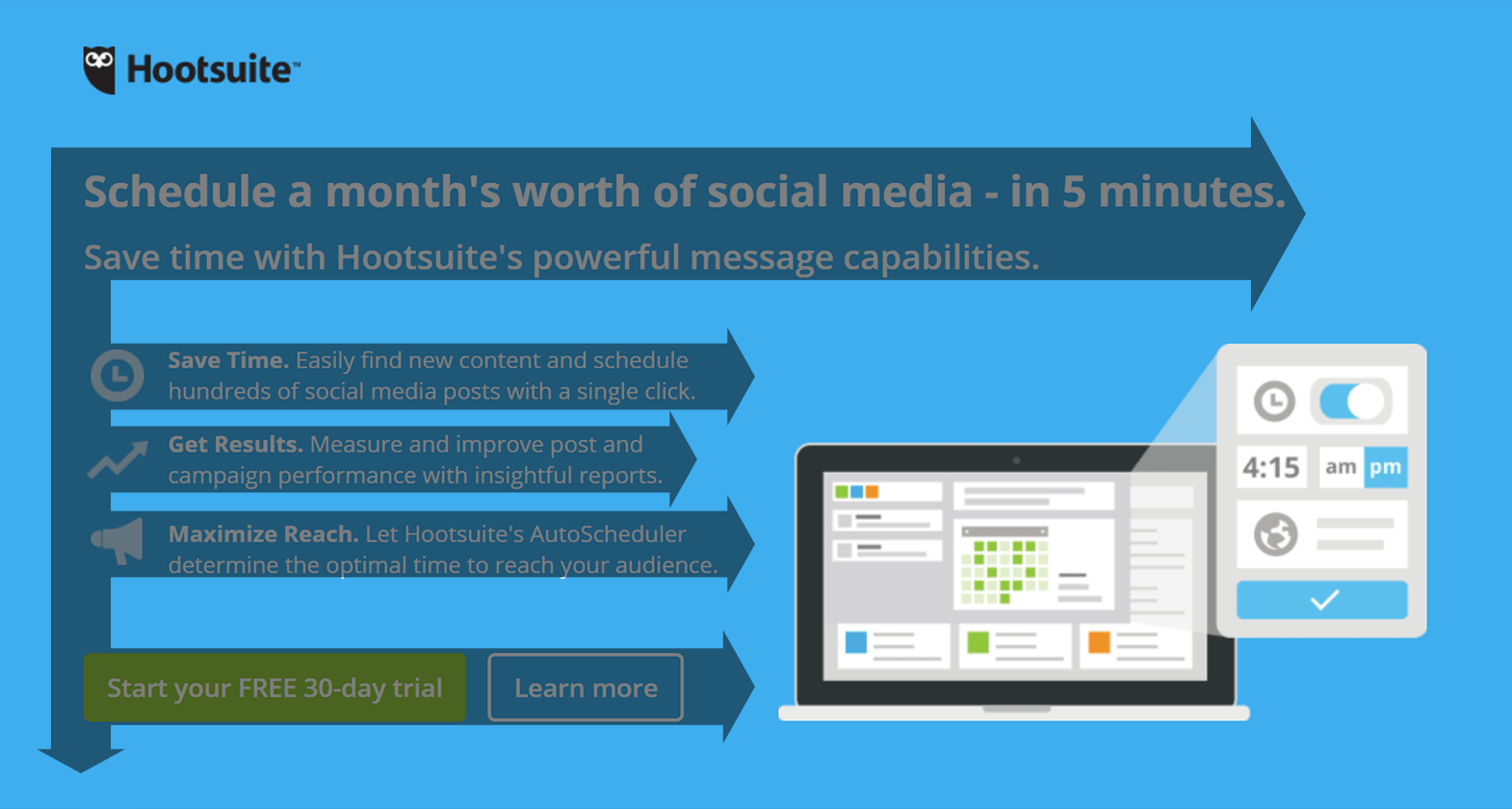
- The headline and subhead capture the visitor’s attention first.
- Their gaze then moves to the iconography-supported bullet-point benefits.
- Finally, both CTA buttons come into view. BigCommerce also employs the F-pattern on their landing page (above the fold):
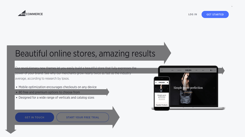
- The prominent headline font draws immediate attention.
- The subhead then guides the eye towards the image.
- Bullet-point copy is scanned next.
- Lastly, the user’s gaze moves left to right, encompassing both CTA buttons. By aligning your landing page elements with this visual order, you guide visitors through the page towards the desired CTA click. While highly effective for content-rich pages, the F-pattern can also be implemented on pages with less content.
The Z Pattern
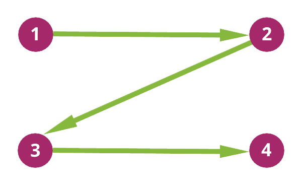
The Z-pattern layout finds its application on less text-heavy pages. It mirrors the natural eye movement during reading – left to right, top to bottom in a zigzag pattern:
- The initial scan is from top-left to top-right, forming a horizontal line.
- Next, a downward and leftward scan creates a diagonal line.
- Finally, the eye moves back to the right, forming another horizontal line. This creates the characteristic viewing pattern :
Similar to the F-pattern, the Z-pattern doesn’t necessitate rigid adherence to a perfect Z shape. The horizontal lines can be angled, and multiple Z patterns can be incorporated throughout the page. However, ensure the following:
- The top horizontal line highlights the primary elements for immediate attention.
- The diagonal line presents information leading towards the CTA button.
- The bottom horizontal line strategically places the CTA for maximum impact. The Lyft landing page exemplifies the Z-pattern:
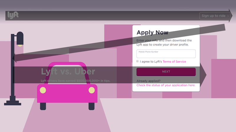
- The logo and “Sign up to ride” CTA button occupy the top horizontal line, grabbing initial attention.
- The diagonal line guides the visitor to the form’s headline.
- The bottom horizontal line features the “Lyft vs. Uber” headline and subhead, leading to the CTA button. Another example is LinkedIn’s use of the Z-pattern:
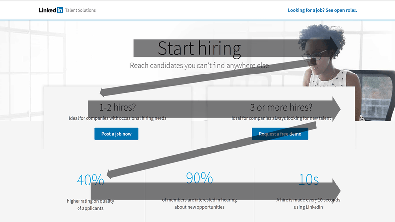
- The “Start hiring” headline and the woman’s face are strategically placed on the first horizontal line.
- The downward-left scan leads the eye to the copy above the two blue CTA buttons.
- The second diagonal movement highlights the 40% statistic, followed by a left-to-right scan to capture the other statistics. By leveraging the Z-pattern, you can direct visitor attention to persuasive elements that encourage conversion.
Using the F and Z patterns to create engaging landing page experiences
Strategically positioning crucial landing page elements along the user’s natural eye path, whether in an F or Z pattern, results in a more engaging landing page experience. Harness the power of visual hierarchy on your landing pages to ensure your message resonates and visitors take the desired actions.