One of the things I love most about Sass is its ability to streamline front-end design workflows. While JavaScript offers tools for file management and task automation, Sass’s built-in mixins enable developers to create modular front-end style code. This article presents ten of my favorite Sass mixins that help me write web styles more efficiently.
These mixins are indispensable to my workflow and find their way into almost every web project I undertake. The web is teeming with articles showcasing useful Sass mixins, and several libraries offer convenient solutions for smaller tasks, such as Bourbon. One such library, which inspired some of the mixins discussed below, is Andy.
This article covers mixins for:
- Media queries
- Color themes
- Centering elements
- Clearfix
- Consistent font sizes
- Animation transitions
- Retina images
- Quick gradients
- External fonts
- Quick padding/margins
Media Queries
Media queries simplify the process of adding custom breakpoints to stylesheets and implementing responsive behavior for different screen sizes. However, excessive use of media queries can lead to maintenance challenges. Sass mixins offer a solution to this problem.
| |
These definitions allow us to use the mixins as follows:
| |
This approach works seamlessly on its own or with grid frameworks like Bootstrap.
The if statement generates a media query tailored to a specific screen size, determined by the size name passed to the mixin. This enables us to adjust CSS attributes for different screen sizes. We can also customize the breakpoint at which these adjustments take effect. Most responsive layouts employ three or four screen width dimensions to optimize content presentation. Despite the ever-expanding variety of screen sizes, devices, and applications, a common trend among web developers is to target small screens for phones, medium screens for tablets, large screens for laptops, and extra-large screens for desktop computers.

For context, Bootstrap v3 utilizes the following media points:
- max-width: 767px (screens up to 767px wide)
- min-width: 768px (screens wider than 768px)
- min-width: 992px (screens wider than 992px)
- min-width: 1200px (screens wider than 1200px)
Color Themes
Establishing a consistent color theme throughout your site reduces redundancy in CSS code for elements with similar styling. For instance, if you want all your div buttons to share a 1px solid dotted border, defining this style within your theme simplifies the process. This Sass mixin allows you to define as many color variables as needed and apply them to multiple classes, providing flexibility in color customization and feature implementation that affects the color of various elements. A comprehensive article here delves deeper into working with color themes in Sass.
| |
A well-defined color theme can potentially eliminate up to 70% of color-related styling, streamlining your workflow. It’s advisable to maintain a separate .scss file for your color theme and consolidate all brand color variables within it.
Consider the following example:
| |
This simple line will generate:
| |
Centering Elements
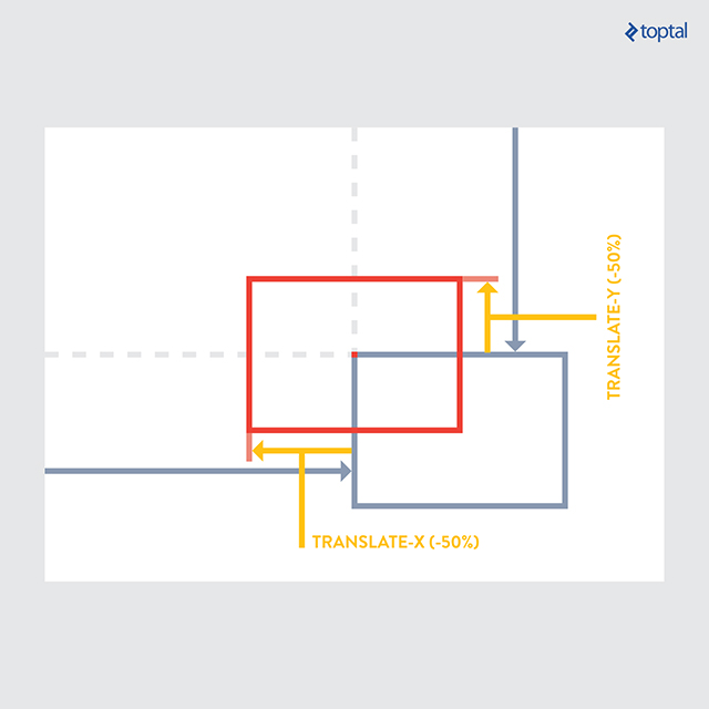
Centering an element within its parent can be accomplished through various methods, depending on the specific layout requirements. One approach involves using absolute positioning, which allows for both vertical and horizontal centering. This method necessitates setting the parent element’s position to relative. By leveraging this technique, centering an element can be condensed into just two lines of code.
| |
| |
While this mixin offers versatility in content centering, it’s important to acknowledge that alternative methods exist, each with its own advantages and disadvantages. The optimal solution depends on factors such as layout style and browser compatibility requirements. Flexbox provides another powerful tool for alignment, although it may not be fully supported by older browsers. For simple text and container alignment, standard CSS properties often suffice. This particular mixin proves particularly useful when dealing with nested containers and complex layout structures.
Clearfix
This mixin provides a quick and effective way to apply the clearfix CSS property to elements, addressing issues related to floated content. While numerous clearfix solutions exist, this one has proven to be highly reliable. Once the Sass mixin is defined, its implementation is straightforward.
This mixin is beneficial when you have content floating to the right or left and need to clear the space below the floated element for subsequent content.
| |
| |
Consistent Font Sizes
Setting a base rem font size in your HTML document provides a scalable approach to font sizing across your website. Rem units are preferable to em units for this purpose, as em units compound based on parent element styles, while rem units scale consistently relative to the root font size. By defining your default font sizes using the following mixin within a dedicated .scss file for typography, you can significantly streamline your typography coding process.
| |
| |
This mixin also includes a pixel fallback mechanism for browsers that lack support for rem units, such as IE8 and below. In such cases, the mixin calculates the pixel equivalent of the specified rem size, ensuring consistent rendering across different browsers.
Animation

Defining and applying animation properties to elements can be simplified using this mixin. Currently, the animation CSS property still requires vendor prefixes for cross-browser compatibility, which this mixin takes care of.
| |
The mixin starts by adding the necessary vendor prefixes for compatibility across different browsers. It then accepts custom strings and properties as input. The final section defines the mixin name, “fade-out” in this case, and specifies the animation behavior at different keyframes. This example demonstrates a basic setup, and you can customize the animation at any percentage of its duration.
| |
In this example, the targeted element begins with full opacity (opacity: 1;) at 0% of the animation timeline. As the animation progresses, the opacity gradually decreases, reaching zero (opacity: 0;) at 90% of the animation duration. If we set the animation to last for 5 seconds, the element will completely fade out after 4.5 seconds (90% of 5 seconds). The final parameter, “3” in this case, determines the number of times the animation will repeat.
Retina Images
This mixin allows you to serve high-resolution images to devices with retina displays while providing a fallback for devices with standard displays. When working with retina images, it’s recommended to compress them as much as possible without sacrificing image quality. Tools like TinyPNG offer efficient compression for both PNG and JPG formats.
| |
This mixin allows you to add a rule for the retina image alongside the CSS property defining the original image.
| |
Previously, achieving this effect required using media queries, but this mixin provides a cleaner and more concise solution. For a more in-depth discussion of this mixin, refer to this article.
Quick Gradients
Adding gradients to your stylesheets is simplified with this mixin, requiring only the start color, end color, and gradient type as input. You can also specify other gradient properties as needed. The gradient type parameter allows you to choose from vertical, horizontal, or radial (sphere-shaped) gradients.
| |
This mixin eliminates the need to remember various vendor prefixes and parameter orders for implementing gradients.
| |
External Fonts
Using the CSS font-face property, we can easily embed custom fonts into our websites. However, different browsers have varying levels of support for different font file types. This mixin helps address this issue by utilizing all relevant font files within a specified directory.
Simply place all font files within a directory and use the “@include” tag in your stylesheet to import them.
| |
This mixin takes care of defining alternate font format URLs and handles browser-specific workarounds for optimal compatibility.
Quick Padding & Margins
This mixin proves particularly useful when you want to omit specific padding or margin properties, such as padding-left or margin-top. By utilizing the Sass null value, we can easily skip unwanted padding or margin properties.
| |
This mixin can be used to replace numerous padding-* and margin-* properties throughout your stylesheets. You can selectively define padding or margins for specific sides of an element as needed. Padding and margins are among the most frequently used CSS properties, and this mixin offers a small but significant time-saving advantage.
| |
Wrap Up
Incorporating Sass mixins, such as the ones presented in this article, can greatly enhance your workflow efficiency. These specific mixins can help you streamline common web development tasks, allowing you to allocate more time and focus to other aspects of your project that demand greater attention to detail.
Several methods exist for installing and utilizing Sass, typically involving the command prompt to install necessary libraries. The main Sass website here outlines the installation process using Ruby, while another popular option is to use Node.js.
Sass offers benefits beyond automation, enabling you to structure and manage your project stylesheets effectively. Even relatively simple web projects can amass thousands of lines of CSS code. Sass provides a powerful solution for breaking down this code into manageable modules, each with a specific purpose, improving code organization and maintainability.