Using Sass for Theming: A Guide to SCSS

Utilizing Sass for stylesheet creation, even with its fundamental features like nesting properties or utilizing variables, significantly enhances efficiency and simplifies the workflow for front-end developers. It’s no wonder that CSS preprocessors have become the standard practice for styling websites and applications; their absence would be deeply felt.

When addressing theming, the process of modifying the visual presentation of a website while preserving its layout, Sass’s features such as mixins or functions offer a remarkably expedited approach. This SCSS tutorial will guide you through crafting a minimalist theme and leveraging SCSS to empower your CSS programming.

A Basic Approach with Mixins

Consider the following layout:

 1
 2
 3
 4
 5
 6
 7
 8
 9
10
11
12
<body class="theme-1">
   <div class="container">
       <div class="left">
           Left
       </div>
       <div class="right">
           Right
           <button class="button">Button</button>
       </div>
   </div>
</body>
</html>
Image of blank css theme layout

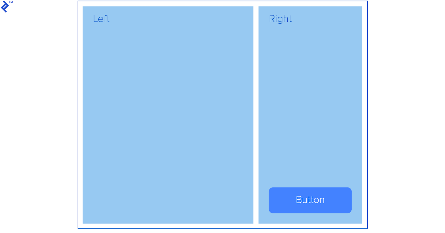
Imagine you’re tasked with generating multiple themes for this layout. The theme needs to apply distinct colors to all containers (including the main container) and the button. The selection of the theme will be determined by a class assigned to either the body element or potentially an “outer” container:

1
<body class="theme-1">

Let’s construct a mixin named “themable” to encapsulate our color scheme as parameters.

 1
 2
 3
 4
 5
 6
 7
 8
 9
10
11
12
13
14
15
16
17
18
19
20
21
22
23
24
25
26
27
28
29
30
31
32
33
34
35
36
37
38
39
40
41
42
43
44
45
@mixin themable($theme-name, $container-bg, $left-bg, $right-bg, $innertext, $button-bg) {
   .#{$theme-name} {
       .container {
           background-color: $container-bg;
           border: 1px solid #000;
           display: flex;
           height: 500px;
           justify-content: space-between;
           margin: 0 auto;
           padding: 1em;
           width: 50%;

           * {
               color: $innertext;
               font-size: 2rem;
           }

           .left {
               background-color: $left-bg;
               height: 100%;
               width: 69%;
           }

           .right {
               background-color: $right-bg;
               height: 100%;
               position: relative;
               width: 29%;
           }

           .button {
               background-color: $button-bg;
               border: 0;
               border-radius: 10px;
               bottom: 10px;
               cursor: pointer;
               font-size: 1rem;
               font-weight: bold;
               padding: 1em 2em;
               position: absolute;
               right: 10px;
           }
       }
   }
}

Subsequently, utilize this mixin to produce our themes:

1
2
@include themable(theme-1, #f7eb80, #497265, #82aa91, #fff, #bc6a49);
@include themable(theme-2, #e4ada7, #d88880, #cc6359, #fff, #481b16);
Comparison of theme-1 and theme-2 generated using Sass

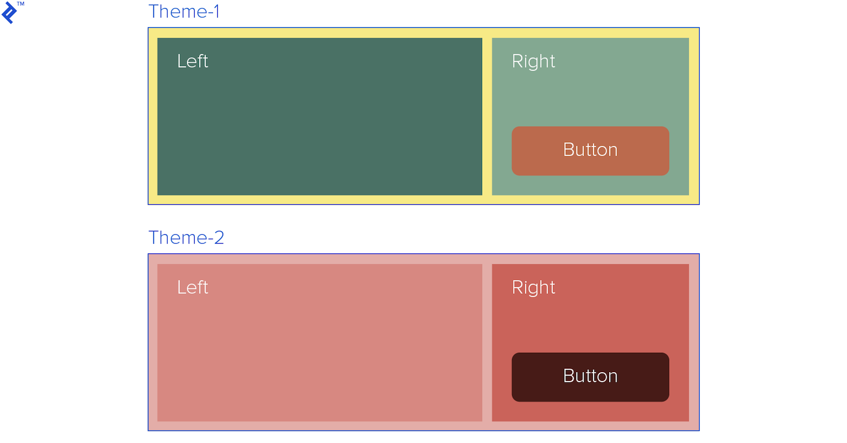
While this method already saves considerable time, it presents some limitations:

Themes often encompass a wide range of properties beyond just colors. If we were to modify the Bootstrap theme, for instance, composing a mixin using the preceding structure would lead to maintainability issues and reduced code readability. Furthermore, this approach deviates from Sass best practices, such as directly embedding hex color codes within the mixin.

Structuring a Styles Scheme with Sass Maps

Leveraging maps, which function similarly to key-indexed arrays, enables us to establish a more semantic and comprehensible set of styles for our theme, improving maintainability and clarity for fellow developers. While lists offer an alternative, maps, with their self-explanatory keys, prove more suitable for this purpose.

Our new approach employs a nested map:

 1
 2
 3
 4
 5
 6
 7
 8
 9
10
11
12
13
14
15
16
17
18
19
20
21
22
23
$theme-1: (
   container: (
       bg: #e4ada7,
       color: #000,
       border-color: #000
   ),
   left: (
       bg: #d88880,
       color: #fff,
       height: 100%,
       width: 69%
   ),
   right: (
       bg: #cc6359,
       color: #fff,
       height: 100%,
       width: 29%
   ),
   button: (
       bg: #481b16,
       color: #fff
   )
);

To access each section within our theme-1 scheme and its corresponding sub-maps, we utilize the @each directive to iterate through them:

1
@each $section, $map in $theme-1

$section will capture the key of the current section, and $map will retrieve the nested map associated with that key.

We can then access individual properties within each map, such as the background (bg) property, using the map-get function:

1
map-get($map, bg)

By combining our new mixin, based on this map structure, we can effortlessly create numerous themes:

 1
 2
 3
 4
 5
 6
 7
 8
 9
10
11
12
13
14
15
16
17
18
19
20
21
22
23
24
25
26
27
28
29
30
31
32
33
34
35
36
37
38
39
40
41
42
43
44
45
46
47
48
49
50
51
52
53
54
55
56
@mixin themable($theme-name, $theme-map) {
   .#{$theme-name} {
       .container {
           .left, .right {
               font-size: 2rem;
           }
       }

       .container .right {
           position: relative
       }

       .button {
           border: 0;
           border-radius: 10px;
           bottom: 10px;
           cursor: pointer;
           font-size: 1rem;
           font-weight: bold;
           padding: 1em 2em;
           position: absolute;
           right: 10px;
       }

       // Loop through each of the keys (sections)
       @each $section, $map in $theme-map {
           @if ($section == container) {
               .container {
                   background-color: map-get($map, bg);
                   border: 1px solid map-get($map, border-color);
                   display: flex;
                   height: 500px;
                   justify-content: space-between;
                   margin: 0 auto;
                   padding: 1em;
                   width: 50%;
               }
           } @else {
               .#{$section} {
                   background-color: map-get($map, bg);
                   color: map-get($map, color);

                   @if ($section != button) {
                       height: map-get($map, height);
                       width: map-get($map, width);
                   }
               }
           }
       }
   }
}

@include themable(theme-1, $theme-1);
@include themable(theme-2, $theme-2);


Note the use of the @if directive to apply distinct properties for sections other than buttons.

1
2
3
4
                   @if ($section != button) {
                       height: map-get($map, height);
                       width: map-get($map, width);
                   }

This structure allows us to introduce specific properties or even rules for certain sections, or differentiate between keys holding a single value and those containing a nested map.

Our theme can comprise multiple maps utilized by various mixins applied throughout our stylesheet. The complexity of the base layout and our preferred approach will determine the extent of this structure.

Further Enhancements

Sass provides built-in functions to further streamline our workflow. For example, hsl functions like lighten or darken can dynamically calculate colors, such as the color of a button on hover.

We can modify the button code to lighten its background on hover, irrespective of the original background color, eliminating the need to define an additional color for this state.

1
2
3
4
5
6
7
8
@if ($section != button) {
   height: map-get($map, height);
   width: map-get($map, width);
} @else {
   &:hover {
       background-color: lighten(map-get($map, bg), 20%);
   }
}

Furthermore, integrating Sass modules can significantly enhance code readability and scalability. Each theme map can reside in its own module and be imported into the main stylesheet.

 1
 2
 3
 4
 5
 6
 7
 8
 9
10
@import 'theme-1';
@import 'theme-2';
@import 'theme-3';
 
 
@mixin themable($theme-name, $theme-map) {
   .#{$theme-name} {
       .container {


This approach necessitates organizing the modules within the project as follows:

/ ├── _theme-1.scss ├── _theme-2.scss └── _theme-2.scss

To delve deeper into leveraging Sass for DRY (Don’t Repeat Yourself) CSS principles, refer to Toptaler Justin Brazeau’s insightful article, “Sass Mixins: Keep Your Stylesheets DRY.”

Licensed under CC BY-NC-SA 4.0