One of the most frequently misused, misinterpreted, and overlooked aspects of Rails’ built-in functionality is the view helper. Automatically generated within the app/helpers directory of each new Rails project, helpers are often perceived negatively, viewed as repositories for miscellaneous methods used throughout an application’s view layer. This lack of organization is, unfortunately, reinforced by Rails itself, which incorporates all helpers into every view by default, cluttering the global namespace.
However, what if these helpers were more descriptive, structured, and reusable across various projects? What if they could transcend simple one-off functions scattered throughout views, becoming powerful tools capable of generating intricate markup effortlessly, freeing views from conditional logic and excess code?
Let’s explore how to achieve this while constructing an image carousel using the well-known Twitter Bootstrap framework and fundamental object-oriented programming principles.
When are Rails Helpers Appropriate?
Rails’ view layer offers a variety of design patterns, including presenters, decorators, partials, and of course, helpers. As a general guideline, helpers excel when generating HTML markup that demands a particular structure, specific CSS classes, conditional logic, or reusability across multiple pages.
The FormBuilder and its associated methods, which generate input fields, select tags, labels, and other HTML structures, exemplify the potential of Rails helpers. These methods automatically generate markup with the appropriate attributes, showcasing the convenience that drew developers to Rails initially.
Well-designed helpers offer the same benefits as any well-written, clean code: encapsulation, reduced code duplication (DRY), and separation of logic from the view.
Dissecting a Twitter Bootstrap Carousel
Twitter Bootstrap is a [popular front-end framework offering built-in support for common components like modals, tabs, and image carousels. Bootstrap components present a compelling case for custom helpers due to their highly structured markup, reliance on specific classes, IDs, and data attributes for JavaScript functionality, and the need for conditional logic in attribute setting.
A Bootstrap 3 carousel features the following markup structure:
| |
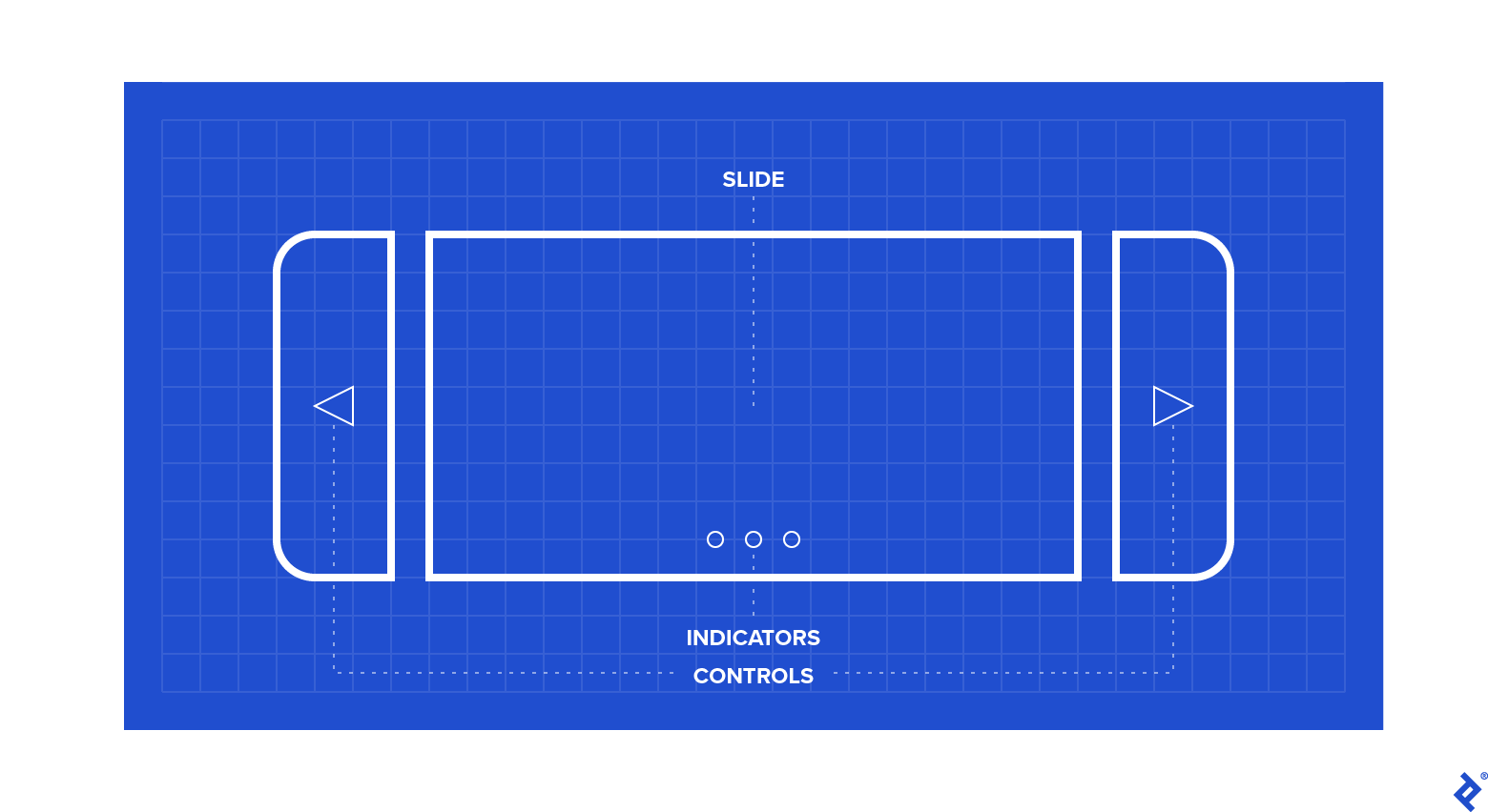
As observed, three primary structures exist: (1) indicators, (2) image slides, and (3) slide controls.
The objective is to create a single helper method that accepts a collection of images and renders the complete carousel component, ensuring accurate data, id, href attribute, and CSS class assignments.
Constructing the Helper
Let’s begin with a basic helper outline:
| |
The carousel_for helper method will return the complete carousel markup for the provided image URLs. Instead of creating multiple individual methods for each carousel part (requiring passing image collections and other state information), a new plain Ruby class called Carousel will represent the carousel data. This class will feature an html method that returns the fully rendered markup. Initialization occurs with the images collection of image URLs and the view context.
The view parameter, an instance of ActionView into which all Rails helpers are mixed, is passed to access built-in Rails helper methods like link_to, content_tag, image_tag, and safe_join for markup construction within the class. The delegate macro is added to enable direct method calls without referencing view:
| |
Knowing that a carousel consists of three distinct components, let’s stub out methods to generate markup for each. The html method will then combine them within a container div tag, applying the necessary Bootstrap classes for the carousel itself.
The built-in safe_join method efficiently concatenates string collections and applies html_safe to the result. Access to these methods is provided through the view parameter passed during instance creation.
Building the Indicators:
| |
Indicators are implemented as a simple ordered list (ol) containing a list item (li) element for each image in the collection. The active image indicator requires the active CSS class, which will be applied to the first indicator created. This exemplifies logic typically handled within the view itself.
Note that indicators need to reference the unique id of the containing carousel element (in case of multiple carousels on a page). This id, easily generated in the initializer, can be used throughout the class (particularly within indicators and controls). Programmatically generating this id within the helper method ensures consistency across carousel elements. This approach prevents potential carousel breakage due to typos or inconsistent id updates across elements.
| |
Creating the Image Slides:
| |
This section iterates over each image passed to the Carousel instance, creating the appropriate markup: an image tag wrapped in a div with the item CSS class. The active class is added to the first slide created.
Implementing Previous/Next Controls:
| |
Links are created to control carousel movement between images. The use of uid ensures consistent and unique ID usage throughout the carousel structure.
The Complete Helper:
The complete carousel helper code is presented below:
| |
Helper in Action:
Let’s illustrate the helper’s practicality with an example. Consider a website for apartment rental listings, where each Apartment object possesses a list of image URLs:
| |
Using the carousel helper, the entire Bootstrap carousel can be rendered with a single carousel_for call, eliminating complex logic from the view:
| |
Unsure about when to leverage Rails view helpers? Here’s a practical demonstration.
Conclusion
This straightforward yet effective technique moves a significant amount of markup and logic from the view layer into a reusable helper function. A simple carousel_for(some_images) call now renders carousel components anywhere. This generic helper, usable across all Rails projects employing Twitter Bootstrap, provides a valuable tool for project-specific components.
Next time repetitive markup and embedded conditional logic clutter your views, consider whether a helper function can simplify your workflow.
