I was recently tasked with building a grid system from scratch. While reinventing the wheel might seem redundant, it’s a fantastic learning opportunity, so I dove in. I expected a challenge, but the ease surprised me!

Let’s explore how Flexbox layouts enable elegant layout implementations without resorting to complicated hacks. We’ll also delve into Sass, its functionality, and its useful utilities, even if you’re unfamiliar with it. You might even discover something new about CSS grids, like Bootstrap’s grid system.
A Quick Overview of Sass and Flexbox
Sass acts as a tool to overcome some of CSS’s limitations. It’s a scripting language that compiles into CSS. Its syntax will feel familiar if you already know CSS, but it offers tools like variables, mixins for reusability, and if, for, each and while directives among others. One of the best things about Sass is that any valid CSS code is also valid Sass, allowing you to gradually transition your codebase.
Here’s a simple for loop example:
| |
This loop iterates from 1 to 3, generating classes. The iteration index is conveniently stored in $i. We can also use math to output .a-numbered-class-X three times, each with a different width. This code produces:
| |
This demonstrates how Sass can streamline tasks that would require manual copying, pasting, and modification in CSS, making it more error-prone and less elegant. If you haven’t tried Sass, now’s the time!
Flexbox, short for Flexible Box, is a CSS3 layout system that dynamically positions and distributes elements. This powerful tool enables flexible layouts with minimal code. For a deeper dive into Flexbox, refer to Chris Coyier’s Complete Guide to Flexbox.
The Grid
Let’s break down the fundamental elements of our grid, taking inspiration from Bootstrap: Containers, Rows, and Columns, each nested within the previous element.
We’ll use the BEM naming conventions for class names. BEM conventions are straightforward and provide valuable information about the element and its context. In short:
- Blocks represent self-contained, meaningful entities:
.block. - Elements are parts of a block with no independent meaning:
.block__elem. - Modifiers act as flags on blocks or elements:
.block .block--mod.
Containers
The outermost element, containers, hold our row elements. We have two types: .container and .container--fluid.
.container is designed to span 100% width below a certain breakpoint, have a fixed maximum width above it, and maintain equal left and right margins:
| |
Play with it here by expanding and contracting the “output” window
For the fluid container, which always occupies 100% width, we override these properties using a modifier:
| |
With that, we’ve implemented both container types. Let’s move on to the next element.
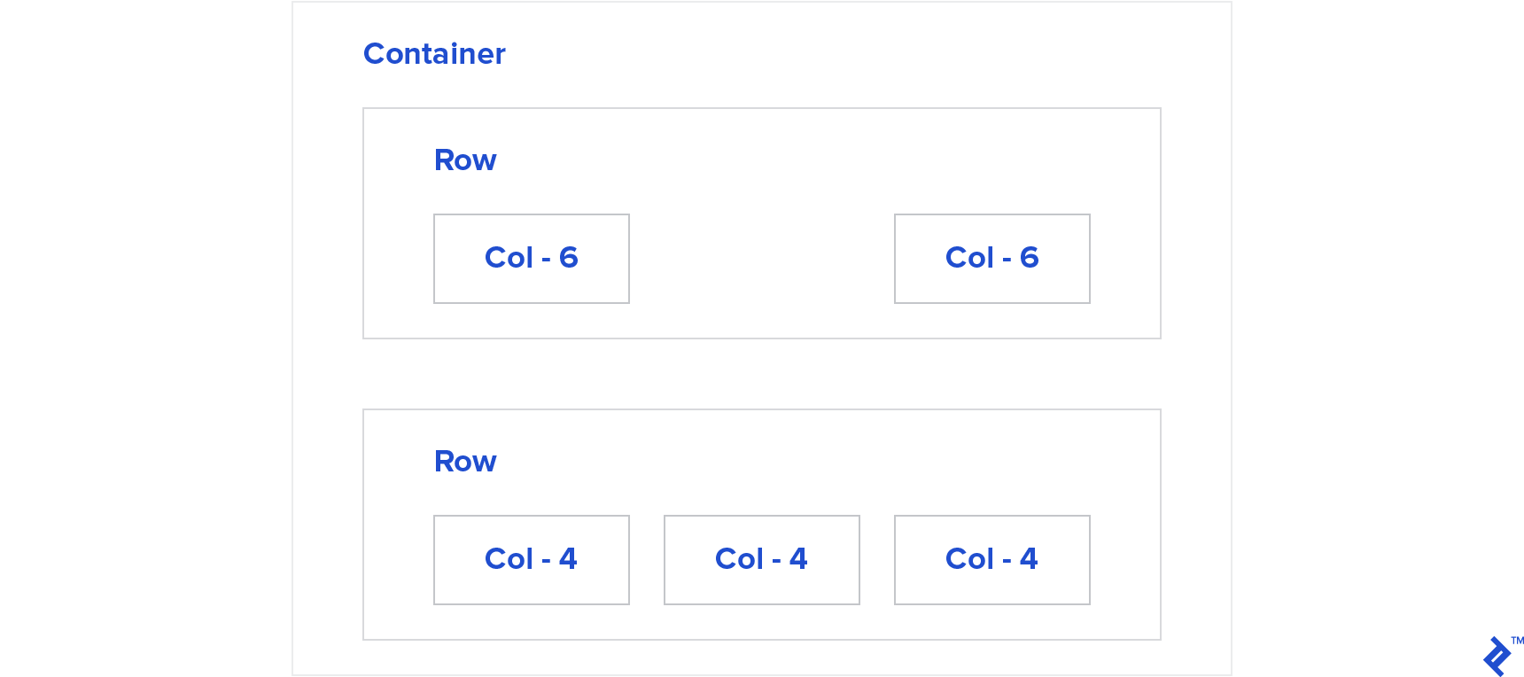
Rows
Rows serve as horizontal organizers for our content.
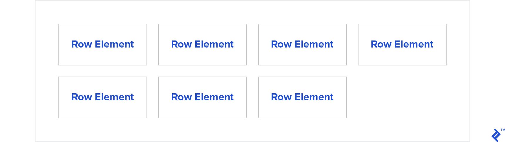
We’ll leverage Flexbox to position a row’s children, enabling wrapping to prevent overflow and assigning them 100% width within the row for nesting purposes.
| |
This will arrange child elements horizontally and wrap them onto new lines if their combined width exceeds the row’s width. Adding a few divs will result in this:
Play with it here by expanding and contracting the “output” window.
While it’s taking shape, it’s not quite a CSS grid yet. It’s missing…
Columns
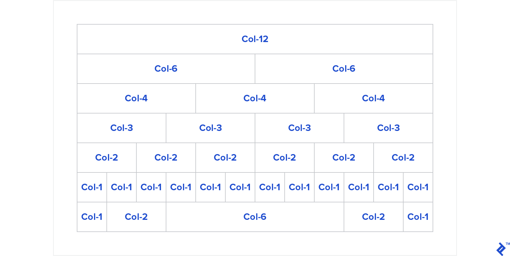
Columns are where our site’s content resides. They define the number of divisions within a row and their respective proportions. We’ll implement a twelve-column layout, allowing us to divide a row into up to twelve parts.
Let’s start with basic math. For a single column, its width should be 100%. For twelve columns, each should occupy 8.333…% or 100/12 of the total width.
Flexbox offers the flex-basis property for this kind of content distribution.
To divide a row into four columns, we’d add:
| |
This ensures each element occupies 25% of the width, or any desired percentage.
Let’s make this more dynamic. Since we want our classes to reflect the possible divisions, let’s use .col-1 to represent a column div occupying 8.333% width (as twelve of them should fit on a single line). We’ll increment the percentage for subsequent classes until .col-12, which will take up 100% width.
| |
To illustrate, let’s divide the width into four equal parts. We’d use .col-3 because it fits into 12 four times, meaning .col-3 should have a flex-basis of 25%:
| |
Now it’s starting to resemble a grid!
Screen Width-dependent Columns
Next, we want elements to adjust their width based on screen size, using breakpoints to trigger layout adaptations for different devices. We’ll name breakpoints by size: small (sm), medium (md), and so on. For instance, .col-sm-12 will occupy 12 columns until the sm breakpoint is reached.
Let’s rename .col-* to .col-sm-*. Since our grid is mobile-first, these properties apply to all screen sizes. For larger screens, we’ll add the class .col-md-* to modify behavior.
Consider an element with both .col-sm-12 and .col-md-4. Below the “md” breakpoint, it should occupy 100% width. Above it, it should occupy 33.333%—a common scenario for mobile optimization, where stacking elements vertically might be necessary due to limited width.

To achieve this, we’ll introduce a media query (an expression that conditionally applies styles based on screen width or device) at the breakpoint to create our md columns, similar to how we created sm columns:
| |
While functional, this is becoming repetitive (quite WET—not very DRY). Let’s abstract it further.
Since each breakpoint requires a media query, let’s create a mixin called create-mq that dynamically generates media queries based on a provided breakpoint:
| |
Now, let’s wrap the code for creating __col classes into a mixin called create-col-classes and utilize our create-mq mixin:
| |
That’s it! Now, we define our breakpoints in a Sass map and iterate through them:
| |
Our grid system is nearly complete! We have .container__col-sm-* as our default, modifiable at larger screen sizes using container__col-md-* and container__col-lg-*.
We can even nest rows! Play with it here.
The beauty of this approach is its flexibility. If we wanted to match the breakpoints of Bootstrap v4, we simply need to:
| |
And that’s all! Play with it here.
Note that Bootstrap takes a more comprehensive mobile-first approach than we initially discussed. The smallest window sizes have no suffix like “sm” or “md.” This is because classes equivalent to .container__col-X apply not only from 0 to 576px but also to all window sizes unless explicitly overridden. We can add .container__col-sm-Y to specify a width of Y columns between the “sm” breakpoints.
Offsets
Offsets add left margins relative to the preceding column. For instance, .container__col-offset-4 adds a margin-left: 33.333% at all screen sizes, while .container__col-md-offset-4 applies the same margin above the “md” breakpoint.
Implementing this is straightforward. We add an -offset property within our class-creation loop, but instead of flex-basis, we use margin-left. We also need to handle -offset-0 to reset margins on larger screens:
| |
With that, we have fully functional offsets! Play with it here.
Displayability
Let’s introduce classes like the ones of Bootstrap v4 to control element visibility based on screen size.
For example, .hidden-md-up hides elements from the “md” breakpoint upwards, while .hidden-md-down hides them below the breakpoint.
The code is surprisingly simple: We iterate through breakpoints and generate .hidden-* classes for each, modifying our create-mq mixin for greater abstraction:
| |
As a side note, this feels like a legitimate use case for !important. An element might have an arbitrarily high specificity with a display: block rule, but we still want to control its visibility based on breakpoints. Feel free to share your thoughts on this approach in the comments!
And there you have it: a functional displayability system.
Conclusion
While not production-ready, this “framework” demonstrates the power and simplicity of Flexbox layouts and Sass. With just a few lines of code, we replicated the core functionality of a CSS grid system.
This exercise also highlights that a basic version of almost any software can be built with relative ease. It’s real-world complexities that introduce challenges.
I’ve created a GitHub repo for issues and pull requests.
What features would you like to see added? Can the implementation be further simplified or made more elegant?
Share your thoughts in the comments below!