Becoming proficient in web layout without a strong understanding of CSS is like attempting to learn how to swim without ever getting wet. However, unlike swimming – a skill that, once learned, stays with you – mastering CSS is a continuous journey. This is because CSS itself is constantly evolving.
This challenge is further complicated by variations in how different browsers (and even different versions of the same browser) implement and support CSS, along with varying adoption rates of CSS recommendations. For over a decade, web designers and developers have been wrestling with unpredictable and inconsistent additions of CSS3 features being supported in each new browser version.
Despite this, a deep understanding of CSS is crucial for any competent web designer or developer. This article will guide you through some basic CSS layout principles, covering both established CSS2 techniques and the latest layout approaches in CSS3.
NOTE: All code examples in this article utilize HTML5 elements and Sass syntax. The complete working code can be accessed from https://github.com/laureanoarcanio/css-layout-examples.
Use Case
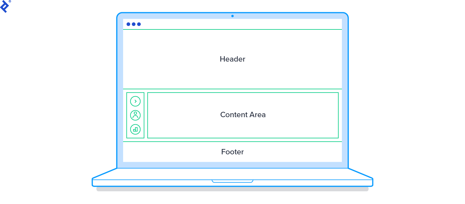
A practical way to grasp a technology is by applying it to a specific scenario or problem. With this in mind, let’s consider a web app layout with dynamic behavior. This layout will have fixed elements like a header, footer, navigation menu, and sub-navigation, as well as a scrollable content area. The layout requirements are as follows:
- Basic Layout
- Header, footer, navigation menu, and sub-navigation should remain fixed when scrolling.
- Navigation and sub-navigation elements should occupy the entire vertical space available.
- The content section should utilize all remaining space and include a scrollable area.
- Dynamic Behavior
- The navigation menu should display icons only by default, with the option to expand and show text (and collapse back to icons).
- Layout Variations
- Some pages will have sub-navigation next to the navigation menu, while others won’t.
CSS Tutorial Using Classic CSS2 Techniques

We’ll begin with the HTML5 markup for our example implementation using traditional CSS:
| |
Fixed Positioning
In CSS2, we can achieve fixed elements (header, footer, etc.) by using a positioned layout model with fixed positioning.
To ensure that these elements stay above other content, we’ll use the z-index CSS property. The z-index property controls the stacking order of elements, with higher values appearing “on top.” Note that z-index only works on positioned elements. In our example, we’ll use a z-index of 20 (higher than the default) for our fixed elements.
We’ll also set the width property to 100%, making the element use all available horizontal space.
| |
Now, let’s move on to #nav and #subnav.
CSS Expansion
For #nav and #subnav, we’ll employ a technique called CSS Expansion, which is useful when positioning elements as fixed or absolute.
Vertical expansion is achieved by setting both the top and bottom properties to fixed values. This causes the element to expand vertically to fill the remaining space. Essentially, you’re anchoring the element’s top and bottom to specific points on the page, forcing it to expand between them.
Similarly, horizontal expansion involves setting the left and right properties to fixed values.
Our use case requires vertical expansion.
| |
Default (Static) Positioning
The main scrollable content area can rely on default (static) positioning. Elements will render in their order within the document flow. As the only element in the document flow (since everything else is fixed), we only need to define its margin property to prevent overlap with the fixed header, footer, and navigation:
| |
This fulfills the basic layout requirements of our use case using CSS2. Now, let’s address the dynamic functionality.
Dynamic Behavior Using Classic CSS2 Techniques
Our navigation menu should display icons by default, with the ability to expand and show text (and collapse back to icons).

Let’s start by adding 5em to the navigation menu’s width when expanded. We’ll create an “expanded” CSS class that can be dynamically added or removed:
| |
Here’s an example using JavaScript (with jQuery) to toggle the navigation menu between expanded and collapsed modes when the user clicks the navigation toggle icon:
| |
Now our navigation menu can expand and collapse dynamically. However, there’s a problem.
While the menu can expand and contract, it overlaps the sub-navigation, which isn’t ideal. This highlights a limitation of CSS2 – the excessive reliance on hardcoded position values.
To reposition other elements to accommodate the expanded navigation menu, we need to define additional “expanded” CSS classes with more fixed position values.
| |
We also need to update our JavaScript to dynamically adjust these elements when the navigation toggle is clicked:
| |
That’s better.
Layout Variations Using Classic CSS2 Techniques
Let’s address the requirement for pages to optionally hide the sub-navigation menu. We want it hidden when the user clicks the “users” icon in the main navigation.
First, we’ll create a “hidden” class that applies display: none:
| |
Again, we’ll use JavaScript (jQuery) to apply the “hidden” CSS class to the #subnav element when the user clicks the “users” icon:
| |
Now, the #subnav element hides correctly. However, the space it occupied remains empty instead of being utilized by other elements.
To achieve the desired behavior, we’ll use the adjacent sibling selector.
Adjacent Sibling CSS Selector
The adjacent sibling selector lets you target instances of the second element that immediately follow the specified first element.
For example, this will select only #main elements that immediately follow an element with the ID subnav:
| |
This snippet sets the left margin of #main to 20em only if it immediately follows a displayed #subnav.
If #nav is expanded (adding the expanded class to #main), we adjust the left margin of #main to 25em:
| |
If #subnav is hidden, we move the left margin of #main to 6em, placing it next to #nav:
| |
(Note: This approach requires #subnav to be present in the DOM even when hidden.)
Finally, if both #subnav is hidden and #nav is expanded, we set the left margin of #main to 11em:
| |
This approach avoids complex JavaScript, but it highlights how intricate the code can become with more elements. CSS2 often requires extensive hardcoding of position values.
Leveraging CSS3
CSS3 brings enhanced functionality and layout techniques that simplify development and reduce reliance on hardcoded values. It’s inherently more dynamic and “programmable.” Let’s explore some of these capabilities.
CSS3 calc() Function
The CSS3 calc() function function enables dynamic calculation of CSS property values (note: browser support varies may vary). The calc() function accepts a simple expression using arithmetic operators (+, -, *, /) with standard precedence rules.
Using calc() can minimize hardcoded values required in CSS2. For instance:
| |
This dynamically achieves the same result as top: 6em and bottom: 4em in CSS2, offering flexibility and adaptability without hardcoding position values.
CSS3 Flexbox Layout
Flexbox is a new layout model in CSS3 (support varies across browsers) designed for more predictable element arrangement across different screen sizes and devices, making it valuable for [responsive web design.
Key features include:
- Simplified positioning of child elements for complex layouts with cleaner code.
- Flexible layout direction (any direction) and dimensions for child elements.
- Automatic expansion and contraction of child elements to utilize available space.
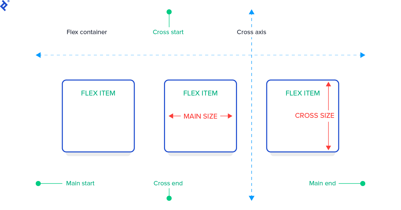
Flexbox introduces its own terminology:
- Flex container: An element with
display: flexordisplay: inline-flex, acting as a container for flex items. - Flex item: Any element within a flex container. (Note: Text directly within a flex container is wrapped in an anonymous flex item.)
- Axes: Each flexbox layout has a
flex-direction (main axis) for laying out flex items and a perpendicularflex-wrap(cross axis). - Lines: Flex items can be placed on single or multiple lines using the
flex-wrapproperty. - Dimensions: Flexbox equivalents of height and width are
main sizeandcross size, defining sizes along the main and cross axes, respectively.
Let’s look at the alternative markup for a flexbox layout:
| |
Our main layout (header, content, footer) is vertical, so we’ll use a column layout:
| |
While the main layout is vertical, elements in the content area (nav, subnav, main) are horizontal. Since a flex container can have only one direction, we’ll nest multiple containers.
We’ve added a content-area container to wrap #nav, #subnav, and #main, allowing for a vertical overall layout and a horizontal content area.
To position flex items, we’ll use the flex property (shorthand for flex: <flex-grow> <flex-shrink> <flex-basis>;):
- flex-grow:: Controls how much an item can grow relative to siblings.
- flex-shrink:: Controls how much an item can shrink relative to siblings.
- flex-basis:: Specifies the item’s initial size.
Setting both flex-grow and flex-shrink to zero makes the item’s size fixed. We’ll do this for the fixed-size header and footer:
| |
To have an item consume all available space, set its flex-grow and flex-shrink to 1 and its flex-basis to auto. We’ll apply this to the content area:
For the horizontal layout of items within content-area, we’ll add display: flex; and flex-direction: row;:
| |
Within content-area, #nav and #subnav have fixed sizes, so we’ll set the flex property accordingly:
| |
(Note: overflow-y: hidden is added to prevent content overflow issues in some browsers.)
#main will take up the remaining space:
| |
Let’s add the dynamic behavior:
The JavaScript code remains the same (except for the CSS class name, which is now layout-flexbox instead of layout-classic):
| |
The expanded class is added to the CSS:
| |
And there you have it! The flexbox layout automatically handles the width change without needing to adjust other elements manually.
Hiding the sub-navigation also works seamlessly without any modifications, using the same JavaScript code. Flexbox understands free space and adapts the layout accordingly.
Flexbox offers elegant ways to center elements both vertically and horizontally, demonstrating the power of managing free space within a presentational language. However, mastering its concepts and syntax might require more effort compared to classic CSS.
CSS3 Grid Layout
While Flexbox is at the forefront of CSS3, Grid Layout is considered even more cutting-edge. The W3C specification is still in draft form with fairly limited browser support. (It’s enabled in Chrome via the “experimental Web Platform features” flag in chrome://flags).
However, it’s not necessarily a revolutionary concept. As the HTML5 design principles state: “When a practice is already widespread among authors, consider adopting it rather than forbidding it or inventing something new.”
Markup-based grids have been in use for a long time, and CSS Grid Layout follows the same paradigm, bringing its benefits to the presentation layer without requiring markup.
The core idea is to position elements within a predefined grid layout that can be fixed or flexible. Like flexbox, it leverages the concept of free space and allows defining both vertical and horizontal directions within the same container, promoting code conciseness and flexibility.
Grid Layout introduces two grid types: explicit and implicit. We’ll focus on explicit grids here.
Similar to flexbox, Grid Layout introduces its own set of terms:
- Grid container: An element with
display: gridordisplay: inline-grid, where elements are positioned and aligned to a predefined grid (explicit mode). The grid consists of intersecting horizontal and vertical grid lines forming grid cells. - Grid track: The space between two adjacent grid lines. Each track has a sizing function determining its width or height.
- Grid cell: The space enclosed by two adjacent row and two adjacent column grid lines, representing the smallest unit for positioning grid items.
- Flexible length: A dimension using the
frunit, representing a fraction of the grid container’s free space.

Here’s the markup for a Grid Layout:
| |
Unlike flexbox, we don’t need an extra wrapper for the content area, as Grid Layout allows defining element positioning in both directions within the same container.
Let’s examine the CSS:
| |
We’ve set display: grid; on the container. grid-template-columns and grid-template-rows define the space between grid tracks, not the position of the lines themselves.
Measurement units can be:
- Length units
- Percentages of the grid container’s size
- Measurements based on the content
- Fractions of the free space
In grid-template-columns: auto 0 auto 1em 1fr;, we have:
- 1 track defining 2 columns of
autowidth (#navspace) - 1 gutter of 0 (margin for the optional
#subnavis at the element level) - 1 track defining 2 columns of
autowidth (#subnavspace) - 1 gutter of
1em - 1 track using
1frfor#main(occupies remaining space)
The auto value creates dynamic columns sized based on their content. We’ll define sizes for #nav and #subnav later.
Similarly, grid-template-rows: 5em 1em 1fr 1em 3em; sets fixed heights for #header and #footer, with elements in between using the remaining space and 1em gutters.
Now, let’s position the elements within the grid:
| |
This places the header between grid lines 1 and 6 horizontally and 1 and 2 vertically. The footer follows the same pattern but between the last two lines. The main area occupies its designated space.
grid-column and grid-row are shorthands for grid-column-start / grid-column-end and grid-row-start / grid-row-end.
Let’s define the widths for #nav and #subnav, which are placed in tracks with auto values:
| |
Now we can toggle #nav and hide/remove #subnav, and the layout adapts seamlessly. Grid Layout also supports line aliases for easier grid modifications without breaking the code.
Conclusion
Even with classic CSS, there’s significant potential for creating sophisticated layouts. However, it often involves tedious hardcoding and repetition.
CSS3 introduces powerful layout techniques like Flexbox and Grid Layout, which simplify development, reduce hardcoding, and improve flexibility.
Mastering these techniques for both CSS2 and CSS3 is crucial for harnessing the full potential of CSS to create optimal user experiences and maintainable codebases. This article serves as an introduction to the vast world of CSS and its capabilities. Happy coding!