When A/B testing their call to action, most people concentrate on superficial aspects like button color, shape, or text spacing – but these are insignificant in the grand scheme of things. As emphasized before, minor tweaks usually yield insignificant results. The success of a call to action (CTA) hinges on fundamental elements that heavily influence landing page performance. Get these right, and your chances of success skyrocket. Get them wrong, and you’ll struggle to achieve even mediocre results. Let’s explore the key areas to optimize your CTAs.
3 crucial elements of a compelling CTA
Spoiler alert! They are value proposition, tone, and positioning. Continue reading for a detailed explanation.
1. The value proposition
Many businesses can readily recite customer demographics like income, location, job titles, and education. However, fewer can successfully grasp the psychographics (remember 1960’s-style marketing) that explain customer motivations. These are the driving forces or anxieties that compel people to overcome inertia and ultimately try your brand. Until you uncover these reasons, crafting a compelling value proposition for your product or service’s ad will be impossible.
Center it around achieving specific benefits
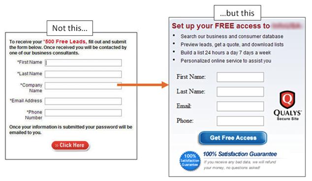
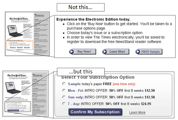
Instead of highlighting the value offered, CTAs often emphasize the desired action (e.g., phone call, email signup, downloading a whitepaper). Swapping a generic offer or CTA with a well-researched value proposition can yield a 201% conversion increase. The form on the left in the example below fails to communicate the value of signing up, while the one on the right clearly outlines distinct advantages (not just features) that address users’ daily challenges.
AND, most importantly, once you perfect the value proposition, the CTA – in this instance, a button – naturally falls into place. You can use specific wording tailored to the offer, creating consistency from the headline to the link, button, or phone number intended for user action. This is crucial because according to MarketingExperiments, the best CTAs provide three key benefits:
- Guidance: Telling users what to do.
- Information: Clarifying what they’ll gain.
- Anxiety Relief: Eliminating doubt or perceived risk associated with taking action. Value propositions (and the closely related unique selling propositions) might seem like abstract, jargon-filled business school concepts.
Keep it concise
The key with CTAs is conciseness – using fewer words to convey more meaning. Start by identifying and avoiding “friction words” that evoke mixed feelings, causing hesitation and ultimately leading people to decline your offer. Here are a few examples from the excellent CopyHackers:
- Sign Up (common in newsletter signup CTAs)
- Submit
- Invest
- Donate
- Support Replacing these words with more influential and persuasive alternatives is a simple way to make your value proposition resonate better with your target audience. For instance, most people are less inclined to “read more” or “learn more,” but they will “check out” or “discover.” While seemingly insignificant, it’s crucial to recognize that 71% of B2B buyers make purchase decisions based on personal value, not just financial incentives. This means that even in the most conventional and mundane contexts, we still need to appeal to emotions. “Power words” have long been used in copywriting to break through the clutter and instantly appeal to our primal instincts, which ultimately drive our decisions. Unsurprisingly, many of these words appear in studies on the best converting words and phrases, such as those by Buffer, which often include:
- New
- You
- Free
- Because
- Instantly When effectively combined, you get a great CTA like this one for nexus-security’s AdWords Grader:
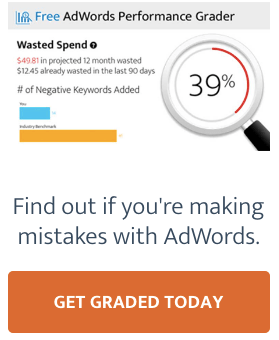
The offer itself is undeniably strong. It effectively highlights a major pain point for marketers in four distinct ways:
- Projected 12-month budget or spend waste
- Spend wasted in the last 90 days
- A graph clearly illustrating unfavorable comparison to the industry benchmark
- And an overall score significantly below 100% The CTA phrasing mirrors the groundwork laid by these ratings and the classic “fix your mistakes” headline:
- Get = Action Verb
- Graded = Primary Value Prop
- Today = Urgency
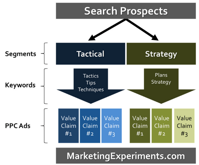
Consider a shift in perspective
No problem, as you can build a list of different variations and test with your ad creative. MarketingExperiments presents an excellent framework for testing value props with ads that you should whiteboard (now) to start running through ideas for improvement.
Key takeaway: Make sure your CTA communicates the unique value your prospect is going to get by acting on it.
2. Tone (and “scent”)
Message match attempts to align the search query a prospect uses with the advertisement they see (and click) and with the messaging on the landing page where they eventually arrive.
The tone of your CTA can have the same effect, creating an alignment between a visitor’s expectations, the value prop you’re offering, and the way they take you up on that offer (also similar to “conversion scent”).
As discussed, the words used can heavily influence the effectiveness of your CTA and your ultimate number of conversions. Because many times, they imply or allude to additional qualities in a prospect’s mind, packing multiple meanings (which may be unintended).
For example, the CTA “Download Guide,” while seemingly innocuous, might sound like an extra demand on a busy executive’s time (how long will it take to download?). That’s what one study concluded, when simplifying the language to “View Full Article” (among other changes) resulted in a 84.6% lift.
Tone alters the message – saying the same thing (more or less) but putting a different spin on it to make it more palatable to the reader. Many times, that means pushing the boundaries to the extremes in order to cut through the noise to the specific types of people you’re trying to reach (even at risk of offending the few).
Kinda like this sophomoric one from my company:
…which sounded great during the brainstorming session, occurring before seeing this other excellent use of poop emojis. (Best anchor text ever?)
Then there’s this less immature but still playful one on Copy Weekly:

The absence of tone quickly becomes jargon. Tonal extremes, on the other hand, can help.
The problem with “synergy” and other vague uses of industry-specific jargon (besides the fact that every single one of your competitors is saying the same exact thing) is that they quickly lose meaning due to lack of clarity. And clarity, above all, is one of the best ways to increase conversions.
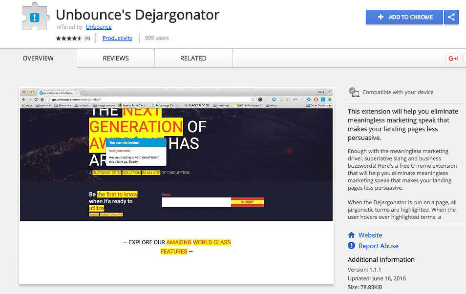
To help you pinpoint these problems on your pages, Unbounce recently released the Dejargonator Chrome Extension, which will highlight all uses of jargon on a page (while also offering a few witty critiques in the dialog box).
However before moving on to the last bit, it’s important to recognize that sometimes, once in a rare while, jargon pays off.
But there are ground rules. First, you’re speaking specifically to the small group of people who actually understand what that technical mumbo jumbo means. And second, when you want to be inclusive by excluding people. Similar to the liberal use of poop emojis above, you’re purposefully turning some people away but gaining extra points with a select few.
Key takeaway: Be careful to use a tone of voice thatwill resonate with your target audience.
3. Page design & positioning
Long, scrolling pages are nothing new. Consumers today are used to scrolling endlessly for all of your information packed on a single page. And yet…
The “fold” thing really does still hold some weight. Specifically, relocating a CTA from under to above the fold resulted in a 20% conversion increase in one example.
Here’s why.
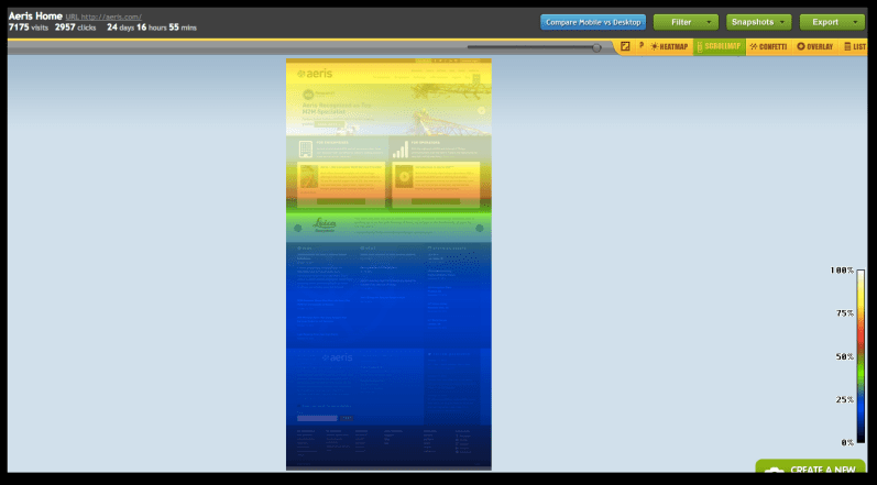
That scroll map above kinda resembles an ocean. The crystal clear water at the top is where all the people are, with some beautiful, colorful coral reefs just below. Then the continental shelf drops precipitously; plunging into the deep dark abyss where no people (or website visitors) venture further.
Basic analysis of user behavior like this can instantly tell you why a CTA might not be performing. The value prop is good. The tone matches the audience you’re attempting to reach. But they’re just not seeing it down there.
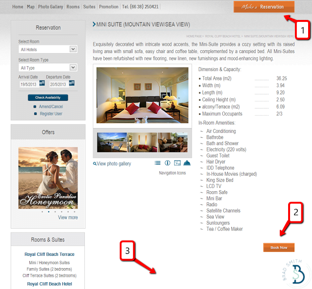
Page positioning of your primary CTA can dictate clicks (and conversions). For example, using one that’s left-justified or centered will align with how we naturally scan web pages in an F-shape. So simply relocating CTA’s to these “hot spots” is one simple way to increase your chances of success (as Neil Patel astutely points out).
But simply locating a CTA above the fold won’t guarantee success. Because when there’s no discernable CTA (or equally problematic – too many), this happens:
Nobody clicks anywhere specific, because they’re not quite sure where to click in the first place.
This commonly happens when you create a website based on art instead of interaction. There’s no singular goal or objective behind the page, and it sabotages the effectiveness of your CTA (getting lost in sea of competition for visitor attention).
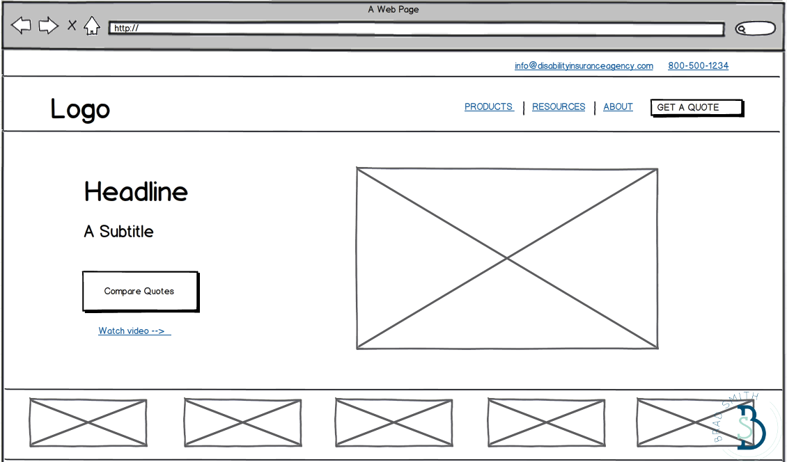
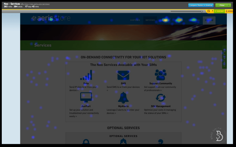
When a page is reorganized to emphasize the primary objective on a page, it should resemble this one from the Disability Insurance Agency:
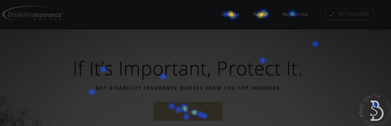
The majority of page interactions (or clicks) successfully happen exactly where you want them – on the CTA button.
Purposefully offsetting the CTA from other elements on the page is another good technique to draw attention and focus.
Another way to verify how you’re doing is to look at click ratios of the page. For example, using a simple tool like Crazy Egg you can see how the percentage of clicks on a page are distributed. If the bulk are on your primary action, you’re doing a good job.
(If they’re evenly distributed among several different options that aren’t your primary ones, you’re not.)
Another common mistake when using multiple CTA’s is not to arrange them according to priority for the page visitor. In other words, there should be a clear hierarchy or differentiation between primary, secondary and tertiary page options.
For example, just last week I was reviewing a prospect’s site and came across this:
These two offers now compete for attention because visually they’re the exact same.
Simply changing the CTAs’ shape, sizing, colors, etc. (so they don’t have even weight) could result in a 64% conversion increase, as one MarketingExperiments study found.
Conversion-focused design incorporates all of this usability and behavior analysis to make sure the entire page’s focus will be squarely on your CTAs. For example:
Where:
- Add a prominent CTA where people expect to see one (remember the F-pattern)
- Repeat CTA with specific language appropriate for the page’s offer.
- Increase whitespace around CTAs so there’s nothing competing with this action.
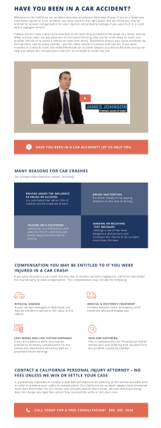
Even when zoomed WAY out to 25%, like this new landing page design for the Johnson Attorneys Group, your eyes should immediately jump to the primary CTA’s:
Key takeaway: Putting it all together, your CTA positioning can’t fail if it’s:
- Placed where people expect to see them, based on how we browse in an F-shape
- Weighted differently than secondary options
- Surrounded by ample whitespace