Over my 15-year career in web development, I’ve collaborated with a range of companies, from large enterprises to small startups, and countless software engineers. Throughout my journey, I’ve observed one recurring and critical issue in projects: failure to write clean and easy-to-understand code.
Surprisingly, even highly skilled developers at leading companies don’t always adhere to best practices and produce code that is easily maintainable and optimizable.
The Consequences of Messy and Dirty Code
To illustrate this point, consider this blog post discussing clean code principles which remains relevant:
Source code is akin to financial debt. Suppose you want to buy a house to live in. Most people don’t have the financial wherewithal to pay cash for a house, so you take out a mortgage instead. But the mortgage itself is not a great thing to have. It’s a liability. You have to pay interest on your debt every month…
So too in web development. The code has ongoing costs. You have to understand it, you have to maintain it, you have to adapt it to new goals over time. The more code you have, the larger those ongoing costs will be. It’s in our best interest to have as little source code as possible while still being able to accomplish our business goals.
Instead of dwelling on abstract concepts, this article will delve into essential clean code principles, explore different code organization techniques, and explain how to improve code maintainability, scalability, and debuggability.
We will start with basic code styling and progress to best practices for building large HTML/CSS applications with reusable components. We will also cover naming conventions for enhanced readability, as well as third-party frameworks and their best practices.
By the end of this article, you will have a solid grasp of quality code fundamentals and how to make your HTML and CSS code easier to maintain and extend.
Code Styling Essentials
Let’s start with the fundamentals of good HTML and CSS code, including W3C validity, naming conventions, file structure, and more.
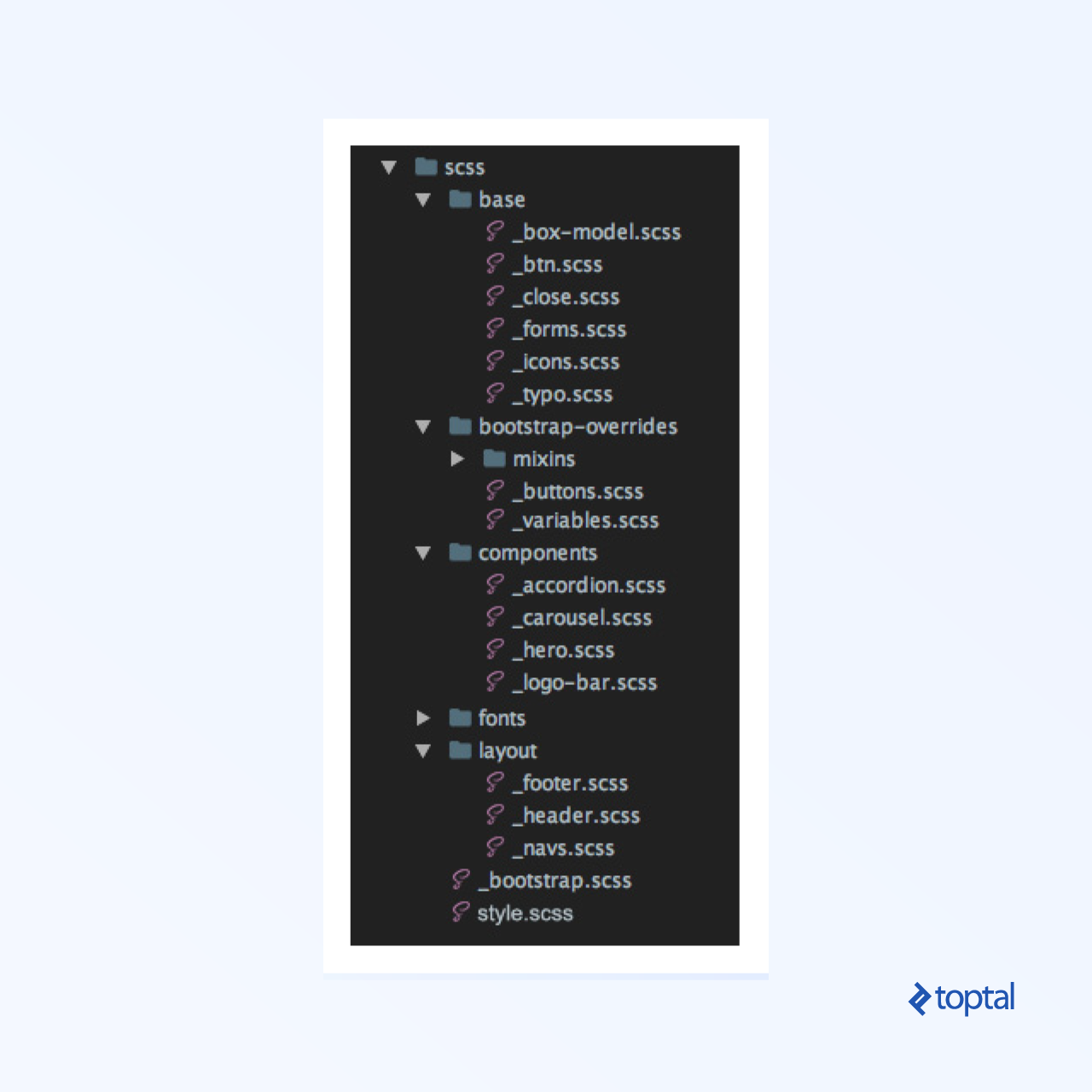
Establish a clear structure from the beginning.
When developing a large application, a well-defined file structure is crucial. A recommended structure is as follows:
Validate your code using validators.
Always strive to use HTML and CSS validators.
Bad code:
 1
 2
 3
 4
 5
 6
 7
 8
 9
10
11
12
13
14
15
16
17
18
19
20
| <figure>
<div>
<img src="demo.jpg" alt="">
<figcaption>
<h2>Hello world</h2>
</figcaption>
</div>
</figure>
<picture>
<source src="demo.webp" type="image/webp">
<img src="demo.jpg" alt="">
</picture>
<details>
<header>
<summary>Expand details</summary>
</header>
<p>All content goes here</p>
</details>
|
1
2
3
| p {
font: 400 inherit/1.125 serif;
}
|
Good code:
 1
 2
 3
 4
 5
 6
 7
 8
 9
10
11
12
13
14
15
16
17
18
19
| <figure>
<img src="demo.jpg" alt="">
<!-- figcaption should be child of element figure element, not div -->
<figcaption>
<h2>Hello world</h2>
</figcaption>
</figure>
<picture>
<!-- source should have srcset attribute -->
<source srcset="demo.webp" type="image/webp">
<img src="demo.jpg" alt="">
</picture>
<details>
<!-- summary is not allowed as child of header -->
<summary>Expand details</summary>
<p>All content goes here</p>
</details>
|
1
2
3
4
5
6
| p {
font-weight: 400;
font-size: inherit;
line-height: 1.125;
font-family: serif;
}
|
Ensure clean code by adding alternative text to <img> tags.
This attribute is essential for SEO, search engines, web crawlers, screen readers, and more.
Bad code:
Good code:
1
| <img src="demo.jpg" alt="This is placeholder of the image">
|
Adopt kebab-case (spinal-case).
When naming elements, opt for kebab-case (spinal-case) instead of camelCase or under_score. Reserve under_score for BEM, although consistency with Bootstrap’s - delimiter is recommended.
Bad code:
1
2
3
| <section class="section_featured_Listing">
<h1 class="largeTitle">H1 title</h1>
</section>
|
Good code:
1
2
3
| <section class="section-featured-listing">
<h1 class="large-title">H1 title</h1>
</section>
|
kebab-case enhances readability compared to camelCase and under_score.
Use descriptive and concise names.
Class names should follow the format .noun-adjective.
Prioritize common class names over content-specific names to improve code readability.
Bad code:
1
2
3
4
5
| <div class="team-wrapper">
<button class="large-button-green"></button>
<p class="greenText-john-smith-description"></p>
<div class="white-bg"></div>
</div>
|
Good code:
1
2
3
4
5
| <div class="section-team">
<button class="btn-lg btn-success"></button>
<p class="text-success"></p>
<div class="bg-white"></div>
</div>
|
Omit type attributes for stylesheets and scripts in HTML5.
These attributes, while required in HTML4/XHTML, are optional in HTML5 according to W3C standards.
Bad code:
1
2
| <link type="text/css" rel="stylesheet" href="../styles.css">
<script type="text/javascript" src="..//main.js"></script>
|
Good code:
1
2
| <link rel="stylesheet" href="styles.css">
<script src="app.js"></script>
|
Use specific classes when needed.
Enhance code rendering speed and simplify future management by using specific CSS selectors. Avoid referencing parent elements unless necessary.
Bad code:
1
2
3
| section aside h1 span {
margin-left: 25%;
}
|
Good code:
1
2
3
| .left-offset {
margin-left: 25%;
}
|
While directly applying a class to the target element might increase HTML code, it improves rendering performance and reduces management complexities.
Add a class to the parent element for alternative styling.
When reusing a block with different styling, minimize HTML modifications by adding a class to the parent element and applying new styles to its children in CSS.
Bad code:
 1
 2
 3
 4
 5
 6
 7
 8
 9
10
11
12
| <article>
<h1>Same section with another styles</h1>
<p>Lorem ipsum dolor sit amet, lorem sit eget proin id ipsum. </p>
…
</article>
<article class=”another-article”>
<h1 class=”other-styling-title”>Same section with another styles</h1>
<p>Lorem ipsum dolor sit amet, lorem sit eget proin id ipsum. </p>
…
</article>
|
 1
 2
 3
 4
 5
 6
 7
 8
 9
10
11
12
13
14
15
| article {
padding: 10px 15px;
h1 {
font-size: 32px;
color: #ff0000;
}
}
.another-article {
padding-bottom: 30px;
border-bottom: 4px solid #ccc;
}
h1.other-styling-title {
font-size: 20px;
}
|
Good code:
 1
 2
 3
 4
 5
 6
 7
 8
 9
10
11
12
| <article>
<h1>Same section with another styles</h1>
<p>Lorem ipsum dolor sit amet, lorem sit eget proin id ipsum. </p>
…
</article>
<article class=”other-styling”>
<h1>Same section with another styles</h1>
<p>Lorem ipsum dolor sit amet, lorem sit eget proin id ipsum. </p>
…
</article>
|
 1
 2
 3
 4
 5
 6
 7
 8
 9
10
11
12
13
14
15
16
| article {
padding: 10px 15px;
h1 {
font-size: 32px;
color: #ff0000;
}
&.other-styling {
padding-bottom: 30px;
border-bottom: 4px solid #ccc;
/* you will have less classes */
h1 {
font-size: 20px;
}
}
}
|
Remove units from zero values.
Specifying the unit for zero values is redundant and provides no benefit. 0px, 0em, 0%, and other zero values are equivalent.
Bad code:
1
2
3
4
5
| div {
margin: 20px 0px;
letter-spacing: 0%;
padding: 0px 5px;
}
|
Good code:
1
2
3
4
5
| div {
margin: 20px 0;
letter-spacing: 0;
padding: 0 5px;
}
|
Utilize the hr tag instead of border-bottom in CSS.
For horizontal rules, use the hr tag instead of creating a new selector and defining border styles in CSS. This promotes a more markup-centric approach.
Bad code:
1
2
| <p class="border-bottom">I want this section to have a border.</p>
<p>Lorem ipsum</p>
|
1
2
3
| .border-bottom {
border-bottom: 1px solid #000;
}
|
Good code:
1
2
3
4
| <p>I want this section to have a border.</p>
<hr>
<p>Lorem ipsum</p>
// If necessary change hr variable in bootstrap
|
Leverage the A > B selector.
The A > B selector, which applies styles only to direct children, is beneficial for situations like nested menus, as it avoids the need to redefine submenu styles.
Bad code:
 1
 2
 3
 4
 5
 6
 7
 8
 9
10
| <ul>
<li>List 1</li>
<li>List 2</li>
<li>List 3
<ul>
<li>Submenu 1</li>
<li>Submenu 2</li>
</ul>
</li>
</ul>
|
1
2
3
4
5
6
7
| ul li {
list-style-type: none;
}
li ul li {
/* redefine to default value */
list-style-type: disc;
}
|
Good code:
 1
 2
 3
 4
 5
 6
 7
 8
 9
10
| <ul>
<li>List 1</li>
<li>List 2</li>
<li>List 3
<ul>
<li>Submenu 1</li>
<li>Submenu 2</li>
</ul>
</li>
</ul>
|
1
2
3
| ul > li {
list-style-type: none;
}
|
Writing Clean HTML
In HTML, the focus is on creating a robust and maintainable front-end.
Prioritize markup-based front-end code.
Favor markup-based front-end code over excessive CSS.
This approach benefits search engine optimization, enhances code readability, and potentially improves search rankings and user experience.
Bad code:
1
2
3
4
5
| <div class="main-content">
<p class="content-title">Main text title</p>
<img src="http://via.placeholder.com/150x150" alt="example">
<p class="image-description">Here is image description</p>
</div>
|
Good code:
1
2
3
4
5
6
7
8
9
| <main>
<h1>Main text title</h1>
<figure>
<img src="http://via.placeholder.com/150x150" alt="example">
<figcaption>
Here is image description
</figcaption>
</figure>
</main>
|
Eliminate unnecessary HTML wrappers.
Minimize the use of redundant wrapper elements like <div> and <span>. Strive for granularity and linearity to reduce code.
Bad code:
1
2
3
4
5
6
7
8
9
| <section class=”container”>
<div class=”row”>
<div class=”col-xs-12”>
<div class=”inner-wrapper”>
<span>Unnecessary br tags</span>
</div>
</div>
</div>
</section>
|
Good code:
1
2
3
| <section class=”container”>
<p>Unnecessary br tags</p>
</section>
|
Embrace atomic classes for styling.
Utilize atomic classes, which are single-purpose styling units similar to inline styles, for styling purposes.
Bad code:
1
2
3
4
5
6
| <h1>Without using atomic class</h1>
<p>Paragraph without atomic class</p>
<section>
<h1> Another h1 text</h1>
<p>Paragraph inside div without class</p>
</section>
|
1
2
3
4
5
6
| h1 {
color: red;
}
section > h1 {
color: blue;
}
|
Good code:
1
2
3
4
5
6
| <h1 class="text-red">Without using atomic class</h1>
<p>Paragraph without atomic class</p>
<section>
<h1 class="text-blue"> Another h1 text</h1>
<p>Paragraph inside div without class</p>
</section>
|
1
2
3
4
5
6
| .text-red {
color: red;
}
.text-blue {
color: blue;
}
|
By using granular atomic classes as needed, you can create a more markup-driven front-end.
Use semantic elements effectively.
Semantic elements enhance code structure and improve the readability of both code and content.
Bad code:
1
2
| <span class="heading"><strong>Welcome</strong></span>
<span>This is unnecessary br tag.</span>
|
Good code:
1
2
| <h1>Welcome</h1>
<p>This is unnecessary br tag.</p>
|
Leverage HTML5 tags to enhance expressive freedom, standardize common elements, and improve automated document processing. For a comprehensive list, refer to the element reference. Many developers overuse <div> and <span> tags. Before doing so, check here for suitable tags:
Bad code:
1
2
3
4
5
6
7
8
| <div class="article-blue">
<div class="article-title-red">HTML 4 title</div>
<div class="content">
Semantics
<span class="boldtext">are</span>
important.
</div>
</div>
|
Good code:
1
2
3
4
5
6
| <article>
<h1>HTML5 title</h1>
<p>
Semantics <strong>are</strong> important.
</p>
</article>
|
In short, embrace and learn new HTML5 elements. The effort is worthwhile!
CSS: Clean Code and Preprocessors
Let’s move on to CSS with some unconventional but valuable advice:
Use a CSS preprocessor.
Sass is a highly regarded, robust, and widely used professional-grade CSS extension language.
Sass offers two syntax options: SCSS (Sassy CSS), an extension of CSS syntax, and the older indented syntax (or “Sass”), which provides a more concise way to write CSS.
Group selectors and utilize @extend in SASS.
Grouping selectors or using @extend in SASS promotes code DRYness (Don’t Repeat Yourself).
Bad code:
 1
 2
 3
 4
 5
 6
 7
 8
 9
10
11
| p {
font-size: 22px;
-webkit-font-smoothing: antialiased;
-moz-osx-font-smoothing: grayscale;
}
h1 {
font-size: 41px;
color: #000;
-webkit-font-smoothing: antialiased;
-moz-osx-font-smoothing: grayscale;
}
|
Good code:
 1
 2
 3
 4
 5
 6
 7
 8
 9
10
11
12
13
| .font-smoothing {
-webkit-font-smoothing: antialiased;
-moz-osx-font-smoothing: grayscale;
}
p {
font-size: 22px;
@extend .font-smoothing;
}
h1 {
font-size: 22px;
@extend .font-smoothing;
}
|
Opt for rem units over pixels in CSS.
Utilize REMs for sizes and spacing, as they are based on the root <html> element’s font-size, making it easier to scale the entire project by adjusting the root font size (e.g., for different media queries or screen sizes).
This approach reduces code for responsive views:
Bad code:
 1
 2
 3
 4
 5
 6
 7
 8
 9
10
11
| p {
font-size: 22px;
padding: 10px;
}
@media (max-width: 767px) {
p {
font-size: 16px;
padding: 5px;
}
}
|
Good code:
 1
 2
 3
 4
 5
 6
 7
 8
 9
10
11
12
13
| html {
font-size: 14px;
}
@media (max-width: 767px) {
html {
font-size: 12px;
}
}
p {
font-size: 1.6rem;
padding: 1rem;
}
|
Avoid fixed height or width in CSS.
Instead of fixed dimensions, generate heights based on inner content and padding, and define widths using a grid system (nested if needed).
Bad code:
1
2
3
4
5
| <footer id="footer" class="text-center">
<h2>Let's Get In Touch!</h2>
<hr>
<p>Ready to start your next project with us?</p>
</footer>
|
1
2
3
| #footer {
height: 130px;
}
|
Good code:
1
2
3
4
5
| <footer id="footer" class="text-center">
<h2>Let's Get In Touch!</h2>
<hr>
<p>Ready to start your next project with us?</p>
</footer>
|
1
2
3
4
| #footer {
padding-top: 23px;
padding-bottom: 47px;
}
|
Reference the parent item only once in SCSS.
When using a CSS preprocessor and styling a section, reference the parent item only once in CSS. Include all child elements and media queries within its brackets to simplify future modifications.
Bad code:
 1
 2
 3
 4
 5
 6
 7
 8
 9
10
11
12
13
14
15
16
17
| .section-parent-class {
position: relative;
h2 {
color: #ff0;
}
header {
margin: 2rem 1rem;
}
}
@media (max-width: 767px) {
.section-parent-class {
footer {
padding: .5rem;
}
}
}
|
Good code:
 1
 2
 3
 4
 5
 6
 7
 8
 9
10
11
12
13
14
15
| .section-parent-class {
position: relative;
h2 {
color: #ff0;
}
header {
margin: 2rem 1rem;
}
footer {
@media (max-width: 767px) {
padding: .5rem;
}
}
}
|
Consider the impact of CSS rules before writing them.
Always analyze the potential effects of CSS rules before implementation. For specific styling needs, tailor your rules to target only the desired elements.
Bad code:
1
2
3
4
| /* Commonly used class */
.title {
color: #008000;
}
|
Good code:
1
2
3
4
| /* Specify it not to affect other titles */
.section-blog .title {
color: #008000;
}
|
Reuse existing CSS rules and variables.
Before creating new CSS rules or variables, thoroughly check for existing ones in both custom CSS and frameworks that meet your requirements. This is especially crucial for large applications.
Bad code:
1
2
3
| .jumbotron {
margin-bottom: 20px;
}
|
Good code:
1
2
3
4
| // change $jumbotron-padding from _variables.scss
.jumbotron {
margin-bottom: $jumbotron-padding;
}
|
Use specific rules.
For backgrounds with a single property, specify that property directly. If multiple background properties exist, use a single declaration.
Bad code:
1
2
3
| .selector {
background: #fff;
}
|
Good code:
1
2
3
4
| .selector {
/* This way background image will not be overwritten if there is any */
background-color: #fff;
}
|
Leverage shorthand properties and values.
Strive to use shorthand properties and values to create concise, readable, and efficient stylesheets.
Bad code:
1
2
3
4
5
6
7
8
9
| img {
margin-top: 5px;
margin-right: 10px;
margin-bottom: 25px;
margin-left: 10px;
}
button {
padding: 0 0 0 20px;
}
|
Good code:
1
2
3
4
5
6
7
8
| img {
/* Shorthand style */
margin: 5px 10px 25px;
}
button {
/* Don’t play with shorthand too much */
padding-left: 20px;
}
|
Use em instead of px for line height.
Employing em and px units provides design flexibility and scalability. This allows for easier adjustments during development, enhanced responsiveness, and user control over site scaling for optimal readability.
Bad code:
1
2
3
4
| p {
font-size: 12px;
line-height: 24px;
}
|
Good code:
1
2
3
4
| p {
font-size: 12px;
line-height: 2em; /* or just line-height: 2; */
}
|
Maximize the use of Bootstrap classes.
While this applies to UI frameworks in general, we’ll use Bootstrap as an example due to its popularity.
Leverage Bootstrap’s pre-built classes to streamline development and promote HTML-based markup.
Bad code:
1
2
3
4
| <section class="without-bootstrap">
<div class="first-column">Lorem ipsum dolor sit amet, ut ius delenit facilisis</div>
<div class="second-column">Lorem ipsum dolor sit amet, ut ius delenit facilisis</div>
</section>
|
1
2
3
4
5
6
7
8
| .first-column,
.second-column {
width: 25%;
float: left;
padding-left: 15px;
padding-right: 15px;
}
...
|
Good code:
1
2
3
4
| <section class="row">
<div class="col-md-6">Lorem ipsum dolor sit amet, ut ius delenit facilisis</div>
<div class="col-md-6">Lorem ipsum dolor sit amet, ut ius delenit facilisis</div>
</section>
|
Customize your framework effectively.
Utilize Bootstrap’s variables.scss file to easily configure and customize your front-end without writing extensive code. Manual customization might negate the benefits of using a framework.
Avoid neglecting variables.scss for potential upgrade ease, as even minor updates require careful changelog review, markup and CSS adjustments, and manual migration.
Bad code:
 1
 2
 3
 4
 5
 6
 7
 8
 9
10
11
| navbar {
padding: 20px 10px;
}
.carousel-indicators {
li {
width: 6px;
height: 6px;
margin-right: 3px;
margin-left: 3px;
}
}
|
Good code:
1
2
3
4
5
6
| $navbar-padding-y: ($spacer / 2) !default;
$navbar-padding-x: $spacer !default;
$carousel-indicator-width: 30px !default;
$carousel-indicator-height: 3px !default;
$carousel-indicator-spacer: 3px !default;
|
Refrain from overwriting .container width.
Instead of modifying .container width directly, utilize the grid system or adjust the container width in _variables.scss. If width reduction is needed, use max-width to preserve responsiveness.
Bad code:
1
2
3
4
5
| .container {
@media (min-width: $screen-lg-min) {
width: 1300px;
}
}
|
Good code:
1
2
3
4
5
6
| // change $container-lg from _variables.scss
.container {
@media (min-width: $screen-lg-min) {
width: $container-lg;
}
}
|
Embrace Bootstrap 4 classes and minimize CSS.
Start using Bootstrap 4, despite its beta status, as it offers new classes, including Flexbox and spacers, for faster layout creation.
Bad code:
 1
 2
 3
 4
 5
 6
 7
 8
 9
10
| <div class="flex-ex">
<div>Flex item 1</div>
<div>Flex item 2</div>
<div>Flex item 3</div>
</div>
<div class="flex-ex flex-reverse">
<div>Flex item 1</div>
<div>Flex item 2</div>
<div>Flex item 3</div>
</div>
|
 1
 2
 3
 4
 5
 6
 7
 8
 9
10
11
12
13
| .flex-ex {
display: flex;
> div {
padding: 2px;
}
&.flex-reverse {
flex-direction: row-reverse;
}
li {
list-style: none;
padding: .5rem;
}
}
|
Good code:
 1
 2
 3
 4
 5
 6
 7
 8
 9
10
| <ul class="list-unstyled list-inline d-flex flex-row">
<li class="p-2">Flex item 1</li>
<li class="p-2">Flex item 2</li>
<li class="p-2">Flex item 3</li>
</ul>
<ul class="list-unstyled list-inline d-flex flex-row-reverse">
<li class="p-2">Flex item 1</li>
<li class="p-2">Flex item 2</li>
<li class="p-2">Flex item 3</li>
</ul>
|
Assign classes to elements for border removal or modification.
Bad code:
1
2
3
4
5
6
7
| <div class="border-example2 py-5">
<span class="border0"></span>
<span class="border-top0"></span>
<span class="border-right0"></span>
<span class="border-bottom0"></span>
<span class="border-left0"></span>
</div>
|
 1
 2
 3
 4
 5
 6
 7
 8
 9
10
11
12
13
14
15
16
17
18
19
20
21
22
23
24
25
| border-example2 {
> span {
width: 100px;
height: 100px;
display: inline-block;
margin: .50rem;
background-color: #e1e1e1;
border: 1px solid;
&.border0 {
border: none;
}
&.border-top0 {
border-top: none;
}
&.border-right0 {
border-right: none;
}
&.border-bottom0 {
border-bottom: none;
}
&.border-left0 {
border-left: none;
}
}
}
|
Good code:
1
2
3
4
5
6
7
| <div class="border-example py-5">
<span class="d-inline-block m-2 border-0"></span>
<span class="d-inline-block m-2 border-top-0"></span>
<span class="d-inline-block m-2 border-right-0"></span>
<span class="d-inline-block m-2 border-bottom-0"></span>
<span class="d-inline-block m-2 border-left-0"></span>
</div>
|
1
2
3
4
5
6
7
8
| .border-example {
> span {
width: 100px;
height: 100px;
background-color: #e1e1e1;
border: 1px solid;
}
}
|
Use .col-sm-X when .col-md-X and .col-lg-X have the same value for X.
Avoid redundant column declarations. For instance, .col-md-10 implicitly includes .col-lg-10.
Bad code:
1
2
3
4
| <ul class="press-list list-inline row">
<li class="col-lg-4 col-md-4 col-sm-4 col-xs-6"><a href="#"><img class="img-fluid" src="assets/images/press/press-1.png" alt=""></a></li>
<li class="col-lg-4 col-md-4 col-sm-4 col-xs-6"><a href="#"><img class="img-fluid" src="assets/images/press/press-2.png" alt=""></a></li>
</ul>
|
Good code:
1
2
3
4
| <ul class="press-list list-inline row">
<li class="col-md-4 col-xs-6"><a href="#"><img class="img-fluid" src="assets/images/press/press-1.png" alt=""></a></li>
<li class="col-md-4 col-xs-6"><a href="#"><img class="img-fluid" src="assets/images/press/press-2.png" alt=""></a></li>
</ul>
|
Avoid using .col-xs-12.
The .col-xs-12 class is applied by default when no other .col-xs-X class is assigned, making it redundant.
Bad code:
 1
 2
 3
 4
 5
 6
 7
 8
 9
10
11
12
13
14
15
16
| <section id="services">
<div class="container">
<div class="row">
<div class="col-lg-12 text-center">
<h2>Services</h2>
<h3 class="text-muted">Lorem ipsum dolor sit amet consectetur.</h3>
</div>
</div>
<div class="row text-center">
<div class="col-md-6 col-xs-12">
<h4>E-Commerce</h4>
<p class="text-muted">Lorem ipsum dolor sit amet, consectetur adipisicing.</p>
</div>
</div>
</div>
</section>
|
Good code:
 1
 2
 3
 4
 5
 6
 7
 8
 9
10
11
12
| <section id="section-services" class="text-center">
<div class="container">
<h2>Services</h2>
<h3 class="text-muted">Lorem ipsum dolor sit amet consectetur.</h3>
<div class="row">
<div class="col-md-6">
<h4>E-Commerce</h4>
<p class="text-muted">Lorem ipsum dolor sit amet, consectetur adipisicing.</p>
</div>
</div>
</div>
</section>
|
Choose normalize.css over reset.css.
If you are already using Bootstrap, normalize.css is included, so there is no need to include it again.
Adhere to guidelines for consistency.
Maintaining consistency is crucial, even if specific rules are not strict best practices. Consistently follow established guidelines for naming, code style, and file structure.
Wrapping Up
I hope you found this article insightful and that it encourages you to write minimal HTML and CSS code using best practices.
Maintaining large applications with messy code is challenging, especially for large companies that can afford high-quality code. By following clean coding principles, you increase your chances of securing a good job. Additionally, freelancers juggling multiple projects and clients must deliver clean code that can be easily handed off to other developers.
In future posts, I aim to delve into more advanced topics such as automating the coding process with Gulp/Grunt tasks, using Linters, exploring Editor plugins and code-generating tools, discussing AI-powered code writing tools, and covering other related subjects.
I trust this has been an informative and engaging read. Best of luck in your coding endeavors.