Angular, a Google-developed framework, is a complete rewrite of AngularJS. This updated framework boasts various enhancements, including improved builds and faster compilation times. This Angular 5 tutorial guides you through constructing a note-taking application from scratch, making it ideal for those eager to learn Angular 5.

The complete source code for the app is accessible here.
AngularJS (version 1) and Angular (version 2+) are the two primary versions of this framework. The significant differences between these versions, particularly Angular’s transition from a JavaScript framework, justify the name change.
Should I Use Angular?
The answer depends on your needs. Some developers advocate for using React and creating custom components with minimal extra code. However, this approach has its own challenges. Angular provides a fully integrated framework that streamlines project initiation. It eliminates concerns about library selection and simplifies common development hurdles. Angular can be considered the front-end counterpart to Ruby on Rails for back-end development.
TypeScript
Don’t be intimidated if you’re unfamiliar with TypeScript. Your JavaScript knowledge is sufficient for a quick transition to TypeScript, especially with assistance from modern editors. Currently, VSCode and JetBrains IntelliJ editors (like Webstorm or, in my preference, RubyMine) are favored choices. Opting for a more intelligent editor over vim proves beneficial by highlighting code errors as TypeScript is strongly typed. Notably, Angular CLI, powered by Webpack, handles the TypeScript to JavaScript compilation, so manual compilation within the IDE is unnecessary.
Angular CLI
Angular now includes a dedicated CLI, allowing it to manage most routine tasks automatically. Installing Angular, which necessitates Node 6.9.0 or later and NPM 3 or higher, is the first step. For the most current installation instructions for your system, consult the relevant documentation. Once these prerequisites are in place, execute the following command to install Angular CLI:
| |
Upon successful installation, use the ng new command to generate a new project:
| |
Navigate to the newly created project directory and run ng serve to launch the application:
| |
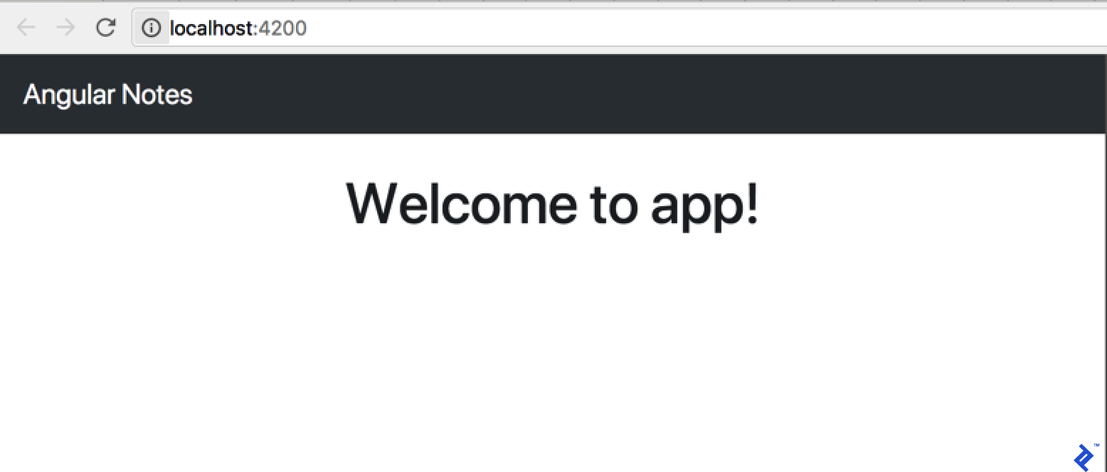
Accessing the provided link in your browser displays the following:

What’s happening behind the scenes? Angular CLI utilizes webpack dev server to render the app on an available port (enabling multiple applications to run concurrently) with live reload functionality. It monitors project source files, recompiling changes and prompting browser refreshes. Angular CLI provides a development-ready environment without manual configuration. But this is merely the beginning.
Components
With a basic app up and running, let’s delve into Angular’s application structure. Those familiar with AngularJS development will recall controllers, directives, and simplified directive-like components intended to ease the transition to Angular 2. For those without this experience, rest assured – components are now the primary focus. They serve as the fundamental building blocks within Angular. Examining the code generated by Angular CLI provides insights.
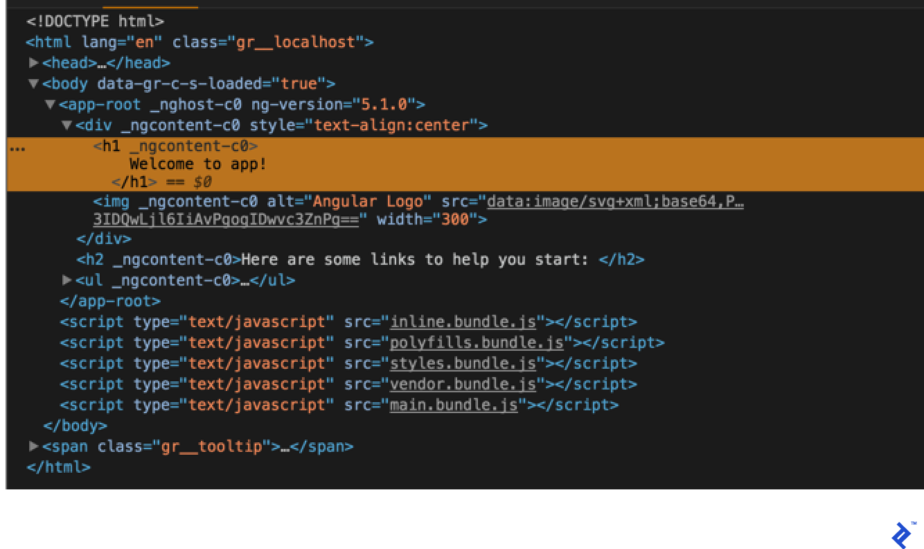
Starting with index.html:
| |
The markup appears familiar, except for the app-root tag. How does Angular interpret and utilize this tag?
Exploring the src/app directory reveals its contents. Refer to the previous ng new output or open the project in your IDE. Inside, you’ll find app.component.ts with the following (note that this may differ slightly depending on your Angular version):
| |
While @Component(...) resembles a function call, it’s actually a TypeScript decorator. More on that later. For now, focus on understanding its purpose. Parameters like selector contribute to generating component declarations. Essentially, it streamlines boilerplate code generation, providing a functional component declaration without requiring additional code for decorator parameter support. These are commonly referred to as factory methods.
Recall the app-root tag from index.html. The selector parameter is how Angular maps the tag to its corresponding component. Similarly, templateUrl and styleUrls specify the locations of the component’s markup and CSS, respectively. The component decorator offers numerous parameters, some of which we’ll utilize in our application. Refer to here for a comprehensive reference.
Examining the component’s markup:
| |
Apart from the embedded Angular logo as an SVG, the markup remains familiar, except for Welcome to {{ title }}!. Referring back to the component code reveals title = 'app';. This is Angular Interpolation, where expressions within double curly braces are dynamically populated from the component (consider {{ title }} as shorthand for {{ this.title }}).
We’ve now covered the auto-generated elements within our Angular app responsible for rendering the browser content. Let’s recap the process: Angular CLI employs JavaScript bundles through Webpack, compiling the Angular app and injecting it into index.html. Inspecting the browser’s source code reveals something similar to this:
Code modifications trigger recompilation by Angular CLI, which re-injects updated code and refreshes the browser. This efficient process ensures a smooth development experience. Let’s shift focus and transition our project from CSS to Sass. Open .angular-cli.json and modify the styles and styleExt properties as follows:
| |
Next, integrate the Sass library and rename styles.css to styles.scss. Use yarn to add Sass:
| |
Incorporate Twitter Bootstrap by running yarn add bootstrap@v4.0.0-beta.2 and include the following in styles.scss:
| |
Ensure page responsiveness by updating the viewport meta tag in index.html:
| |
Finally, replace the contents of app.component.html with:
| |
The browser now displays the following:
With the boilerplate set up, let’s proceed to creating custom components.
Our first component
Since notes will be displayed as cards, begin by generating a component to represent a single card. Utilize Angular CLI by executing:
| |
Inspecting src/app/card/card.component.ts reveals code similar to AppComponent with a minor difference:
| |
It’s considered good practice to prefix component selectors for consistency, typically with app-. Customize this prefix in .angular-cli.json before using ng generate for the first time.
Observe the component’s constructor and the ngOnInit function. While a detailed explanation can be found in Angular’s documentation, understanding their basic roles is key. The constructor is invoked immediately upon component creation, potentially before data is ready. Conversely, ngOnInit executes after the initial data change cycle, providing access to component inputs. We’ll explore inputs and component communication shortly. For now, remember: use the constructor for constants (hard-coded values) and ngOnInit for data-dependent operations.
Populate the CardComponent implementation, starting with its markup. The default content is:
| |
Replace it with code resembling a card:
| |
While displaying the card component is tempting, it raises questions about responsibility. Should AppComponent handle card display? Since AppComponent loads first, maintaining its simplicity is crucial. Creating a separate component to manage and display a list of cards is a better approach.
This new component’s role clearly defines it as a CardListComponent. Use Angular CLI to generate it:
| |
Before proceeding, address the overlooked aspect after generating the first component. Angular CLI modified app.module.ts. Let’s examine its contents:
| |
BrowserModule and NgModule are internal Angular modules (refer to the documentation for details). While AppComponent predates our custom code, the newly generated components are integrated into the module in two ways. First, they are imported from their respective definition files. Second, they are included in the declarations array within the NgModule decorator. Forgetting to add a new component to the NgModule while attempting to use it in your markup will result in an error:
| |
Always consult the console when troubleshooting unexpected application behavior.
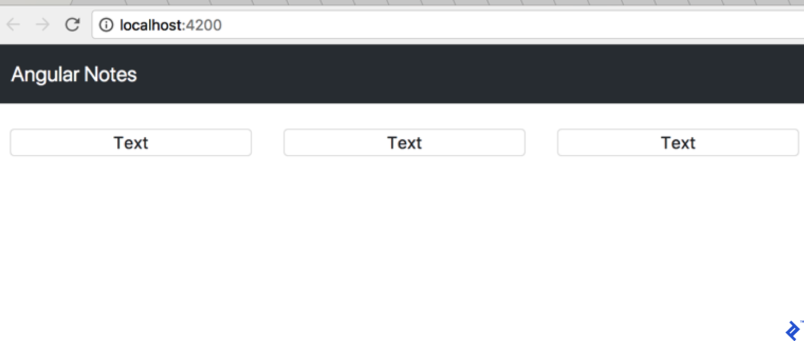
Populate the card list component’s markup (src/app/card-list/card-list.component.html):
| |
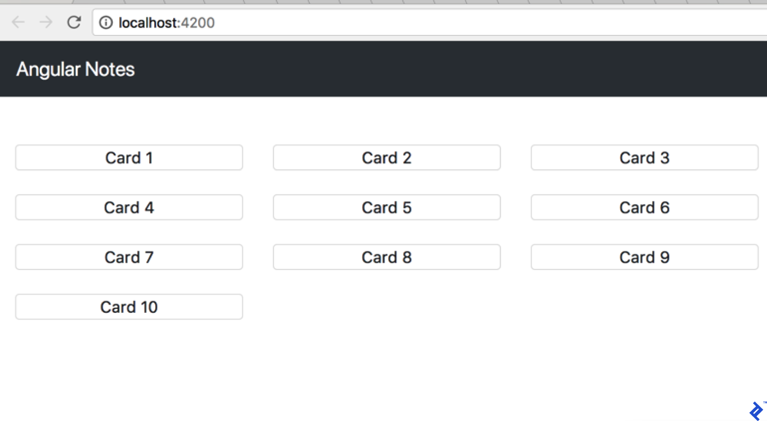
Opening the application in a browser will display:
Currently, cards are displayed from hard-coded markup. Let’s move this hard-coded card array into the application logic:
| |
With the initial list in place, pass it to the CardListComponent for rendering. This requires creating the first input. Add the following to the CardListComponent:
| |
The code imports Input from Angular and uses it as a decorator for the cards class-level variable, defined as an array of objects of any type. Ideally, strict typing with an interface like card is preferable. However, for this initial implementation, any suffices.
The card array is now available in CardListComponent. Modify the component’s template to utilize it:
| |
The asterisk preceding the attribute name signifies an Angular structural directives. Structural directives govern the structure of the template. While the asterisk serves as “syntax sugar,” a deeper understanding of its mechanics can be gained by you can read further. For this example, understanding its effect is sufficient. ngFor, a repeater directive, will iterate over the cards array, rendering an app-card for each element. The browser now displays:

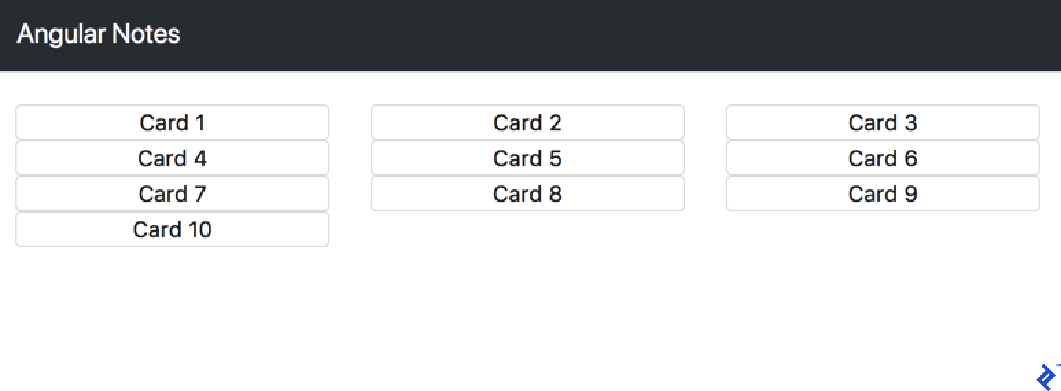
Despite the card array, the page remains empty. The array was defined in AppComponent but hasn’t been passed to the CardListComponent’s input. Update the AppComponent template:
| |
The square brackets around the attribute indicate one-way bind. This binds the cards variable from AppComponent to the [cards] input of the CardListComponent. The result is:

Displaying the actual card content necessitates passing the card object to the CardComponent. Extend the CardListComponent:
| |
This change triggers a console error: Can't bind to 'card' since it isn't a known property of 'app-card'. Angular reminds us to define the input within the CardComponent. Make the following adjustments:
| |
Display the card text by updating the CardComponent template:
| |
The result:
The styling needs improvement. Add a new style to card.component.css:
| |
This enhancement results in:
Component communication
Introduce a NewCardInputComponent to handle note creation:
| |
Add the following to its template:
| |
Update the component decorator:
| |
Include the new component in the AppComponent template:
| |
The browser now shows:

The new component remains inactive. Let’s change that. Begin by introducing a variable to store the new card data:
| |
How do we populate this variable from user input? AngularJS developers might recall the concept of two-way data binding.
Interestingly, two-way data binding is absent in Angular. However, we haven’t lost access to its functionality. We’ve used [value]="expression" to bind expressions to an input’s value property. Similarly, (input)="expression" provides a declarative approach to binding expressions to input events. Combining them:
| |
Now, newCard.text updates whenever its value changes, passing the updated value to the component input. Conversely, user input triggers the browser’s input event, assigning the input value to newCard.text.
Angular offers syntax sugar to simplify this:
| |
This ([]) syntax, known as banana in a box or ngModel, is an Angular directive that handles event value extraction and binding. This simplifies the code, binding the value to both the input element and the component variable.
However, using ngModel introduces an error: Can't bind to 'ngModel' since it isn't a known property of 'input'. We need to import ngModel into AppModule. Referencing the documentation reveals that it resides within the Angular Forms module. Update AppModule:
| |
Working with native events
With the variable populated, we need to send its value to the card list in AppComponent. For component communication in Angular, inputs are essential. To send data outside a component, we use outputs. Similar to inputs, outputs are imported from Angular and defined using decorators:
| |
Note the use of EventEmitter. Component outputs function as events, but not in the traditional JavaScript event sense. These events are bubbles and eliminate the need for constant preventDefault calls in event listeners. To send data from the component, utilize its payload. Subscribing to these events is the next step. Update the AppComponent template:
| |
Similar to the NewCardInput component, an expression is bound to the onCardAdd event. Now, implement the addCard method in AppComponent:
| |
The data still isn’t being outputted. Let’s trigger this when the user presses the enter key. Listen for the DOM keypress event in the component and output the corresponding Angular event. Angular provides the HostListener decorator for this purpose. This function decorator accepts the name of the native event and the function Angular should execute in response. Implement and analyze its behavior:
| |
Upon detecting the document:keypress event, the code verifies that the enter key was pressed and newCard.text contains data. If both conditions are met, the addCard method is called, emitting the onCardAdd Angular event with the card text and resetting the card text to an empty string. This enables continuous card creation without requiring manual text clearing.
Working with Forms
Angular offers two approaches to handling forms: template-driven and reactive. We’ve already utilized ngModel for two-way binding, a key aspect of template-driven forms. However, Angular forms encompass more than just model values; validity is crucial. Currently, we’re manually validating NewCardInput within the HostListener function. Let’s enhance this using a more structured template-driven approach. Update the component’s template:
| |
The hash symbol (#form) introduces a template reference variable, providing code access to the form. Utilize this to leverage the required attribute for validation instead of manual checks:
| |
Another new decorator comes into play: ViewChild. It grants access to elements marked with template reference variables. In this case, it’s our form, declared as a public component variable named form, enabling us to use this.form.valid.
Working with template-driven forms mirrors traditional HTML form handling. For more complex scenarios, Angular offers reactive forms. Let’s explore them after converting our existing form. First, import the necessary module into AppModule:
| |
Unlike template-driven forms, reactive forms are defined within the code. Modify the NewCardInput component:
| |
Beyond importing new modules, there are a few key changes. The constructor utilizes dependency injection to inject FormBuilder. The form is then built using this injected service. The text argument represents the field name, an empty string sets its initial value, and Validators.compose enables combining multiple validators for a single field. Access the field’s value using .value and set it using .setValue('').
Now, let’s adjust the markup:
| |
FormGroupDirective informs Angular which form group to associate with the form. formControlName specifies the corresponding field from the reactive form.
Currently, the main difference between the template-driven and reactive approaches lies in the increased code required for the latter. This raises the question: is it worthwhile if dynamic form definition isn’t necessary?
The answer is a resounding yes. To understand why, let’s delve into the “reactive” nature of this approach.
Add the following code to the NewCardInput component constructor:
| |
Open the browser’s developer tools console and observe the output as you input data into the form:
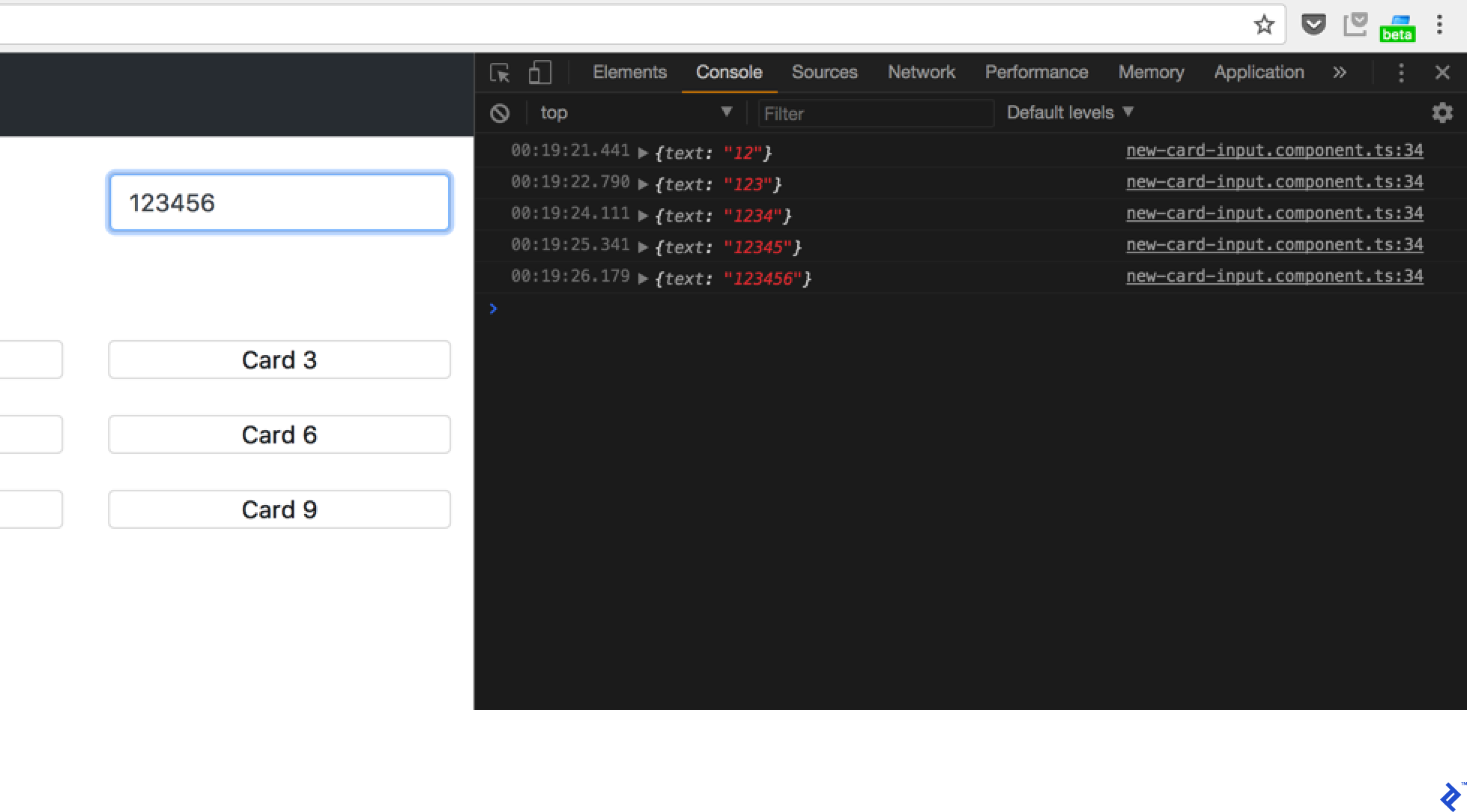
RxJS
This demonstrates RxJS in action. Let’s break it down. You’re likely familiar with promises and asynchronous code. Promises handle single events, like a POST request returning a promise upon completion. RxJS, however, works with Observables, which manage event streams. Consider this analogy: the implemented code executes whenever the form changes. Processing these changes with promises would only handle the first change before requiring re-subscription. Observables, on the other hand, handle each event in a continuous stream of “promises.” This stream can be interrupted by errors or explicit unsubscription.
What is the purpose of takeWhile? Observables are subscribed to within components and used throughout the application. Consequently, they might be destroyed during the application’s lifecycle, such as when components represent pages in a routing setup (more on routing later). Promises execute once and are disposed of. In contrast, Observables persist as long as the stream is active and unsubscribed. Therefore, to prevent memory leaks, subscriptions should be explicitly unsubscribed:
| |
Managing numerous subscriptions with this boilerplate code can become cumbersome. Thankfully, the takeWhile operator offers a solution. It ensures that the stream halts emission when this.alive becomes false. Simply set this value within the component’s onDestroy function.
Working with back-ends
Since we’re not building the server-side here, we’ll use Firebase for our API. If you have your own API back-end, let’s configure our back-end in development server. Create proxy.conf.json in the project root and add:
| |
This configuration instructs the development server to proxy any requests targeting the /api route on the application’s host (the Webpack dev server) to http://localhost:3000/api. To enable this, modify the start command in package.json:
| |
Now, running the project with yarn start or npm start incorporates the proxy configuration. Let’s explore API interaction within Angular. Angular provides HttpClient. Define a CardService for our application:
| |
The Injectable decorator signifies that this service can be injected into other components through Dependency Injection. To access this service, add it to the provider list in AppModule:
| |
Now, inject it into AppComponent, for example:
| |
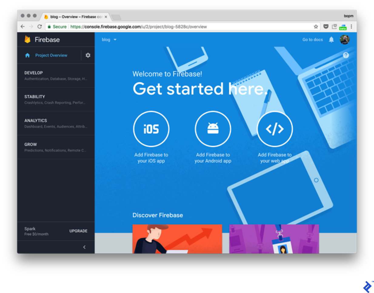
Next, configure Firebase by creating a demo Firebase project and clicking “Add Firebase to your app.” Copy the provided credentials into the application’s environment files (src/environments/):
| |
Update both environment.ts and environment.prod.ts. Environment files are integrated during compilation. The .prod. portion is determined by the --environment flag used with ng serve or ng build. Utilize values from these files throughout your project, referencing them from environment.ts. Angular CLI will automatically provide the correct content based on the environment.
Add the Firebase support libraries:
| |
Modify the CardService to integrate with Firebase:
| |
The import for the card model introduces an interesting detail. Let’s examine its structure:
| |
Data is structured using classes. Alongside the text property, we include key$ from Firebase. Update AppComponent to utilize this service:
| |
The $ suffix in cards$ denotes an observable variable. Incorporate cards$ into the AppComponent template:
| |
This results in a console error:
| |
Why does this occur? Firebase returns observables, but *ngFor in CardListComponent expects an array of objects. While subscribing to the observable and assigning its value to a static array is possible, a more elegant solution exists:
| |
The async pipe, another example of Angular’s syntax sugar, simplifies the process. It subscribes to the observable and returns its current value, eliminating manual subscription management.
Reactive Angular – Ngrx
Let’s delve into application state, referring to the properties that define its current behavior and status. In Ngrx, State is a single, immutable data structure entity. Ngrx is an “RxJS powered state management library for Angular applications, inspired by Redux.”
Ngrx draws inspiration from Redux. “Redux is a pattern for managing application state.” It’s a set of conventions that guide how applications determine when to display UI elements (like a collapsible sidebar) and where to persist session state received from the server.
Let’s break down its implementation. State is immutable, meaning its properties cannot be modified after creation. This seemingly prevents storing application state directly within State. However, every state is immutable, but the Store, providing access to State, is an Observable of states. Therefore, State represents a single value within a stream of Store values. Modifying the application state requires Actions. These actions transform the current State into a new one. Both states remain immutable, but the new state is derived from the previous one. Instead of mutating State directly, a new State object is created. Reducers facilitate this as pure functions. This means that given the same State, Action, and payload, a reducer will consistently return the same new state.
Actions consist of an action type and optional payload:
| |
Consider an action for adding a new card:
| |
A corresponding reducer might look like this:
| |
This function is invoked whenever a new Action event occurs. We’ll cover action dispatching later. For now, assume that dispatching the ADD_CARD action triggers this case statement. Let’s analyze its behavior. A new State is returned based on the previous State using TypeScript spread syntax. This eliminates the need for constructs like Object.assign in most cases. Modifying state outside these case statements should be avoided to maintain predictability and simplify debugging.
Integrate Ngrx into the application using the following command:
| |
Create the Action definition (app/actions/cards.ts):
| |
Define the Reducer (app/reducers/cards.ts):
| |
This example demonstrates how spreads and native TypeScript functions like map can be used for array manipulation.
To handle scenarios where application state encompasses multiple data types, compose it from isolated states using module resolution (app/reducers/index.ts):
| |
This code includes a logger for Ngrx in development and creates a selector function for the card array. Incorporate it into AppComponent:
| |
This illustrates how actions are dispatched using the store. However, the code is still unusable because reducers haven’t been integrated into the application. Modify AppModule:
| |
The application now functions, albeit with a caveat. The Firebase integration is no longer functional due to the introduction of the Ngrx store. Data persistence is absent. While solutions like ngrx-store-localstorage allow storing data in the browser’s localStorage, API interaction requires a different approach. Incorporating the previous API integration directly into the reducer is not possible due to its requirement as a pure function. The definition of a pure function provides a clue: “evaluation of the result does not cause any semantically observable side effect or output, such as mutation of mutable objects or output to I/O devices”… So, what’s the solution? Side-effects of Ngrx
Ngrx effects
Side effects are code segments that intercept Actions, similar to reducers. However, instead of modifying the state, they handle tasks like sending API requests and dispatching new Actions based on the results. Let’s implement Firebase support using effects. First, install the effects module:
| |
Add new actions to handle loading operations in Card Actions (src/app/actions/cards.ts):
| |
Three new actions are introduced: one for initiating card list loading, and two for handling successful and unsuccessful responses. Implement the effects (src/app/effects/cards.ts):
| |
This code defines an injectable CardsEffects service. The @Effect decorator defines effects based on Actions. The ofType operator filters the relevant actions. While ofType can be used to trigger an effect based on multiple action types, only two are necessary for this example. For the Load action, each action is transformed into a new observable based on the result of the getCardList method call. Success maps the observable to a new LoadSuccess action carrying the request results as its payload. Errors result in a single ServerFailure action (note the use of the of operator, converting a value or array into an observable).
Effects dispatch new Actions after interacting with external systems (Firebase in this case). However, the code includes another effect handling the ServerFailure action with dispatch: false in its decorator. What does this signify? This effect maps the ServerFailure action to its payload and logs the server error to the console. Since this operation doesn’t modify state, dispatching actions is unnecessary. This demonstrates how to implement effects without requiring empty actions.
With two out of three actions covered, let’s address LoadSuccess. The application retrieves a list of cards from the server, which needs to be merged into the State. Update the reducer (src/app/reducers/cards.ts):
| |
This code utilizes the spread operator to merge the existing card array with the payload (cards from the server). Now, add the new Load action to AppComponent:
| |
This should load cards from Firebase. Let’s check the browser:
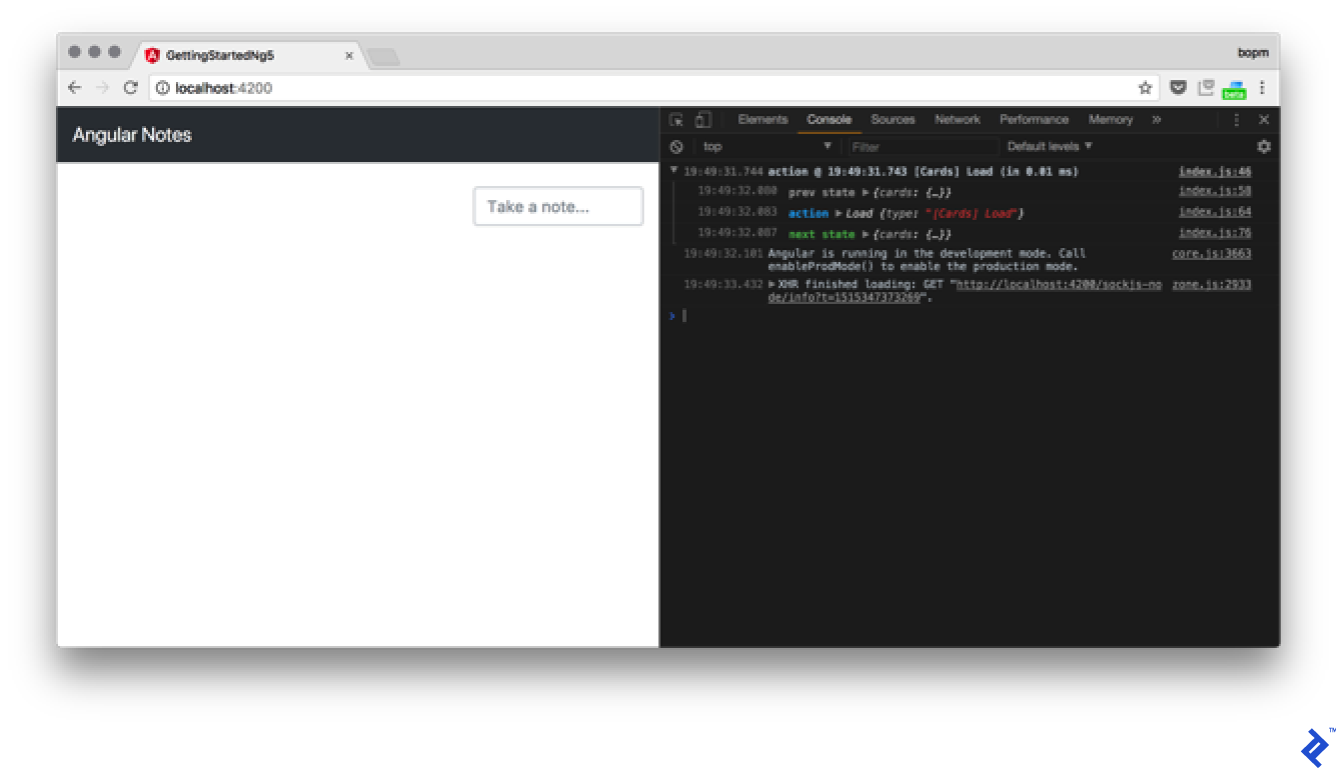
Something’s amiss. The action is being dispatched, as evident from the logs, but there’s no server request. What’s wrong? We forgot to integrate the effects into AppModule. Make the following change:
| |
Back to the browser…

It’s working! That’s how you integrate effects for loading data from the server. Next, implement card creation and data persistence. Modify the createCard method in CardService:
| |
Add an effect for handling card additions:
| |
When creating a card, the code retrieves the $key from Firebase and merges it into the card array. The case cards.ADD: branch in the reducer should be removed. Let’s test its functionality:
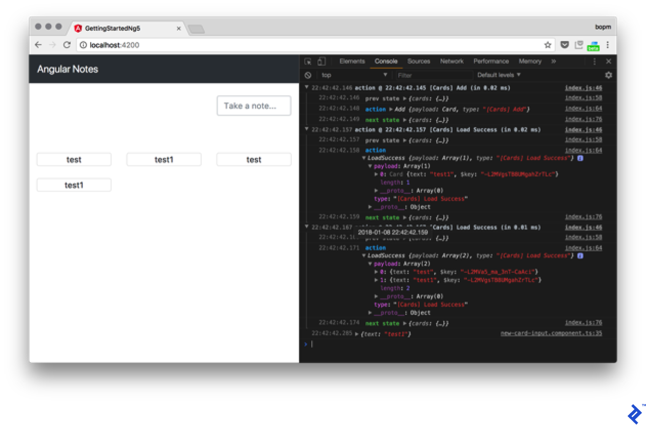
Unexpectedly, duplicate data appears after adding a card. Let’s investigate. Examining the console reveals two LoadSuccess actions. The first dispatches the new card correctly, while the second includes both cards. If not the effects, where is this second action originating from?
The card loading effect contains the following code:
| |
getCardsList returns an observable. Adding a new card to the collection triggers an emission. Therefore, either the manual card addition is unnecessary, or a take(1) operator should be used to limit the subscription to a single value. However, maintaining a live subscription is preferable (assuming multiple users), so let’s modify the code to handle subscriptions effectively.
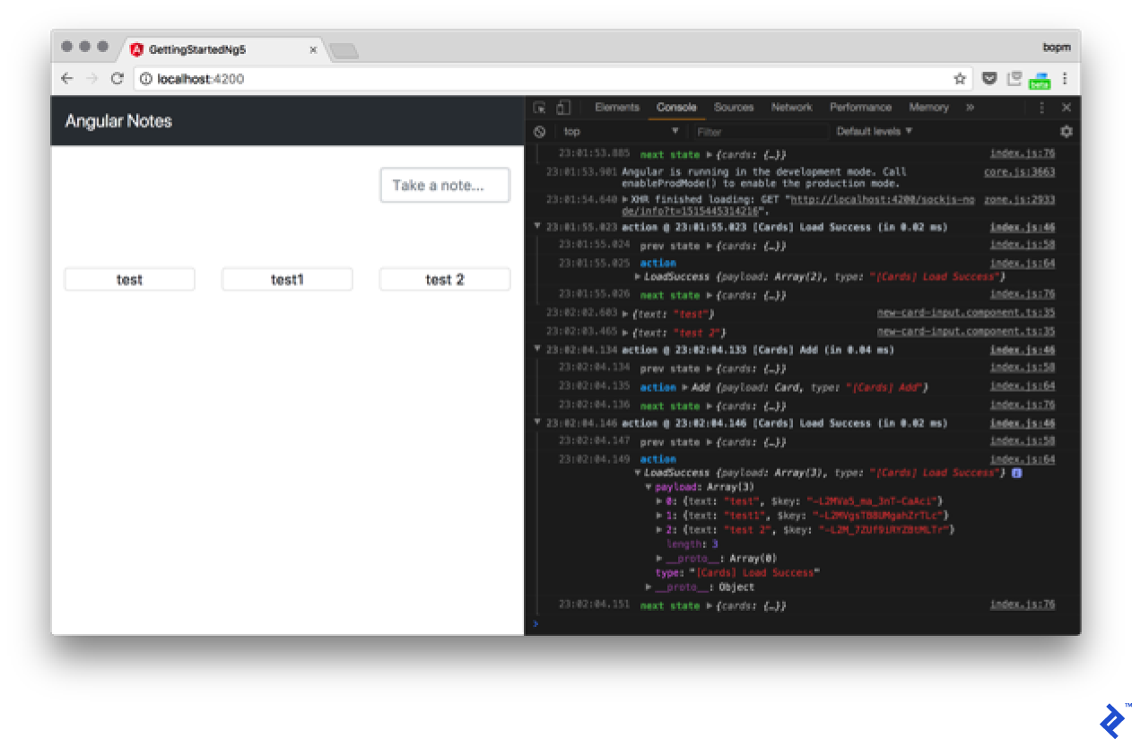
Add a non-dispatching effect:
| |
Finally, update the reducer’s LoadSuccess case to replace cards instead of combining them:
| |
The application now functions correctly:

Implementing a remove action follows a similar pattern. Since data is retrieved from the subscription, only the Remove effect needs to be implemented. Consider that a challenge for you to tackle.
Routing and modules
Let’s discuss application composition. How do you add an About page? In Angular, pages are typically components. Generate the component:
| |
Add the following markup:
| |
With the About page component ready, how do we make it accessible? Modify AppModule:
| |
For now, generate MainComponent using the same method as AboutComponent; we’ll populate it later. The route structure is self-explanatory. Two routes are defined: /cards and /about. Additionally, an empty path redirects to /cards.
Move the card handling code from AppComponent to MainComponent:
| |
Remove it from AppComponent:
| |
Also, remove it from the markup:
| |
Several changes are introduced. First, router directives are added: RouterLinkActive applies a class to active routes, and routerLink dynamically manages href attributes. routerOutlet instructs the Router where to display content on the current page. These directives collectively create a menu present on all pages, along with two distinct content pages:
To delve deeper, refer to the Router Guide.
As our application expands, we might consider optimization. For instance, we could load the About component by default and only load other components when a user requests them by clicking the Cards link. Lazy loading of modules makes this possible. Let’s begin by creating CardsModule:
| |
The flat flag instructs Angular to avoid generating a separate directory for our module. Let’s move all card-related elements into this new module:
| |
While we previously used forRoot calls in our imports, we now use forFeature or forChild. This signifies that we’re extending our configuration rather than starting from scratch.
Let’s examine what remains in our AppModule:
| |
We still define EffectsModule.forRoot here because its absence would prevent it from functioning in our lazy-loaded module (due to the lack of a target for lazy loading). Additionally, we encounter new syntax for the router’s loadChildren. This tells our router to lazy load CardsModule, situated in the ./cards.module file, when the cards route is requested. Furthermore, we include meta reducers from the updated ./reducers/root.ts file. Let’s take a closer look:
| |
Presently, we have no state at the root level. However, defining an empty state is necessary for future extension during lazy loading. Consequently, our cards state needs definition elsewhere. In this instance, it resides in src/app/reducers/index.ts:
| |
Here, we extend our root state with a cards key. This results in key nesting duplication, as both a module and an array are named cards.
If we launch our app now and inspect the developer console’s network tab, we’ll observe that cards.module.chunk.js only loads after clicking the /cards link.
Production Preparation
Let’s prepare our app for production by building it. We can achieve this by executing the build command:
| |
What’s happening here? We’re transforming our application into static assets suitable for deployment on any web server (the --base-href option allows deployment in the ng build subdirectory). The -prod flag signals a production build to AngularCLI. Meanwhile, --aot requests ahead-of-time compilation, which is generally preferable for its smaller bundle size and faster code execution. However, AoT’s strictness on code quality might expose previously unnoticed errors, making early builds crucial for easier debugging.
I18n
Another reason for building our app lies in how Angular handles i18n, or internationalization. Angular addresses this during compilation instead of runtime. Let’s configure it for our app by adding the i18n attribute to our AboutComponent.
| |
This attribute instructs the Angular compiler to translate the tag’s contents. As a compiler directive, it’s removed during compilation and replaced with the appropriate translation for the target language. Now that we’ve marked our first translated message, let’s proceed with the actual translation process. Angular provides the ng xi18n command for this purpose:
| |
This generates a translation file mapping our messages to their source code locations. We can then provide this file to a Phrase or manually add our translations. Let’s create a new file named messages.ru.xlf within the src directory:
| |
We can now serve our app in Russian, for example, using the command ng serve --aot --locale=ru --i18n-file=src/messages.ru.xlf. Let’s test its functionality:

Next, let’s automate our build script to produce builds in two languages (English and Russian) during each production build, placing them in their respective en and ru directories. We can add the build-i18n command to the scripts section of our package.json file:
| |
Docker
Let’s package our app for production using Docker. We’ll start with a Dockerfile:
| |
Here, we utilize a multistage build with a Node-based image to build the server package, followed by an Nginx-based image. Since Angular CLI no longer does it for us, we employ Gulp to compress our artifacts. While peculiar, let’s add Gulp and the necessary compression scripts.
| |
Now, let’s create a gulpfile.js in our app’s root directory:
| |
Finally, we need an Nginx configuration for our container. Let’s add it to nginx/default.conf:
| |
This configuration serves our built application from either the en or ru directory, redirecting from the root URL to /en/ by default.
We can build our app using the command docker build -t app .:
| |
Once built, we can serve it locally using Docker with the command docker run -it -p 80:80 app. Upon successful execution, we should see:
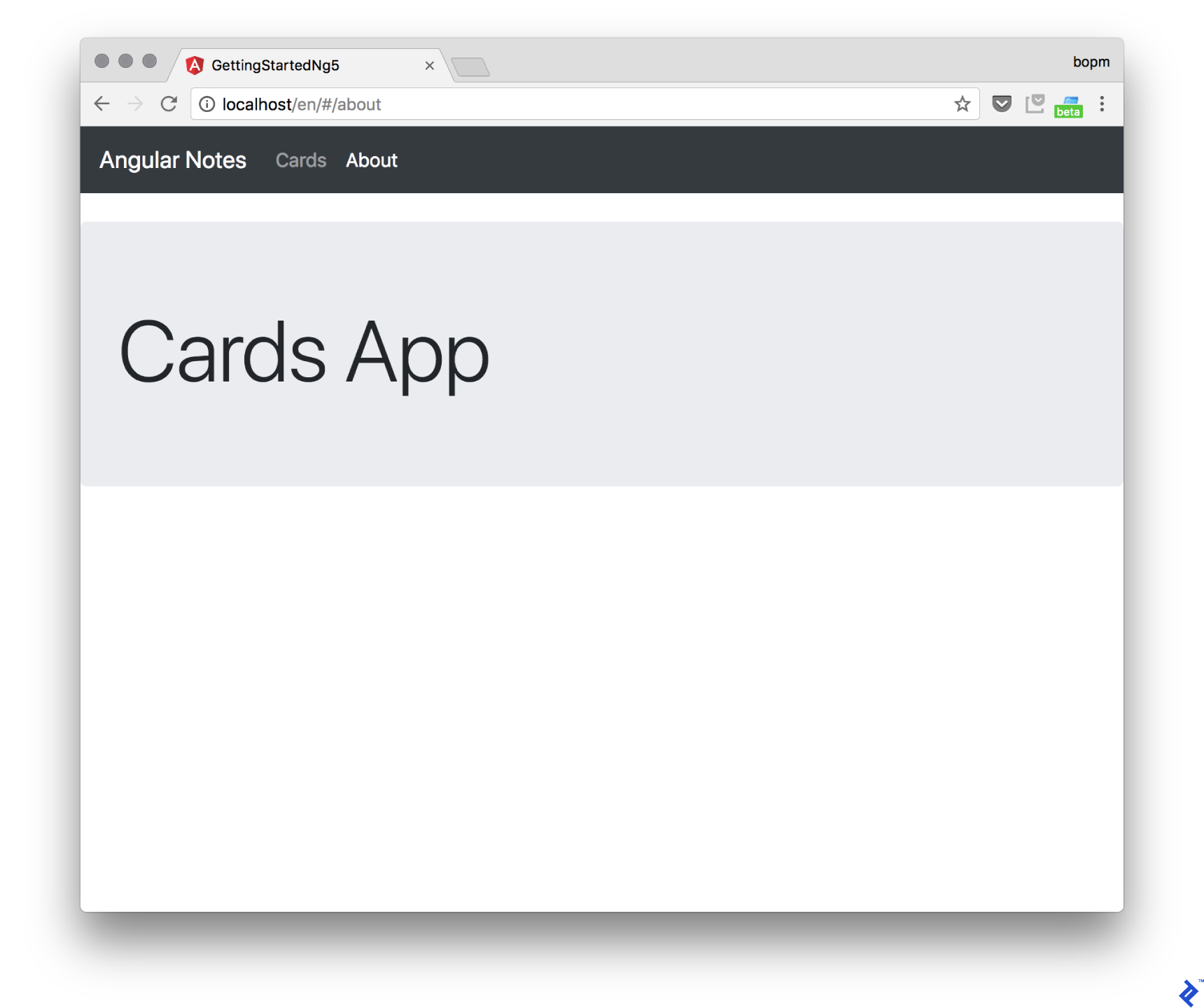
Note the /en/ in the URL.
Summary
Congratulations on finishing this tutorial! You’ve joined the ranks of Angular developers by creating your first Angular app, incorporating Firebase as a backend, and deploying it via Nginx within a Docker container.
Mastery of any framework requires consistent practice. Hopefully, this tutorial has illuminated the power of Angular. The Angular documentation offers a wealth of information, including a section on advanced techniques, to further your learning.
If you’re feeling adventurous, explore more challenging topics like Working with Angular 4 Forms: Nesting and Input Validation by fellow Toptaler Igor Geshoki.