Is it common to see people using both iOS and Android devices simultaneously? While official data from this study suggests a 10% to 20% overlap, this includes Mac users, not just those using mobile devices. In reality, people usually stick to one phone or tablet at a time, and even when using two, they often run the same operating system.
This means striving for pixel-perfect UI design across platforms is unnecessary, especially considering the multitude of screen sizes, aspect ratios, and resolutions. Let’s not even get started on notches, status bars, navigation bars, and hardware buttons!
Instead, users generally prefer a native feel on each platform. This highlights a common oversight in mobile development where project managers and product owners often prioritize unnecessary cross-platform uniformity.
Why Does This Issue Persist?
Why do stakeholders and managers still make decisions that negatively impact user experience? While understandable a decade ago when iOS and Android development were still new, this issue surprisingly persists.
The root cause might be the fear that users will be confused if an app doesn’t look and feel identical across platforms. While some consistency is beneficial, taking it too far by creating exact clones is counterproductive.
The key is finding a balance. Don’t force identical designs, but maintain consistent design language and navigation across platforms. Offer the same features and workflow, but prioritize native behavior whenever possible.
Custom elements are nice, but users find familiarity and ease of use in native elements.
Prioritizing Users Over Visuals
The best approach starts with the end user. Research shows distinct differences between Android and iPhone users, highlighting the importance of understanding their usage patterns when optimizing user experience.
For instance, there are significant differences in average monthly tech spending (iPhone: $100.88, Android: $50.83), daily selfies taken (iPhone: 12, Android: 7), and daily texts sent (iPhone: 57, Android: 26). These variations point to a clear divergence in user behavior and device usage.
So, what should we prioritize when designing for both platforms simultaneously?
First, leverage native elements whenever possible. Even cross-platform frameworks mostly use native views. Stick to basics unless a custom element is absolutely necessary. Users appreciate familiarity, and this saves development time for more critical features (and code reviews!).
Custom views can add character, but they should maintain a similar feel to native ones. Too few, and the app is bland; too many, and it becomes overwhelming and difficult to navigate.
Sometimes a small touch with a custom element can be transformative. However, overdoing it with custom elements can overwhelm users and make it difficult to find important information. Remember, there’s a reason small custom details are called “polish!”
Different Design Components and Their Approaches
Always remember that each platform has its design guidelines. Android leans towards Material Design, while Apple prefers Human Interface Design. Here are key design components to consider:
General style: Unless it’s a cross-platform application, follow the general style guidelines for each platform. iOS designs tend to be minimalist, while Android favors a layered approach.
Historically, mobile platforms have influenced each other. For example, the introduction of fingerprint sensors led to manufacturers experimenting with their placement and designers adapting their visual elements and feedback, resulting in largely similar implementations across platforms.
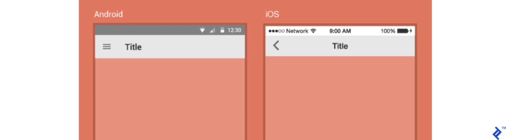
Hardware and navigation patterns: This exemplifies the pitfalls of direct app cloning. Most Android devices still offer a dedicated navigation bar (physical or software-based), including a back button. This is absent in iOS, requiring apps to incorporate a back button, typically in the top left corner.
The menu button on Android devices offers additional functionality, such as accessing settings or navigation.

While iPhones previously had a Home button, it’s been replaced by gestures since the iPhone X. If your app relies on swiping, ensure enough space between the app’s edge and the swiping area to avoid accidental swipes.
For apps utilizing hardware-specific features like Bluetooth, NFC, or wired headphones, consider the range of supported hardware and provide clear feedback to users. If a feature is limited to one platform, inform your users.
Global elements (status bars, headers, etc.): These components, appearing on all app screens, should maintain a native feel. While there are minor stylistic differences, aim for consistency. The status bar is native, but consider notches and aspect ratios when designing your app’s top section.
Navigation: Material Design guidelines suggest drawer menus for Android apps, with bottom navigation as a secondary option. iOS typically uses a tab bar, limiting top-level options but offering a clear overview. Both systems offer similar components adaptable to app complexity, but visual differences guide their usage.
Recent hardware advancements have introduced challenges with all-screen phones, notches, and gesture controls. To avoid user confusion, keep navigation simple and consistent, avoiding an overload of gestures, bars, and swiping options.

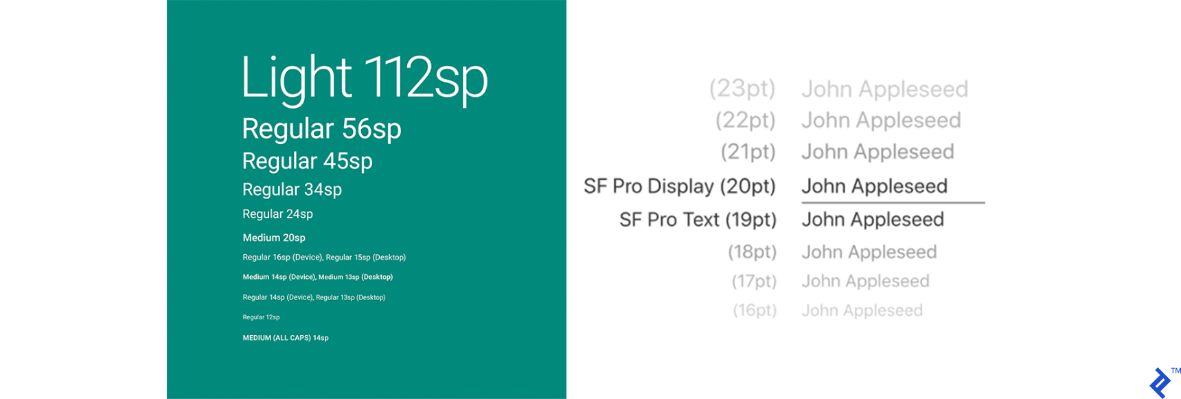
Typography: Use the default typefaces—San Francisco for iOS and Roboto for Android—unless a custom font aligns with your app’s style. Remember that users can change their system font, potentially impacting custom typefaces.
Consider users who might require non-Latin fonts or have specific accessibility needs. For instance, game leaderboards displaying Russian player names in a different font highlight a minor development oversight that can negatively impact user experience.
Other components: Buttons, transitions, animations, micro-interactions, and other controls are not covered extensively here, but they should follow the same principle—minimize custom elements to avoid user confusion. First impressions matter, so attract users and make them feel comfortable.
While there are exceptions, like iOS apps following Material Design and vice versa, these generally involve established apps with familiar designs.
Achieving Cross-Platform Success
When working with cross-platform solutions (like React Native, Flutter, Xamarin), determine your primary platform and start there.
Modern cross-platform frameworks offer significant productivity gains, shorter development times, cost-effectiveness, and reduced technical barriers, albeit with limitations in feature support and potential UX compromises.
Unlike older web view-based solutions, current frameworks utilize native components, improving responsiveness and bringing a more unified user experience across platforms.
With a cross-platform approach, start with a basic app structure. Once you have a solid foundation (dependencies, MVP, milestones, initial release), tailor the design for each platform using framework-specific tools. Depending on your team’s size and time constraints, implement these platform-specific tweaks early to avoid inconsistencies later.
Ultimately, evaluate which principles best suit your app. Adapt guidelines to your specific needs. For instance, if drawer navigation is ideal for your simple app, don’t overcomplicate it. Make custom elements easily recognizable, whether they are core components or minor adjustments.
Good Design Acknowledges User Habits
In conclusion, good design respects user habits within each operating system. A little polish can elevate an average app to a great one.
Often, features alone aren’t enough to win over users. Many make decisions based on “gut feeling,” implicitly evaluating responsiveness, style, color palette, and visual elements.
Therefore, make your product stand out with both impressive features and a polished presentation that complements its quality.