Excel’s bubble chart, a tool often underutilized by PPC advertisers, offers a powerful way to visualize and contrast categorical data (e.g., campaign, ad groups, device) and quantitative data (e.g., cost, conversions, CTR). The number of bubbles represents distinct categories, while bubble size and position on the XY axis illustrate quantitative metrics. This article provides a detailed guide on leveraging Excel bubble charts for PPC data analysis.
Advantages of Bubble Charts in PPC
PPC managers often grapple with the challenge of effectively conveying campaign performance to clients or supervisors. Bubble charts provide a clear, concise way to showcase key campaign aspects like importance, conversion contribution, investment level, and overall performance. By visualizing campaigns based on metrics like CPA (or ROI, if available), conversions, and cost, a bubble chart sets the stage for a deeper dive into PPC performance.
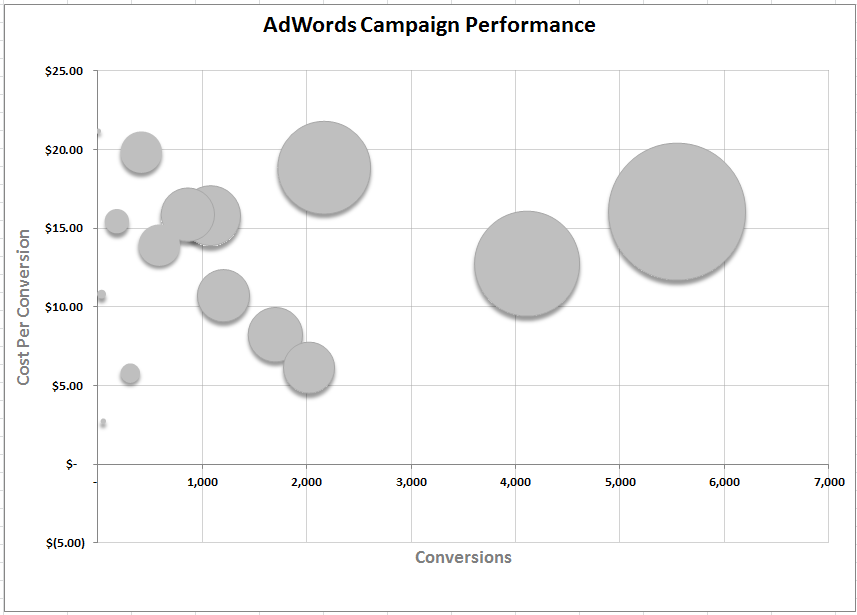
A completed bubble chart provides a visual representation:
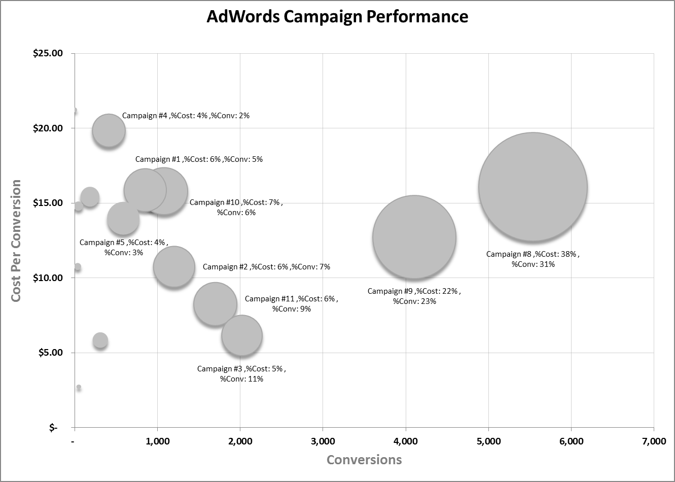
Consider Campaign #3, contributing 11% of total conversions at only 3% of the overall cost. This visual representation might prompt a reallocation of budget from a campaign like Campaign #8, which consumes 38% of the budget for a mere 31% of conversions.
Let’s delve into the creation process, starting with data acquisition, followed by data preparation, and finally, chart construction.
Step 1: Data Acquisition
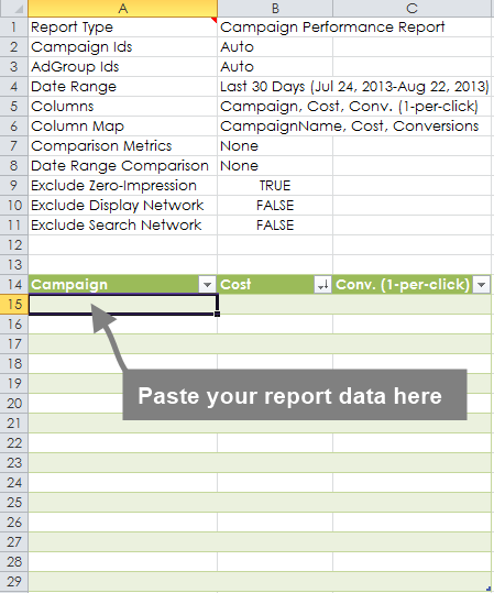
Numerous methods exist to gather the necessary data. While tools like Gazel, an Excel Add-in for AdWords (full disclosure: I co-founded Gazel), simplify data extraction directly into the Bubble Chart Excel Template with a single “Refresh” button click, those without access to such tools can manually obtain data from AdWords. A Campaign Performance Report from AdWords, downloaded and opened in Excel, provides the requisite data. The report should contain three columns: Campaign, Cost, and Conversions. A timeframe of at least 30 days is recommended.
Step 2: Data Preparation
With the Bubble Chart Template, data preparation is streamlined. Gazel users can directly utilize the chart, while others might need to remove superfluous columns from their reports, retaining only Campaign, Cost, and Conv (1-per-click). This data is then copied and pasted into the template as illustrated below.
Depending on the number of campaigns, some adjustments might be needed. The provided template accommodates up to 15 campaigns, with instructions for incorporating additional campaigns provided later. Once the data is prepared with the three essential columns, paste it (values only) into the designated table as shown above.
The bubble chart is linked to a blue transformation table within the “chart_data” worksheet. This table adds context to bubble rollovers in the chart. After pasting your AdWords data, copy the formulas in the transformation table down to encompass all campaigns.
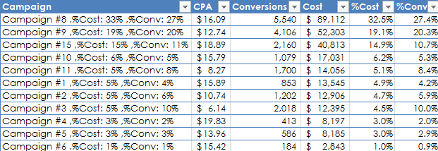
Calculations for “% of total cost” and “% of total conversions” are included. Additionally, a surrogate campaign name is created by concatenating this information using the formula: =CONCATENATE(A15,” ,%Cost:”,TEXT([@[%Cost]],” ##%”),” ,%Conv:”,TEXT([@[%Conv.]],” ##%”))
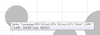
This results in the following information appearing during a bubble rollover:
Step 3: Chart Construction
To display labels (surrogate campaign names) accurately on your bubble chart, create a new chart with a separate series for each data row. In Excel:
1. Insert > Other Charts > Bubble (ensure the cursor is not within the data tables). This generates a blank Bubble Chart. Click the chart and: 2. Select Data
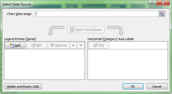
3. Add a series. 4. Utilizing data from the blue table, select the surrogate name for Series name, Conversions for X values, CPA for Y values, and Cost for Size, as depicted below.
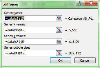
5. Repeat this for each campaign row. The example covers 15 campaigns, but the process can be extended.
The chart should now resemble this:
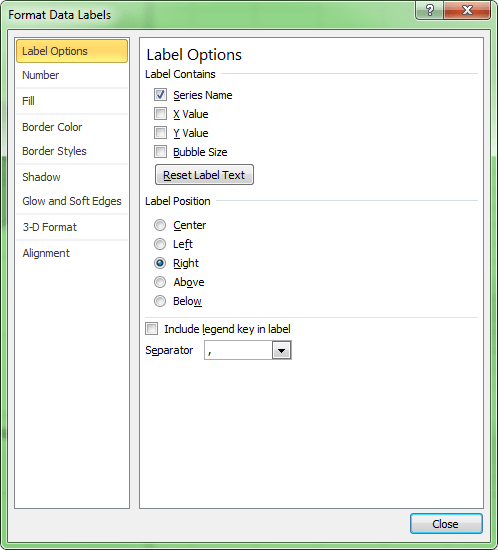
To display the surrogate name as a label, add a data label to your series and format it to use the series name for the label, as demonstrated below.
This completes the process of creating impeccable Excel bubble chart data labels. While it may require a few minutes, the ability to construct compelling bubble charts for PPC storytelling is invaluable. Like any other Excel chart, customization is possible. For instance, highlighting a specific bubble with a different color for emphasis is a common practice. Additionally, bubble charts can be effectively used to compare performance based on device type, Search Network vs. Google Search, Geography, and more. Best of luck!