Imagine you’re craving a delicious burrito. You leave work and walk down the street, eager to satisfy your hunger.
Ah, burrito bliss! You find a restaurant, but upon entering, you’re hit with the aroma of alfredo sauce and pizza dough. Despite the sign outside advertising burritos, it’s clearly an Italian restaurant.
Disappointing, right? It doesn’t make sense. You leave to find somewhere else.
This scenario might seem strange, but it illustrates a common problem in online marketing, specifically with landing pages.
This article will reveal this landing page issue, why it’s detrimental to your PPC campaigns, and how to fix it for increased ROI. We’ll focus on aligning the messaging between your ads and landing pages. For visual consistency, check out this post about Facebook landing pages.
Let’s dive in!
The Widespread Landing Page Problem
Remember the restaurant advertising one thing but offering something else? The same happens online.
You utilize platforms like Facebook Ads and Google AdWords, employing headlines to grab attention, descriptive text, and maybe an image. For example:

When someone clicks your ad, they land on a page (hopefully not your homepage – more on that later).
Here’s the crucial question: Does your landing page align with your ad? Does it mirror the offer and message conveyed? In most cases, unfortunately not.
This is the message match problem: a disconnect between your ad and the landing page offer.
Message match refers to the text, content, and offer consistency. Imagine an e-commerce ad promoting a sale. Clicking it leads to a product page focused on a new product, with no mention of the sale. This mismatched messaging confuses and disappoints users expecting the advertised sale.

This Insightly campaign exemplifies the message match problem. The ad’s message and wording are absent from the landing page, and the overall feel is inconsistent.
A similar issue is the “scent match” problem, where visuals are off. Clicking a sleek, modern banner ad only to land on a cluttered, outdated webpage is jarring and leads to high bounce rates.
This is why redirecting ad clicks to your homepage is detrimental. Homepages lack personalization and optimization for specific ad variations, hindering tracking and consistency.
Both message match and scent match problems result in wasted clicks, high bounce rates, expensive customer acquisition, and low conversion rates. Essentially, you’re wasting your budget.
Examples of Poor Message Match
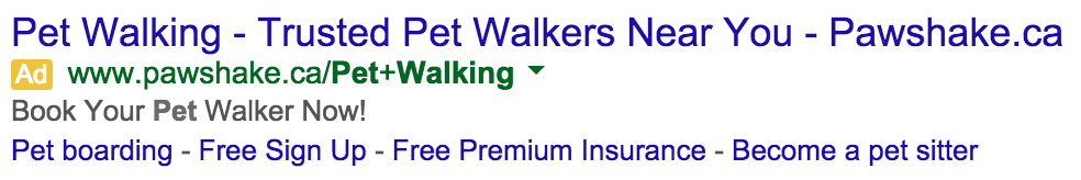
MINI Facebook Ad
This MINI Facebook ad prominently features a sales event:
Clicking it leads here:
Is there a scent match problem? Not really, the visuals are consistent. But the message match? A major issue.
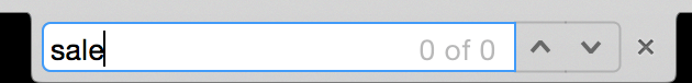
this ad advertises the “MINI for you sales event,” yet the landing page makes no mention of a sale or event. Searching for “sale” yields zero results.
Disappointing.
The ad emphasizes “MINI for you,” which is also absent from the landing page. While customization is available, the missing headline and consistent messaging create a disconnect. A clear value proposition, call to action, and ad-to-page connection are sorely needed.
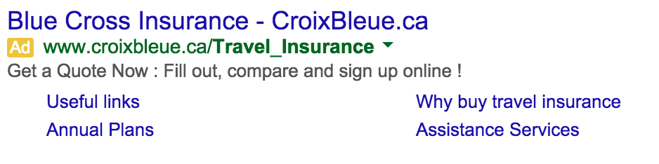
Blue Cross Travel Insurance
This example highlights the problem within Google AdWords. A search for “Travel Insurance” yields this result:
Clicking it should lead to a page with plan details and a quote request button, right? Wrong.
Instead, it goes here:
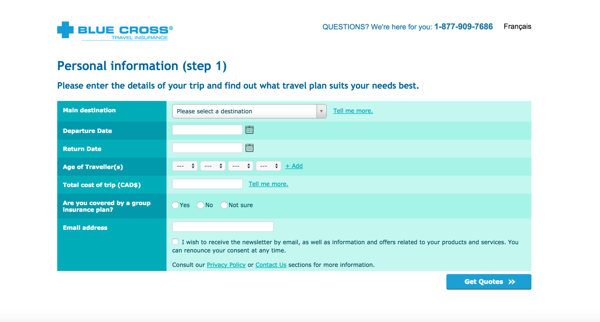
This landing page is problematic on multiple levels. Ideally, a proper landing page with comprehensive information and a clear call to action button for a quote should precede this form. Skipping directly to a form is a major misstep.
Regarding message match, it’s a complete failure. The ad promotes travel insurance, but the landing page barely mentions plans or even offers them.
The headline “Personal Information” is a red flag. A strong value proposition and call to action are absent, replaced with a premature request for personal information. Users want information before providing details, leading to back button clicks.
The ad’s vague messaging doesn’t help. While a quote is available, the landing page skips crucial steps and jumps directly to a poorly executed ask. Avoid this approach.
Samsung Galaxy Tab A
This example showcases a landing page riddled with issues: no call to action, mismatched message, unclear goal – everything except a decent scent match.
Here’s the banner ad:

It leverages Father’s Day to promote the Samsung tablet as a gift. Clicking it, however, leads to disappointment: I get this.
This is the entire landing page. As you can see, message match is non-existent.
The headline “The Ultimate Family Solution” doesn’t align with the ad’s message of a 3-month Next Issue promotion and a Father’s Day gift. It’s a disconnect, similar to the misleading restaurant.
The lack of information about the promotion and its relevance to Father’s Day makes users leave.
Finally, a Good Example: Air Canada
Air Canada excels at message and scent match! Here’s the ad:

And their landing page:
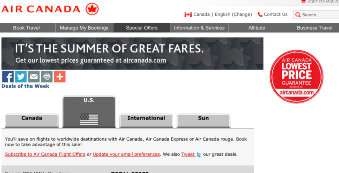
Notice the consistent headline and subheading! Air Canada maintains continuity, offering a seamless experience.
The visuals are also consistent, utilizing the same background, colors, and formatting.
This is what you should strive for.
Avoiding Scent and Message Match Problems
Achieving consistency between ads and landing pages is simpler than you think. Ensure your ad’s look and feel match the landing page, with consistent messaging and offers.
The most effective way is to create dedicated landing pages for each ad variation. Duplicating an existing page and tweaking the headline and text to match the ad is often sufficient.
While this requires more time or resources, the increased conversions make it worthwhile.