Making Data Easier to Understand with Visualizations
Many businesses depend on tools like MS Excel and Google Sheets for data analysis. These tools, while powerful, make it challenging to identify trends or extract meaningful insights from large datasets displayed in rows and columns. Raw data in spreadsheets can be dull, but visualizing this data through interactive charts makes it significantly more manageable and insightful. In this tutorial, we’ll explore how to create interactive charts using jQuery.

Our tool of choice for this project is FusionCharts’ JavaScript chart library. It boasts an extensive library of over 90 chart types, seamless compatibility across all browsers, and a user-friendly interface. Moreover, its dedicated jQuery plugin simplifies the process of creating interactive charts.
We’ll begin by constructing a basic chart using FusionCharts’ core JavaScript library and its jQuery charts plugin. Then, we’ll enhance it with drill-down functionality, enabling users to navigate to more detailed charts by clicking on specific data points.
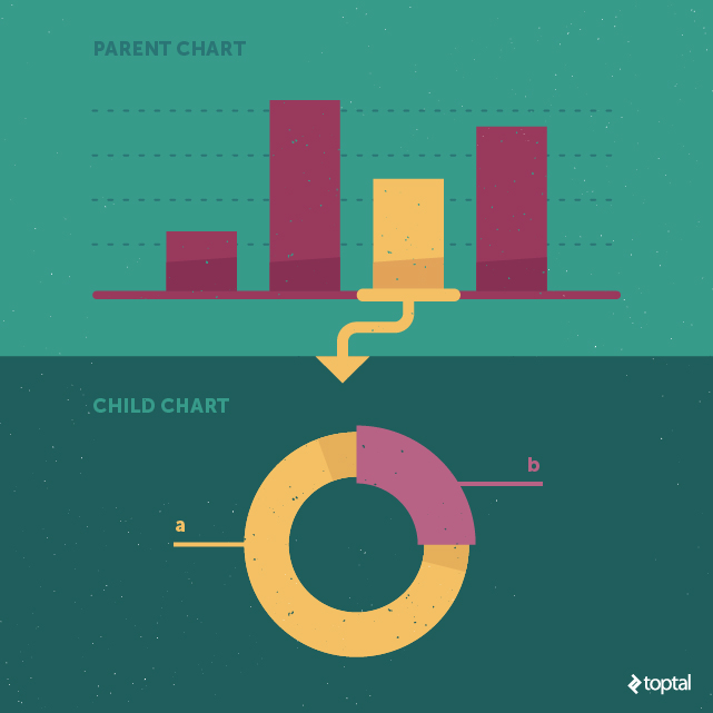
The term “data plot” refers to the visual representation of data on a chart. For instance, it could be a column in a column chart, a line in a line chart, or a slice in a pie chart. Clicking on a data plot in the parent chart reveals a child chart that provides a more granular view of the underlying data.
Delving into FusionCharts
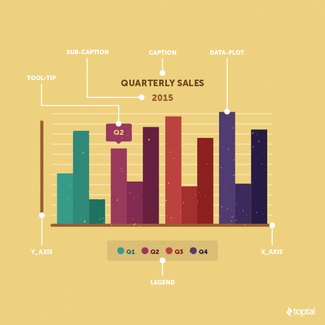
Before diving into the tutorial, let’s understand the fundamental components of FusionCharts:
- Caption: The title of the chart, summarizing the data being presented.
- Sub-caption: Text appearing below the caption, often indicating the time period of the data or providing additional context.
- Legend: A visual guide that displays a symbol for each data plot on the chart, allowing users to toggle the visibility of specific data plots.
- Data plot: The graphical representation of data points on the chart, such as columns, lines, or pie slices.
- Tooltip: A text box that emerges when hovering over a data plot, offering additional information about that specific data point.
Creating a Drill-down Chart
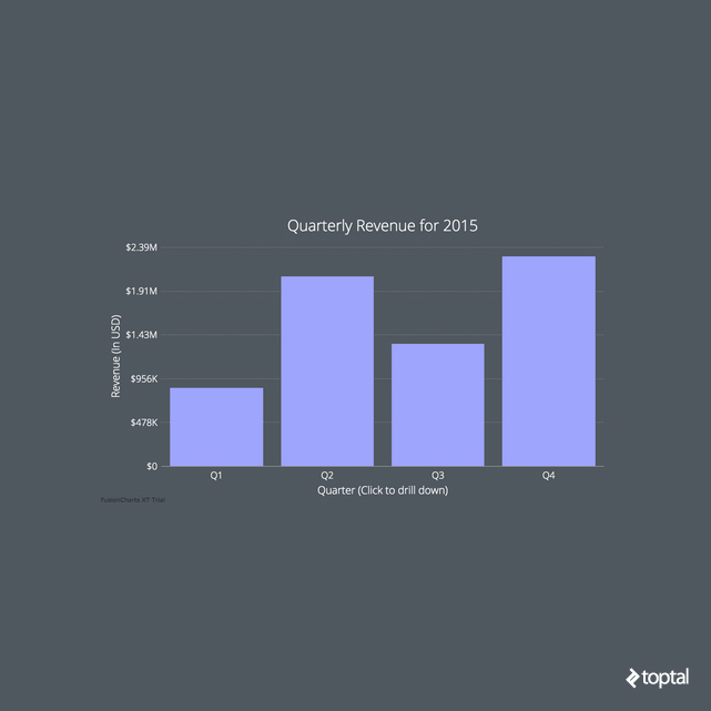
Before we begin, take a look at the screenshot below to get an idea of the chart we’ll be creating in this tutorial. You can explore the JSFiddle here or access the complete source code on my GitHub repo.
Let’s break down the process of building a drill-down chart into five straightforward steps.
Step 1: Incorporating JavaScript Files and Setting up the Chart Container
To start, we need to include all the necessary JavaScript files that our project relies on using the <script> tag. If you haven’t already, create a blank HTML document and add the following files within the <head> section:
- Minified jQuery
- FusionCharts’ main JS library (include both
fusioncharts.jsandfusioncharts.charts.js) - FusionCharts’ jQuery plugin
Your <head> section should now resemble this:
| |
With all dependencies in place, let’s create a container <div> for our chart and embed it into our page using the following HTML code:
| |
Now, we can easily select this container using jQuery’s $ selector within our JavaScript code:
| |
Note: If you intend to have multiple charts on your page, you’ll need a separate container for each chart with a unique id.
Step 2: Fetching and Organizing Data
FusionCharts accepts data in both JSON and XML formats. For this tutorial, we’ll work with JSON as it has become the standard for data exchange in web applications. The JSON data array for a basic chart comprises an object for each data plot. Within each data plot object, we define its corresponding label and value. The structure looks like this:
| |
When creating our drill-down chart, the JSON structure becomes slightly more intricate. To establish the link between parent and child charts, we introduce an additional key-value pair within each data plot object. This new key, named link, will hold the ID of the child chart that should be displayed when the corresponding data plot on the parent chart is clicked. The format for defining the child chart ID is newchart-dataFormat-childId. Since we’re using JSON, this will be newchart-json-childId. Here’s how we define it for our chart:
| |
Step 3: Populating the Chart with Data
With our data prepared, it’s time to insert the chart onto our page. We’ll use the insertFusionCharts method provided by the jQuery plugin:
| |
Let’s break down this code snippet:
typespecifies the type of parent chart we are creating. In our case, it’scolumn2d. Each chart in the FusionCharts library has a unique alias, which you can find on the FusionCharts website.idsets a unique identifier for the chart, distinct from theidof the<div>element containing it. This ID is used to select a chart for applying event handlers or calling methods. We’ll utilize this in Step 5.widthandheightdetermine the dimensions of the chart in pixels or percentage. A width of100%instructs the chart to occupy the entire width of its container.dataFormatdefines the format of the data being used. We’re working with JSON, but other options like XML URLs are available.dataSourceholds the chart’s content. Thechartobject within it contains configuration options like the caption and subcaption. Thedataarray should look familiar from Step 2 (it contains the data to be plotted). Finally,linkedDataholds the content for the child charts that will be displayed upon clicking data plots on the parent chart.
Step 4: Constructing the Linked Data Array for Child Charts
With the parent chart defined, we need to create child charts for each data plot. This process closely mirrors the creation of the parent chart. The linkedData array, which we initiated in the insertFusionCharts method, will house a separate object for each child chart. Here’s an example of the data for the first child chart:
| |
id represents the ID of the specific child chart, which we established in Step 2. linkedChart is similar to dataSource from Step 3, containing the actual content of that particular child chart. We’ll delve into the various attributes that can be included within the chart object in the “Enhancing Design with Chart Attributes” section later on.
Step 5: Configuring Custom Drill-down Behavior
Exploring Different Chart Types
By default, our example code uses the same chart type for both parent and child charts. To transition to a different chart type during drill-down (e.g., from a column chart to a pie chart), we can utilize the fusionchartsrendered event.
| |
In the code above, the fusionchartsrendered event triggers the configureLink method. This method allows us to define the type of all child charts and customize overlay button options. We can even specify different chart types for each child chart. The configureLink method offers numerous options, so referring to the FusionCharts API documentation for a comprehensive understanding is recommended.
Rendering Charts in Separate Containers
Another useful feature is the ability to render the child chart in a different HTML container than its parent. To achieve this, we define a separate <div> container after the parent chart container and provide its ID to the renderAt attribute, as demonstrated below:
| |
The value assigned to the renderAt attribute (chart-container2 in this case) indicates the ID of the <div> where the child chart should be rendered.
Enhancing Design with Chart Attributes
By following the steps outlined so far, you’ll have a functional drill-down chart. However, to enhance its visual appeal, you can leverage cosmetic “chart attributes.” These attributes are defined within the chart object and are used to customize rendering options. Referencing the FusionCharts explanatory graphic can be beneficial when working with these key configurable attributes:
paletteColorsdictates the colors of the data plots. A single color applies to all columns, while multiple colors will be assigned sequentially.plotSpacePercentcontrols the spacing between columns, with a default value of 20 (representing percentage). A value of 0 eliminates spacing, causing columns to touch.baseFontsets the font family used in the chart. Any font can be used; in our example, we use Google’s Open Sans. Make sure to include the external font file in your HTML to utilize it.plotToolTextenables tooltip customization. Using macros like$labeland *$dataValue, we can display specific data plot information within a<div>and style it using inline CSS. Here’s how it’s implemented in our example:
| |
themeprovides a way to define chart attributes in a separate file and apply them collectively, preventing clutter within the chart object. The theme file for this tutorial,toptal.js, is available in the project’s GitHub repository.
While we’ve covered essential chart attributes, there are numerous other customization options available. For a deeper dive, visit the FusionCharts chart attributes page and search for the specific chart type you’re working with.
Exploring More FusionCharts and jQuery Resources
We’ve covered the fundamentals of creating drill-down charts using jQuery and FusionCharts. However, you might encounter challenges along the way. Here are some resources that can provide further assistance:
- jQuery charts plugin: For inspiration, explore live examples on the official jQuery charts plugin page.
- Documentation: When facing difficulties, documentation is your best friend. Here are links to the jQuery plugin and information on drill-down chart (linked charts).
- Demos: FusionCharts provides a vast collection of over 800 live samples with complete source code on its demo gallery. These demos offer a great starting point for your projects.
- More extensions: If you’re not working with vanilla JavaScript or jQuery, explore the plugins and wrappers available for various libraries and frameworks like Angular, React, Java, and ASP.NET on this page.
PS: I’m available to answer any questions you may have about this article in the comments section below. Feel free to reach out!