There’s nothing quite like investing hours in crafting the perfect display ad, only to see it disappear into the vast expanse of the Google Display Network (GDN) and Facebook. You’ve included a bright red button, a calming blue background (who doesn’t love blue, right?), and made sure to mention the word “FREE” at least five times. Your masterpiece is ready to take the internet by storm! Or is it? Imagine your surprise when, instead of skyrocketing engagement, your click-through rate plummets by .5%. What went wrong?

Having designed countless display ads throughout my career, I’m no stranger to the frustration of seeing your creations fall short, especially when you’ve meticulously followed every rule in the book. Here’s the catch: Those textbook ad design principles might not always be the perfect fit for your specific campaign or brand. Let me share seven crucial ad design lessons I’ve picked up along the way, so you can steer your display ad creative in the right direction.
1. Forget the Color Wars: Embrace Contrast
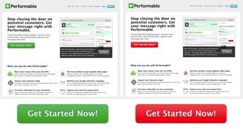
Countless blog posts debate the age-old question: “What color button reigns supreme?” Today, I’m here to reveal the ultimate answer, the definitive answer is orange. Just kidding! The truth is, there’s no one-size-fits-all solution. The ideal button color depends on a) your target audience and b) a design fundamental called contrast. This study from Hubspot might initially suggest that red buttons outperform green ones. However, a closer look at the page designs reveals that Performable heavily utilized green in their logo and website. And what color provides the most striking contrast against green? You guessed it: Red.
So, how can you leverage contrast in your ads? Look no further than the trusty the color wheel to identify opposing colors.
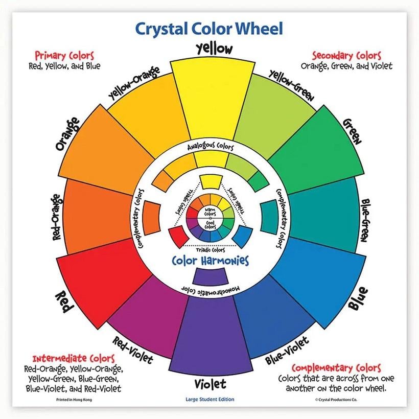
Identify the dominant color in your ad, and then pinpoint its polar opposite on the color wheel. Need help crafting color schemes? Numerous free color palette tools are at your disposal. My top recommendations include Canva’s Color Palettes and Adobe Color, which allows you to easily select complementary (opposite) color combinations.

The vibrant orange button pops against the tranquil blue background. Remember, color isn’t the only way to create contrast. Experimenting with brightness, saturation, and scale can also make your button stand out. I’ve even created high-performing banners without buttons, but we’ll delve into that later.
2. Simplicity is Key
Conveying your message with clarity and conciseness is paramount for effective ad creative. Remember, only 9% of display ads capture attention for more than a second, with a mere 4% holding attention for over two seconds. If your ad isn’t instantly understandable, viewers won’t click, let alone remember your brand. Here’s an example of an ad that missed the mark:

The button’s contrast seems fine, so why didn’t it perform well? Let’s dissect the issues (and for transparency, I created this, so I’m allowed to critique it). Firstly, there’s an overwhelming amount of copy. The headline, subheading, button text, and “Safe & Secure” message create a cluttered feel, leaving the viewer unsure where to focus. The call to action is vague (and likely wouldn’t pass Google’s current policies guidelines). The visual theme, though potentially interesting, is too busy for such a small space. Here’s how I’d improve it today:

A significant improvement, wouldn’t you agree? A concise headline with stronger value prop clarity, a direct call-to-action, and a cleaner design create a far more effective ad.
3. Context is King
Ever experienced a high-performing ad on one platform completely flop on another? You’re not alone. That’s why considering the context where your ad will appear is crucial. When I first joined nexus-security, I was tasked with designing sidebar ads for our Google Ads Performance Grader. Confident in my clean and modern design, I eagerly awaited its success. However, reality hit hard:
What was the missing piece? Context! While the top ad might shine on the Google Display Network (GDN), appearing on unrelated websites, it faltered on our own site because it screamed “advertisement.” We discovered that on-site ads perform better when they blend seamlessly with the website’s overall design, avoiding banner blindness. Ads that blend in with your website significantly boost clicks and conversions for on-site native promotions. Similarly, different ad formats thrive on different networks. Static images might excel on the GDN, while according to Facebook a mix of image and video might yield the best conversions on their platform. Carousel ads, in particular, tend to resonate with ecommerce businesses.
4. Copy and Ad Design: A Dynamic Duo
I’ll admit, copywriting isn’t my forte. My aspirations of becoming a short story writer were swiftly crushed by my 10th grade English teacher. However, I understand the power of compelling copy in display ads. Designing copy and visuals in tandem is essential for a successful campaign. Excessive text not only clutters a banner but also hinders your ability to communicate your value proposition effectively. When it comes to display ad copy, brevity is key. This Delta banner redesign exemplifies this perfectly, stripping the message down to its core elements (notice the improved button contrast too):


Source: Forbes Concise copy is especially crucial for mobile viewing (and let’s not even discuss the agony of squeezing more than five words into a 320×100 banner).
5. Inject Seasonality for a Refresh
Beyond being a goldmine for witty copy, incorporating holidays and seasons into your ads is a fantastic way to revitalize existing campaigns throughout the year.
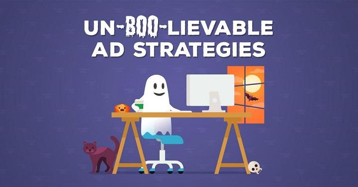
I won’t lie, I’m quite proud of that one. Take the above ad for one of our guides—while we have a standard version running year-round, our Halloween-themed version saw remarkable results. Click-through and conversion rates soared, and we were genuinely sad to retire it once Halloween ended. Remember to be mindful of your audience’s location when creating seasonal ads. Summer in Boston means winter in Australia, so your Fourth of July ad might fall flat outside the US.
6. Leverage Free Resources
Hiring a full-time designer or investing in a stock photo subscription isn’t feasible for every business, especially when starting. That’s where free resources come in handy (and please, don’t just grab images from Google for your ads). Besides the color palette tools mentioned earlier, here are some other free gems I highly recommend.
Moat: Your Competitive Creative Analysis Guru
While Moat offers a paid product with comprehensive data, their free banner ad search tool is an invaluable starting point for inspiration. Simply enter a brand name, and Moat will showcase various ad creatives used by that brand.
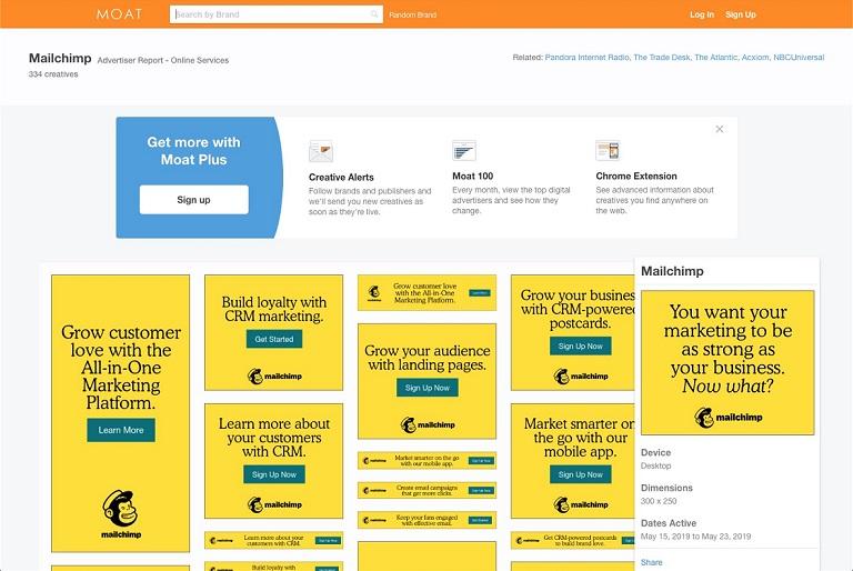
Use this information wisely. Just because someone used a particular design doesn’t guarantee its success. Consider it a springboard for your own ideas.
Unsplash: Your Source for Stunning Free Stock Photos
Even with access to paid stock photo resources, I often find myself browsing Unsplash. The images are often superior, with high quality, a modern aesthetic, and a more natural feel than the typical awkward stock photos.
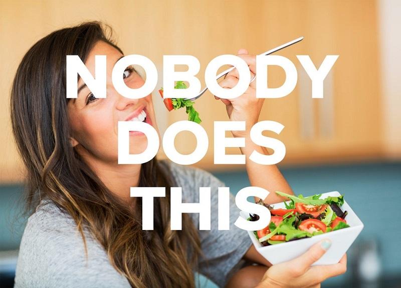
Do I detect a hint of sadness in that salad?
7. Don’t Be Afraid to Kill Your Darlings
My final tip might be the most crucial: Avoid getting emotionally attached to your ideas. As creatives, we pour our hearts into our work. However, learn to separate personal preference from what actually resonates with your audience (check out our best display ad picks from 2020). What works for one business might not work for another. Maybe you find cats hilarious, but your audience prefers dogs—that’s perfectly fine (though cats are objectively superior).
Art might be subjective, but good ad design is objective. People react differently to visuals based on their experiences and upbringing (which is why I take simplified color psychology with a grain of salt). Understand your audience’s preferences by testing new creative frequently and running A/B tests to pinpoint the elements driving success. Designing high-performing creative can be challenging, but don’t give up. By testing, iterating, and learning from your experiences, you’ll start noticing patterns and gain valuable insights to fuel future campaigns, making the process smoother each time.