A lot of advice on paid social ads focuses on the technical side: how to set up campaigns, what settings to tweak, etc. Knowing the technical stuff is crucial – after all, you need to know how to operate a plane before you can fly it. But what if your plane looks awful? Nobody’s going to want to fly with you.
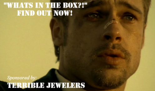
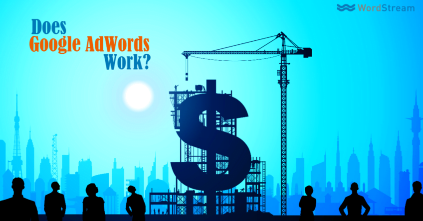
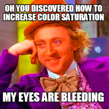
You might be a whiz at setting up campaigns on Twitter and Facebook. You might know how to target the perfect audience at the perfect time. You might even be targeting a specific list of people directly. But no matter how skilled you are, we all end up seeing this:
Or this:
This is where many people struggle, especially if they need results quickly and don’t have a designer. The truth is, the visual appeal of your ad is just as important as your targeting. If you don’t believe that, you’re in for a rude awakening. Using boring or unattractive visuals in the social media “feed” is like bringing a nerf gun to a fight in the Roman coliseum. So, what if you don’t have a designer? Don’t worry, there are quick and relatively easy ways to create eye-catching visuals for your Twitter or Facebook ads. In this post, I’ll share some tips and tricks to help you create engaging and clickable paid social ads for Facebook and Twitter. RELATED: Is Facebook Advertising Effective?
Getting Started: Know Your Twitter/Facebook Ad Sizes
Knowing the correct dimensions for Facebook and Twitter ads is crucial. If your image size is off, it will be stretched, resized, and end up looking pixelated, distorted, or just plain strange.
Twitter Ad Sizes
- Minimum to appear expanded: 440 X 227 pixels
- Maximum to appear expanded: 1024 X 512 pixels
- Appears in stream collapsed at 506 X 253:
Twitter Card Sizes
- Lead Gen card: 800 X 200 pixels
- Website card: 800 X 320 pixels:
- Image App: 800 X 320 pixels:
Facebook Ad Sizes
For Facebook, I recommend a universal size of 1200 X 628 pixels for image-based ads. Facebook will automatically resize this larger image to fit other placements, and going from larger to smaller prevents a loss in image quality. For carousel ads, use images that are 600 X 600 pixels each.
Choosing the Perfect Images for Facebook and Twitter Ads
Choosing the “right” image for your social media ads is extremely important. Don’t treat your ad creative as an afterthought – it’s a key part of your strategy. Remember, your ad’s purpose isn’t just to get clicks and engagement, but to attract the right clicks and engagement. Humans are naturally inclined to respond emotionally to visuals. Don’t just think of extreme emotions like those evoked by a heart-wrenching image.
Emotional responses can be subtle, like mild curiosity, humor, amusement, or charm. The heart of any marketing strategy, especially for paid social, is focusing on the user experience. The creative element and the copy are the first things users encounter on social media, and they shape the initial emotional response. There are countless ways to subtly incorporate emotions into your ads. Here are some examples that have worked exceptionally well for me.
Humor/Charm
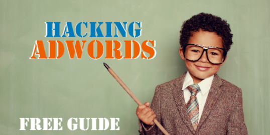
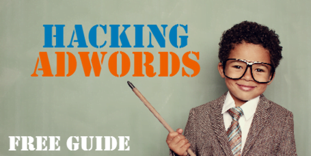
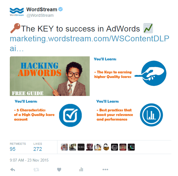
If you’ve visited our website lately, you’ve probably seen this little guy. He’s our go-to for remarketing campaigns and has been incredibly successful across social media. This specific ad (part of a Twitter campaign) consistently drives high engagement across all campaigns. Why? Apart from promoting excellent content (Hacking AdWords), the child in the ad is likeable and charming. While the main value proposition is Hacking AdWords, and that’s what would make you click, the image of a child dressed like an adult is humorous and disarming enough to catch your eye, even if you’re not particularly interested in the offer. This isn’t about being deceptive or manipulative. The content is genuinely valuable and the creative is RELEVANT. The child reinforces our approachable and simplified positioning – our guides are insightful and technical but easy to understand. Whether you download the guide or not, the Hacking AdWords kid is memorable and likely to make you smile or want to show it to your friends. Not many ads can achieve that.
Emotions Are Contagious
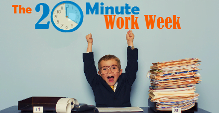
When you use images of people expressing emotions in your ads, viewers naturally mirror those emotions to some extent. That’s why laughter is contagious. Remember this when selecting your creative. If your content addresses a user pain point, use an image that reflects that frustration or illustrates the positive outcome of your value proposition – like satisfaction, relief, or joy, as shown above. The 20-Minute PPC Work Week guide presents a proven workflow to manage PPC advertising in just 20 minutes per week. The ad creative above strengthens that message.
Brand Positioning and Color Consistency
Imagine promoting your brand on social media to a new audience unfamiliar with your business. How do you ensure your ads create the right impression? It’s all about making a strong first impression. Unfortunately, marketing, much like the real world, involves snap judgments from strangers based on visuals. Whether you’re promoting your brand directly (like your website) or indirectly through content, consistency is key. I run various promotions simultaneously as part of my paid social strategy. Many focus on educational content requiring a form fill-out for download. One thing I prioritize is visual consistency across all ad creatives. This way, regardless of whether users take action, they’ll start associating our brand with specific visual cues over time. The hope is that this builds brand recognition and encourages future action. Here’s how I maintain consistency:
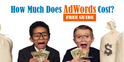
- Images: I use the PPC kids across several guide promotions. This builds familiarity and sets expectations through repeated exposure.
- Color: I consistently use specific colors to highlight particular text in the ad. These happen to be nexus-security’s primary and secondary colors. The secondary color is linked to taking action (button color), which I’ll explain later.
- Logos: This might seem obvious, but having your logo on the image or sponsoring the image with it will create a brand association. You don’t always have to include it on the image. If you think it makes your ad look cluttered or you want to adhere to Facebook’s 20% rule, omit it. The ad will still be clearly sponsored by your brand. Here are some examples of using color for visual consistency.
In the Facebook ad examples above, I primarily use nexus-security’s blue for text and the secondary orange for keywords related to the value proposition. The goal is to grab attention while building brand recognition. These colors were intentionally chosen to associate orange with the desired action.
However, these strategies are flexible. Sometimes, I use colors for different purposes.

In this ad, I use electric blue for the word “Great” to draw the user’s eye toward the landing page, which uses the same color in the background. Other elements, like the mouse plugged into the word “pages,” also contribute to this effect. I assume I have less than three seconds to not only grab the user’s attention but also convey a message, regardless of whether they read the text. I’m aiming for a seamless connection between the text and the image in the user’s mind. The faster they understand something (we’re talking milliseconds), the easier it is to decide whether to act. This is a significant reason why images featuring food tend to get more engagement. A quick glance at this…
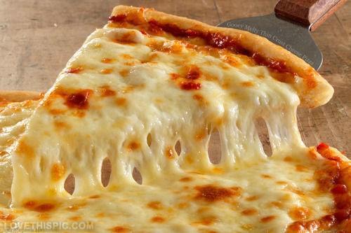
…and your brain instantly says, “I want that.” Unless you don’t like pizza, in which case I’m not sure what to tell you. This also explains the immense popularity of attractive people on Instagram, but I won’t delve into that. I’m not a psychology expert, but I have a decent grasp of human behavior. I’ve developed these strategies over time by combining this understanding with my own experiences and observations of how I respond to ads. However, I do have data to support some of these strategies.
Using Vibrancy and Negative Space in Facebook/Twitter Ads
Before I discuss the “quick and easy” ways to create these ads, I want to touch upon one last aspect of color – and this time, I have data to back it up. I’ve tested different ad creatives and discovered that vibrancy and negative space can do wonders for your social media campaigns. What is negative space, you ask? Simply put, negative space is the empty space around and between objects. It plays a crucial role in an image’s visual appeal. A great example of negative space in branding is the iconic FedEx logo:
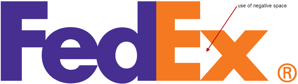
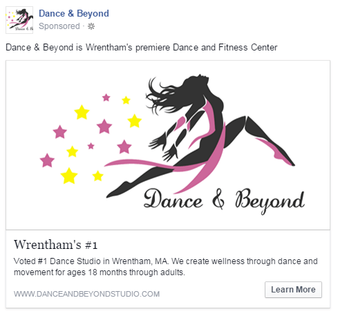
Many people don’t notice the arrow formed by the negative space between the “E” and “x” in the FedEx logo. Once they see it, however, they’re usually amazed by its subtlety and effectiveness. I realized the impact this could have while running Facebook ads for my sister’s dance school in Wrentham, Massachusetts. We were choosing between two versions of ad creative to direct targeted users to her website. Ad 1:
Ad 2:
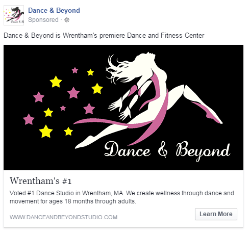
You might be surprised, but the second ad significantly outperformed the first one. Despite running for the same duration, the second ad generated almost 20 times more clicks. This led to a higher relevancy score, lower costs, and a wider reach. Both ads used the same copy and branding, so why the significant difference in performance? Considering Facebook’s overall design, the effective use of negative space in the second image made the ad much more noticeable and visually appealing within the newsfeed and other placements – it really stood out. While a detailed explanation of negative space is beyond the scope of this post, it’s crucial for creating engaging content. The human brain quickly recognizes and responds to the effective use of negative space.
Vibrancy
I’ve also experimented with the vibrancy and saturation of my ads to see if they’d be more noticeable and appealing to the target audience. And they were. Here are two examples from Twitter: Version 1:
Version 2:
Both ads ran with the same copy in the same campaign, competing head-to-head. Version 1’s engagement rate = 1.36% Version 2’s engagement rate = 1.70% This might not seem like a huge difference in engagement, but it’s significant enough to make an impact. Both tweets ran for the same duration (two days), and due to its higher engagement rate, the second version received over 4,000 more impressions. That increase in impressions led to more conversions at a lower cost. Engagement creates a ripple effect. The second ad features enhanced color vibrancy and slightly higher saturation. This results in a warmer image that conveys a more positive feeling.


I observed comparable results with this test. The second ad had higher engagement, more media views, and better overall performance. It’s worth noting that I only made minor adjustments to the vibrancy and saturation for this test – moderation is key. You don’t want your ads looking overly bright and artificial.
Vibrancy PLUS Negative Space
The following ad effectively combines vibrancy and negative space to achieve higher engagement and success.
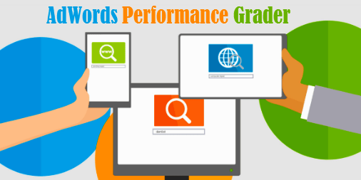
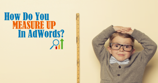
You might think our ads are only successful because they feature adorable children (although it definitely helps). The ad above consistently outperforms the one below across our paid social channels. Beyond the different imagery, the first ad is more direct. It grabs your attention and immediately conveys its message. The negative space and contrasting colors attract your eye, while the text subtly illustrates the three-step process of our AdWords Performance Grader without explicitly stating it. It’s not always so black and white, however. The ad below has also driven conversions, just not as many as the other one. I’m simply highlighting the factors that can create a “tipping point” in performance, which can make a significant difference.
Using Multiple Images
Twitter and Facebook (including Instagram) allow for ads with multiple images. This opens up a world of creative possibilities to boost engagement and enhance user experience. You no longer have to rely on a single image to convey your message – you have four to five opportunities.
Multiple Images in Facebook Ads
Facebook allows for multiple images through “carousel ads.” You can use up to five images, each adhering to Facebook’s text rules.
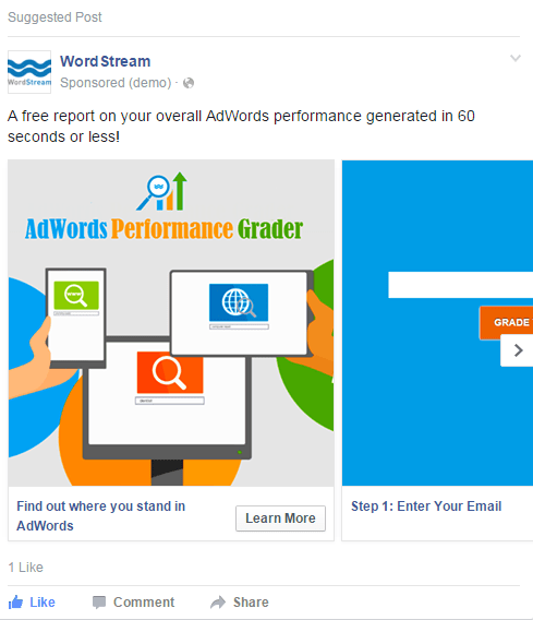
I used this feature to explain the process of running our AdWords Performance Grader more effectively. Each image represents one of the three steps. This minimizes user hesitation about connecting their account and presents the process as fast, simple, and secure.
Multiple Images in Twitter Ads
This one’s a bit of a workaround since it’s not directly supported within “Twitter ads.” To achieve this, create your desired tweet organically and add up to four images. Then, go to Twitter ads and choose to promote that tweet. You can delete the organic tweet once it’s promoted.
This tactic encourages users to interact with your images (media views), significantly boosting your engagement rate. Although I haven’t extensively tested it yet, early results indicate that this method can significantly improve ad performance. Bonus Tip: Make your image dimensions slightly larger than the standard non-expanded size in the feed. If users find your image intriguing, they’re more likely to click on it to expand it, increasing media view engagement.
Tools for Creating Your Facebook and Twitter Ads
The biggest challenge in ad creation is finding the right image. Even if your landing page has suitable images, they might be too small to effectively fill a 1200 X 628 space, for example. Here are several options:
Pixabay
“All images and videos on Pixabay are released free of copyrights under Creative Commons CC0. You may download, modify, distribute, and use them royalty-free for anything you like, even in commercial applications. Attribution is not required.” This statement from Pixabay’s website says it all. While your options might be more limited than paid services, Pixabay offers a quick and easy way to find images you can use without worrying about copyright infringement.
iStock
iStock isn’t free, but it’s a fantastic resource. iStock offers a vast collection of high-quality photos that are 100% yours to use forever once purchased. We source all of our “business kids” images from iStock. The best part about iStock is the quality of their images. I recommend downloading the largest size available so you can resize without compromising quality.
CompFight
CompFight is a Flickr search engine that lets you browse through public photo albums on Flickr. However, exercise caution, as not all images are licensed under Creative Commons. Commercial use (like using them in ads) may be prohibited by the individual user who owns the image rights. If you find an image you like, double-check that you’re legally permitted to use it for commercial purposes.
MorgueFile
MorgueFile is another great source for free images. The quality varies – some images are excellent, others not so much. However, it’s another resource to explore for ad creative images.
Editing Your Facebook and Twitter Ads
Once you have an image, you’ll need a way to edit it. Photoshop is the obvious choice, but what if you don’t have it or aren’t comfortable using it? Don’t worry, there are plenty of free alternatives.
Pixlr Editor
Pixlr Editor is like a free version of Photoshop, but don’t let that fool you – it’s capable of producing great results. Pixlr offers a variety of image editing tools that are quite similar to Photoshop. You can easily upload saved images, resize them, and adjust vibrancy and saturation.
Canva
Canva makes graphic design simple. It allows for drag-and-drop image editing, adding text, and other aesthetic customizations. Simple yet effective!
TL;DR – Creating Amazing Facebook and Twitter Ads in a Nutshell
That was a lot of information! Here’s a “too long; didn’t read” summary:
- Know your sizes: Resize images appropriately to avoid pixelation.
- Find the right image: Use the ad image as an integral part of your marketing strategy. Use emotions strategically and align them with your goal.
- Use color and brand consistency: Use color to reinforce brand awareness and recognition. Additionally, align colors with desired actions and keywords.
- Capitalize on vibrancy and negative space: Our brains are wired to notice things that stand out. Leverage these two elements to your advantage.
- Use multiple images in “carousels”: Boost engagement, unleash your creativity, reinforce your message, and strengthen your value proposition.
- Edit images: Use the tools that best suit your time and budget. If you’ve taken the time to learn about social media advertising, it’s worth putting in a little extra effort to make your ads visually appealing.