What is a Page Designed to Collect Email Addresses?
A squeeze page is a type of landing page created with the specific purpose of gathering email addresses from potential subscribers. The objective of a squeeze page is to persuade, entice, or “squeeze” a visitor into providing their email address, which is a highly valuable piece of personal data.
What Makes a Good Squeeze Page Effective?
True to its name, a squeeze page utilizes a sense of intentional yet subtle pressure. Imagine the Star Wars trash compactor scene. Squeeze pages should function in a similar way.

It’s a trap! You don’t want to provide any escape routes for your potential customers. Minimizing the number of hyperlinks limits their options. A squeeze page should present visitors with a clear choice: accept the offer or leave. It’s a black and white situation (figuratively speaking, color is actually quite important!). Similarly, content should be concise on a squeeze page, especially above the fold (we’ll discuss this further later). Excessive content can distract from the offer. Speaking of the offer, it needs to be compelling, something shiny, attractive, and desirable. It should be valuable enough for someone to exchange their email address, which is like a digital piece of their identity.
What Makes an Offer Appealing for a Squeeze Page?
While various content types can be hosted on a squeeze page, some are more effective than others. High-value content offers include:
- Email Course
- E-Book
- White Paper Collection
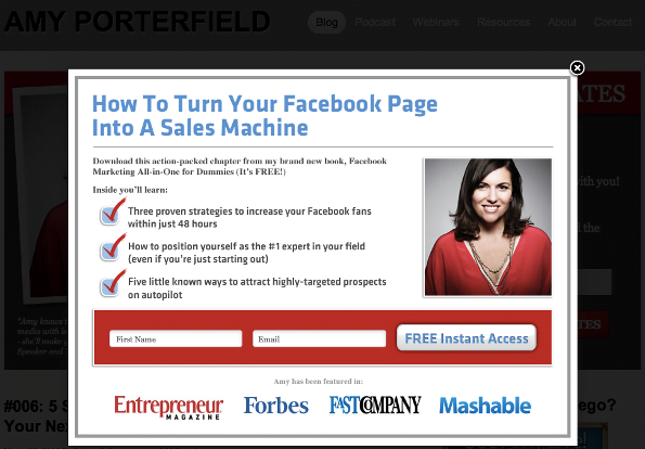
- Templates / Design Aids D. Bnonn Tennant of Kiss Metrics argues that requesting a user’s email address should be absolutely essential for the offer. Asking for an email in exchange for a downloadable file or video can be off-putting. Users generally understand they shouldn’t have to provide their email just to watch a video. However, if you’re sending them an ebook, needing their email for delivery makes sense. In fact, requesting an email for a video might lead some users to search for it on YouTube, a major marketing failure! That’s why videos weren’t included in the list above - users are accustomed to accessing them freely. The key is subtlety and discretion regarding your intentions. If the most effective offers are aligned with the requested user data, then for email opt-ins, email courses are ideal. Email courses are highly valuable for several reasons:
- Information is delivered in smaller, manageable portions, increasing the likelihood of engagement.
- A valuable email course creates anticipation for future emails, fostering a positive relationship that benefits future offers and pitches.
- Incorporating video sections within email courses enhances their value.
- As previously mentioned, an email course justifies requesting an email address, making you appear more trustworthy and less like spam.
Steps to Create a Squeeze Page
How do you build a squeeze page? Several methods exist:
- Do It Yourself: Manually create a squeeze page, similar to any other landing page.
- Specialized Generator: Numerous tools assist in generating squeeze pages. nexus-security’s new Landing Pages & Leads tool is an excellent example – its user-friendly wizard offers various templates, colors, and themes. It also assists with forms, copy, thank you pages, tracking codes, and other best practices. Give it a try!
- WordPress Plug-ins: WordPress users have access to various plug-ins offering landing page or squeeze page templates.
- WordPress Landing Pages Plugin: Landing page creation and tracking
- WordPress Easy Sign Up Plugin: Simplified signup forms for newsletters and offers
- WordPress Lead Plus Free Squeeze Page Creator: Quick and easy WordPress squeeze page templates What elements should a squeeze page include? What should it look like? The next section explores squeeze page formats and examples. Discover why everything you thought you knew about conversion rate optimization is wrong.
Comparing Two Popular Squeeze Page Formats: Splash Page vs. Pop-Up
“Squeeze page” is an umbrella term encompassing any webpage primarily designed to obtain user sign-ups for an offer. The chosen format is up to you. Two common forms are splash pages and pop-ups. Pop-Up Squeeze Pages Pop-up squeeze pages can be incredibly annoying – often appearing over content you’re trying to read, demanding your email address until you find the (often hidden) close button. A survey by Jakob Nielsen study found that 95% of users experienced a negative, even VERY negative impact on their online experience due to pop-ups. Additionally, over 50% reported that pop-ups negatively affected their perception of the advertisers. Ouch! While this study was conducted in 2004, pop-ups are still widely disliked (although some advertisers report significantly increased conversion rates from offer pop-ups). It’s crucial to carefully consider using pop-up squeeze pages. If you choose to use them, do it effectively. Effective Pop-Up: This pop-up isn’t terrible. It might block desired content, but it’s quick to read and has a visible close button.
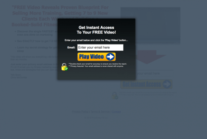
Ineffective Pop-up: This pop-up is visually unappealing and requests your email address in exchange for a video you were just about to watch. It appears spammy and likely is. There’s also no visible close button.
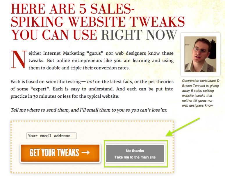
Splash Page A splash page is another squeeze page implementation method. These are custom pages users land on when first visiting your website. Utilizing a splash page as a squeeze page increases offer visibility. However, some visitors might immediately leave without ever seeing your actual homepage. To mitigate this, include a clear “no thanks” button directing users directly to your homepage. While you typically wouldn’t want to redirect users from a squeeze page, it’s different with splash pages – users are trying to access your main content. You’re simply presenting an offer before they proceed. Let them choose! If opting for a splash page, ensure its design, copy, and feel align with your regular homepage for a seamless experience. Additionally, implement a cookie so returning visitors bypass the splash page. The following splash page from Information Highway Man serves as a good example, with a prominent “take me to the normal site” button for user convenience.
Remember, using a classic landing page as a squeeze page is perfectly acceptable. The choice is yours!
Best Practices and Tips for Squeeze Page Design
Here are some optimization tips for your squeeze page design.
- Testimonials & Success Stories: Positive feedback from satisfied customers demonstrates your offer’s value. Social proof is powerful. Seeing a Facebook friend (even a distant acquaintance) download your ebook can significantly increase conversion rates.
- Video/Multimedia Elements: Videos and multimedia elements maintain visitor engagement and can convey information more effectively than text, resulting in a cleaner, less cluttered design. However, please avoid using audio. It’s rarely implemented effectively and often obnoxious or even startling. I assure you, no one will stay on your squeeze page because of a soothing voice describing the benefits of fish oil supplements.
- Color Psychology: Effective squeeze pages strategically employ color. Pay attention to contrast, white space, etc.
- Page Text Design: Make content easily digestible and scannable with headlines, bullets, etc. Highlight essential information and ensure it’s easily found and read. Explore more content design and marketing tips!
- Below the Fold Content: Remember how excessive content can deter visitors and reduce conversions? This holds true for above-the-fold content. Google isn’t fond of content-light, potentially spammy squeeze pages. The solution? Add keyword-rich content below the fold for an SEO boost while keeping the core elements (opt-in forms, bullet points, videos) at the top.
- Scarcity AKA Missing-Out-Syndrome: Scarcity elements encourage immediate action by promoting a “limited-time deal.”

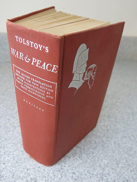
- Don’t Overwhelm with Your Offer: Few people have read Leo Tolstoy’s War & Peace. It’s considered a literary masterpiece, so why isn’t it more widely read? Its sheer size can be intimidating. Don’t let your offer be like War & Peace.
Many of us have a folder filled with massive PDF files. While extensive white paper collections might seem appealing initially, people rarely read them due to time constraints. As Kiss Metrics suggests, offer something users will use, not just should use. Unused resources hold no value.
- Minimize Form Fields: More form fields on a squeeze page generally lead to fewer conversions. Ideally, request only the email address, though some marketers prefer including a name field for personalized emails (the necessity is debatable). A clever technique involves requesting minimal information upfront and providing additional fields on the subsequent thank you page. Users might or might not complete the extra fields, but you’ve already secured their email address. Some marketers believe excessive form fields encourage fake email submissions – users might suspect you’re not just offering a free “How to Shave Your Kitten” guide. Avoid form fields that deter users. Personally, I despise providing my phone number for free offers and will often abandon the offer if it’s required.
- Highlight User Value Through Language: Emphasize the benefits and payoff of your offer. Replace generic button text like “submit” with more relevant calls to action like “Download Templates” or “Send Me My Free Kitten Shaving Guide.”

- Auto-responder email: Squeeze pages often utilize autoresponder emails to instantly deliver the offer upon form submission. You can picture users eagerly checking their inbox for your incredible kitten shaving ebook, right? Don’t keep them waiting!
- Product Images: Images enhance engagement on any webpage, including squeeze pages!
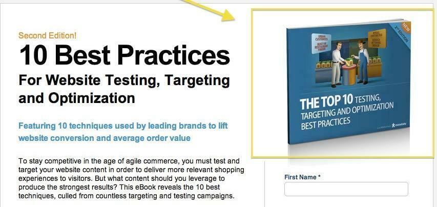
These images might not always be captivating, especially for ebooks and white papers, but any visual is better than none.
- Display Encouraging Statistics Like Download Numbers: McDonald’s boasts “Over 1 Million Served.” If your offer has a significant number of downloads, showcase it! It encourages others to join. However, wait until you have an impressive figure. “2 People Have Taken This Offer” doesn’t inspire confidence. Looking for more tips on boosting landing page conversion rates? We’ve got you covered!
Squeeze Page Examples: The Good and the Not-So-Good
Below are some examples of squeeze pages, showcasing both effective and ineffective elements. Enjoy!
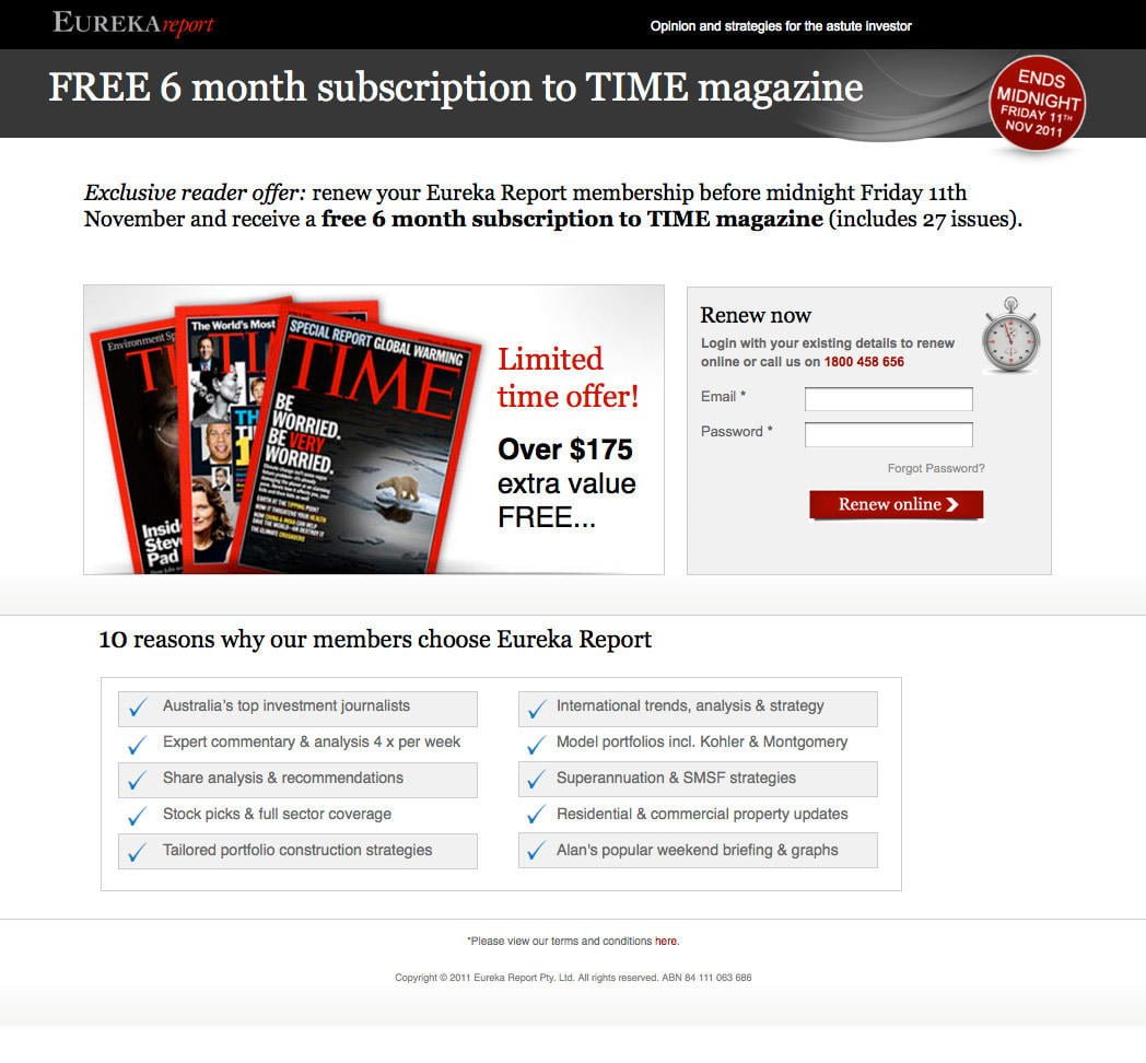
Positive Aspects:
- Relevant button text
- Scarcity elements highlighted in red to encourage action
- Short form field
- Large, bright, visually appealing image
- Minimal text, formatted with bullet points for easy readability Areas for Improvement:
- The unnumbered top 10 list seems odd
- The offer focuses on renewing with Eureka Report, but the connection feels misleading – are users signing up for Time magazine or renewing with Eureka? The lack of clarity is confusing.
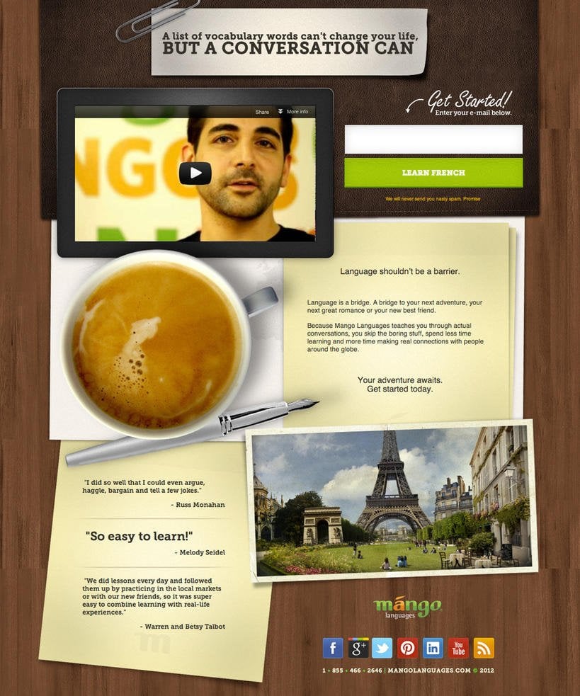
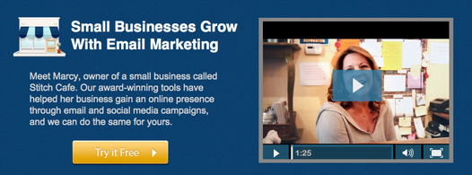
Positive Aspects:
- Sleek and visually appealing design
- Effective use of visuals and media elements with a video, coffee cup, and Eiffel tower, creating an immersive experience
- Minimal text with social sharing buttons
- Testimonials, particularly the prominent one from Melody Seidel
- Short form requesting only the email address and a large, colorful, offer-specific button Areas for Improvement:
- This example is well-executed overall.
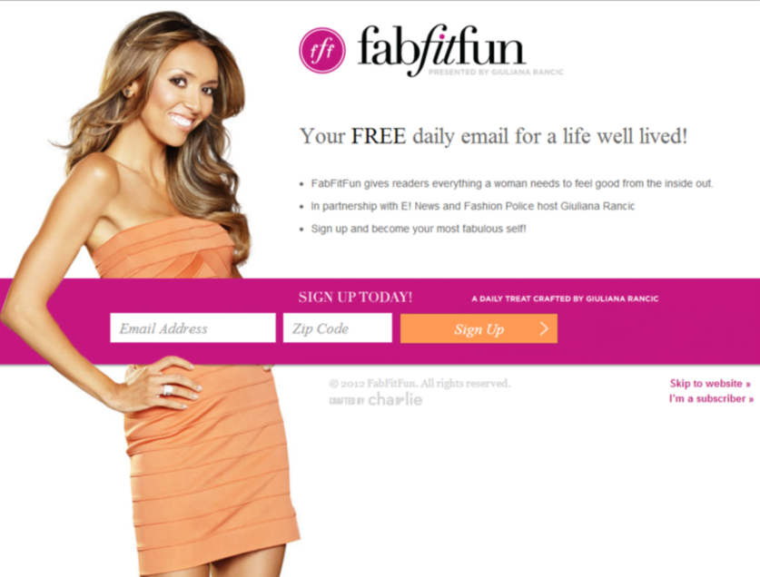
Positive Aspects:
- Eye-catching and vibrant design
- Short, horizontally formatted form field, minimizing its perceived length
- Minimal text formatted with bullet points Areas for Improvement:
- The bullet points lack compelling information to encourage sign-ups. “Everything a woman needs to feel good from the inside out” is vague.
- The “skip to website” link could be more prominent. We hope this guide to squeeze pages has been helpful. Share your tips for creating super-effective squeeze pages in the comments! Attribution**:** Several squeeze page example images taken from Unbounce, War and Peace image from [Wikicommons](https://raw.githubusercontent.com/Nexusdecode/images-549143589519/main/1722554479156.html; charset=UTF-8)