Creating maintainable and consistent CSS, especially for large and complex projects, is a significant challenge. Preprocessors, such as Sass, can be instrumental in addressing this challenge. Preprocessors are programs that transform one type of data into another. In the realm of web development, CSS preprocessors translate a specialized syntax into standard CSS. While many preprocessors exist, this article will focus on Sass and its advantages.
What Is Sass and Why Should You Use It?
For those unfamiliar with Sass, the official Sass webpage offers an excellent starting point. Sass, short for Syntactically Awesome StyleSheets, extends CSS by introducing features that enhance its power and elegance.
Sass offers numerous powerful features, with variables, extends, and mixins being among the most notable. Variables allow for storing reusable information like colors, while extends facilitate the creation of inheritable class-like structures. Mixins, conceptually similar to functions, provide reusable blocks of styles. Beyond these, Sass boasts several advantages over other preprocessors, including support for logic statements (like conditionals and loops), custom functions, integration with libraries such as Compas, and much more. These features alone can significantly boost a team’s productivity and contribute to higher-quality CSS.
The Need for a CSS Style Guide
However, even with the power of preprocessors, writing good CSS code remains a challenge. Modern web applications are growing in size and complexity, demanding scalable, readable code and minimizing spaghetti code and unused styles. A standardized approach is essential for teams to tackle these challenges. Spaghetti code, notorious for its poor quality, slowness, repetitiveness, and unmaintainability, often arises in the absence of well-defined guidelines and standards. Without a clear direction, developers tend to write code based on immediate needs and preferences, resulting in inconsistencies and inefficiencies.
Time constraints imposed by bug fixes, hotfixes, and urgent patches often lead to suboptimal code that merely solves the immediate problem without regard for maintainability. This often introduces unused CSS, further exacerbating the issue. Furthermore, the overuse of !important to achieve quick fixes leads to messy, hard-to-maintain code with unpredictable behavior. As the codebase grows, these issues become increasingly problematic.
This article aims to present a set of rules, best practices, and tips for writing better Sass, which can be collectively used as a style guide. Adhering to these guidelines can help developers avoid the aforementioned pitfalls. While the rules are grouped for easier reference, they should ideally be adopted and followed as a whole or, at the very least, in their majority.
Style Guide
This style guide’s rules and best practices stem from experiences gathered while working with numerous development teams, often through trial and error. Some are inspired by widely adopted methodologies such as BEM. While not all rules have a concrete technical rationale, their origins often lie in practical experience and ensuring consistency. For instance, enforcing consistent spacing between parentheses enhances readability. While the specific formatting choice is less important, adhering to a consistent standard across the team is paramount.

General CSS Rules
General rules should be adhered to rigorously. They primarily focus on code formatting, enhancing consistency and readability:
- Indentation should utilize spaces instead of tabs, ideally two spaces per indentation level. This is an often-debated topic, and teams are free to choose their preferred convention, as long as consistency is maintained.
- Include an empty line between statements for improved readability.
- Use one selector per line, as shown below:
| |
- Do not include spaces between parentheses.
| |
- Enclose strings and URLs within single quotes:
| |
- End all rules with a semicolon, without any preceding space:
| |
Rules for Selectors
The following rules pertain to working with selectors:
- Avoid using ID selectors. They are overly specific and are primarily intended for JavaScript interactions.
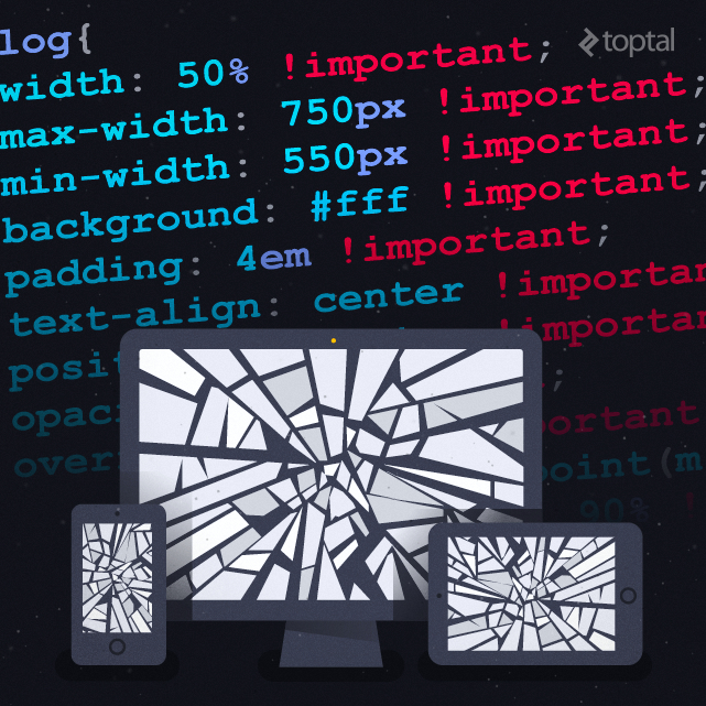
- Avoid using
!important. Its presence signals a potential issue with the CSS structure and can lead to messy and unmaintainable stylesheets when overused. - Refrain from using the child selector. Similar to ID selectors, child selectors introduce tight coupling with the HTML structure.
Maintaining Order in Sass Rules
Consistency extends to the order of rules within stylesheets. A consistent order improves code comprehension and reduces the time spent navigating the codebase. The recommended order is as follows:
- Start with
@extendto highlight inherited styles. - Follow with
@includeto provide visibility into mixins and functions applied. - Write standard CSS class or element rules next.
- Place nested pseudo-classes and pseudo-elements before other nested elements.
- Finally, include other nested selectors as demonstrated below:
| |
Naming Conventions
The naming conventions presented here draw inspiration from the widely adopted BEM and SMACSS methodologies. BEM, short for Block, Element, Modifier, developed by the YANDEX team, aims to clarify the relationship between HTML and CSS within a project. SMACSS, which stands for Scalable and Modular Architecture for CSS, provides a set of guidelines for structuring CSS for improved maintainability.
Drawing from these, the recommended naming conventions are as follows:
- Use prefixes for each element type. For example, use
l-for layouts,m-for modules, andis-for states. - Use two underscores to denote child elements:
| |
- Use two dashes to indicate modifiers:
| |
Variables
Leverage variables extensively. Begin with global variables like colors in a separate file, such as _colors.scss. If a value is repeated throughout the stylesheet, create a variable for it. Please DRY. You’ll appreciate this practice when making future changes, as it centralizes modifications.
Use hyphens to separate words in variable names:
| |
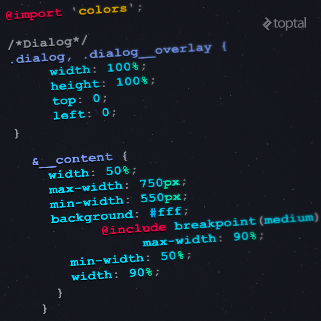
Media Queries
Sass allows for writing media queries as element queries. Instead of relegating them to separate files or the bottom of the stylesheet, consider nesting them as follows:
| |
This approach results in the following CSS output:
| |
Nested media queries clearly highlight overridden rules, especially when used with named media queries.
Create a mixin like this for named media queries:
| |
For further information on naming media queries, refer to these articles: Naming Media Queries and Write Better Media Queries with Sass.
Other Considerations
Finally, keep the following recommendations in mind:
- Avoid writing vendor prefixes manually. Utilize a tool like autoprefixer for this purpose.
- Limit nesting to a maximum of three levels deep. Exceeding this limit often indicates overly complex selectors and diminishes readability. Remember that CSS is meant to style the HTML structure, not replicate it.
| |
- Avoid exceeding 50 lines of nested code, or establish a reasonable limit suitable for your team. Excessively long blocks of code can hinder readability and make it difficult to fit within the editor window.
- Use a main file to import all blocks, partials, and configurations.
- Maintain a consistent import order, starting with vendor and global dependencies, followed by authored dependencies, layouts, patterns, and finally, parts and blocks. This prevents conflicts and ensures that vendor styles, which are typically outside our control, take precedence.
- Don’t hesitate to break down code into smaller, manageable files.
Conclusion
The aim of this style guide is to provide guidance on enhancing Sass code quality. Note that most of the tips and rules discussed here are also applicable to Vanilla CSS and other preprocessors. Feel free to adapt the rules to align with your team’s preferences. Ultimately, the key is to establish a clear style guide, whether it’s adapting this one, adopting another, or creating a custom solution, and commit to writing exceptional code.