In the realm of mobile A/B testing, many marketers stumble by equating mobile visitors with their desktop counterparts. They design landing pages primarily for desktop and then rely on generic, template-based responsive design to adapt those pages for mobile. This approach fails to consider the distinct behaviors and requirements of mobile users.
This misapplied desktop-centric approach leads to a substantial 270% gap between desktop and mobile conversions. Marketers overlook the crucial difference in mindset and context between these user groups. The crux of mobile conversion lies in recognizing that mobile devices aren’t mere substitutes for desktops; their usage patterns and purposes are entirely different.

Given the behavioral and cognitive disparities between mobile and desktop users, it is paramount for marketers to discern these nuances and tailor experiences that cater specifically to the mobile mindset.
Identifying Weak Points in Your Mobile Funnel
The journey toward an enhanced mobile experience begins with pinpointing the areas where your mobile funnel falters. This involves analyzing existing data and visitor behavior using tools like Google Analytics and heatmaps to gain a deeper understanding of mobile user behavior. Here are some essential basic mobile metrics to initiate this exploration:
- Mobile Audience & Devices – Our objective is to understand our mobile visitors better by identifying their key characteristics. This metric helps determine the devices and browsers visitors utilize. Rather than undertaking a complete mobile site overhaul, this data pinpoints the devices requiring immediate optimization, thus saving time and resources.
- Mobile Acquisition – Uncover the most effective referral sources for mobile traffic and the channels that yield the highest and lowest ROI specifically on mobile, as these might differ from desktop trends.
- Mobile Behavior Metrics – Next, we analyze visitor actions on your landing pages. Identify your top landing pages and their respective bounce rates on mobile. For a broader, more insightful perspective, examine “exit pages.” Determine the pages where visitors leave after navigating past the initial step of your landing page.
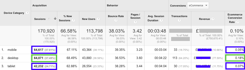
- Device Behavior – This metric delves into technical aspects like site speed, revealing the time taken for your landing pages to load on various browsers and devices. By cross-referencing data on top used devices and browsers with site speed, you gain a clearer understanding of whether the optimization process necessitates design adjustments, technical improvements, or both. A cursory glance at Google Analytics can shed light on your current situation. Notice how this specific site experiences comparable levels of mobile and desktop traffic. However, a stark 260% discrepancy exists in e-commerce conversions and overall revenue. This signifies substantial revenue loss.
Having identified mobile visitor behavior patterns, we can then formulate a testing hypothesis. This hypothesis should revolve around strategic landing page optimizations aimed at generating quantifiable, comprehensible, and scalable results. Testing a well-defined hypothesis, as opposed to random elements on your mobile landing page, offers valuable insights into the emotional state and behavioral needs of your customers. Outlined below are some mobile testing concepts, best practices, and illustrative examples of mobile A/B tests that you can implement. Executing such AB tests over the past few years has not only boosted signups and registrations for our clients but has also provided deeper insights into their mobile visitors’ needs.
Mobile Test #1: Experiment with Strategic Images to Uncover Your Unique Selling Proposition
Humans process process visuals more rapidly than text, making them a primary focal point for visitors landing on your page. Their impact is further amplified considering the limited real estate available on mobile screens. A frequent tactic employed by marketers is showcasing a straightforward product image. While seemingly logical, this approach fails to convey why the product surpasses competitors or what benefits it offers to the visitor. Testing strategically chosen visuals and images can yield significantly improved results and provide richer insights into the mobile visitor’s mindset. Leveraging colors and strategic imagery effectively triggers emotional responses in visitors, effectively communicating your USP and accelerating conversions. Our preferred methodology when testing images to create an impact and cater to mobile visitor mindset involves conducting visual tests that contrast the visitor’s current state of mind with the desired state. For instance, a home insurance company employing this approach might test an image depicting a worried individual to represent the current state. The desired state, in contrast, would showcase a happy and secure family. These images represent either the family’s current emotional state or the aspired state attainable by investing in the company’s insurance. Testing both images reveals which emotional touchpoint holds greater sway over the customer’s purchasing decision. In the example below, the original landing page designed by the client featured a product image promoting their software:

Our variation shifted focus to the peace of mind and sense of security customers experience after purchasing the software:

Instead of highlighting the product, we emphasized the desired state of mind of the mobile visitor. Our variation resulted in a 78% increase in signups and a 15% rise in purchases. These test results illuminated the target audience’s priorities and guided our content selection when optimizing other landing page elements, such as testimonials, headlines, and call-to-action buttons. Engage in brainstorming sessions with your team and engage with customers to better grasp the emotional value proposition of your product or service. Translate these insights into more meaningful A/B tests for images used on your mobile landing pages.
Mobile Test #2: A/B Test Strategic Headlines
Subjecting your landing page headline to A/B testing provides another straightforward method to experiment with different strategies and decipher visitor preferences: current state vs. desired state. Similar to image testing, avoid superficial headline tweaks; instead, prioritize testing distinct hypotheses related to your value proposition. For instance, rather than stating “The #1 Dating Site in the World,” a dating platform could test “Join Millions of Happy Couples.” This shift redirects the headline’s focus away from the company and towards the customer, revealing customer priorities. When used effectively, headlines can effectively convey your unique selling proposition and differentiate you from competitors, particularly when paired with the right image. In the following example, the company’s tagline across all landing pages was “The #1 Commission Software for Businesses.”

As part of our testing hypothesis, we experimented with the headline “Lead Your Team to Success,” resulting in a 97% surge in qualified leads.

The test results also provided valuable insights into customer expectations from a value perspective, enabling us to conduct numerous A/B tests centered around their value proposition.
Mobile Test #3: Deconstruct Forms into Sections
The form submission experience differs significantly between desktop and mobile platforms. While navigating and completing a multi-field form is relatively simple on a larger screen, this process becomes cumbersome and frustrating on smaller mobile devices. This often leads to visitors abandoning the landing page altogether. To address this, experiment with breaking down lengthy forms into manageable sections. Identify the most critical piece of information for your business and request only that initially. Once visitors take this first step, their investment increases, making them more likely to complete the remaining form sections. A significant advantage of this approach on mobile is that even if a visitor doesn’t complete the entire form, you still capture their email address or phone number. The example below illustrates the continuation of our tests for the same B2B company. We tested a two-step form: Step 1:

And Step 2:
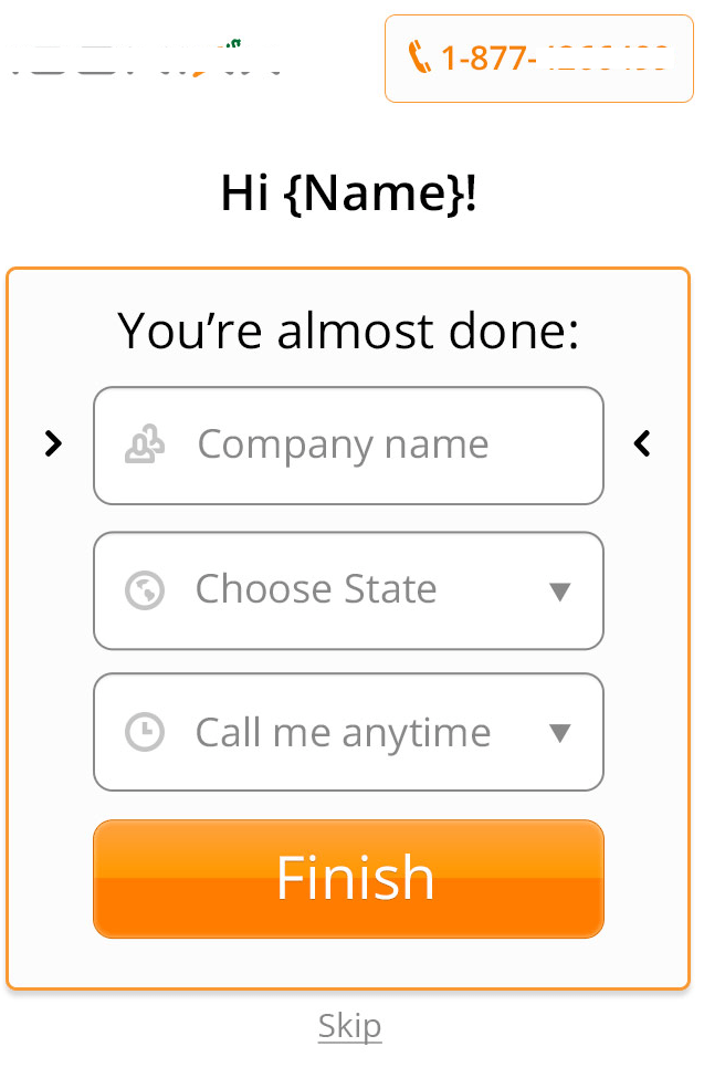
This modification led to a further 55% increase in leads, providing the sales team with richer customer information for subsequent calls.
Mobile Test #4: Test Mobile Overlays
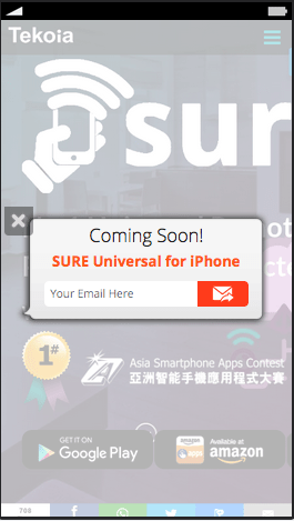
Given that most landing pages are designed with desktop users in mind, mobile visitors often struggle to find what they’re looking for. Cramming the same volume of content, visuals, calls-to-action, and other elements onto a smaller screen hinders focus for mobile visitors, often resulting in page abandonment. To direct mobile visitor attention toward a single element and encourage conversion, consider testing overlays featuring a single call-to-action. A specific call-to-action overlay, such as a “Call Now” or “Download the App” button, helps mobile visitors achieve their goals, reduces frustration, and minimizes page abandonment. For example, our client Tekoia offers an Android app but hadn’t yet released an iOS version. As illustrated below, their initial landing page automatically condensed all content for mobile screens, displaying three call-to-action buttons and various social sharing buttons above the fold.

Desktop Version

Mobile Version This resulted in nine calls to action, potentially confusing mobile visitors. To ensure that only relevant users were prompted to download the app, we implemented a simple overlay that dynamically detects the visitor’s device and serves the appropriate offer (using our in-house solution, Banana Splash, developed over the past two years). Android users now see a dedicated Google Play button, while iOS users are encouraged to subscribe for updates about the upcoming iOS app release. iOS Version:
Android Version:

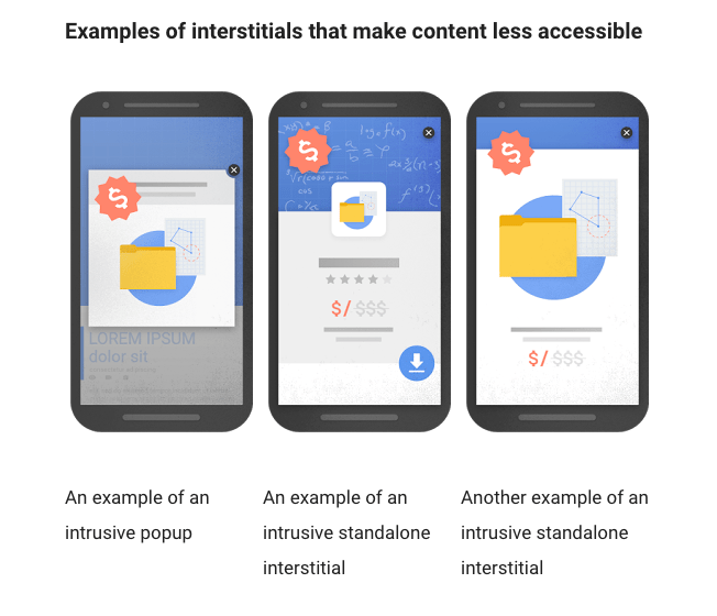
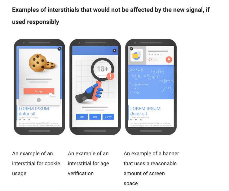
This segmentation strategy led to a 110% increase in relevant app downloads and generated thousands of relevant subscribers eagerly awaiting the iOS launch. Google’s new policy concerning mobile interstitials and pop-ups marks a positive development for mobile experiences. This revised approach prioritizes relevant pop-ups that enhance the mobile user’s journey on the site. Websites employing intrusive pop-ups that obstruct content, lack clear exit mechanisms, or offer irrelevant content will face penalties.
Testing different overlay formats saves significant time and resources as it doesn’t require a complete landing page redesign. Instead, it involves simple adjustments based on test results.
Mobile Test #5: Enhance Trust by Testing a Native Look and Feel
User mindsets shift depending on the device they’re using. When designing dedicated mobile landing pages for your campaigns, consider experimenting with different aesthetics. For instance, iPhone users are accustomed to a particular interface, while Android users are more comfortable with the Android aesthetic. Replicating the experience familiar to each user group can significantly improve conversion rates. Examine your device reports in Google Analytics to identify patterns and discern if a specific device type dominates usage.
Next Steps for an Improved Mobile Experience
A successful mobile landing page hinges on understanding the distinct expectations of mobile visitors. Prioritize the mobile user, delve into their characteristics, and start exploring ways to optimize your existing responsive design or create dedicated landing pages for mobile users. Implementing these five A/B test ideas encourages a departure from generic best practices and facilitates meaningful, data-driven tests. This, in turn, equips you with the insights needed to tailor your website and offerings to effectively meet the specific needs and expectations of mobile visitors.