This article concludes our three-part series exploring X (formerly Twitter) cluster analyses using R and Gephi. In the first installment, we analyzed heated online discussion surrounding famed Argentine footballer Lionel Messi; part 2 deepened the analysis by focusing on key players and topic dissemination. While Twitter rebranded as X in July 2023, replacing “tweet” and “retweet” with other terms, the underlying data science principles and strategies we cover remain relevant.
Political discourse often leads to polarization. When distinct communities with widely divergent viewpoints emerge online, their Twitter activity tends to cluster tightly around two main groups, with minimal interaction between them. This phenomenon exemplifies homophily, the human inclination to engage primarily with like-minded individuals.
Our previous article delved into computational methods for analyzing Twitter data, leveraging Gephi to generate insightful visualizations](https://gephi.org/). Now, let’s employ cluster analysis to extract meaningful conclusions from these techniques and pinpoint the most informative aspects of social data.
To highlight clustering, we’ll shift our focus to US political data from May 10-20, 2020, employing the same Twitter data acquisition process as before but targeting the then-president’s name instead of “Messi.”
The following visualization represents the interaction graph of this political conversation. Similar to our first article, we used Gephi’s ForceAtlas2 layout to plot the data and color-coded the communities identified by the Louvain algorithm.

Let’s delve deeper into the nuances of this data.
Unpacking Cluster Composition
As emphasized throughout this series, we can characterize clusters by their influential figures. However, Twitter offers a wealth of additional data for analysis. Take, for instance, the user description field, a space for brief user biographies. Word clouds enable us to uncover common self-descriptors within these descriptions. The code snippet below generates two word clouds, one for each cluster, based on word frequency in user descriptions, revealing how these self-portrayals can be collectively informative:
| |
Past US election data underscores the strong geographical segregation of voters](https://www.nytimes.com/interactive/2021/upshot/2020-election-map.html). Building on our identity analysis, let’s examine the place_name field, where users often indicate their location. The following R code generates word clouds based on this field:
| |
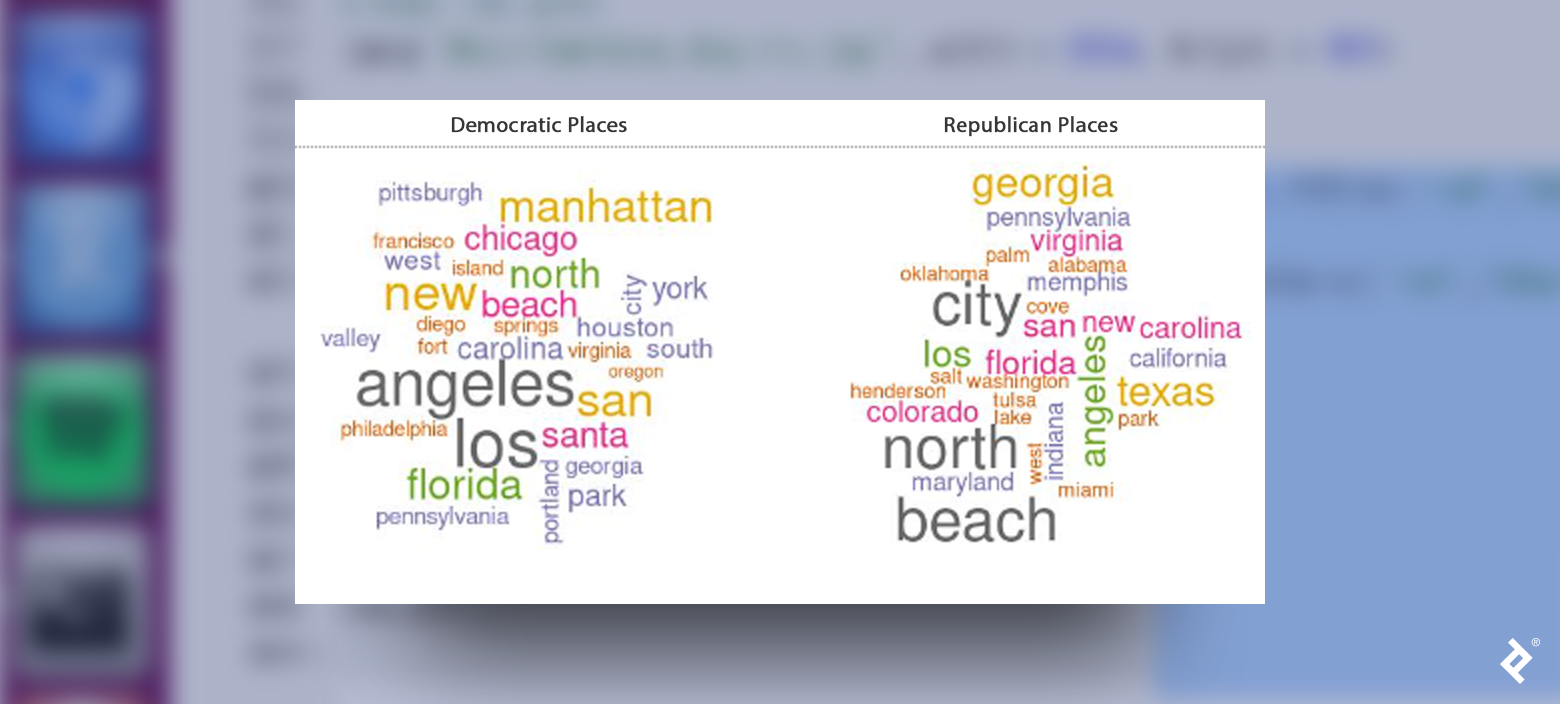
While some locations might appear in both word clouds due to the presence of both Republican and Democratic voters in most areas, certain states like Texas, Colorado, Oklahoma, and Indiana exhibit a strong Republican affiliation. Conversely, cities like New York, San Francisco, and Philadelphia show a strong Democratic correlation.
Deciphering User Behavior
Shifting our focus to user behavior, let’s investigate the distribution of account creation dates within each cluster. A uniform distribution would suggest no correlation between creation date and cluster affiliation.
The histogram below illustrates this distribution:
| |

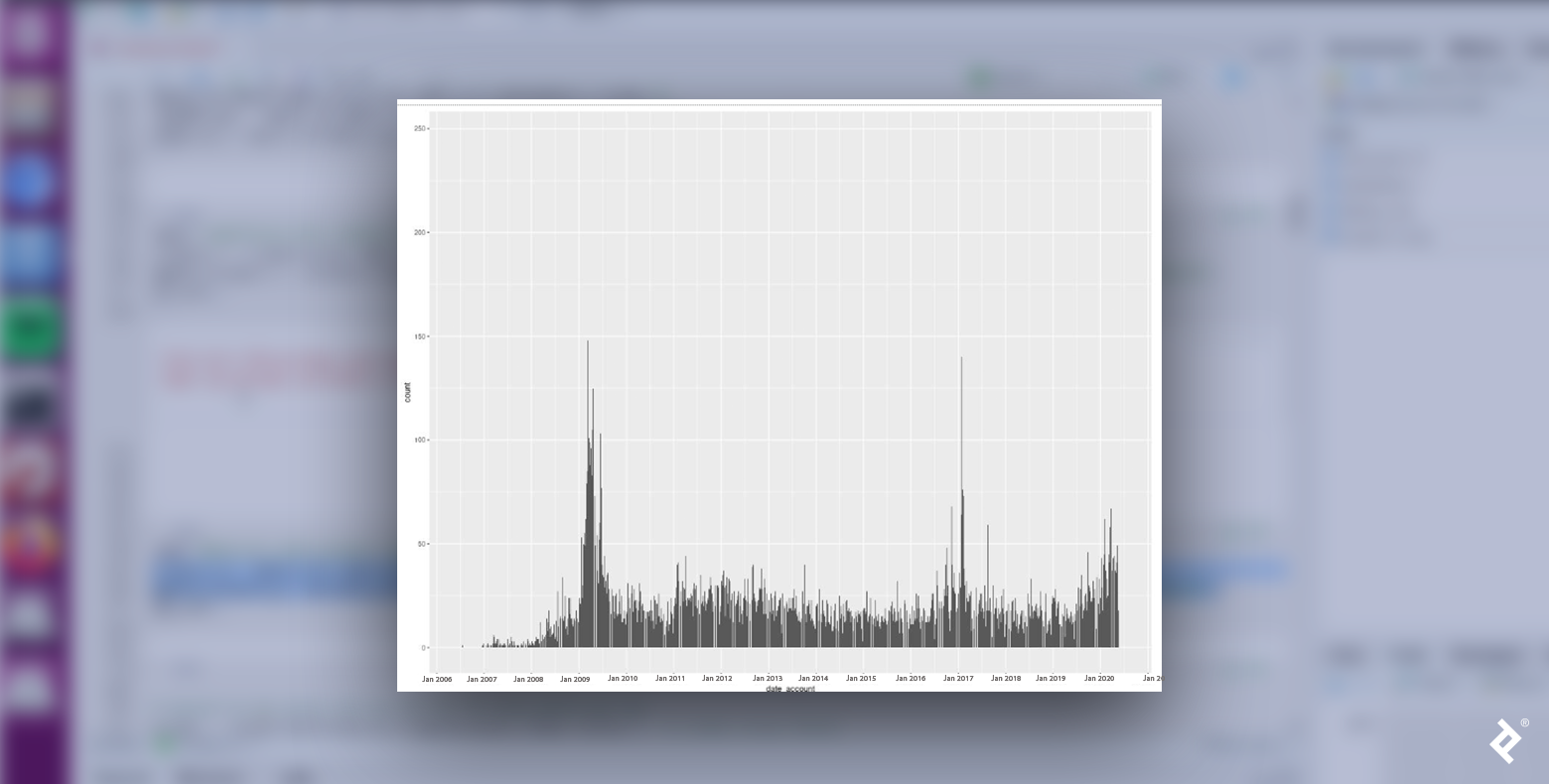
Clearly, Republican and Democratic users are not uniformly distributed. Both groups experienced surges in new accounts in January 2009 and January 2017, coinciding with presidential inaugurations following the November elections of the preceding years. This pattern suggests a potential link between proximity to these events and heightened political engagement, aligning with our focus on political tweets.
Intriguingly, the most significant peak for Republicans arises in mid-2019, culminating in early 2020. Could this behavioral shift reflect digital habits shaped by the pandemic?
Democrats also saw a spike during this period, albeit less pronounced. Perhaps Republican supporters exhibited a larger surge due to stronger sentiments regarding COVID lockdowns? Delving into political science knowledge, theories, and findings would be necessary to formulate more robust hypotheses. Nevertheless, this data reveals fascinating trends worthy of political analysis.
Another avenue for comparing behavior is analyzing how users retweet and reply. Retweets amplify messages, while replies contribute to specific conversations or debates. A high reply count often indicates a tweet’s contentious, unpopular, or divisive nature, while favoriting signifies agreement. Let’s examine the ratio measure between tweet favorites and replies.
Given the principle of homophily, we’d anticipate users to predominantly retweet those within their community. We can verify this using R:
| |

As expected, Republicans tend to retweet fellow Republicans, and the same holds true for Democrats. Now, let’s observe how party affiliation influences tweet replies.

A strikingly different pattern emerges. While users are more likely to reply to tweets from those who share their political leaning, retweeting within their group remains significantly more prevalent. Additionally, individuals outside these two primary clusters seem more inclined to engage in replies.
Employing the topic modeling technique outlined in part two, we can predict the conversation topics users are likely to engage in with in-group versus out-group members.
The following table highlights the two most prominent topics for each interaction type:
| Democrats to Democrats | Democrats to Republicans | Republicans to Democrats | Republicans to Republicans | ||||
| Topic 1 | Topic 2 | Topic 1 | Topic 2 | Topic 1 | Topic 2 | Topic 1 | Topic 2 |
| fake | people | trump | americans | news | biden | people | china |
| putin | covid | news | trump | fake | obama | money | news |
| election | virus | fake | dead | cnn | obamagate | country | people |
| money | taking | lies | people | read | joe | open | media |
| trump | dead | fox | deaths | fake_news | evidence | back | fake |
Fake news appears to be a hot-button issue in replies. Regardless of their affiliation, users replying to those from the opposing party tended to discuss news sources favored by their respective sides. Within their groups, Democrats focused on Putin, election integrity, and COVID, while Republicans emphasized ending lockdowns and Chinese disinformation.
Polarization in Action
Polarization is a pervasive pattern in social media, extending far beyond the US. We’ve explored how to analyze community identity and behavior within a polarized context. These tools empower anyone to conduct cluster analysis on data sets of interest, uncovering patterns and generating insights that can both inform and inspire further exploration.
Also in This Series:
Social Network Analysis in R and Gephi: Digging Into Twitter
Understanding Twitter Dynamics With R and Gephi: Text Analysis and Centrality