This is the second part of a three-part series about analyzing Twitter clusters using R and Gephi. Part one established the foundation for the example we’ll explore in detail here; part three utilizes cluster analysis to analyze polarized posts about US politics and draw conclusions.
Importance of Nodes in Social Networks
Before we begin, it’s essential to understand the concept of centrality. In the realm of network science, centrality refers to nodes that hold significant sway over the network. However, “influence” itself can be interpreted in numerous ways. Is a node with numerous connections inherently more influential than one with fewer but potentially more significant connections? What defines a “significant connection” within a social network?
To tackle these complexities, network scientists have devised various centrality measures. We’ll delve into four frequently used measures, noting that many more exist.
Degree Centrality
The most prevalent and easily grasped measure is degree centrality. Its premise is straightforward: a node’s influence is gauged by the number of connections it possesses. Variations exist for directed graphs; you can assess indegree (hub score) and outdegree (authority score).
Our previous exploration utilized the undirected approach. This time, we’ll concentrate on the indegree approach. This allows for a more precise analysis by prioritizing users who are frequently retweeted over those who simply retweet often.
Eigenvector Centrality
The eigenvector measure expands on degree centrality. The more influential nodes that link to a particular node, the higher its score. We start with an adjacency matrix, where rows and columns denote nodes. A 1 or 0 signifies whether the corresponding nodes in a given row and column are linked. The primary calculation determines the eigenvectors of this matrix. The principal eigenvector houses the desired centrality measures, with position i containing the centrality score of node i.
PageRank
PageRank is a variant of the eigenvector measure that lies at the heart of Google’s search algorithm. While Google’s exact method remains undisclosed, the fundamental idea involves each node starting with a score of 1 and then distributing this score evenly among its outgoing edges. For instance, a node with three outgoing edges would “send” one-third of its score through each edge. Simultaneously, a node’s importance is boosted by the edges that point towards it. This results in a solvable system of N equations with N unknowns.
Betweenness Centrality
The fourth measure, betweenness centrality, employs a distinct approach. Here, a node’s influence is determined by its presence on numerous short paths connecting other nodes. Essentially, it plays a crucial role in connecting various parts of the network.
In social network analysis, such nodes could represent individuals who excel at helping others secure new jobs or establish novel connections—they act as gateways to previously unexplored social circles.
Choosing the Right Centrality Measure
The ideal centrality measure hinges on your analytical objective. Do you aim to identify users frequently highlighted by others in terms of sheer volume? Degree centrality might be the optimal choice. If you prioritize a quality-focused measure, eigenvector or PageRank would be more suitable. If pinpointing users who effectively bridge different communities is paramount, betweenness centrality is your best bet.
When employing multiple similar measures, like eigenvector and PageRank, calculate both and compare their rankings. Discrepancies can prompt further analysis or the creation of a new measure by combining their scores.
Alternatively, utilize principal component analysis to determine which measure provides deeper insights into the true influence wielded by nodes within your network.
Practical Centrality Calculation
Let’s explore how to calculate these measures using R and RStudio (achievable with Gephi as well).
Begin by loading the necessary libraries:
| |
Next, remove isolated nodes from our existing data, as they are inconsequential for this analysis. Employ the igraph functions betweenness, centr_eigen, page_rank, and degree to compute centrality measures. Store the scores within the igraph object and a data frame to identify the most central users.
| |
Now, let’s examine the top 10 most central users based on each measure:
| Degree | |
| Eigenvector | |
| PageRank | |
| Betweenness | |
Here are the results:
| Degree | Eigenvector | PageRank | Betweenness | ||||
|---|---|---|---|---|---|---|---|
| ESPNFC | 5892 | PSG_inside | 1 | mundodabola | 0.037 | viewsdey | 77704 |
| TrollFootball | 5755 | CrewsMat19 | 0.51 | AleLiparoti | 0.026 | EdmundOris | 76425 |
| PSG_inside | 5194 | eh01195991 | 0.4 | PSG_inside | 0.017 | ba*****lla | 63799 |
| CrewsMat19 | 4344 | mohammad135680 | 0.37 | RoyNemer | 0.016 | FranciscoGaius | 63081 |
| brfootball | 4054 | ActuFoot_ | 0.34 | TrollFootball | 0.013 | Yemihazan | 62534 |
| PSG_espanol | 3616 | marttvall | 0.34 | ESPNFC | 0.01 | hashtag2weet | 61123 |
| IbaiOut | 3258 | ESPNFC | 0.3 | PSG_espanol | 0.007 | Angela_FCB | 60991 |
| ActuFoot_ | 3175 | brfootball | 0.25 | lnstantFoot | 0.007 | Zyyon_ | 57269 |
| FootyHumour | 2976 | SaylorMoonArmy | 0.22 | IbaiOut | 0.006 | CrewsMat19 | 53758 |
| mundodabola | 2778 | JohnsvillPat | 0.2 | 2010MisterChip | 0.006 | MdeenOlawale | 49572 |
Observe that the initial three measures share users like PSG_inside, ESPNFC, CrewsMat19, and TrollFootball, implying their significant influence on the discussion. Betweenness, with its different approach, exhibits less overlap.
Note: Opinions expressed by the mentioned Twitter accounts do not represent those of Toptal or the author.
Below are visualizations of our original color-coded network graph with user label overlays. The first highlights nodes by PageRank scores; the second, by betweenness scores:


These visualizations can be recreated using Gephi. Calculate betweenness or PageRank scores via the Network Diameter button within the statistics panel. Display node names using attributes as demonstrated in the first part of this series.
Analyzing Text with R and LDA
Social network discussions can be analyzed to uncover conversation topics. One approach is topic modeling using Latent Dirichlet Allocation (LDA), an unsupervised machine learning technique that helps identify sets of co-occurring words. We can then infer the discussed topic from these word sets.
First, we need to clean up the text using the following function:
| |
We also need to eliminate stop words, duplicate entries, and empty entries. Subsequently, convert our text into a format suitable for LDA processing: a document-term matrix.
Our dataset includes users communicating in various languages (English, Spanish, French, etc.). For optimal LDA performance, focusing on a single language is recommended. We’ll apply it to users within the largest community identified in the previous part, primarily consisting of English-speaking accounts.
| |
Determining Optimal Topic Count
A crucial LDA hyperparameter is the number (k) of topics to estimate. A common approach involves training LDA models with varying k values and evaluating the coherence of each model. We’ll test k values from 3 to 20, as values outside this range are generally less insightful based on experience:
| |
Now, let’s visualize the coherence score for each k:
| |
A higher coherence value signifies better topic segmentation within the text:
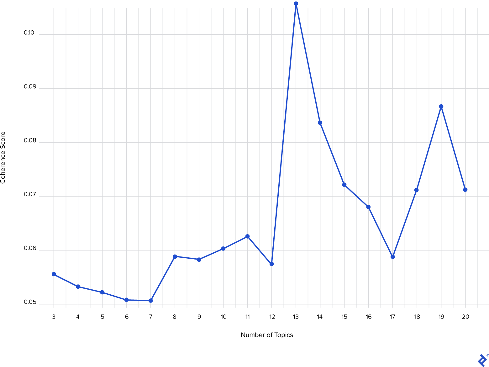
With k = 13 yielding the peak coherence score, we’ll proceed with the LDA model trained using 13 topics. Utilizing the GetTopTerms function, we can extract the 10 principal words for each topic and infer the topic’s meaning:
| |
The following table presents the five most prominent topics detected and their representative 10 principal words:
| t_1 | t_2 | t_3 | t_4 | t_5 | |
|---|---|---|---|---|---|
| 1 | messi | messi | messi | messi | messi |
| 2 | lionel | league | est | psg | |
| 3 | lionel_messi | post | win | il | leo |
| 4 | psg | million | goals | au | leo_messi |
| 5 | madrid | likes | ch | pour | ahora |
| 6 | real | spo | ions | pas | compa |
| 7 | barcelona | goat | ch_ions | avec | va |
| 8 | paris | psg | ucl | du | ser |
| 9 | real_madrid | bar | ballon | qui | jugador |
| 10 | mbapp | bigger | world | je | mejor |
While English dominates this community, French and Spanish speakers are also present (t_4 and t_5). We can deduce that the first topic revolves around Messi’s former team (FC Barcelona), the second concerns Messi’s Instagram post, and the third centers on Messi’s accomplishments.
Having identified the topics, we can determine the most discussed one. Begin by concatenating tweets by user (again, within the largest community):
| |
Next, sanitize the text and generate the DTM. Then, call the predict function, supplying our LDA model and DTM as arguments. Set the method to Gibbs for enhanced computational speed due to the substantial text volume:
| |
The com1.users.topics data frame now contains information on each user’s engagement with each topic:
| Account | t_1 | t_2 | t_3 | t_4 | t_5 | […] |
|---|---|---|---|---|---|---|
| ___99th | 0.02716049 | 0.86666666 | 0.00246913 | 0.00246913 | 0.00246913 | |
| Boss__ | 0.05185185 | 0.84197530 | 0.00246913 | 0.00246913 | 0.00246913 | |
| Memphis | 0.00327868 | 0.00327868 | 0.03606557 | 0.00327868 | 0.00327868 | |
| ___Alex1 | 0.00952380 | 0.00952380 | 0.00952380 | 0.00952380 | 0.00952380 | |
| […] |
Finally, leverage this information to create a new node graph attribute indicating the most discussed topic by each user. Generate a new GML file for visualization in Gephi:
| |

Summary and Next Steps
In this installment, we built upon our initial exploration by introducing additional criteria for identifying influential users. We also learned to detect and interpret conversation topics and visualize them within the network.
The next article delves further into analyzing clustered social media data, providing users with valuable tools for deeper exploration.
Also in This Series:
Social Network Analysis in R and Gephi: Digging Into Twitter
Mining for Twitter Clusters: Social Network Analysis With R and Gephi