When working on large projects or collaborating with other developers, our code can often become disorganized, hard to understand, and challenging to expand upon. This is especially noticeable when revisiting the code after a period of time, as it requires us to recall the mindset we had during its initial development.
To address this, many developers have adopted CSS architectures to structure their code and enhance its readability. SMACSS, which stands for Scalable and Modular Architecture for CSS, is one such approach. Developed by Jonathan Snook, this set of CSS architecture guidelines has become my preferred method for organizing styles.
It’s important to note that SMACSS differs from CSS frameworks like Bootstrap or Foundation. Instead of providing pre-built components, it offers a set of rules and principles that act as a template or guide. Let’s delve into some CSS design patterns within the SMACSS framework to see how they can make our code more robust, organized, understandable, and modular.
Every SMACSS project structure consists of five main categories:
- Base
- Layout
- Modules
- State
- Theme
Base
In SMACSS, base styles establish the default appearance of elements across the entire page. Think of them as your starting point. If you’re using a reset stylesheet, it ensures consistent styling across different browsers by accounting for variations in their default CSS.
Base styles should primarily utilize bare element selectors or those combined with pseudo-classes. Avoid using class or ID selectors unless absolutely necessary, such as when overriding styles for third-party plugins.
Here’s an example of how a base style file might look:
| |
As you can see, it encompasses default values for sizes, margins, colors, borders, and other properties that will be used consistently throughout the website. Your typography and form elements should have unified styles that maintain a cohesive design and theme across all pages.
While not specific to SMACSS, I highly recommend minimizing the use of !important and deep nesting. We’ll discuss these concepts in more detail later. If you prefer using reset CSS, this is the appropriate place to include it. Since I work with Sass, I include it directly at the top of the file instead of copying or referencing it separately in each page’s <head> element.
Layout
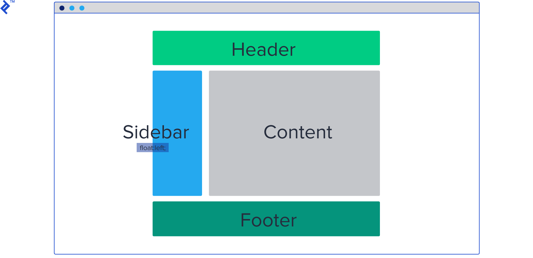
Layout styles are responsible for dividing the page into major sections. These are not smaller components like navigation or accordions, but rather the top-level divisions of your content:
Within these layout sections, you’ll place various CSS modules like boxes, cards, unordered lists, galleries, and so on. We’ll explore modules more thoroughly in the next section.
To illustrate, let’s consider a typical web page and identify its layout components:

In this example, we have a header, main content area, and a footer. Each of these layouts contains modules such as links, logos (header), boxes, articles (main content), and copyright information (footer).
Layout styles are typically assigned ID selectors since they represent unique sections that don’t repeat on the page. It’s also good practice to prefix layout style rules with the letter l to differentiate them from module styles.
Within your layout styles, you’ll typically define properties specific to the layout itself, such as borders, alignments, margins, and potentially background colors.
Here’s an example of how layout styles might be structured:
| |
You can also include helper classes for alignments, allowing you to easily position elements or text by adding the appropriate class to their parent or directly to the element.
For instance, you could create a default margin class like .l-margin with a margin of 20px. Whenever you need padding for a container, element, card, or box, simply apply the l-margin class to it. The goal is to create reusable styles:
| |
Avoid tightly coupled styles that are specific to a single element:
| |
Let’s take a moment to discuss naming conventions in SMACSS. Namespacing in CSS involves adding a prefix to element names to prevent conflicts. But why is this necessary?
Imagine you’re styling a label and create a class called .label. Later on, you encounter another element that you also want to style as a label, but with different styles. This creates a naming conflict.
Namespacing helps resolve this by providing a unique identifier for each style. While both elements might be conceptually labeled, their different namespaces (prefixes) allow them to have distinct styles:
| |
Module
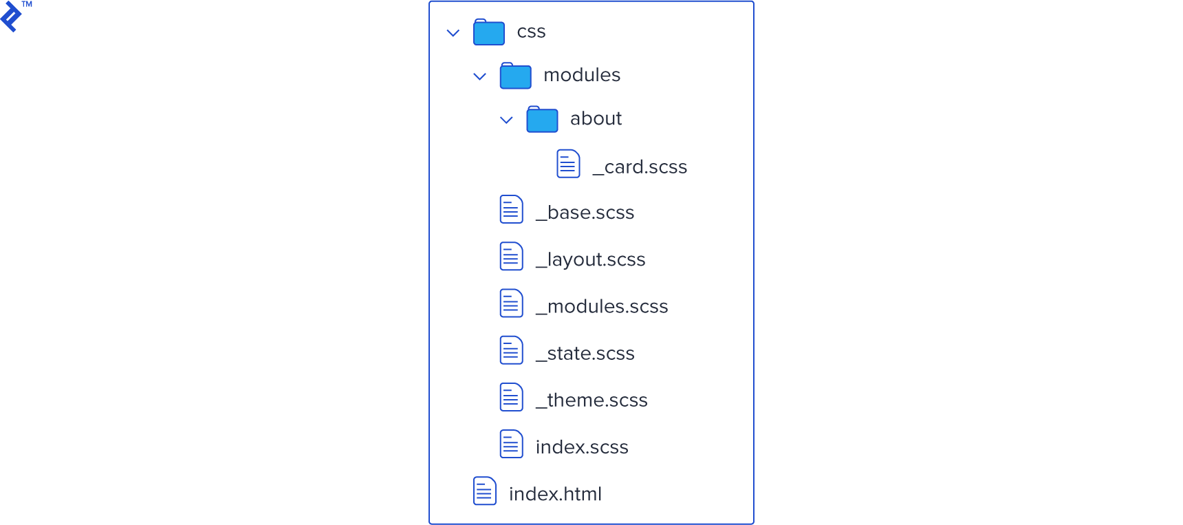
As previously mentioned, SMACSS modules are smaller, reusable chunks of code that reside within a specific layout. It’s best practice to store these modules in a separate folder, especially as your project grows. You can further organize modules by features/pages:
In our previous example, we had an article, which can be treated as a module. How should the CSS for this module be structured? We could have a class .article containing child elements for the title and text. To maintain consistency within the module, we prefix the child elements:
| |
You might notice the use of two hyphens after the module prefix. This is because module names can sometimes consist of multiple words or have their own prefixes. The double hyphen helps to clearly distinguish the child element from the module name: big-article-title vs. big-article--title and big-article--text.
Modules can also be nested within each other, particularly if a module occupies a significant portion of the page:
| |
In this example, box and list are both modules, with list nested inside box. Therefore, list--li is a child of the list module, not the box module.
One of the key principles here is to limit yourself to a maximum of two selectors per CSS rule, ideally aiming for a single selector with prefixes.
This practice minimizes code duplication, avoids redundant selectors on child elements with the same name, and ultimately improves performance. It also helps us steer clear of using !important rules, which are often indicative of poorly structured CSS.
Good (note the single selector):
| |
Bad (note the repetition within selectors and the overlapping reference method):
| |
State
In SMACSS, state refers to the different visual representations of modules based on user interactions or dynamic changes. It essentially dictates how elements should look in various scenarios.
For example, a jQuery accordion would utilize states to control the visibility of its content. State styles help us define the appearance of an element at a specific point in time.
State styles are applied to the same element as layout styles, acting as an additional rule that can override previous styles. Since they are applied last, they take precedence in the cascade.
Similar to layout styles, it’s helpful to use prefixes for state styles. This enhances their visibility and emphasizes their priority. A common prefix for state styles is is, as in is-hidden or is-selected.
| |
| |
In certain cases, the use of !important might be justified within state styles, particularly when dealing with JavaScript-driven modifications that occur after the initial render. For instance, you might have an element that is hidden by default and you want to reveal it on a button click.
If the default style is deeply nested:
| |
simply adding:
| |
won’t be sufficient because the more specific rule will take precedence.
Instead, you can define the state class like this:
| |
This approach helps differentiate state modifiers from layout styles, which are only applied on page load, while still adhering to the principle of minimal selectors.
Theme
As the name suggests, theme styles encompass the visual aspects that define the overall look and feel of your website. This includes primary colors, shapes, borders, shadows, and other stylistic elements that are used consistently.
Instead of redefining these styles repeatedly, we can create a dedicated theme unit that houses all the unique visual treatments. These styles can then be applied to default elements as needed.
| |
| |
It’s important not to confuse SMACSS theme rules with base rules. While base rules focus on establishing default appearances and often involve resetting browser styles, theme rules are responsible for the final visual presentation and the unique identity of your design.
Theme rules are particularly useful for websites with multiple styles or themes that can be switched dynamically. For instance, you might have a theme switcher that allows users to toggle between different color schemes. By centralizing theme styles, you can easily manage and update the overall visual aesthetic of your site.
CSS Organization Methodologies
This overview has covered some of the key concepts of the SMACSS architecture. For a more in-depth understanding, I encourage you to visit the official website of SMACSS and explore its principles further.
While more advanced methodologies like OOCSS and BEM](https://medium.com/@Intelygenz/how-to-organize-your-css-with-oocss-bem-smacss-a2317fa083a7) exist, SMACSS provides a great starting point for those seeking a simpler and more approachable way to structure their CSS. BEM selectors, while powerful, can sometimes feel overly complex and verbose.
If you’re looking for a straightforward approach that is easy to grasp, implement, and maintain consistency within your team, SMACSS is an excellent choice. Its clear guidelines make it easy for new team members to understand the existing codebase and start contributing immediately without deviating from the established style. SMACSS is a focused CSS architecture that delivers on its promise of scalability and modularity.