It’s common for developers to need UI elements not offered by their target platform, or that lack specific features. The solution is custom UI components.
Android’s UI model is inherently adaptable, allowing for customization, testing, and creating custom UI components in several ways:
Extend an existing component (like TextView, ImageView), adding or modifying functionality. For instance, a CircleImageView extending ImageView could override onDraw() to display images as circles and add a loadFromFile() function.
Combine components: This uses Layouts to position elements. An example is a LabeledEditText extending LinearLayout horizontally, containing a TextView label and an EditText input field.
This method can utilize the previous one, using native or custom internal components.
The most flexible, but complex, approach is creating a component from scratch. This involves inheriting the View class and overriding functions like onMeasure() for layout and onDraw() for content. These components rely heavily on Android’s 2D drawing API.
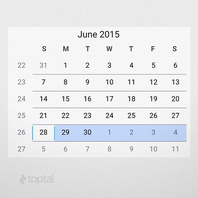
Customizing Android: The CalendarView
Android provides a native CalendarView component. It’s functional, showing a month and highlighting the current day. It might look fine for a native style, but customization is limited.
For instance, you can’t change how days are marked or the background color. Adding custom text or graphics, like for special occasions, is not possible. It looks like this:
CalendarView in AppCompact.Light theme.Creating a Custom Calendar
So, how do you create a custom calendar view? Any approach works, but practicality often rules out 2D graphics, leaving the other two. We’ll combine them here.
You can find the source code here.
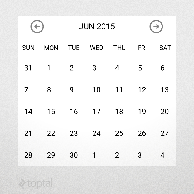
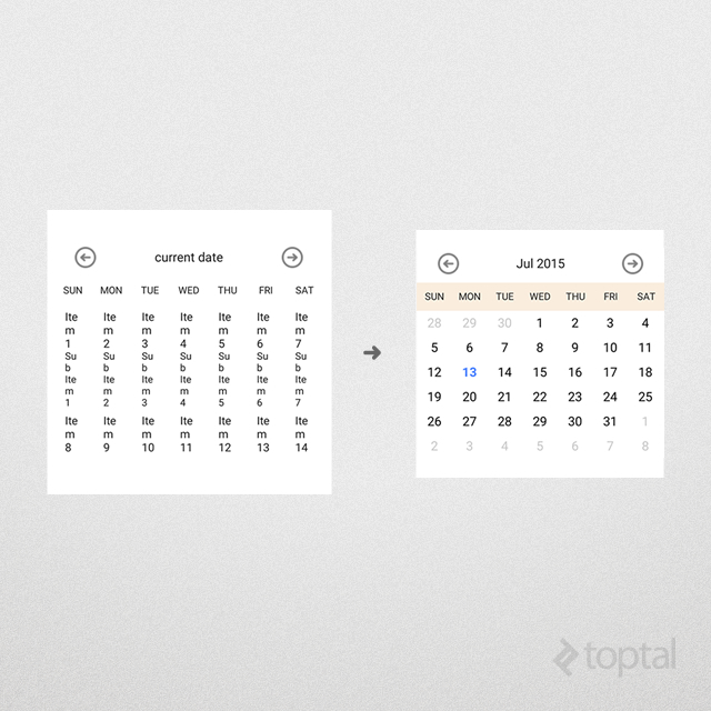
1. Layout
We’ll display days in a grid, with the month name and navigation buttons at the top:
Custom calendar view.The layout file, control_calendar.xml, looks like this (repetitive markup is shortened):
 1
 2
 3
 4
 5
 6
 7
 8
 9
10
11
12
13
14
15
16
17
18
19
20
21
22
23
24
25
26
27
28
29
30
31
32
33
34
35
36
37
38
39
40
41
42
43
44
45
46
47
48
49
50
51
52
53
54
55
56
57
58
59
60
61
62
63
64
65
66
67
68
69
70
71
72
| <?xml version="1.0" encoding="utf-8"?>
<LinearLayout
xmlns:android="http://schemas.android.com/apk/res/android"
android:orientation="vertical"
android:layout_width="match_parent"
android:layout_height="match_parent"
android:background="@android:color/white">
<!-- date toolbar -->
<RelativeLayout
android:layout_width="match_parent"
android:layout_height="wrap_content"
android:paddingTop="12dp"
android:paddingBottom="12dp"
android:paddingLeft="30dp"
android:paddingRight="30dp">
<!-- prev button -->
<ImageView
android:id="@+id/calendar_prev_button"
android:layout_width="30dp"
android:layout_height="30dp"
android:layout_centerVertical="true"
android:layout_alignParentLeft="true"
android:src="@drawable/previous_icon"/>
<!-- date title -->
<TextView
android:id="@+id/calendar_date_display"
android:layout_width="wrap_content"
android:layout_height="wrap_content"
android:layout_centerVertical="true"
android:layout_toRightOf="@+id/calendar_prev_button"
android:layout_toLeftOf="@+id/calendar_next_button"
android:gravity="center"
android:textAppearance="@android:style/TextAppearance.Medium"
android:textColor="#222222"
android:text="current date"/>
<!-- next button -->
<ImageView
android:id="@+id/calendar_next_button"
... Same layout as prev button.
android:src="@drawable/next_icon"/>
</RelativeLayout>
<!-- days header -->
<LinearLayout
android:id="@+id/calendar_header"
android:layout_width="match_parent"
android:layout_height="40dp"
android:gravity="center_vertical"
android:orientation="horizontal">
<TextView
android:layout_width="0dp"
android:layout_height="wrap_content"
android:layout_weight="1"
android:gravity="center_horizontal"
android:textColor="#222222"
android:text="SUN"/>
... Repeat for MON - SAT.
</LinearLayout>
<!-- days view -->
<GridView
android:id="@+id/calendar_grid"
android:layout_width="match_parent"
android:layout_height="340dp"
android:numColumns="7"/>
</LinearLayout>
|
2. Component Class
This layout works within an Activity or Fragment, but encapsulation as a UI component promotes modularity.
Our UI component will be a LinearLayout:
 1
 2
 3
 4
 5
 6
 7
 8
 9
10
11
12
13
14
15
16
17
18
19
20
21
22
23
24
25
26
27
28
29
30
31
32
33
| public class CalendarView extends LinearLayout
{
// internal components
private LinearLayout header;
private ImageView btnPrev;
private ImageView btnNext;
private TextView txtDate;
private GridView grid;
public CalendarView(Context context)
{
super(context);
initControl(context);
}
/**
* Load component XML layout
*/
private void initControl(Context context)
{
LayoutInflater inflater = (LayoutInflater)
context.getSystemService(Context.LAYOUT_INFLATER_SERVICE);
inflater.inflate(R.layout.control_calendar, this);
// layout is inflated, assign local variables to components
header = (LinearLayout)findViewById(R.id.calendar_header);
btnPrev = (ImageView)findViewById(R.id.calendar_prev_button);
btnNext = (ImageView)findViewById(R.id.calendar_next_button);
txtDate = (TextView)findViewById(R.id.calendar_date_display);
grid = (GridView)findViewById(R.id.calendar_grid);
}
}
|
This code inflates the XML layout and assigns internal controls to variables.
3. Adding Logic
For calendar functionality, we need some logic:
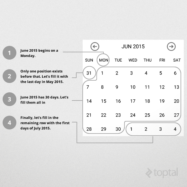
The calendar is seven days wide, with all months starting in the first row.
Determine the starting position of the month, filling preceding positions with previous month’s days.
Fill in the current month’s days.
Fill remaining positions in the last row(s) with next month’s days.
This diagram illustrates the process:
Custom calendar view business logic.A six-row grid (42 days) accommodates all cases. Using Android’s date functions simplifies handling different month lengths.
The updateCalendar() function implements this:
 1
 2
 3
 4
 5
 6
 7
 8
 9
10
11
12
13
14
15
16
17
18
19
20
21
22
23
24
25
26
| private void updateCalendar()
{
ArrayList<Date> cells = new ArrayList<>();
Calendar calendar = (Calendar)currentDate.clone();
// determine the cell for current month's beginning
calendar.set(Calendar.DAY_OF_MONTH, 1);
int monthBeginningCell = calendar.get(Calendar.DAY_OF_WEEK) - 1;
// move calendar backwards to the beginning of the week
calendar.add(Calendar.DAY_OF_MONTH, -monthBeginningCell);
// fill cells (42 days calendar as per our business logic)
while (cells.size() < DAYS_COUNT)
{
cells.add(calendar.getTime());
calendar.add(Calendar.DAY_OF_MONTH, 1);
}
// update grid
((CalendarAdapter)grid.getAdapter()).updateData(cells);
// update title
SimpleDateFormat sdf = new SimpleDateFormat("MMM yyyy");
txtDate.setText(sdf.format(currentDate.getTime()));
}
|
4. Customization
To customize day display, we’ll use an Adapter. Our CalendearView needs:
- Bold blue text for the current day.
- Grayed-out days outside the current month.
- A special icon for event days.
- Season-based header colors.
The first three are simple. Here’s a CalendarAdapter implementation:
 1
 2
 3
 4
 5
 6
 7
 8
 9
10
11
12
13
14
15
16
17
18
19
20
21
22
23
24
25
26
27
28
29
30
31
32
33
34
35
36
37
38
39
| @Override
public View getView(int position, View view, ViewGroup parent)
{
// day in question
Date date = getItem(position);
// today
Date today = new Date();
// inflate item if it does not exist yet
if (view == null)
view = inflater.inflate(R.layout.control_calendar_day, parent, false);
// if this day has an event, specify event image
view.setBackgroundResource(eventDays.contains(date)) ?
R.drawable.reminder : 0);
// clear styling
view.setTypeface(null, Typeface.NORMAL);
view.setTextColor(Color.BLACK);
if (date.getMonth() != today.getMonth() ||
date.getYear() != today.getYear())
{
// if this day is outside current month, grey it out
view.setTextColor(getResources().getColor(R.color.greyed_out));
}
else if (date.getDate() == today.getDate())
{
// if it is today, set it to blue/bold
view.setTypeface(null, Typeface.BOLD);
view.setTextColor(getResources().getColor(R.color.today));
}
// set text
view.setText(String.valueOf(date.getDate()));
return view;
}
|
For season-based colors, we’ll add colors to /res/values/colors.xml:
1
2
3
4
| <color name="summer">#44eebd82</color>
<color name="fall">#44d8d27e</color>
<color name="winter">#44a1c1da</color>
<color name="spring">#448da64b</color>
|
Then, define an array mapping months to seasons:
1
2
3
4
5
6
7
8
9
| // seasons' rainbow
int[] rainbow = new int[] {
R.color.summer,
R.color.fall,
R.color.winter,
R.color.spring
};
int[] monthSeason = new int[] {2, 2, 3, 3, 3, 0, 0, 0, 1, 1, 1, 2};
|
In updateCalendar(), we select the color based on the month and season:
1
2
3
4
5
6
| // set header color according to current season
int month = currentDate.get(Calendar.MONTH);
int season = monthSeason[month];
int color = rainbow[season];
header.setBackgroundColor(getResources().getColor(color));
|
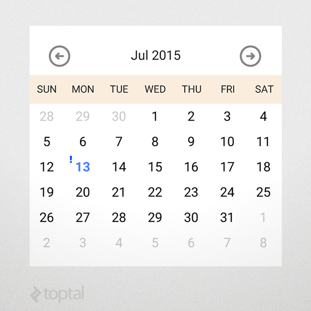
This gives us:
Header color changes according to season.Note: Due to HashSet’s object comparison, we replace eventDays.contains(date) with:
 1
 2
 3
 4
 5
 6
 7
 8
 9
10
11
| for (Date eventDate : eventDays)
{
if (eventDate.getDate() == date.getDate() &&
eventDate.getMonth() == date.getMonth() &&
eventDate.getYear() == date.getYear())
{
// mark this day for event
view.setBackgroundResource(R.drawable.reminder);
break;
}
}
|
5. Design-Time Appearance
We can call updateCalendar() in the constructor to improve the design-time view:
For performance, use isInEditMode() to limit data loading in the designer.
6. Using the Component
Include the component in XML layouts (see activity_main.xml):
1
2
3
4
| <samples.aalamir.customcalendar.CalendarView
android:id="@+id/calendar_view"
android:layout_width="match_parent"
android:layout_height="wrap_content"/>
|
Retrieve and interact with it:
1
2
3
4
5
| HashSet<Date> events = new HashSet<>();
events.add(new Date());
CalendarView cv = ((CalendarView)findViewById(R.id.calendar_view));
cv.updateCalendar(events);
|
This displays the current day with an event marker:
CalendarView displaying an event7. Adding Attributes
We can add attributes for customization via XML. Let’s add a dateFormat attribute:
1
2
3
4
5
| <resources>
<declare-styleable name="CalendarDateElement">
<attr name="dateFormat" format="string"/>
</declare-styleable>
</resources>
|
Use it in the layout:
1
2
3
4
5
6
| <samples.aalamir.customcalendar.CalendarView
xmlns:calendarNS="http://schemas.android.com/apk/res/samples.aalamir.customcalendar"
android:id="@+id/calendar_view"
android:layout_width="match_parent"
android:layout_height="wrap_content"
calendarNS:dateFormat="MMMM yyyy"/>
|
And implement it:
1
2
3
| TypedArray ta = getContext().obtainStyledAttributes(attrs, R.styleable.CalendarView);
dateFormat = ta.getString(R.styleable.CalendarView_dateFormat);
|
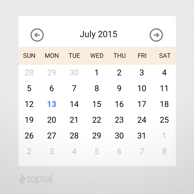
Now, the UI designer will reflect the chosen date format:
Changing the CalendarView attributes.8. Handling Events
To handle events like long-presses, we can add a listener:
1
2
3
4
5
6
7
8
9
10
11
12
13
14
15
16
17
| // long-pressing a day
grid.setOnItemLongClickListener(new AdapterView.OnItemLongClickListener()
{
@Override
public boolean onItemLongClick(AdapterView<?> view, View cell, int position, long id)
{
// handle long-press
if (eventHandler == null)
return false;
Date date = view.getItemAtPosition(position);
eventHandler.onDayLongPress(date);
return true;
}
});
|
We can then report these events. One way is through an interface:
1
2
3
4
| public interface EventHandler
{
void onDayLongPress(Date date);
}
|
The parent can provide an implementation:
1
2
3
4
5
6
7
8
9
10
11
12
13
14
15
16
17
18
19
20
21
22
23
24
| @Override
protected void onCreate(Bundle savedInstanceState)
{
super.onCreate(savedInstanceState);
setContentView(R.layout.activity_main);
HashSet<Date> events = new HashSet<>();
events.add(new Date());

CalendarView cv = ((CalendarView)findViewById(R.id.calendar_view));
cv.updateCalendar(events);
// assign event handler
cv.setEventHandler(new CalendarView.EventHandler()
{
@Override
public void onDayLongPress(Date date)
{
// show returned day
DateFormat df = SimpleDateFormat.getDateInstance();
Toast.makeText(MainActivity.this, df.format(date), LENGTH_SHORT).show();
}
});
}
|
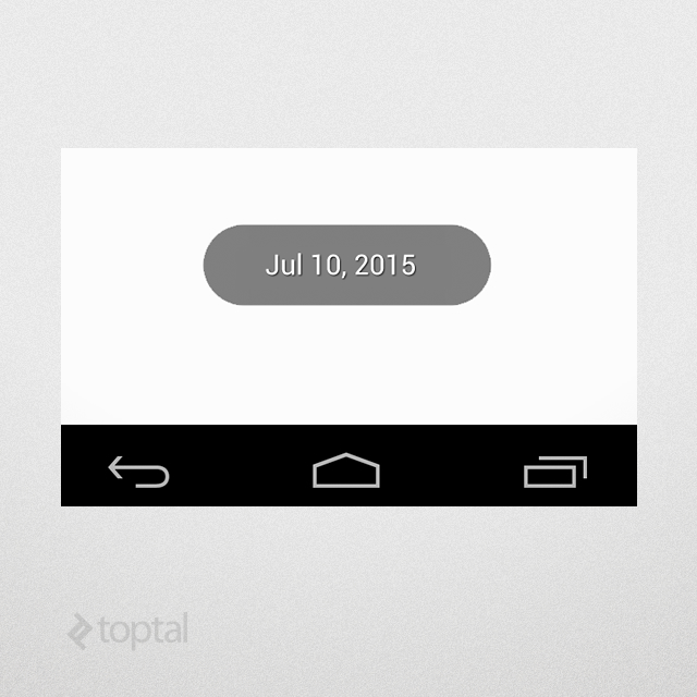
Long-pressing a day now triggers this handler:
Another option is using Android’s Intents and BroadcastReceivers for broadcasting events to multiple receivers.
Conclusion
Behold the awesome power of Android customization!
To create custom components:
- Design the XML layout.
- Derive your class from a suitable parent.
- Add logic and use attributes for customization.
- Use
isInEditMode() for better design-time experience.
This calendar view example demonstrates the process, but you can create any component you need!
Good luck with your coding!