Flexible box, often shortened to Flexbox, is a collection of CSS properties introduced in 2009 to offer a powerful, innovative layout system. Flexbox is considered part of CSS3 (the third version of CSS).
You likely already utilize many CSS3 properties, such as box-shadow, border-radius, and background gradients. However, Flexbox hasn’t reached the level of widespread use that it deserves. This could be attributed to several factors, including significant changes during its development, limited support in Internet Explorer 10, or the fact that Flexbox represents a comprehensive ecosystem while earlier paradigms relied primarily on individual, ready-made properties.
Flexbox is incredibly powerful and offers a broad spectrum of options to create CSS flex layouts that were previously only imaginable.
This guide will lead you through the fundamentals of Flexbox and illustrate how you can leverage its capabilities to build impressive Flexbox layouts, which would have otherwise necessitated complex CSS workarounds or even JavaScript.
Why Should You Use Flexbox?
By default, HTML block-level elements arrange themselves vertically. To align them horizontally, you typically need to rely on CSS properties like float or manipulate the display property with table-like or inline-block settings.
When using float (left or right), you are required to clear the wrapper at some point to prevent it from overlapping subsequent elements. Additionally, float restricts you to organizing elements solely in a horizontal manner.
Alternatively, you can manipulate the display property to achieve your desired layout. However, this approach often feels cumbersome, not to mention repetitive, and often results in a fragile layout that may not render consistently across browsers. This method is especially ineffective when targeting multiple devices with varying screen sizes—a common requirement today.
That’s where Flexbox comes in!
By applying a simple rule to a parent element, you can effortlessly control the layout behavior of all its children.
Flexbox empowers you to:
- Reverse the order of elements within a Flexbox parent container.
- Wrap child elements into columns (the number of columns can adjust dynamically based on child and parent height).
- Define the rate at which elements expand or contract when the viewport size changes.
- Control whether elements can shrink or not, regardless of the specified width unit type (relative or absolute).
- Modify the order of elements using CSS (combining this with media queries unlocks limitless possibilities for your layout flow).
- Create intricate element distributions that are equidistant with surrounding space or just space between them.
- Generate “renegade” elements that flow differently (all elements to the left but one to the right, top/bottom…the choice is yours).
- And, crucially, eliminate the need for the clear-fix hack altogether!
Flexbox can seem challenging initially. It’s arguably easier to learn ten unrelated CSS properties than five interconnected ones. However, with your existing CSS knowledge and some guidance from this article, you’ll be well on your way to mastering a new realm of CSS possibilities.
Understanding the Fundamentals of Flexbox
Display
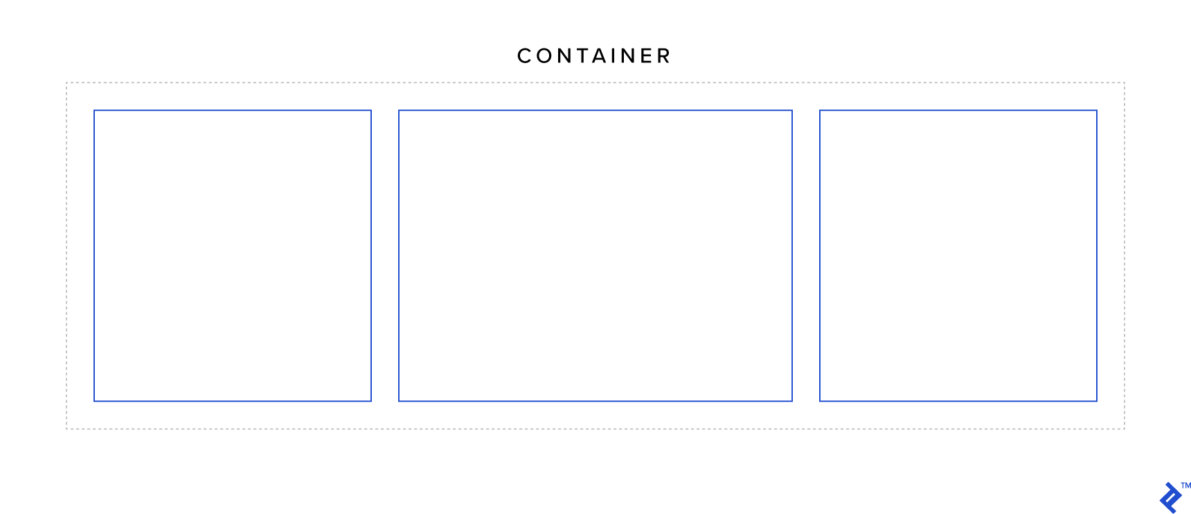
The display property is one of the most fundamental properties in CSS and holds significant importance in the context of Flexbox. It is used to define a flex container.
Two possible values can be assigned to create a flex container: flex and inline-flex.
The key difference between the two is that a display: flex container behaves like a block-level element, while a display: inline-flex container behaves like an inline-block element. Additionally, elements with display: inline-flex will expand if there’s insufficient space to accommodate their children. Beyond these distinctions, the behavior of the two is largely the same.
Try experimenting with the code sample provided below. Reduce the viewport width when inline-flex is active and…observe what happens as you scroll.
| |
Flex Direction
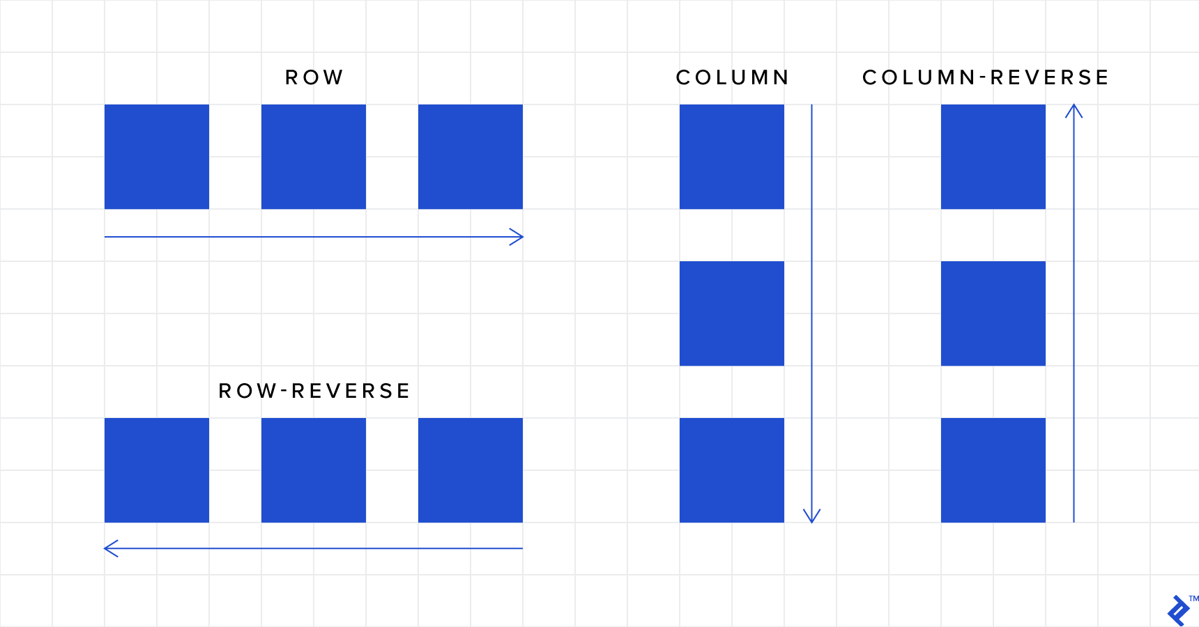
As you observed in the first example, the default behavior is to arrange elements in a single row. However, there’s more to it:
- row (default): Arranges the elements from left to right (this order reverses if the RTL (right-to-left) direction is set).
- row-reverse: Reverses the order of elements within a row arrangement.
- column: Arranges the elements vertically from top to bottom.
- column-reverse: Reverses the order of elements within a column arrangement.
Tip: The values
columnandcolumn-reverseeffectively swap the axes. This means properties that typically affect the horizontal axis will now affect the vertical axis, and vice versa.
| |
Flex Wrap
If you revisit the first code example, you’ll notice that child elements within a flex container don’t wrap by default. This is where the flex-wrap property comes in:
- nowrap (default): Prevents the items within a flex container from wrapping.
- wrap: Wraps items as necessary into multiple rows (or columns, depending on the
flex-directionsetting). - wrap-reverse: Similar to
wrap, but the number of rows (or columns) increases in the opposite direction as items are wrapped.
| |
Flex Flow
You have the option to combine the flex-direction and flex-wrap properties into a single property called flex-flow.
| |
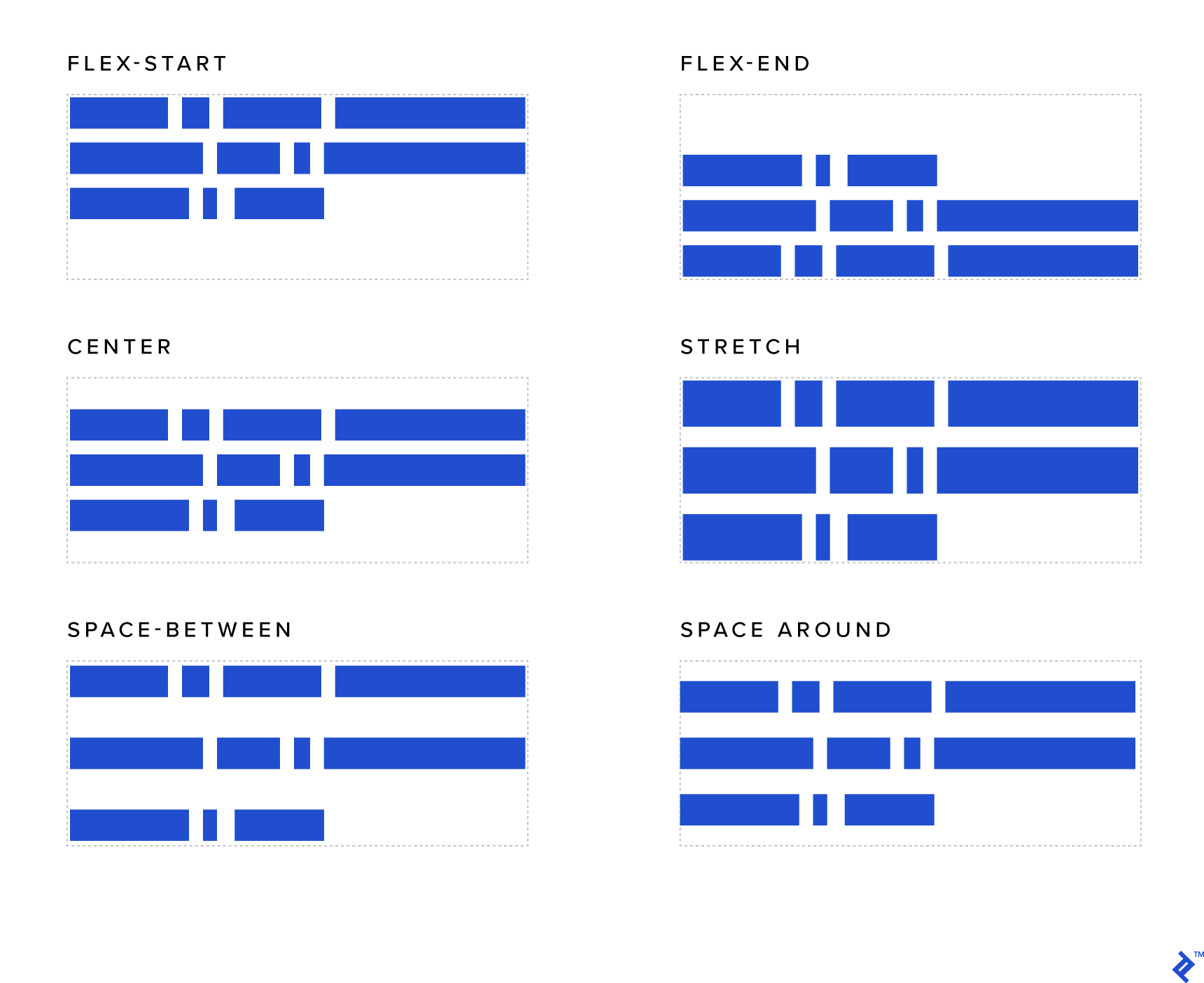
Justify Content
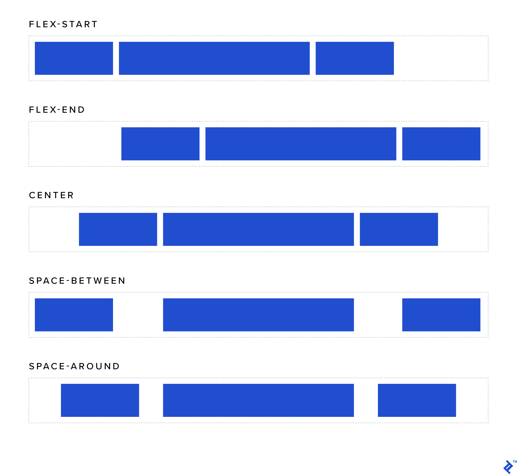
This property allows you to control how child elements are aligned horizontally within their container:
- flex-start (default): Elements are aligned to the left (similar to how inline elements behave with
text-align: left). - flex-end: Elements are aligned to the right (similar to inline elements with
text-align: right). - center: Elements are horizontally centered (similar to inline elements with
text-align: center). - space-around (where the magic begins): Each element will be rendered with an equal amount of space around it. Keep in mind that the space between two adjacent child elements will be double the amount of space between the outermost elements and the edges of the container.
- space-between: Similar to
space-around, except the elements will be separated by the same distance, and there will be no space at either edge of the container.
Note: Recall that
flex-direction, when set tocolumnorcolumn-reverse, switches the axes. In such cases,justify-contentwill affect vertical alignment instead of horizontal.
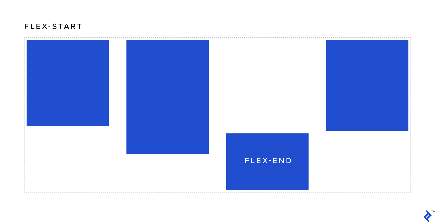
Align Items
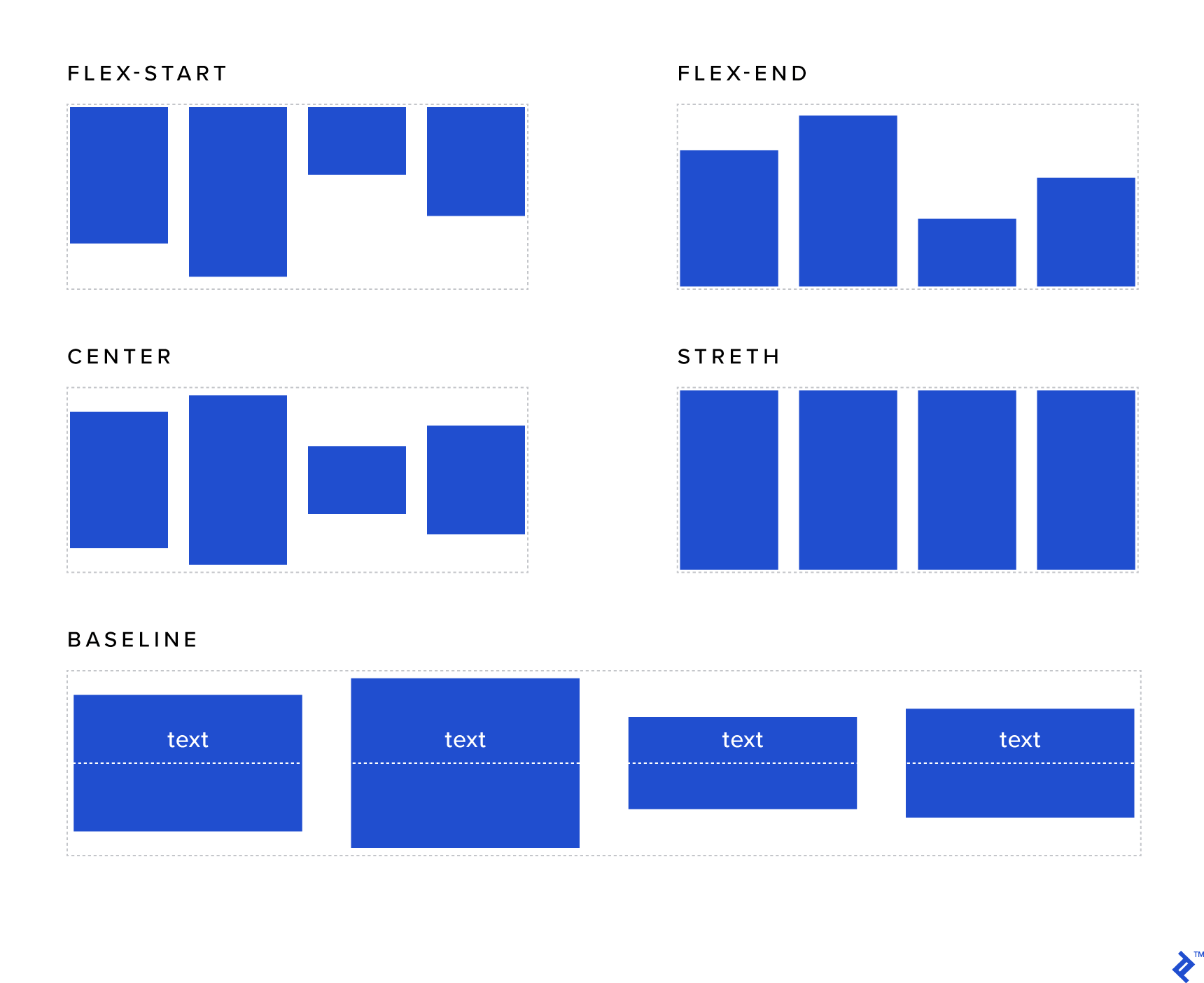
The align-items property shares similarities with justify-content. However, it operates within the context of individual rows rather than the entire container:
- flex-start: Elements are aligned to the top of the container.
- flex-end: Elements are aligned to the bottom of the container.
- center: Elements are vertically centered within the container (finally, a reliable way to achieve this).
- stretch (default): Forces elements to occupy the full height (when applied to a row) or the full width (when applied to a column) of the container.
- baseline: Aligns the elements based on their actual baselines.
Align Content
This property is akin to both justify-content and align-items, but it operates along the vertical axis and affects the entire container (not just individual rows as in the previous example). To observe its effects, you’ll need more than one row of content:
- flex-start: Rows are aligned to the top (i.e., they are stacked from the top of the container).
- flex-end: Rows are aligned to the bottom (i.e., they are stacked from the bottom of the container).
- center: Rows are vertically centered within the container.
- stretch (default): Generally, this property stretches elements to utilize the entire vertical height of the container. However, if you’ve set a specific height for an element, that height will be respected, and any remaining vertical space (below that element within its row) will be left empty.
- space-around: Each row will have an equal amount of space above and below it. Note that the space between two consecutive rows will be double the space between the top/bottom rows and the top/bottom edges of the container.
- space-between: Similar to
space-around, but the elements will be separated by equal distances, and there will be no space at the top or bottom of the container.
Flex Grow
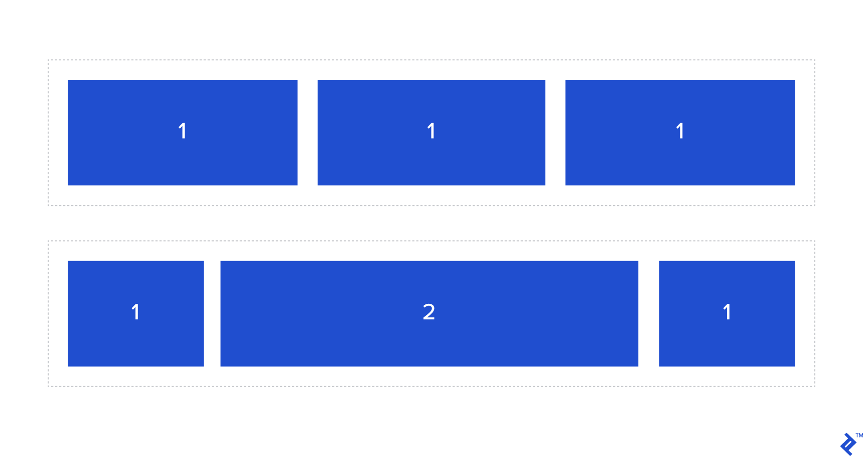
This property determines the relative proportion of available space an element should consume. It accepts an integer value, with 0 being the default.
For instance, suppose you have two elements within the same flex container. If both elements have a flex-grow value of 1, they will expand equally to share the available space. However, if one has a flex-grow value of 1 and the other has a flex-grow value of 2, as demonstrated in the example below, the element with a flex-grow value of 2 will grow to occupy twice as much space as the first element.
| |
Flex Shrink
Similar to flex-grow, this property determines whether an element can shrink or not. It also accepts an integer value. Similar to flex-grow, flex-shrink specifies the shrink factor of a flex item.
| |
Flex Basis
This property defines the initial size of an element before available space is distributed and elements are adjusted.
Tip: Keep in mind that
flex-basisdoesn’t fully supportcalc()orbox-sizing: border-boxin every browser. As a recommendation, consider using thewidthproperty if you need to utilize either of those (note that you’ll also need to setflex-basis: auto;).
| |
Flex
For convenience, you can combine the flex-grow, flex-shrink, and flex-basis properties into a single shorthand property called flex.
| |
Tip: When using the
flexshorthand property, ensure you explicitly define every value (even if you intend to use the default values) as some browsers may not recognize them otherwise (a common issue arises from not explicitly setting theflex-growvalue).
Align Self
This property functions similarly to align-items, but its effect is applied individually to a specific element. The possible values are:
- flex-start: Aligns the element to the top of the container.
- flex-end: Aligns the element to the bottom of the container.
- center: Vertically centers the element within the container (a straightforward way to achieve this!).
- stretch (default): Stretches the element to occupy the full height of the container (when applied to an element within a row) or the full width of the container (when applied to an element within a column).
- baseline: Aligns the element based on its baseline.
Order
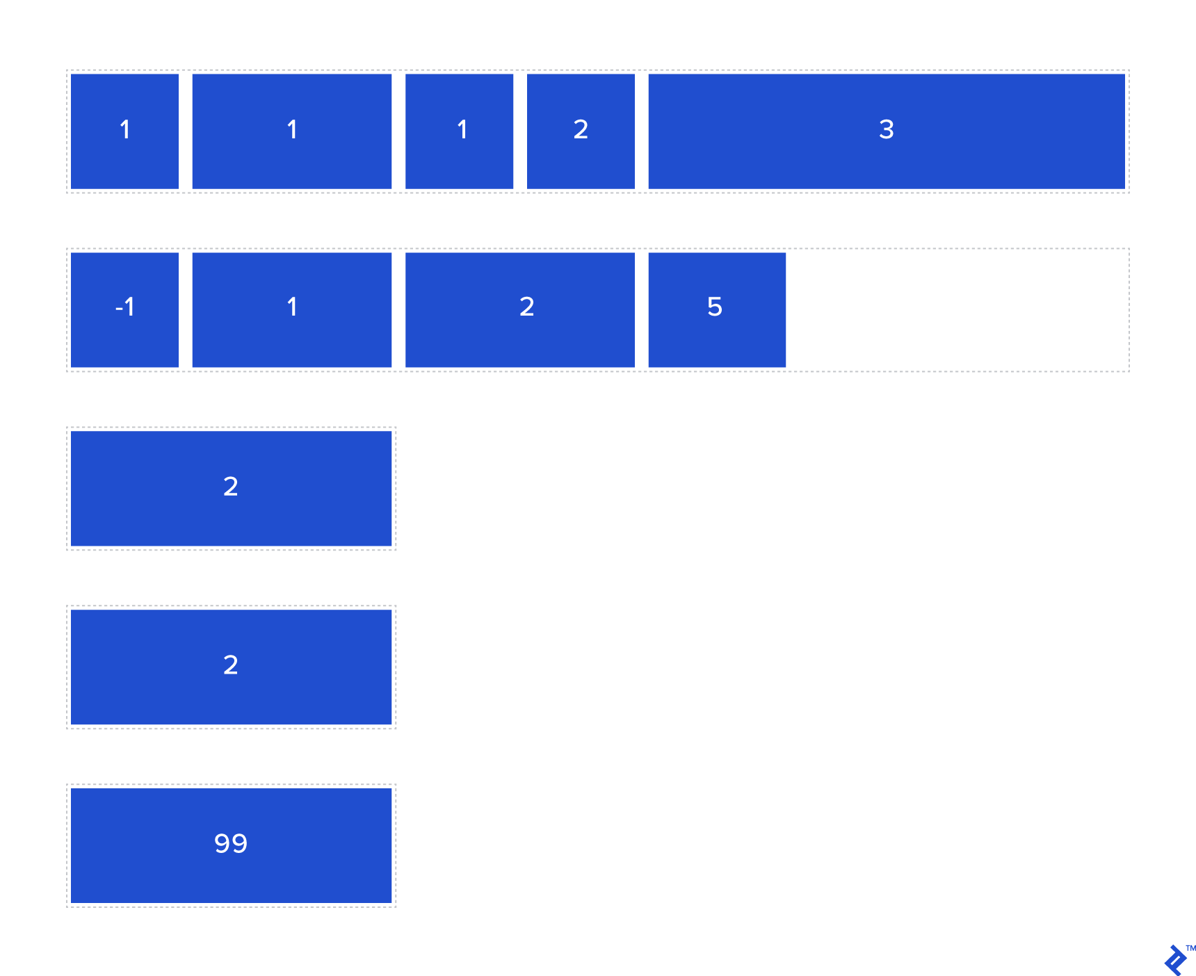
One of the most compelling features of Flexbox is its ability to reorder elements without requiring modifications to the DOM or JavaScript. This is achieved using the order property.
The order property works in a straightforward manner. Much like how the z-index property governs the stacking order of elements, order controls the order in which elements are positioned within their flex container. Elements with a lower order value (which can be negative) are positioned before those with a higher order value.
| |
Bringing It All Together: Practical Examples of Flexbox Layouts
Flexbox opens up a realm of possibilities when it comes to designing layouts. Below, you’ll find illustrative examples of how to use Flexbox properties effectively.
Vertical Alignment Component
Flexbox empowers you to effortlessly align elements vertically, including multiple elements simultaneously. Without Flexbox, this would typically involve using positioning or table-based techniques that often require creating a dedicated child element to contain multiple elements. With Flexbox, you can bid farewell to those tedious and fragile methods and simply define a few properties on the parent container—it’s that straightforward, regardless of how frequently the content within the container changes or the nature of those changes!
| |
Half/half Layout
A “half/half” layout refers to a full-height layout with two columns, each having its content vertically centered. This layout is commonly implemented “above the fold” (i.e., within the initial viewport before the user scrolls down).
Using traditional techniques, you could create this layout using floated elements (each with a width of 50%) and then clearing the floats within the container (using techniques like the “clearfix” hack with :before and :after pseudo-elements, overflow: hidden, or adding a clearing <div> with clear: both; at the end). However, this approach can be quite involved, and the result isn’t as robust as what Flexbox offers.
The code snippet below illustrates how simple it is to create this layout using Flexbox. It also demonstrates how child elements automatically become flex containers themselves since their content is also vertically aligned.
Outer wrapper CSS:
| |
Inner wrappers CSS:
| |
Full-width Navbar Buttons
A full-width navbar evenly distributes space among navbar items within the same row, regardless of the number of elements.
The example below showcases this behavior. It also includes some standard buttons that don’t span the entire width, demonstrating the flexibility to combine both types. Without Flexbox, achieving this kind of layout would likely involve JavaScript to calculate available space and dynamically adjust button widths based on which buttons should span the full width and which shouldn’t.
Flexbox significantly simplifies this process.
Wrapper CSS:
| |
Spanning child CSS:
| |
Non-spanning child CSS:
| |
Blurbs
Think back to how many times you’ve needed to implement a series of information boxes containing icons and text across different projects.
This type of layout is particularly prevalent in digital marketing but can be found in various software development contexts as well. Flexbox provides the tools to create this grid-like structure effortlessly and ensure consistent alignment, no matter how many elements you have.
Wrapper CSS:
| |
Child CSS:
| |
For tablet and mobile viewports, the width is adjusted to range between 50% and 100%.
Enhancing Cross-Browser Compatibility
The syntax for Flexbox has undergone numerous changes across different browser versions. This can pose challenges when aiming to support older web browsers, particularly earlier versions of Internet Explorer.
Fortunately, Flexbugs offers a wealth of techniques and workarounds to ensure your code functions consistently across a wide range of browsers. Adhering to the guidance provided on that site will help you achieve more reliable and consistent cross-browser compatibility.
Automated CSS prefixing tools can prove particularly helpful in this regard. Consider using one of the following tools based on your preferred development environment:
Ruby:
Node.js:
Begin Building Intelligent Layouts with Flexbox
Flexbox is an invaluable tool for streamlining, refining, and scaling your front-end development work. The only limit is your imagination.
We hope you found our Flexbox layout examples informative and inspiring. If you’d like a visual aid to plan your next layout, we recommend checking out this handy playground:
Open it in a new window.
As the adoption of modern web browsers continues to rise, embracing Flexbox empowers you to craft visually appealing and highly functional layouts with ease, eliminating the need for convoluted JavaScript or hacky CSS. Additionally, exploring various Flexbox templates can provide further inspiration and serve as excellent starting points for your own layout designs.