Google unveiled Material Design, its innovative design language, at the Google I/O Conference in 2014. Since then, they’ve revamped many of their popular apps to align with this new standard, aiming for a unified user experience. Now, they’re encouraging you to embrace it too.
What Exactly is Material Design?
Visiting the official Material Design specification immediately immerses you in a world of cutting-edge minimalism, dominated by simple shapes and flat colors. Exploring the documentation is a journey in itself, and I suggest taking a look. For now, I’ll provide a concise summary.
The Goal
The aim is to craft a visual language that harmoniously blends established design principles with the boundless potential of technology and science. This entails developing a cohesive underlying system that ensures a consistent experience across diverse platforms and device sizes.
Guiding Principles
Material Design rests on three fundamental principles.
Material as the Metaphor
Drawing inspiration from the tangible qualities of paper and ink, the material exists within a 3D realm, rooted in a tactile reality. It employs realistic shadows to create an illusion of depth. This paper-like material adheres to the laws of physics, preventing elements from passing through each other. However, it can transcend physical limitations, allowing for elements to expand or contract.
Bold, Graphic, Intentional
A bold and graphic interface emerges through deliberate color choices, edge-to-edge imagery, prominent typography, and purposeful white space, fully engaging the user. A prime example is the Floating Action Button, or FAB. That noticeable circle with the “plus” icon in your Google Inbox app? Material Design emphasizes its significance.
Motion with Purpose
Motion is employed meaningfully and appropriately, directing focus and ensuring continuity. Feedback is subtle yet clear, while transitions are efficient and coherent. The key takeaway is to animate with intention, avoiding excessive or unnecessary animations.
AngularJS and Material Design: A Perfect Match
AngularJS, Google’s “Superheroic JavaScript MVW Framework”, tackles the complexities of building single-page applications (SPAs). It provides the foundation for crafting modern web apps that interact with APIs without requiring page reloads.
AngularJS: A Fresh Perspective
Imagine HTML designed specifically for applications—that’s Angular. While HTML excels at structuring static content, it falters when it comes to dynamic applications.
Traditionally, building dynamic applications with HTML involved manipulating the browser to perform tasks beyond its intended scope. Two common approaches include:
- Libraries: Collections of functions (like jQuery).
- Frameworks: Dynamically populating static elements as needed (like Durandal, Ember).
Angular takes a different route. Instead of wrestling with existing HTML, it introduces new HTML constructs, teaching the browser new syntax through “directives.” Angular offers built-in directives and allows you to create custom ones, effectively letting you define your own HTML elements.
Wouldn’t it be remarkable if Google developed directives based on Material Design principles?
Introducing Angular Material
Google is actively developing Angular Material, an implementation of Material Design within AngularJS. It offers a set of reusable UI components based on the Material Design system. Angular Material comprises several components, including a CSS library for typography and elements, a novel JavaScript approach to theming, and a responsive layout system using a flex grid. Its most compelling feature, however, is its impressive collection of directives.
Getting Started
I’ve created an open-source project to kickstart your Angular Material endeavors. It showcases the full spectrum of Angular Material’s capabilities, including navigation, paging, theming, and the entire directive library. All you need to do is integrate your data and bind it to the HTML.
Check out the demo here or grab the code from the code on GitHub.
Directives: The Building Blocks
Directives are fundamental to Angular. You’ll frequently encounter directives like “ng-model” and “ng-repeat.” They are essential for the framework’s proper functioning.
Implementing Angular Material Directives
Angular Material expands this directive library with a set of visually appealing directives inspired by Material Design. These directives are HTML tags prefixed with “md,” short for Material Design, and they are remarkably easy to use. Let’s illustrate with a simple button.
A standard HTML button:
| |
An Angular Material button:
| |
That’s all it takes to create a Material button! Of course, there are additional options for customization, such as theming and elevation to imply importance.
| |
Services: Behind the Scenes
Services are another cornerstone of Angular, enabling code sharing across the application. Core services like “$http” are commonly used for data retrieval in Angular applications.
Angular services are:
- Lazily instantiated: Angular creates a service instance only when a component needs it.
- Singletons: All components depending on a particular service share a single instance created by the service factory.
Utilizing Angular Material Services
Angular Material includes services that add extra functionality to your applications, often enhancing directive performance. A great example is the “toast” service.
A toast is a discreet notification that briefly slides in from the screen’s edge and disappears after a short delay. Implementing it is straightforward:
In JavaScript:
| |
This snippet demonstrates a basic toast appearing at the bottom left, disappearing after 3 seconds.
Some services allow for custom templates. The “$mdToast” service can utilize a custom HTML template using the “md-toast” directive.
Theming: Conveying Meaning Through Color
In Material Design, themes convey meaning through color palettes, tones, and contrast. These themes are applied consistently across all components, fostering a unified visual experience.
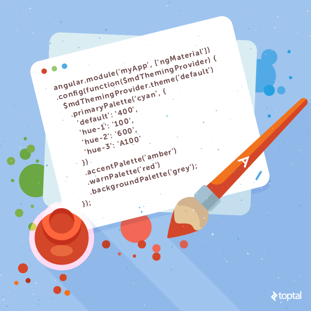
According to the Material Design guidelines, you should “select a limited set of colors by choosing three hues from the primary palette and one accent color from the secondary palette.” Angular Material simplifies this process using JavaScript to configure the theme. First, let’s define “palette” and “hue”:
- Hue: A specific shade of color within a palette.
- Palette: A collection of related hues.
For example, “green” would be a palette, and a specific shade like “forest green” would be a hue. Angular Material provides all valid palettes from the Material Design specification. Discover more about color palettes here.
Theme Configuration
Theming your project is a breeze. In your “app.js” file, define your desired palettes and hues using the “Theming Provider” service:
| |
Applying the Theme
To apply the theme to components, assign the desired palette and hue to the element’s class:
| |
Layout: Embracing Flexbox
Flexbox is the latest and greatest in responsive design, and Angular Material comes equipped with it. If you’re familiar with Bootstrap’s grid system, you’ll adapt quickly. In fact, Bootstrap is adopting Flexbox in its upcoming release. It retains the familiar row and column layout while offering greater flexibility. Learn how to use Flexbox with this tutorial or delve into the official documentation.
The Top 9 Angular Material Directives
Angular Material offers a vast array of directives. Here are nine of my personal favorites:
9. Progress Linear
In SPAs, pages often need time to load data. Displaying a blank screen during this process can make users think the application is unresponsive. Use the Progress Linear directive to keep users informed. An animated progress bar reassures them that the application is working. Alternatively, use the “Progress Circular” directive for a circular indicator.

8. Date Picker
The Date Picker directive streamlines date selection for users and is incredibly simple to implement. Use “md-datepicker” and optionally restrict the selectable range with “md-min-date” and “md-max-date.”

7. Autocomplete
Autocomplete enhances user experience by assisting with option selection—it’s what makes Google Search so effective. The “Autocomplete” directive replicates this functionality by suggesting completions as the user types. Its true power lies in its customization options. By populating your autocomplete with “md-item-template,” you can enhance suggestions. For instance, if searching for names within a company, the autocomplete could display matching names alongside their pictures and job titles.

6. Bottom Sheet
The bottom sheet is a menu that slides up from the bottom, overlaying content and capturing focus. While initially intended for mobile devices, it’s gaining traction on larger screens as well. To implement it, create a template using “md-bottom-sheet” containing either “md-grid” for a grid layout or “md-list” for a list layout. Then, invoke it using the “Bottom Sheet” service: “$mdBottomSheet.show().”

5. Input
Input forms have historically been dull. Not anymore! Inject some life into your inputs with the “Input” directive. Wrap your input tag with “md-input-container” and witness the transformation. Your placeholder gracefully animates into a floating label. Input validation is effortless with subtle color changes and clear warning messages. This directive takes a mundane element and makes it delightful.

4. Toast
Uncertainty about an application’s status is a major source of user frustration. Toasts, those unobtrusive little notifications, provide a solution. In the past, requests to the server meant waiting on a static page. Today, with SPAs, we expect immediate feedback. The Toast directive simplifies this. Summon a toast using the “Toast Service”: “$mdToast.show(),” providing text, duration, and screen position. Customize further with “md-toast.”

3. Grid List
Spice up your lists! Grid lists offer an alternative to traditional list views. Ideal for presenting images, they optimize visual comprehension by arranging tiles of varying sizes on a grid. The layout adapts to different screen sizes, creating a dynamic and visually engaging experience.

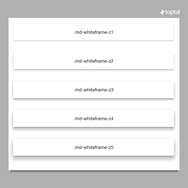
2. Whiteframe
The concept of space is central to Material Design’s paper metaphor. Two elements at the same depth share a seam and move in unison. Overlapping elements at different depths create a layered effect, moving independently. Angular Material provides an elegant solution for manipulating depth. The Whiteframe directive, with the class “md-whiteframe-z{x}” (where “x” represents depth units), lets you control element elevation. Larger numbers result in more pronounced shadows.
1. Sidenav
Creating side navigation menus has never been easier. The “Sidenav” directive positions a menu on either side of the screen. It gracefully slides in and out, either through touch gestures or programmatically via button clicks. A useful feature is the “lock open” option, which keeps the menu open at larger screen sizes. Using “md-is-locked-open=’$mdMedia(‘gt-sm’)’” keeps the menu hidden on phones but locked open on tablets and larger devices.

In Conclusion
Google is embracing Material Design across its product line and spearheading Angular Material development. Material Design draws upon a paper metaphor, bold design choices, and purposeful motion. AngularJS provides structure to SPAs, and Angular Material bridges the gap, bringing Material Design to life within AngularJS applications.
Angular Material is an exceptional choice for implementing Material Design in your SPAs. Don’t start from scratch! Utilize a fully functional starting point complete with directive demos, pre-configured theming, and ready-to-use navigation. Explore the demo here or clone the repository from code on GitHub. For in-depth knowledge, visit the official Angular Material documentation official documentation.
What are your thoughts on my selection of top Angular Material directives? Did I miss any gems? Share your favorites!