
The internet has evolved from simple, static pages to dynamic and interactive experiences. This shift is largely thanks to CSS layout tools like Grid and Flexbox, which provide powerful, adaptable, and streamlined methods for designing web content. This comprehensive guide will teach you how to utilize CSS Grid and Flexbox to construct responsive layouts, complete with detailed explanations of tips and techniques.
1. Grasping the Fundamentals: A Guide to CSS Grid & Flexbox
Responsive design is a web design philosophy that aims to create websites that provide an optimal viewing experience across a wide range of devices. The core concept is to ensure that the layout modifies itself dynamically depending on the device’s screen size, resolution, and orientation.
Both Flexbox and Grid are layout models that empower designers to realize design concepts that were unattainable with older CSS, especially in the realm of responsive design.
2. Essential Flexbox Concepts
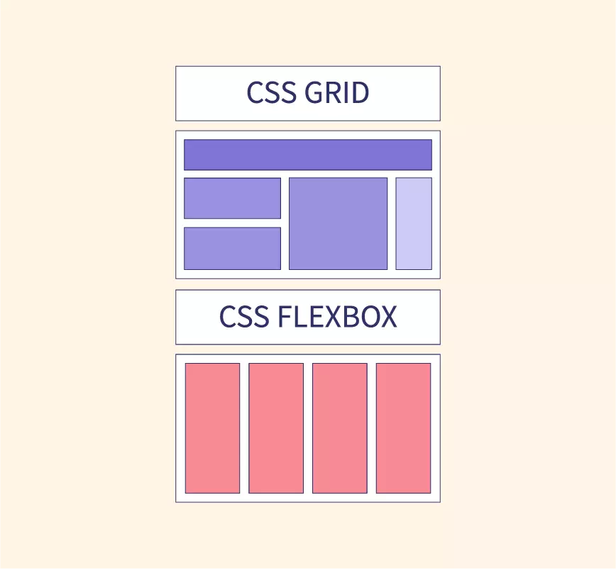
Flexbox, short for Flexible Box Layout, is a one-dimensional layout method. It can manage either columns or rows, but not both simultaneously. Let’s break it down:
- Flex Container: The parent element where the display property is set to
flexorinline-flex. - Flex Items: The immediate children of the flex container.
- Main Axis: The primary axis of the flex container. This is determined by the
flex-directionproperty.
Here are some key properties:
flex-direction: Establishes the direction of the main axis.flex-wrap: Controls whether items should wrap onto new lines or columns.justify-content: Aligns items along the main axis.align-items: Aligns items along the cross axis.flex: A shorthand property encompassingflex-grow,flex-shrink, andflex-basis.
3. Essential CSS Grid Concepts: A Guide & Flexbox Comparison
CSS Grid Layout offers a two-dimensional layout system, meaning it can handle both rows and columns concurrently. Here’s a quick overview: This comprehensive guide will teach you how to utilize CSS Grid and Flexbox to construct responsive layouts, complete with detailed explanations of tips and techniques.
- Grid Container: The element on which you apply
display: grid. - Grid Items: The direct descendants of the grid container.
- Grid Lines: The horizontal and vertical lines that divide the grid, separating the columns and rows.
Some key properties include:
grid-template-columns&grid-template-rows: Define the structure of the grid’s columns and rows.grid-column&grid-row: Position items on the grid.grid-gap: Set the spacing between grid cells.
4. Constructing Responsive Layouts: A Guide to CSS Grid & Flexbox
To create responsive designs using Flexbox and Grid:
- Media Queries: Leverage media queries to modify layouts based on viewport dimensions. For example, transition from a column-based layout on mobile devices to a row-based layout on desktops.
- Flexible Units: Employ relative units like
fr,%,vw, andvhinstead of fixed units such aspx. - Auto-placement in Grid: Allow CSS Grid to automatically place items based on the available space, making it inherently adaptive.
5. Flexbox vs. Grid: Choosing the Right Tool
- Opt for Flexbox when:
- Managing layout in a single dimension – either a row or a column.
- Distributing space among items in a sophisticated manner.
- Opt for Grid when:
- Working with a two-dimensional layout – both rows and columns are required.
- You need precise control over the positioning of items.
6. Best Practices and Tips: A Guide to CSS Grid & Flexbox
- Mobile-First Design: Begin your design process with the smallest screens and progressively scale up.
- Cross-Browser Testing: Ensure compatibility across different browsers, paying special attention to older versions that may have limited support for these properties.
- Provide Fallbacks: Utilize the
@supportsrule to provide fallback styles for browsers that lack support for Grid or Flexbox.
Advanced Flexbox Techniques
Expanding on our foundation, let’s explore more sophisticated tactics and applications of CSS Grid and Flexbox. Mastering these techniques can significantly enhance your web design skills.
1. Nested Flex Containers
Flex containers are not limited to a single level. You have the flexibility to nest one flex container within another. This proves particularly valuable when constructing components like navigation bars or intricate multi-level menus. This comprehensive guide will teach you how to utilize CSS Grid and Flexbox to construct responsive layouts, complete with detailed explanations of tips and techniques.
2. Integrating Flexbox with SVG
Scalable Vector Graphics (SVG) can be seamlessly integrated with Flexbox to craft responsive icons and graphics that adapt beautifully to different viewports.
3. Manipulating Flex Item Order
The order property empowers you to control the visual sequence of flex items, providing designers with a potent tool to rearrange content without modifying the underlying HTML structure.
Advanced CSS Grid Techniques: A Guide & Flexbox Comparison
1. Grid Template Areas
Leverage grid-template-areas to visually map out areas within your design, making content placement more intuitive. This approach also enhances the readability of your code. This comprehensive guide will teach you how to utilize CSS Grid and Flexbox to construct responsive layouts, complete with detailed explanations of tips and techniques.
| |
2. Implementing Masonry Layout with Grid
While Grid doesn’t inherently support masonry layout, you can achieve a similar effect by combining auto-fill, minmax(), and some clever positioning techniques.
3. Overlap and Layering Effects
Grid allows you to strategically overlap items and manage their stacking order using the z-index property. This is particularly effective for crafting parallax scrolling effects or intricate visual compositions.
Combining the Power of Flexbox and Grid: A CSS Guide
Why settle for one when you can harness the strengths of both? Grid excels in macro-layouts (defining the overall page structure), while Flexbox shines in micro-layouts (handling the alignment and distribution of content within individual components).
1. Grid for Structure, Flexbox for Components
Utilize Grid for establishing the main layout structure: header, footer, main content area, sidebar, etc. Within these sections, employ Flexbox to finely align and distribute smaller content elements.
2. Responsive Components with Flexbox within Grid Items: A CSS Guide
For components that demand responsiveness (such as image galleries), consider using a Grid layout as the foundation. Then, define each grid item as a flex container, ensuring that the content within adapts seamlessly based on the available space.
Tips for Achieving Seamless Design with a CSS Grid & Flexbox Guide
- Design Tools: Leverage powerful design tools like Firefox’s Grid Inspector or Chrome’s Flexbox Debugger to visualize and debug your layouts effectively.
- Performance Considerations: While Grid and Flexbox are designed for performance, always be mindful of potential bottlenecks. Avoid excessively complex designs that could lead to lag or stuttering, especially on less powerful devices.
- Fallback Strategy: While modern browsers have embraced these features, it’s essential to have a fallback plan in place for older browsers to guarantee that no user encounters user is left behind.
Bringing Your Designs to Life: Fluid Animations with Flexbox
1. Animated Flex Order
The order property in Flexbox isn’t limited to static arrangements. By combining it with CSS transitions, you can create captivating rearrangements:
| |
2. Dynamic Resizing with Flex Grow and Shrink
Animate the flex-grow and flex-shrink properties to enable dynamic resizing of flex items based on user interactions, such as hover effects.
3. Align and Justify Animations
Transitions applied to different align-items or justify-content values can produce engaging shifts in content alignment.
Advanced Positioning with CSS Grid
1. Creating Diagonal Layouts
By combining the transform property with Grid, you can achieve slanted or diagonal grid cells, introducing a fresh perspective on layout designs to your designs.
2. Maintaining Aspect Ratio
Combining the grid-template-rows property with viewport units and the padding-top hack allows you to maintain a consistent aspect ratio for grid items across different screen sizes.
3. Spanning Across Named Lines
Grid’s line naming capability allows you to define specific start and end lines for your items, simplifying the process of repositioning elements within a responsive design.
Mastering Hybrid Layout Techniques: A Guide to CSS Grid & Flexbox
1. Sticky Components with Grid and Flexbox
Integrate the position: sticky property into your Grid or Flexbox layouts to create headers, sidebars, or other elements that remain fixed during scrolling.
2. Conditional Layouts with CSS Variables and Calc()
Combine the power of CSS variables, the calc() function, and media queries to craft layouts that dynamically adjust based on user-defined or browser-defined conditions.
3. Enhancing Microinteractions with Grid and Flexbox
Integrate JavaScript or CSS animations with your layouts to create subtle, delightful interactions that respond to user engagement with elements.
A Guide to CSS Grid & Flexbox: Conclusion
CSS Grid and Flexbox have fundamentally changed the way web designers approach layout design. By developing a deep understanding of these tools and employing the right strategies, you can create web experiences that are both visually appealing and highly functional across all devices.