No matter the size – from large corporations to small startups – businesses thrive on data. They collect it from users and customers, analyze it, and present it in meaningful ways. This data-driven approach is crucial for growth and success.
Recently, I collaborated with a Brazilian telemedicine startup. Their goal is to make healthcare accessible by connecting patients with doctors and health coaches remotely. To do this, they needed a way for their staff to easily access and understand patient information. In essence, they needed a dashboard.
This is where Typeform and Airtable came into play.
Typeform
Typeform is a popular tool for collecting data through online surveys. It offers an engaging experience for users and includes features that, when used together, make surveys smarter and more efficient:
- Logic Jumps
- Hidden Fields
Typeform surveys can be shared via links, and these links can include pre-filled information in hidden fields. This allows for dynamic surveys that adapt based on user input, thanks to the logic jumps feature.
Airtable Uses
Airtable is a versatile platform that combines the best of spreadsheets and databases. It’s cloud-based and designed for collaboration. A key advantage is its user-friendliness: non-technical users can set up and manage data without needing to code.
Airtable is incredibly versatile and can be used for various purposes:
- CRM (Client Relationship Management)
- HRIS (Human Resources Information System)
- Project Management
- Content Planning
- Event Planning
- User Feedback
These are just a few examples; explore Airtable’s website for numerous case studies here.
If you’re new to Airtable, here’s a breakdown of its data structure:
- Workspace - Contains multiple Bases
- Base - Contains multiple Tables
- Table - Consists of Fields (columns) and rows
- View - A customized way to look at Table data, with filters and selected Fields
- Field - A column in a Table, with a specific data type; refer to here for details on Field Types.
Beyond being a cloud-based database with a familiar spreadsheet interface, Airtable’s power lies in:

For those without a technical background, Airtable offers:
- An intuitive and user-friendly interface
- Automations, configurable with just clicks, to send emails, process data, schedule events, and more
- Multiple view options, allowing teams to work together on the same data
- An app marketplace to enhance Base functionality
For developers, Airtable provides:
- A well-documented API for backend integration
- A scripting environment for automating actions within a Base
- Automations that can trigger custom scripts, expanding automation possibilities
Learn more about Airtable’s features here.
Getting Started: Typeform to Airtable
The client already had Typeform surveys set up. The next step was figuring out how to get that data into Airtable and then turn it into a usable dashboard. Building dashboards on top of any database always involves key considerations: How should the data be organized? What processing is needed before visualization? Should we connect this to Google Sheets and use Data Studio? Or export the data and use another tool?
Fortunately, Airtable had the solution. Not only does it offer automations and scripting for data processing, but it also allows the creation of custom apps and interfaces directly within a Base using Airtable Apps.
Custom Apps in Airtable
Airtable introduced custom apps with the release of its Blocks SDK at the beginning of 2018, and they were met with enthusiasm recently renamed to Apps. The Blocks SDK was a game-changer – it gave developers the ability to create what Airtable aptly calls “An infinitely recombinable Lego kit.”
The later shift to a dedicated apps system, marked by the Airtable Marketplace, made it possible to publicly share these apps.
This means that with Airtable Apps, businesses now have an incredibly flexible and customizable set of building blocks to create solutions tailored to their needs.
Building a custom Airtable app requires a developer familiar with React, a widely used JavaScript library for creating user interfaces. Airtable simplifies this process by providing a library of pre-built React components and hooks. These components help maintain a consistent look and feel across the app, while the hooks assist with managing the application’s state and data flow.
For more on building Airtable apps, refer to their Getting Started article. You can also find practical examples on Airtable’s GitHub page.
Airtable Dashboard Requirements
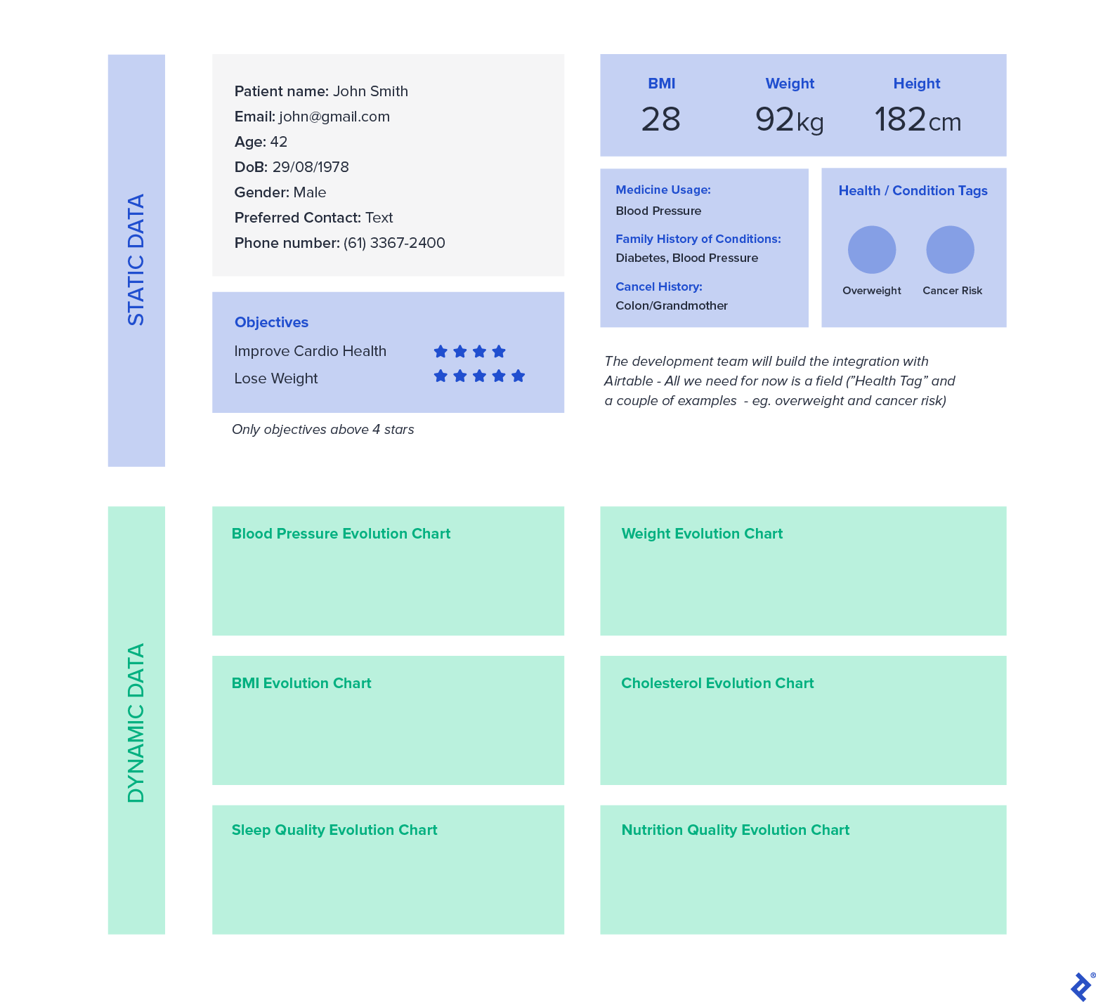
After reviewing the dashboard mockups with the client, the necessary data types were clear. We needed a series of components to display text-based information and charts that could track various metrics over time.
Coaches and medical professionals required the ability to create custom dashboards for each patient, so flexibility in adding or removing charts was essential. Other static data points, such as demographics, would always be displayed.
The dashboard sections were structured as follows:
- General Information - Patient Name, Email, Phone Number, Preferred Contact Method, Date of Birth, Age
- Objectives - Patient goals based on their survey responses
- Some Stats - BMI, Height, and Weight
- Medicine Use - A list of the patient’s current medications
- Family History of Conditions - Important information for diagnosis
- Charts - A section where the dashboard user could add and configure charts to visualize different metrics.
One approach for everything except charts would have been to hardcode all the columns for objectives, medicine use, and family history directly into the dashboard. However, this lacked flexibility. Adding new questions to the Typeform survey or new columns in Airtable would require developer intervention to update the custom app.
A more elegant and scalable solution was to use tags to mark columns as relevant to specific dashboard sections. We could then retrieve those columns using metadata exposed by Airtable’s Table and Field models.
This was achieved using Field Descriptions to tag columns. For example, we’d tag a column as relevant to the “Objectives” section, making it appear on the dashboard. To maintain control, only users with the Creator role (administrators) could modify these tags and, therefore, what was displayed on the dashboard.
To illustrate, let’s focus on the “General Information” section and how to implement Charts.
Creating a #TAG# System
Considering the dashboard sections, it made sense to have both reusable and section-specific tags. For example, we used #NAME#, #EMAIL#, and #PHONE# for patient name, email, and phone number fields. This allowed us to retrieve these fields using Table metadata like this:
| |
For sections that drew data from multiple tagged columns, we used these tags:
- OBJ - Objectives
- FAM - Family History
- MED - Medicine Usage
- CAN - Cancer-related Family History
- CHART - Any quantitative column that could be used for charting
To distinguish between a column’s internal name and its label on the dashboard, each field with a #TAG# could also have two #LABEL# tags in its Field Description.
Here’s how a typical Field Description would look:
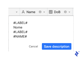
If the #LABEL# tags were missing, we would default to displaying the column name from the Table.
Once we retrieved the field data, we could extract the label from the description using a simple function:
| |
This #TAG# system gave us three key advantages:
- Column names (fields) in the Table could be freely modified.
- Dashboard labels could differ from the internal column names, improving clarity for users.
- The client team could update the Objectives, Medicine Usage, Family History, and Charts sections on the dashboard without requiring any code changes.
Persisting State in Airtable
In React, we use “state” to manage data that can change, and we pass this data to components as “props” to trigger re-renders when needed. This is often linked to API calls. However, Airtable already provides all the data; we just needed to filter it based on the selected patient. Furthermore, typical React state wouldn’t persist across dashboard refreshes.
To address this, Airtable provides the useGlobalConfig hook. It acts as a key-value store specifically for an app instance within a dashboard. We could use this to store and retrieve values when the app loaded, ensuring the dashboard components were populated with the correct data.
The useGlobalConfig hook has another benefit: whenever its values are updated, the dashboard and its child components automatically re-render. This means it functions similarly to a state variable in a traditional React application.
Introducing Charts
Airtable provides chart examples in its Simple Chart App, which utilizes React Charts, itself a React wrapper for Chart.js.
While the Simple Chart App demonstrates a single chart, our Dashboard App needed to allow users to add and remove multiple charts within their dashboards. Additionally, discussions with the client highlighted that some metrics were better visualized together (e.g., diastolic and systolic blood pressure).
This presented two challenges:
- Persisting the state of each user’s charts (ideally using Global Config)
- Allowing multiple metrics per chart
Again, Global Config proved invaluable. We could store the selected metrics and other chart-related settings in the key-value store. As users configured their charts through the UI, the chart component would automatically update due to the changes in Global Config.
Here’s a code snippet (gist) showcasing the chart components, with a focus on dashboard charts.js and single chart.js.
The “table” prop provided to each chart is used to retrieve metadata and identify fields. Meanwhile, the “records” prop contains the data already filtered by the patient selected on the main dashboard component (which imports dashboard_charts/index.js).
Note that the fields available in the chart’s dropdown are those tagged with #CHART#. We achieve this using the following code within a useEffect hook:
| |
The code snippet demonstrates how the setLabel function, mentioned earlier, works in conjunction with the #TAG# system to retrieve and display the label defined within the #LABEL# tags in the field dropdown.
Our chart component leverages the multi-axis capabilities of Chart.js, which can be seen in React Charts. We enhanced this by providing a UI for users to add datasets and select chart types (line or bar).
The key to effectively using Global Config in this scenario is understanding that each key can only store specific data types: string | boolean | number | null | GlobalConfigArray | GlobalConfigObject (see Global Config Value reference).
For each chart, we needed to store:
- chartTitle: Auto-generated initially but editable by the user
- fields: An array where each element represents a data series and contains:
- field: The Airtable field ID
- chartOption: The chart type – ’line’ or ‘bar’, as indicated by the Chart.js docs
- color: The Airtable color, retrieved using the colorUtils
- hex: The corresponding hex code for the Airtable color
Managing this complex data structure was most effectively achieved by stringifying it as an object, rather than creating a deeply nested Global Config structure. The following example (globalConfig.json in the gist) includes Global Config values for filtering records by the selected patient and variables supporting a typeahead component for patient selection (using the react-bootstrap-typeahead library):
| |
Note: The data in the example above and the animations below is placeholder and does not represent actual patient information.
Here’s the end result:

What About the Typeahead?
To enable filtering by patient, we needed a way to select a patient and then use that selection to filter the records.
react-bootstrap-typeahead was the ideal choice for implementing the typeahead component. We just needed to format the options, integrate it with an Airtable input for consistent styling, load Bootstrap, and add some custom CSS for the menu. Integrating external component libraries into an Airtable app isn’t as straightforward as in a typical React web development environment, but it only requires a few additional steps.
The final result looked like this:

We used the renderInput prop provided by react-bootstrap-typeahead to render the Airtable input and maintain a unified style. You can learn more about customizing component rendering here.
To incorporate Bootstrap styles and override our menu items, we utilized two utility functions provided by Airtable:
See frontend.js in the gist for an excerpt of the typeahead implementation.
We loaded Bootstrap globally using this line:
| |
You’ll notice some custom CSS (added logic) to handle styling for hover effects and to restyle links (<a></a>) for consistency with the Bootstrap look and feel. This also included handling setting the Global Config values for the typeahead and record filtering logic to ensure that if a user navigated away from the dashboard, refreshed the page, or shared the dashboard with others, the app would remember the selected patient. This also allowed users to have multiple instances of the same app within their Airtable Dashboard, each with a different selected patient or different charts.
It’s important to remember that an Airtable dashboard is accessible to all users who have permission to view the Base. This means that any custom app installations on a dashboard, including their filter settings for patients and charts, will be consistent for all users viewing the dashboard simultaneously.
Let’s summarize the key takeaways:
- Airtable empowers both technical and non-technical users to work together effectively.
- The Typeform integration for Airtable simplifies data transfer and can be set up by non-technical users.
- Airtable Apps provide a powerful way to extend Base functionality, either by selecting from pre-built apps in the marketplace or by creating custom apps.
- Developers can build almost any solution imaginable on top of Airtable using these custom apps. The example above was designed and implemented in just three weeks (with significant help from existing libraries).
- A
#TAG#system can be implemented to allow for dashboard modifications without requiring code changes from developers. However, carefully consider the use cases and ensure that permissions to modify these tags are restricted to the Creator role for security and data integrity. - Using Global Config allows developers to persist data within an app instance, which is useful for state management and ensuring data persistence across dashboard sessions.
- Directly dragging and dropping components from external libraries into an Airtable app might not work as expected. Use the
loadCSSFromStringandloadCSSFromURLAsyncutilities provided by Airtable to load external stylesheets.
Future-proofing
Consider a More Robust Middleware Layer
While the Typeform and Airtable integration makes it easy to map survey questions to columns, it has a limitation. Modifying an existing mapping in a large survey (e.g., one with over 100 questions) requires deleting the entire mapping and recreating it from scratch.
A more efficient solution would be to use a middleware layer – perhaps implementing a serverless function with a service like Zapier – to manage the data flow between Typeform and Airtable. This would allow for more granular control over the mapping, making it possible to modify individual question mappings without affecting the entire integration. Of course, this approach would come with its own cost implications to consider.
I hope that the lessons learned and shared here will benefit others looking to build solutions using Airtable.
You can find the complete gist with the files discussed for this project in the accompanying repository.