This article was revised by our editorial team on 10/10/22. The update includes new resources and aligns the content with our current editorial guidelines.
When working on web projects, you’ll likely come across Bootstrap. However, many developers still wonder: “What exactly is Bootstrap used for?” This article explores the fundamentals of Bootstrap, its ideal applications, setup instructions, the grid system, and common component illustrations.
Bootstrap empowers programmers to focus on development over design, enabling them to quickly launch attractive websites. Simultaneously, it provides web designers a robust framework for crafting captivating Bootstrap themes.
What is Bootstrap?
Bootstrap is a comprehensive toolkit comprising HTML, CSS, and JavaScript tools designed for building web pages and applications. This free, open-source project, hosted on GitHub, was initially developed by (and for) Twitter.
Following its open-source release in 2011, Bootstrap gained rapid popularity for good reason. Web designers and developers appreciate its flexibility and user-friendliness. Its key strengths include responsive design, broad browser compatibility, consistent design through reusable components, and a short learning curve. Additionally, Bootstrap offers extensive extensibility via JavaScript, built-in support for jQuery plugins, a programmatic JavaScript API, compatibility with any IDE or editor, and support for various server-side technologies and languages, from ASP.NET and PHP to Ruby on Rails.
Getting Started with Bootstrap
Bootstrap comes in two flavors: precompiled and source code versions. While the latter uses the Less CSS preprocessor, a official Sass port version caters to Sass enthusiasts. Bootstrap also utilizes Autoprefixer for simplified CSS vendor prefix management.
The source code version includes Less (or Sass) stylesheets, JavaScript files, and documentation. This allows ambitious developers and designers to customize styles, create their own Bootstrap versions, and make changes to the provided styles. If you’re unfamiliar with Less (or Sass) or prefer not to modify the source code, the precompiled vanilla CSS is a suitable alternative, allowing style overrides with custom CSS.
File Structure
Let’s focus on the precompiled version, downloadable here. The primary file structure consists of two subfolders, css and js:
| Folder | Contents |
|---|---|
js | Contains bootstrapJavaScript files in various formats. |
css | Contains bootstrap, bootstrap-utilities, bootstrap-reboot, and bootstrap-grid CSS files in various formats. |
Bootstrap’s straightforward structure includes precompiled files for easy integration into any web project. Beyond minified and compiled CSS and JS files, previous Bootstrap versions included Glyphicons fonts and an optional starter Bootstrap theme.
This structure can be seamlessly incorporated into your project’s file structure. Include Bootstrap files directly from the zip archive or rearrange them as needed, ensuring the Glyphicons font folder remains at the same level as the CSS folder.
Basic Bootstrap HTML Template
A rudimentary Bootstrap HTML template resembles this:
| |
Starting HTML with an HTML 5 Doctype declaration is crucial, as it informs browsers of the document type. The head section includes three essential <meta> tags, followed by any additional head tags.
JavaScript files are placed at the end of the body, allowing the webpage to load visually before JavaScript execution. jQuery, necessary for Bootstrap plugins, needs to load before bootstrap.js. If you’re not using Bootstrap’s interactive features, you can omit these files.
This constitutes the bare minimum for a basic Bootstrap layout. Developers can explore advanced examples on Bootstrap’s examples page. For design ideas, Bootstrap Expo showcases websites built using Bootstrap. As noted later, Bootstrap allows extensive CSS customization. However, if pre-designed themes are preferred, numerous free, open-source, and premium themes are available from Bootswatch and WrapBootstrap.
Bootstrap Grid System
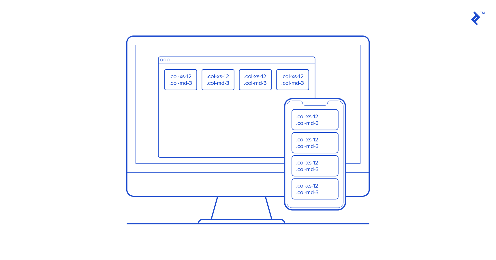
Before delving into components and design templates, it’s important to highlight a key feature introduced in Bootstrap 3: mobile-first design. This approach results in inherently responsive Bootstrap websites that seamlessly scale from phones and tablets to desktops using a single codebase.
This responsiveness stems from a fluid grid system that scales up to 12 columns based on device or viewport size. Grids provide layout structure by defining horizontal and vertical guidelines for content arrangement and margin enforcement. This intuitive structure facilitates left-to-right or right-to-left content flow down a page. Before grids and powerful CSS, table-based layouts were used, arranging content within cells. As CSS matured, frameworks for grid-based layouts emerged, including YUI grids, 960 GS, and blueprint.
The Bootstrap grid system has rules. Grid column elements reside within row elements, forming horizontal groups. Unlimited rows are permitted, but columns must be direct children of rows. A full row’s column widths can be any combination totaling 12, but using all 12 isn’t mandatory.
Rows must be placed within either a fixed-width layout wrapper (.container class, 1170px width) or a full-width wrapper (.container-fluid class) for responsive behavior.
The grid system has four tiers: xs for phones (<768px), sm for tablets (≥768px), md for desktops (≥992px), and lg for larger desktops (≥1200px). These define column collapse/spread breakpoints. Combining tiers allows for dynamic and flexible layouts.
For example, two rows, one with two columns and another with four, can be created like this:
| |
Mixed column widths are also possible:
| |
Shifting columns is achieved using offsets, creating narrower, centered content:
| |
Columns can be nested, and fewer than 12 columns are allowed. Fixed-width or full-width columns are achieved using .container or .container-fluid wrappers, respectively.
| |
Combining different tiers yields varied mobile and desktop appearances. The example below shows four columns in a row on desktops, while on mobile, they stack vertically at full width.
| |
In older Bootstrap versions, complete disable page responsiveness is possible, disabling the “mobile site” aspects. However, this means fixed-width components (like navbars) might become invisible if the viewport narrows beyond the content width. For non-responsive containers, this translates to 970px. Additionally, navbars won’t collapse in mobile views, as explained later.
These are basic examples. Explore Bootstrap’s Grids documentation to understand the full potential of grids.
Bootstrap Web Development: Templates and UI Components
Having addressed “What is Bootstrap?”, let’s dive into component examples, showcasing Bootstrap’s enhanced development experience.
Bootstrap includes basic HTML and CSS design templates with common UI components like Typography, Tables, Forms, Buttons, Glyphicons, Dropdowns, Button Groups, Navigation, Pagination, Labels, Badges, Alerts, Progress Bars, Modals, Tabs, Accordions, Carousels, and more.
Many of these leverage JavaScript extensions and jQuery plugins.
These templates are provided as well-structured CSS classes, applicable to HTML for various effects. Semantic class names like .success, .warning, and .info promote reusability and extensibility. While descriptive, Bootstrap’s class names aren’t tied to specific implementations. Custom CSS can override styles and colors while preserving the class’s meaning.
Bootstrap Typography
Beginners often assume unstyled HTML appears uniformly across browsers. Unfortunately, each browser applies its “user agent” stylesheet, resulting in inconsistencies. For example, heading sizes, list margins/padding, body borders/padding, and button rendering can vary. To address this, CSS “reset” rules define consistent defaults.
Bootstrap goes beyond basic CSS resets. It incorporates normalize.css, an HTML5-ready alternative, and implements well-designed defaults. For instance, the global default font-size is 14px with a 1.428 line-height. The default font is Helvetica/Arial, with a sans-serif fallback. These styles apply to the <body> and paragraphs, with <p> elements receiving a bottom margin of half their computed line-height (10px by default).
Beyond defaults, customizable styles for standard HTML tags (e.g., <mark>, <del>, <s>, <u>, <small>, <strong>) enhance text consistency. Alignment classes like .text-left, .text-center, .text-right, .text-justify, and .text-nowrap simplify content arrangement. Predefined styles are also available for elements like block quotes, unordered/ordered lists (with inline options), and more. Refer to the Bootstrap Typography page for a comprehensive list.
Bootstrap allows applying heading styles using either <h1> tags or the .h1 class. The latter matches <h1> styling but allows inline display.
Forms
Web forms are ubiquitous today. While HTML5 introduced new form attributes, input types, and helper elements, visual improvements have been limited. Bootstrap excels in this area, simplifying label/input alignment, styling, validation, and error message display.
Bootstrap sets textual input elements (<input>, <textarea>, <select>) to 100% width of their parent form element. It also allows choosing between inline forms (using .form-inline, placing multiple labels and inputs in a single line) and horizontal forms (using .form-horizontal, aligning each input in its row using grids). The .form-control-static class enables placing plain text beside labels, matching the form’s visual style.
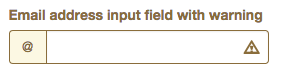
A standout feature is Bootstrap’s validation styles for error, warning, and success states, applied using .has-warning, .has-error, and .has-success classes, respectively. Combining this with icons within input forms enables effective form validation without error messages.
The following snippet creates an input field with an “@” symbol (indicating an email field), a warning icon, and a yellow outline, signifying an input error:
| |
This is just a glimpse. For more examples, refer to Bootstrap’s Forms documentation.
Images and Icons
Bootstrap makes images responsive using the .img-responsive class, applying max-width:100%;, height:auto;, and display:block; for scaling to the parent element.
Besides responsiveness, various effects can be achieved. For instance, rounded corners are applied with .img-rounded, circular shapes with .img-circle, and thumbnails with .img-thumbnail.
Older Bootstrap versions include over 260 glyphs (in font format) from the Glyphicons Halflings set, made available for free (under the same license as Bootstrap) by their creator, Jan Kovařík. These scalable font icons offer advantages over raster images, allowing easy customization (e.g., size, color, drop shadows) via CSS.
Current Bootstrap versions offer the Bootstrap Icons library and suggest alternative libraries. Visit the Bootstrap Icons page for more information.
Buttons, Button Groups, and Button Drop-downs
Button rendering inconsistencies across browsers pose design challenges. Bootstrap addresses this with an elegant solution for buttons. Beyond consistency, Bootstrap provides various button variations. The .btn class applies to <a> and <input> elements. Buttons can be group a series of buttons using the .btn-group class on the parent <div>. With JavaScript, you can create radio- and checkbox-style behaviors. Alternatively, buttons can become drop-down menus by placing them within a .btn-group and providing the appropriate unordered list menu markup.
Navbars
The navigation bar (navbar) is a Bootstrap component specifically designed for building a website’s primary navigation menu. It displays horizontally on larger screens and transforms into a “hamburger” menu on smaller and mobile screens (below 768px).
Essentially, a navbar is an unordered inline list of menu items with optional additional HTML elements like branding (text or logo), form items (e.g., search bar), and menu drop-downs. Two styles are available out of the box: light and dark (inverted). Items can be aligned left or right using .navbar-left or .navbar-right classes, respectively.
Navbars can have four position behaviors. The default uses buffer space. Full-width static navbars scroll away as the user scrolls down. Fixed navbars (positioned at the top or bottom) remain visible regardless of scrolling.
Delivering Enhanced User and Developer Experiences with Bootstrap
This tutorial only scratches the surface of Bootstrap’s capabilities, highlighting key components that set it apart from other frameworks, libraries, and toolkits. Bootstrap enables the rapid development of responsive and aesthetically pleasing front-ends with minimal CSS. It serves as an excellent foundation for your next project or startup.