Animations are everywhere on the web today. They’re not like the annoying flashing GIFs of the past; today’s animations are subtler and more sophisticated. Designers and front-end developers use them to enhance websites, improve user experience, highlight important things, and communicate information.
Web developers can create animations without external libraries by combining the strengths of SVG and CSS. This SVG animation tutorial explains how to make custom animations for real-world use.
SVG Animation: Basics and CSS
Before animating SVGs with CSS, developers need to understand their inner workings. Luckily, it’s similar to HTML: SVG elements are defined with XML syntax and styled with CSS, just like HTML.
SVG elements are specifically designed for creating graphics. There’s <rect> for rectangles, <circle> for circles, and more—<ellipse>, <line>, <polyline>, <polygon>, and <path> are also part of SVG.
Note: Even full list of SVG elements is included, allowing animations with SMIL (synchronized multimedia integration language). But its future is uncertain, and the Chromium team recommends a CSS- or JavaScript-based approach for animating SVGs whenever possible.
Attributes vary depending on the element. For instance, <rect> has width and height attributes, while <circle> uses the r attribute for its radius.

Unlike most HTML elements that can have children, most SVG elements can’t. An exception is the <g> group element, used to apply CSS styles and transformations to multiple elements at once.
The <svg> Element and Its Attributes
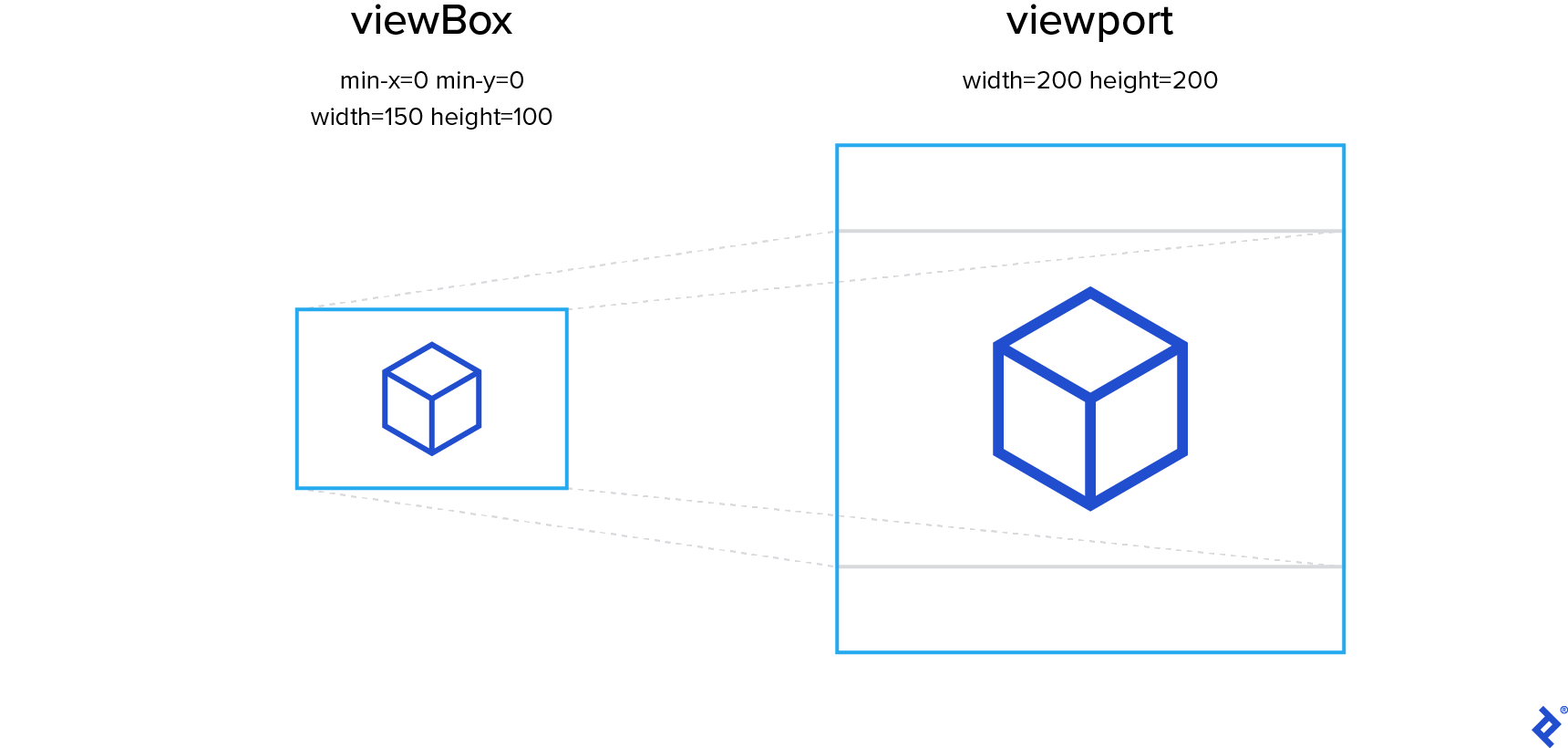
Positioning elements in HTML and SVG differs, particularly regarding the viewBox attribute of an outer <svg> element. Its value has four space- or comma-separated numbers: min-x, min-y, width, and height. These define the portion of the SVG drawing to be rendered by the browser. This area is then scaled to fit the viewport defined by the <svg> element’s width and height attributes.
The viewport’s width and height ratio might differ from the width and height parts of the viewBox attribute, affecting letterboxing.
By default, the SVG canvas maintains its aspect ratio, even if it means a larger viewBox than specified. This results in a smaller, letterboxed rendering within the viewport. However, the preserveAspectRatio attribute allows control over this behavior.
This lets us create isolated images, ensuring correct element positioning regardless of context or rendering size.
While simple SVG images can be hand-coded, complex ones might require vector graphics software (our SVG animation tutorial covers both methods). Affinity Designer is my preferred editor, but any editor should suffice for the basic operations discussed.
Animating SVGs with CSS Transitions and Animations
CSS transitions define the speed and duration of property changes. Instead of abrupt jumps, values transition smoothly, like this SVG circle changing color on hover:
The transition property defines transitions. It takes the property to transition, duration, transition timing function (or easing function), and delay before the effect:
| |
Transitions can be defined for multiple CSS properties, each with its own values. However, this approach has two major limitations.
First, transitions trigger automatically on property value changes, which can be inconvenient. For example, infinitely looping animations aren’t possible.
Second, transitions have only two steps: initial and final states. Animation duration can be extended, but adding more keyframes is not possible.
That’s where CSS animations come in. They allow multiple keyframes and infinite looping:
Animating CSS properties over multiple keyframes involves defining the keyframes using an @keyframes at-rule. Timing is in relative units (percentages) since the animation duration isn’t defined yet. Each keyframe describes the property values at that specific point, with CSS animations ensuring smooth transitions between them.
The animation with defined keyframes is applied to the desired element using the animation property. Similar to transition, it accepts duration, easing function, and delay.
The only difference is using the @keyframes name instead of a property name as the first parameter:
| |
Creating an Animated Hamburger Menu Toggle with SVG/CSS
With a basic understanding of SVG animation, let’s build a classic animation—a menu toggle smoothly transitioning between a “hamburger” icon and a close button (“X”):
This subtle animation effectively notifies users that the icon closes the menu.
We begin by creating an SVG element with three lines:
| |
Each line has two attribute sets. x1 and y1 represent the line’s starting coordinates, while x2 and y2 represent its ending coordinates. Relative units are used for positioning, ensuring content resizes to fit the containing SVG element. While effective here, this method has a drawback: it doesn’t maintain the aspect ratio of elements positioned this way. Using the <svg> element’s viewBox attribute would be necessary for that.
Notice the CSS classes applied to SVG elements. Many properties can be changed via CSS, so let’s apply basic styling to our SVG elements.
We’ll set the <svg> element’s size and change the cursor type to indicate clickability. For the lines’ color and thickness, we’ll use the stroke and stroke-width properties. You might expect color or border, but unlike <svg> itself, SVG sub-elements aren’t HTML elements, often having different property names:
| |
Rendering at this point shows all three lines with the same size and position, completely overlapping. Unfortunately, we can’t change the starting and ending positions independently with CSS, but we can move entire elements. Let’s move the top and bottom bars using the transform CSS property:
| |
Moving the bars along the Y-axis creates a decent-looking hamburger.
Now, let’s code the second state: the close button. An .is-opened CSS class applied to the SVG element will toggle between the two states. For accessibility, we’ll wrap our SVG in a <button> element and handle clicks at that level.
A simple JavaScript snippet will handle adding and removing the class:
| |
To create the X, we’ll apply a different transform property to our hamburger bars. Since the new transform overrides the old one, our starting point will be the bars’ original, shared position.
From there, we’ll rotate the top bar 45 degrees clockwise around its center and the bottom bar 45 degrees counterclockwise. The middle bar will be shrunk horizontally until it’s hidden behind the X’s center:
| |
By default, the transform-origin property for SVG elements is 0,0, meaning our bars rotate around the viewport’s top-left corner. However, we want them to rotate around the center. To achieve this, we’ll set transform-origin to center for the .hamburger__bar class.
Animating with the transition Property
The transition CSS property enables smooth transitions between two different states of CSS properties. Here, we want to animate the transform property, controlling the bars’ positions, orientation, and scale.
We can also manage the transition duration using the transition-duration property. For a snappy animation and SVG transition, we’ll set a short duration of 0.3 seconds:
| |
The only JavaScript required is for toggling the icon’s state:
| |
We select the outer SVG element by its .mute class using querySelector() and add a click event listener. On a click event, the .is-active class is toggled only on the <svg> itself—not deeper in the hierarchy. Since the CSS animation applies only to elements with the .is-active class, toggling it activates and deactivates the animation.
Finally, we’ll turn the HTML body into a flex container for horizontal and vertical centering of the icon. We’ll also update the background color to a very dark gray and the icon color to white for a sleek “dark mode” aesthetic:
| |
We now have a fully functional animated button using basic CSS and a short JavaScript snippet. Modifying the transformations allows for various animations. Fork the CodePen—which includes extra CSS for polish—and get creative!
Utilizing SVG Data from External Editors
Our hamburger menu is quite simple. What about more complex designs? That’s where hand-coding SVG becomes challenging, and vector graphics editing software proves beneficial.
Our second SVG animation is a mute button with a headphones icon. When active, the icon pulsates and dances; when muted, it’s crossed out:
Icon drawing is beyond this tutorial’s scope (and likely your job description), so we’ll start with a pre-drawn SVG icon. The body styling from the hamburger menu example will be used here as well.
Cleaning up the SVG code before use is recommended. Tools like svgo, an open-source, Node.js-based SVG optimizer, can help. This removes unnecessary elements, simplifying manual editing, which will be necessary for adding classes and combining elements.
SVG icons created in image editing software are unlikely to use relative units. Additionally, we want to maintain the icon’s aspect ratio regardless of the containing SVG element’s aspect ratio. The viewBox attribute provides this control.
Resizing the SVG for easy-to-use viewBox values is a good practice. In this case, we’ll convert it to a 100 x 100 pixel viewBox.
Let’s ensure the icon is centered and appropriately sized. We’ll apply the mute class to our base SVG element and add the following CSS styles:
| |
Here, the width is slightly larger than the height to prevent clipping during animation rotations.
Setting Up the SVG Animation
The cleaned-up SVG contains a single <g> element with three <path> elements inside.
The path element draws lines, curves, and arcs using a series of commands describing the shape. Our icon has three unconnected shapes, hence three paths to describe them.
The g SVG element groups other SVG elements. This applies the pulsating and dancing transformations to all three paths simultaneously instead of animating them individually with CSS.
| |
transition isn’t sufficient for the pulsating and dancing headphones; this complexity requires keyframes.
Our starting and ending keyframes (at 0% and 100%) use a slightly shrunk headphones icon. For the first 40%, we enlarge the image slightly and tilt it 5 degrees. For the next 40%, we scale it back down to 0.9x and rotate it 5 degrees in the opposite direction. Finally, for the last 20%, the icon transformation returns to the initial parameters for smooth looping.
| |
CSS Animation Optimizations
To show how keyframes work, we left our keyframe CSS more verbose than it needs to be. There are three ways we could shorten it.
Since our 100% keyframe sets the entire transform list, if we were to omit rotate() entirely, its value would default to 0:
  100% {
    transform: scale(0.9);
  }
Secondly, we know we want our 0% and 100% keyframes to match because we’re looping the animation. By defining them with the same CSS rule, we won’t have to remember to modify both of them if we want to change this shared point in the animation loop:
  0%, 100% {
    transform: scale(0.9);
  }
Lastly, we’ll soon apply transform: scale(0.9); to the mute__headphones class, and when we do, we won’t need to define the starting and ending keyframes at all! They’ll default to the static style used by mute__headphones.
With the animation keyframes defined, we can apply the animation. The .mute__headphones class is added to the <g> element, affecting all three parts of the headphones icon. We set transform-origin to center for rotation around its center and scale it to match the initial keyframe. Without this, switching from the static “muted” icon to the animated one always causes a sudden jump in size. (However, switching back to muted will likely cause a jump in scale and rotation if clicked while larger than 0.9x. CSS alone can’t fully address this.)
We apply the animation using the animation CSS property, but only when the parent .is-active class is present, similar to the hamburger menu.
| |
The JavaScript for switching between states follows the hamburger menu’s pattern:
| |
Next, we’ll add a strikethrough line appearing when the icon is inactive. Due to its simplicity, we can code this manually. This is where simple viewBox values are beneficial. Knowing the canvas edges are at 0 and 100 makes calculating the line’s start and end positions easy:
| |
Resizing vs. Using Relative Units
A case can be made for using relative units instead of resizing the image. This applies in our example because we are adding only a simple SVG line over our icon.
In real-world scenarios you might want to combine more complex SVG content from several different sources. This is where making them all a uniform size is useful, as we can’t manually hard-code the relative values like we did in our example.
With a class directly on our strikethrough <line> element, we can style it with CSS. We just need to ensure it’s hidden when the icon is active:
| |
Optionally, add the .is-active class directly to the SVG to start the animation on page load, changing the initial state from non-animated (muted) to animated (non-muted).
The Enduring Power of CSS-Based SVG Animation
We’ve barely scratched the surface of CSS animation techniques and viewport manipulation](https://www.sarasoueidan.com/blog/svg-coordinate-systems/). Knowing how to hand-code SVG is valuable for simple animations, but understanding when and how to utilize graphics from external editors is crucial. Modern browsers allow us to [create impressive animations using only built-in functionality, for (very) complex use cases, developers might want to explore animation libraries like GSAP or anime.js.
Animations aren’t just for extravagant projects. Modern CSS animation techniques enable a wide range of engaging and polished animations in a simple, cross-browser-compatible manner.
Special thanks to Mike Zeballos for his technical review of this article!