This article is the first in a series of three that explores Twitter cluster analyses using R and Gephi. In the next installment, we will delve deeper into the analysis initiated today, aiming to pinpoint key players and comprehend topic dissemination. The final part will utilize cluster analysis to extract insights from polarized discussions surrounding US politics.
Social network analysis originated in 1934 with Jacob Levy Moreno’s creation of sociograms, visual representations of social connections. In essence, a sociogram is a graphical representation where each point signifies an individual, and connecting lines depict interactions between them. Moreno employed sociograms to examine the dynamics of small groups.
Why small groups? Because during his time, accessing detailed information about numerous personal interactions was challenging. However, the advent of online platforms like Twitter changed this. Today, anyone can readily obtain substantial Twitter data without charge, paving the way for insightful analyses that enhance our understanding of human behavior and its societal ramifications.
This initial installment of our social network analysis series will guide you through conducting such analyses using the R language for data acquisition and preprocessing, and Gephi for generating compelling visualizations. Gephi is a freely available application specifically designed to visualize various networks. It empowers users to effortlessly customize visualizations based on a range of criteria and attributes.
Acquiring Twitter Data for Social Network Analysis in R
If you haven’t already, set up a Twitter developer account and request Essential access. To download data, create an app within the Twitter Developer Portal. Subsequently, in the Projects & Apps section, choose your app and navigate to the Keys & Tokens tab to generate your credentials. These credentials grant you access to the Twitter API for downloading data.
With your credentials in place, you’re ready to begin. Our analysis will utilize three R libraries:
- igraph, responsible for constructing the interaction graph.
- tidyverse, used for data preparation.
- rtweet, which facilitates communication with the Twitter Dev API.
Installation of these libraries can be done using the install.packages() function in R. We’ll assume you have R and RStudio installed, along with a basic grasp of their functionality.
Our demonstration focuses on analyzing the vibrant online discourse surrounding renowned Argentine footballer Lionel Messi during his inaugural week with Paris Saint-Germain (PSG) Football Club. Keep in mind that the free Twitter API restricts data retrieval to seven days preceding the current date. While replicating our exact dataset isn’t possible, you can apply the process to current discussions.
Let’s start with data acquisition. We’ll load the necessary libraries, create an authorization token using your credentials, and define the download criteria.
The following code snippet illustrates these three steps:
| |
Important: Remember to replace all the tags enclosed in <> with the information obtained during the credential creation process.
This code queried the Twitter API, retrieving all tweets (capped at 250,000) containing the keyword “messi” posted between August 8, 2021, and August 13, 2021. We set a limit of 250,000 tweets due to Twitter’s requirement for a quantity value, and because this number provides a substantial dataset for analysis.
Twitter’s download rate is 45,000 tweets per 15 minutes; therefore, retrieving 250,000 tweets took over an hour.
Finally, we stored all contextual variables in an RData file for easy restoration if we need to close RStudio or restart our machine.
Constructing the Interaction Graph
Once the download is complete, the tweets.df dataframe will contain our tweets. This dataframe is structured with each row representing a tweet and each column representing a specific tweet characteristic. Our first step is to use this dataframe to create the interaction graph, where each point symbolizes a user and connecting lines represent interactions like retweets or mentions. Leveraging the capabilities of tidyverse and igraph, we can generate this graph efficiently with a single line of code:
| |
Executing this line creates a graph, stored in the net variable, ready for analysis. For instance, to determine the number of nodes and edges:
| |
Our sample data contains 138,000 nodes and 217,000 edges—a considerable graph. While R offers visualization possibilities, they tend to be computationally intensive and lack the visual appeal of Gephi. Therefore, we’ll proceed with Gephi for visualization.
Visualizing the Graph in Gephi
First, we need a file format compatible with Gephi. This is straightforward, as we can generate a .gml file using the write_graph function:
| |
Next, open Gephi, navigate to “Open graph file,” locate and open the messi_network.gml file. You’ll see a window summarizing the graph information; click Accept. The following will be displayed:

Admittedly, this isn’t very informative yet, as we haven’t applied a layout.
Network Layout
In graphs containing thousands of nodes and edges, arranging the nodes effectively is crucial. Layouts serve this purpose by strategically positioning nodes based on predefined criteria.
For our social network analysis tutorial, we’ll employ the ForceAtlas2 layout, a common choice for such analyses. It simulates attractive and repulsive forces between nodes. Connected nodes are placed closer together, while unconnected nodes are farther apart. This approach effectively reveals communities within the graph, as users belonging to the same community will be grouped together.
To implement this layout, go to the Layout window (bottom left), select ForceAtlas 2, and click Run. You’ll observe the nodes dynamically repositioning themselves, forming numerous “clouds.” After a short period, a stable pattern will emerge, at which point you can click Stop (note that automatic stopping might take longer).
As this algorithm involves randomness, each run will produce slightly different outputs. Your result should resemble this:

The graph is becoming visually engaging. Let’s enhance it further with color.
Identifying Communities
Nodes can be colored based on various criteria; a standard method is by community. For instance, if our graph contains four communities, we’ll use four colors. This color-coding facilitates the understanding of group interactions within your data.
Before coloring, we need to identify the communities. In Gephi, under the Statistics tab, click the Modularity button. This applies the well-known Louvain graph clustering algorithm, known for its speed and considered state-of-the-art due to its efficiency. In the pop-up window, click Accept. Another window will appear displaying a scatter plot of the communities based on their size. This process adds a new attribute called “Modularity Class” to each node, indicating the community to which the user belongs.
Now we can color the graph according to these clusters. Under the Appearance tab, click Apply.
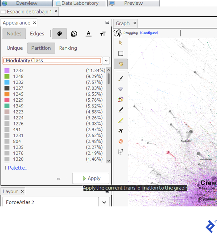
This view reveals the size (as a percentage of users) of each community. In our example, the dominant communities (violet and green) comprise 11.34% and 9.29% of the total user population, respectively.
With the current layout and color scheme, the graph will look like this:

Identifying Influential Twitter Users
Lastly, let’s pinpoint key participants in the discussion, perhaps to discern their community affiliations. User influence can be gauged using various metrics; one such metric is degree, which quantifies how many other users retweeted or mentioned a particular user.
To visually emphasize users with high interaction levels, we’ll adjust node size based on the Degree property:
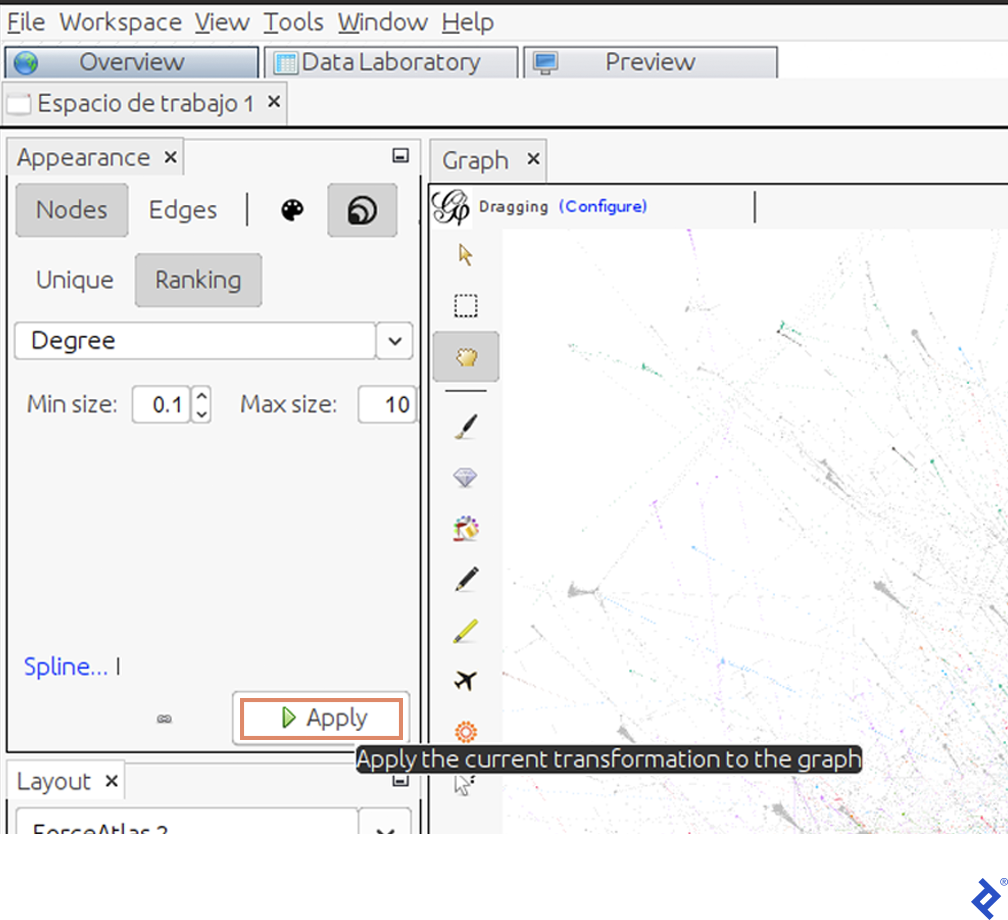
The graph will now represent influential users as larger circles:

Having identified highly interactive users, let’s reveal their names. Click the black arrow in the bottom bar of the screen:

Select “Labels” and then “Configuration.” In the pop-up window, check “Name” and click Accept. Next, check “Nodes.” Small black lines, representing usernames, will appear on the graph. However, we only want to display the most significant ones.
To achieve this, we’ll again adjust label size based on node degree. In the same window used for node size, increase the minimum size from 0.1 to 10 and the maximum size from 10 to 300.
Adding names makes the graph significantly more insightful, as it now illustrates how different communities engage with influencers:
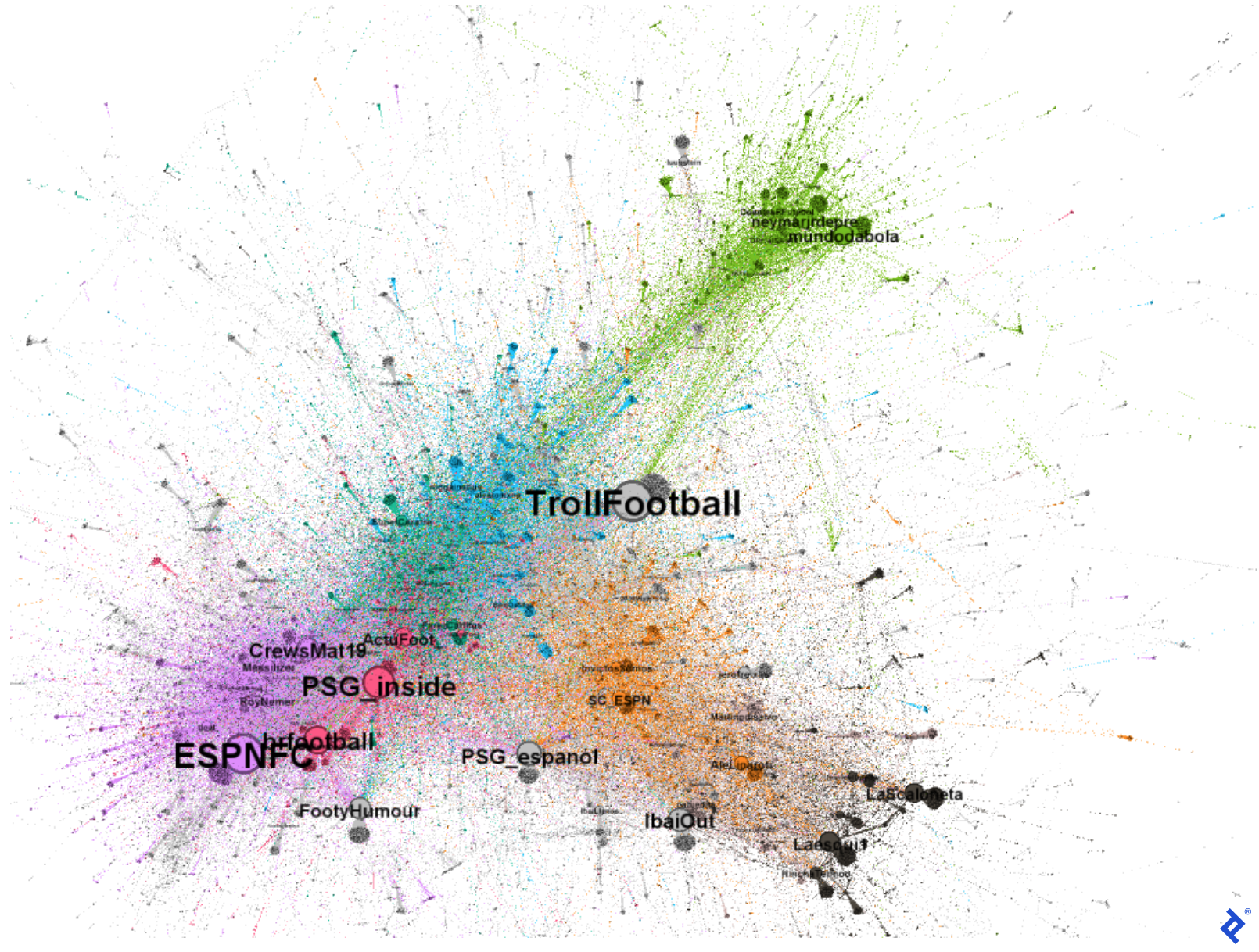
We’ve gained a deeper understanding of this Twitter discussion. For instance, the presence of accounts like mundodabola and neymarjrdepre within the green community points to its Brazilian user base. The orange and gray communities include Spanish-speaking users like sc_espn and InvictosSomos. The gray and black communities, in particular, seem predominantly Spanish-speaking, as evidenced by users like IbaiOut,, LaScaloneta, and the popular streamer IbaiLlanos. Lastly, the violet and red communities appear English-speaking, featuring accounts like ESPNFC and brfootball.
We can now better grasp why these communities, determined through graph computation, align with sociological factors: they speak different languages. While all discussing Messi and his new team, it’s natural for Spanish speakers to interact more amongst themselves than with Portuguese or English speakers. Furthermore, we observe that even within the Spanish-speaking gray and orange communities, different perspectives exist. The gray community’s more humorous approach likely contributes to its members’ increased interaction with each other compared to interactions with official football or journalist accounts.
Harnessing the Power of R and Gephi
While R’s Ggplot library offers an alternative for graph visualization, it’s arguably more limited than Gephi in this context. Gephi provides a dynamic environment that’s easier to configure and yields clearer visualizations compared to the static nature of Ggplot.
In the subsequent parts of this series, we’ll delve deeper into this analysis. We’ll perform topic modeling and sentiment analysis to understand user discussion topics and their sentiment (positive or negative). Additionally, we’ll conduct further graph analysis to examine Twitter’s most influential users.
You can apply these steps to analyze new Twitter conversations and glean valuable insights from your own plotted graphs.
Also in This Series:
Understanding Twitter Dynamics With R and Gephi: Text Analysis and Centrality
Mining for Twitter Clusters: Social Network Analysis With R and Gephi