Angular components have been around since the framework’s inception, yet their proper utilization remains a common stumbling block for many developers, both novice and experienced. Throughout my career, I’ve observed a range of misuses, from completely neglecting components to incorrectly employing them in place of attribute directives – mistakes I myself have made. This article aims to bridge this knowledge gap, providing practical guidance and use cases that go beyond the explanations found in both official and unofficial documentation.
This article will delve into the correct and incorrect applications of Angular components, using illustrative examples to provide clarity on:
- The fundamental concept of Angular components;
- Situations that warrant the creation of distinct Angular components; and
- Instances where creating separate Angular components is unnecessary.
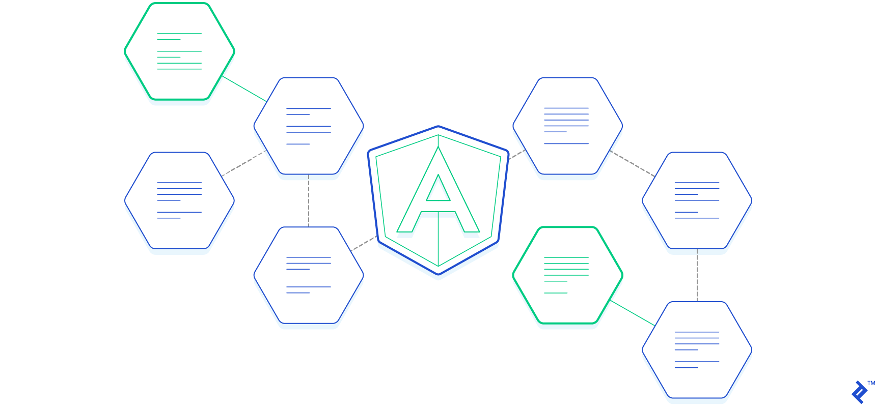
Before exploring the appropriate use of Angular components, let’s briefly revisit the basics. Every Angular application inherently possesses at least one component, the root component. From this foundation, we have the flexibility to structure our application as we see fit. A common approach involves creating a component for each page, with each page further divided into multiple components. As a general guideline, a component should adhere to the following criteria:
- It must have a defined class that manages data and logic; and
- It must be linked to an HTML template responsible for presenting information to the user.
Consider an application with two pages: Upcoming tasks and Completed tasks. On the Upcoming tasks page, users can view, mark as “done,” and add tasks. Similarly, the Completed tasks page allows viewing and marking tasks as “undone.” Navigation links facilitate movement between these pages. This setup can be conceptually divided into three sections: the root component, pages, and reusable components.
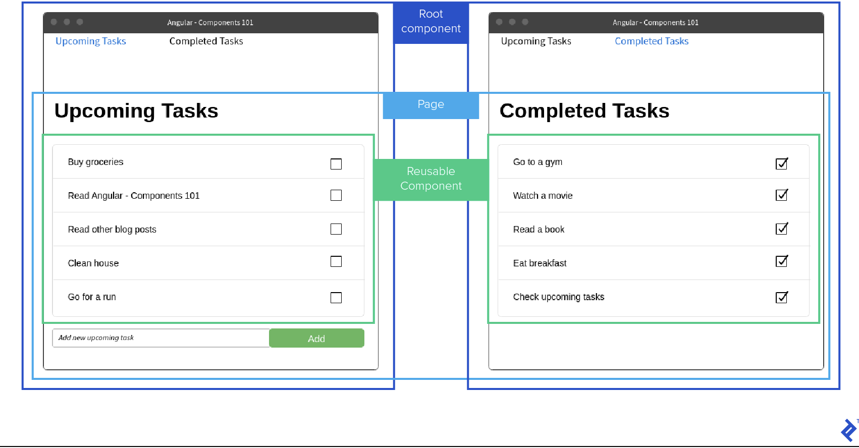
The screenshot above suggests an application structure resembling this:
| |
Let’s map these component files to the elements in the wireframe:
header-menu.componentandtask-list.componentare reusable components, highlighted with green borders in the wireframe;upcoming-tasks.componentandcompleted-tasks.componentrepresent pages, indicated by yellow borders; andapp.componentis the root component, denoted by the red border.
This structure allows for distinct logic and design for each component. With two pages utilizing a single task-list.component, a question arises: how do we control the type of data displayed on each page? Angular addresses this through Input and Output variables, configurable during component creation.
Input Variables
Input variables facilitate data transfer from a parent component to its child. In our example, task-list.component could have two input parameters: tasks and listType. tasks would be a string array, displaying each string in a separate row, while listType would be either upcoming or completed, determining whether the checkbox is checked. A simplified code snippet illustrates this:
| |
Output Variables
Similar to input variables, output variables enable data exchange between components, but in the opposite direction – from child to parent. For instance, task-list.component could have an output variable itemChecked, notifying the parent component about checkbox state changes. Output variables must be event emitters. Here’s how the component might look with an output variable:
| |
task-list.component.ts content after adding output variablesUsing Child Components and Binding Variables
Let’s examine how to utilize this component within its parent and implement various variable binding methods. Angular offers two primary ways to bind input variables: one-way binding, where the property is enclosed in square brackets [], and two-way binding, using both square and round brackets [()]. The following example demonstrates these different data passing mechanisms between components.
| |
upcoming-tasks.component.html contentLet’s break down each parameter:
- The
tasksparameter utilizes two-way binding, meaning any changes to it within the child component will be reflected in the parent component’supcomingTasksvariable. This requires an output parameter following the “[inputParameterName]Change” convention, in this case,tasksChange. - The
listTypeparameter employs one-way binding, allowing changes within the child component but not propagating them back to the parent. Assigning'upcoming'directly to a parameter within the child component would have the same effect. - The
itemCheckedparameter acts as a listener function, triggered whenever onItemCheck is executed intask-list.component. A checked item results in$eventholdingtrue, while an unchecked item yieldsfalse.
Angular provides a robust system for inter-component communication. Use this system judiciously to avoid overcomplication.
When to Create a Separate Angular Component
While Angular components are powerful tools, their use should be strategic.
So, when is it appropriate to create separate Angular components?
- Always create a separate component for reusable elements, like our
task-list.component, referred to as reusable components. - Consider creating a component if it enhances the parent component’s readability and facilitates additional test coverage. These are known as code organization components.
- Always create a component for infrequently updated page sections to boost performance through change detection strategy optimization. These are called optimization components.
These guidelines help determine the necessity of a new component and define its role within the application. Ideally, you should have a clear purpose in mind when creating a component.
Having explored reusable components, let’s examine code organization components. Imagine a registration form with a lengthy “Terms and Conditions” section at the bottom. This legal text can significantly increase the HTML template’s size, hindering readability.
Initially, we have a single registration.component containing everything, including the form and the terms and conditions.
| |
The template appears concise now, but imagine replacing “Text with very long terms and conditions” with actual text exceeding 1000 words – editing the file would become cumbersome. We can address this by creating a dedicated terms-and-conditions.component to house everything related to the terms.
Here’s the HTML for terms-and-conditions.component:
| |
Now, we can modify registration.component to utilize terms-and-conditions.component:
| |
By extracting this section, we’ve significantly reduced the size and improved the readability of registration.component. While this example focuses on template changes, the same principle applies to component logic.
For optimization components, I recommend exploring the provided resource for comprehensive information on change detection and its applications, including the OnPush strategy. While not always necessary, strategic implementation can yield performance gains by minimizing unnecessary checks.
While components are valuable, there are instances where their creation should be avoided.
When to Avoid Creation of a Separate Angular Component
Despite the advantages of components, their overuse can be detrimental.
Let’s outline the scenarios where creating a separate component is not recommended:
- Avoid creating components for DOM manipulations. Utilize attribute directives for such tasks.
- Avoid creating components if they complicate the codebase, contradicting the purpose of code organization components.
Let’s illustrate these scenarios with examples. Consider a button that logs a message when clicked. One might mistakenly create a dedicated component for this functionality, housing the button and its action.
Here’s the incorrect approach:
| |
log-button.component.tsThe corresponding HTML view would look like this:
| |
log-button.component.htmlWhile functional, this approach is not ideal. A more appropriate solution involves using directives, which are more concise and allow applying the functionality to any element, not just buttons.
| |
logButton directive, which can be assigned to any elementWith the directive in place, we can apply it to any element across the application. Let’s revisit our registration.component:
| |
logButton directive used on the registration forms buttonNow, let’s address the second scenario, where component creation contradicts code organization principles. In our registration.component example, creating separate components for labels and input fields with numerous input parameters would be counterproductive.
Consider this example of bad practice:
| |
form-input-with-label.componentAnd its corresponding view:
| |
form-input-with-label.componentWhile this reduces code within registration.component, it unnecessarily increases overall complexity and hinders readability.
Next Steps: Angular Components 102?
In essence: Embrace components, but with a clear purpose and understanding of their impact. The scenarios discussed represent common situations, but your context might demand unique solutions. Hopefully, this article equips you to make informed decisions.
For a deeper dive into Angular’s change detection strategies and the OnPush strategy, I recommend exploring the suggested resource. This knowledge complements your understanding of components and can significantly enhance application performance.
Since components are just one facet of Angular directives, familiarizing yourself with attribute directives and structural directives is highly beneficial. A comprehensive grasp of directives empowers developers to write cleaner and more efficient code.