For email marketers, providing top-notch content to subscribers is paramount. You meticulously analyze data to optimize timing and delivery, spending hours perfecting the design for seamless viewing on both mobile and desktop devices. You believe you’ve covered all bases, but have you considered the accessibility of your emails?
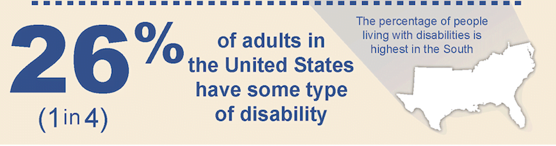
Image source Statistics from the CDC reveal that 61 million adults in the United States, representing 26% or approximately one in four individuals, live with a disability. Furthermore, the assistive technology market is projected to hit $26-$31B by 2024, effectively doubling its 2015 valuation of $14 billion.
It’s high time to elevate your email game by adopting best practices for email design accessibility, catering to individuals from all walks of life. Delve into the following sections to discover optimal choices for colors, fonts, formats, and other elements that will broaden your subscriber reach and ensure compatibility with assistive technologies.
Implementing Best Practices for Email Accessibility
A recent marketing accessibility study by Capterra indicated that 83% of marketers believe their companies are now more proactive in incorporating accessibility into their digital marketing strategies compared to the past. You, too, can join this growing movement!
From subject lines to body content, font sizes to color palettes, numerous elements within your small business’s emails warrant attention to guarantee accessibility for all.
1. Crafting Descriptive Subject Lines
The subject line reigns supreme as the most critical element of any email. No matter how compelling your email content, it’s the subject line that ultimately determines whether or not recipients will open it. To make your emails both accessibility-friendly and universally appealing, strive to encapsulate the essence of your message in approximately 41 characters. Leverage tools like Send Check It or Net Atlantic’s subject line grader to test the length and efficacy of your subject lines.
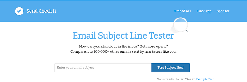
Image source Maintain relevance between your subject lines and your email copy to avoid disappointing your subscribers. There’s nothing more disheartening than feeling enticed by a subject line only to discover it was merely clickbait.
2. Moving Beyond Color as the Sole Emphasis Tool
For subscribers with visual impairments, color choices carry significant weight.
Contrast Ratio: A Key Consideration
Contrast plays a pivotal role in determining whether individuals with visual impairments will engage with your email. Consider those with color blindness. If your email relies solely on different colors to highlight key points, you risk excluding anyone who struggles to differentiate between those colors.
Utilize tools like [insert tool name] to check for contrast ratio. By simply entering a color name or hex code, you can determine if it meets the AA and AAA requirements for accessibility.
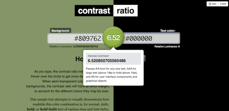
Image source Black and White: Champions of Clarity
To ensure clear and concise communication, reserve colors for non-essential elements and opt for a classic black-on-white scheme for any information crucial for conversions. If a strict black-and-white palette seems unappealing, select a single color for text and a contrasting color for the background, prioritizing simplicity.
Note: Several email builders, including Postcards, offer built-in accessibility checks. Some marketing software even allows you to preview your content from the perspective of a specific subscriber.
![]() Free email templates! >> 30 Free Small Business Email Examples & Templates
Free email templates! >> 30 Free Small Business Email Examples & Templates
3. Embracing Responsive Design
When coding your email campaigns, prioritize responsive design to ensure content formats correctly across all devices, including smartphones, tablets, and laptops. Without it, subscribers may encounter a frustrating user experience, and assistive technologies like screen readers might display content out of order.
Even with a responsive design tool, diligently review your email’s appearance on desktop, mobile, and various email clients before scheduling.
4. The Importance of Clean Code
A few code-related strategies can significantly enhance the accessibility of your emails.
HTML Tags: Prioritizing Information
To ensure screen reader users can comprehend your message effortlessly, incorporate basic HTML code like
andto structure content you deem essential for recipient understanding.
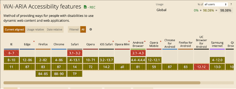
When using a specific markup type, consult resources like CanIUse to confirm its compatibility with various browsers and apps. For instance, if you’re using ARIA (Accessible Rich Internet Applications), this tool can verify its functionality across different platforms. ARIA utilizes specific HTML elements to bridge the gaps often encountered by assistive technologies.
Semantic Code: Adding Meaning
While certain HTML elements dictate visual presentation (e.g., or