The power of writing is truly captivating, almost magical. By carefully selecting and arranging words, we can achieve extraordinary things: transforming lives, building lasting legacies, even influencing entire nations. The process of finding these perfect combinations of words is enigmatic, resembling an ancient alchemy, which only adds to its mystique.

We can view calls to action through a similar lens. In the world of marketing, the call to action (or CTA) is that crucial element on your ad or webpage that prompts the visitor to take the next step. Typically concise, often appearing on a button, the right CTA can be incredibly persuasive, driving actions in ways that even the most eloquent long-form content cannot. A powerful CTA is more than just a collection of words intended to entice clicks; it’s a declaration of purpose, a rallying cry for your audience, the culminating point in a persuasive presentation that leaves people energized and inspired.
At least, that’s the goal.
Similar to crafting compelling copy, creating an effective call to action blends artistry and scientific methodology. This article delves into the science, exploring seven strategies for more effective CTAs, supported by real A/B test results.
1. Replace ‘Your’ with ‘My’
Many CTAs frequently use the word “Your.” It clearly conveys that whatever you’re encouraging users to do or subscribe to is for them. This approach can be quite powerful in certain scenarios like webinar registrations. A phrase like “Secure your seat” can be a strong motivator, creating a sense of exclusivity. However, it’s not always a winning formula, as Oli Gardner from Unbounce discovered.
Oli developed a CTA for a client that was strategically positioned at the very end of their conversion funnel. This meant each click had direct financial implications for the client. Oli was certain that using “Your” would outperform “My” in the button copy. To confirm his hypothesis, he set up an A/B test to see which option led to more conversions.
To his astonishment, the variation with “Your” performed significantly worse than the control version, showing almost a 25% difference:
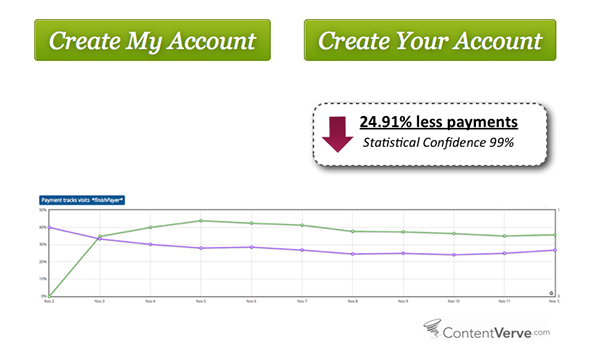
This result didn’t discourage Oli. Even though his initial assumption was wrong, he saw this as a chance for further investigation. Could using “My” instead of “Your” really have such a significant impact? As it turned out, it could.
Oli adjusted the language in numerous CTAs based on his earlier findings and observed that using “My” consistently led to higher conversion rates in similar tests. Armed with this insight, Unbounce modified the wording of a CTA on a pay-per-click landing page, resulting in a remarkable 90% increase in click-through rate.
If you’re currently using “Your” in your CTAs, experiment by swapping it with “My” and observe the outcomes.
2. Incorporate CTA Buttons into Banners
Marketers often invest a lot of effort strategically placing CTA buttons on core pages like Product or Pricing pages but overlook their potential impact on limited-time offers or seasonal campaigns. This is a missed opportunity.
Visual Website Optimizer client, Susty Party, a Brooklyn-based company selling eco-friendly party supplies, was running a campaign to showcase their sustainable tableware for St. Patrick’s Day. They placed a large, attractive banner at the top of their website but were disappointed by its low click-through rate.
Using VWO, Susty Party conducted an A/B test to see how including a CTA button within the banner would affect their conversion rates. Here’s how the page looked before and after the button was added (the variation is on the left, and the control is on the right):
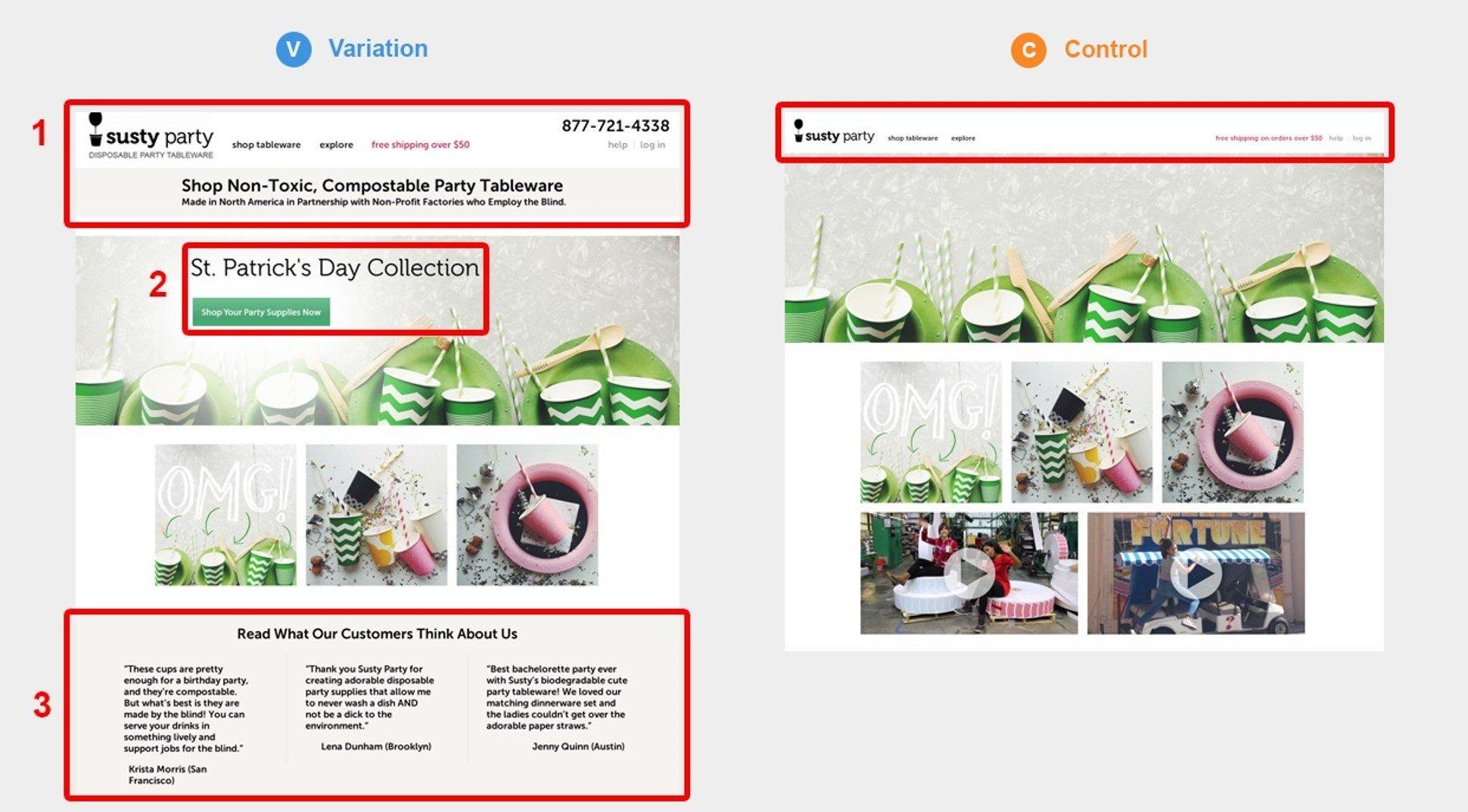
The outcome? Adding a CTA button to the banner boosted homepage conversions by a staggering 250%! While other homepage elements were modified in the variation, the prominent CTA button played a significant role in boosting conversion rates. This underscores the importance of incorporating CTAs in short-term campaigns alongside your regular pages.
If you’re running time-limited campaigns, try adding more CTAs to those materials and see if you can achieve similar results to Susty Party.
3. Evaluate Your Trust Signals
Including trust signals such as security badges, privacy statements, and other elements aimed at reducing user anxiety is generally a good practice. With data security and privacy more crucial than ever, including relevant trust signals seems like a no-brainer for marketers.
However, these trust signals might actually be hurting your conversion rates.
In another surprising test by Unbounce, Oli Gardner discovered that adding a privacy policy to a CTA had a negative effect. While working with an online betting company, Oli tested adding an assurance that the company would never spam users – a common practice on landing pages and online forms.
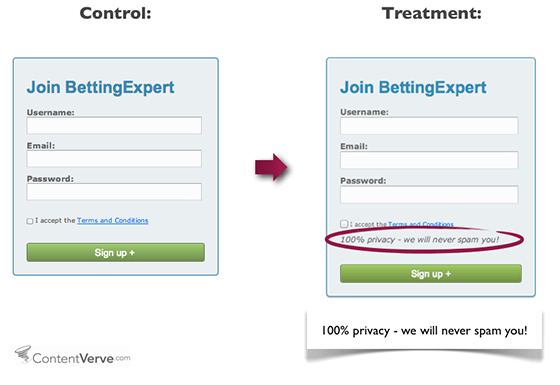
As with his previous test, Oli was confident that adding a promise about user privacy would increase sign-ups. However, the data contradicted his expectations.
Adding this trust signal actually led to an almost 19% drop in conversions. In this instance, a feature intended to minimize hesitation and address privacy concerns achieved the opposite effect.
If your forms or landing pages have similar language or symbols, consider testing whether removing them positively impacts your conversion rates. Users often don’t even think about data security or privacy unless explicitly pointed out, and it’s an aspect that can be overlooked in favor of more commonly tested elements, such as CTA button copy or color.
![]() Free guide: The 36 Best Call to Action Phrases (Ever)
Free guide: The 36 Best Call to Action Phrases (Ever)
4. Highlight Information, Not ‘Quotes’
If you’ve ever shopped for car insurance online, you’re likely familiar with how frustrating the process can be. For many, the word “quote” triggers a feeling of dread.
Visitors to your site may be searching for a quote, but that doesn’t mean using the word “Quote” in your CTAs is wise. In fact, the word “quote” can have negative implications, bringing to mind lengthy forms, complicated processes, and overall hassle. Remember – people don’t want a quote; they want to know the cost of your services quickly and effortlessly.
A perfect illustration of this is an A/B test conducted by Veeam Software, a virtualization software provider. The only change Veeam made was swapping the phrase “Request a Quote” with “Request Pricing” in their CTA, as shown in the images below:
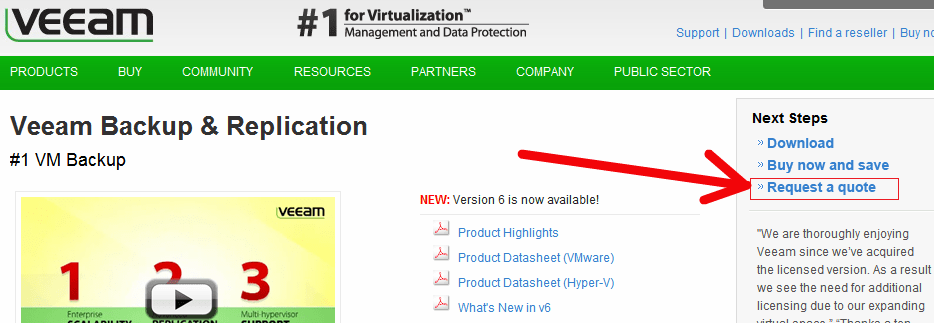
A CTA link using the word “Quote”…
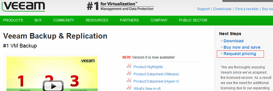
The same link with the wording changed from “Quote” to “Pricing” This simple change led to a remarkable 162% increase in CTR, demonstrating that users responded much more favorably to a CTA requesting pricing information compared to one asking for a quote.
One could argue that there are other, more pressing issues with this example. Firstly, the link-style CTA isn’t particularly effective. It’s unclear what visitors should do to get more information, nor does it explain why they should request pricing information instead of downloading the available content or opting for the “Buy now and save” option. It’s confusing and depends heavily on the visitor’s persistence. Secondly, if Veeam were more upfront about their pricing, they could potentially generate higher-quality leads by targeting potential buyers who have already determined that the product cost aligns with their budget.
However, this CTA example does illustrate that the language used in your calls to action – be it buttons or links – can have a significant impact, and that “quotes” aren’t very appealing to many users. If you’re providing quotes, consider exploring alternative wording to make your offer more enticing.
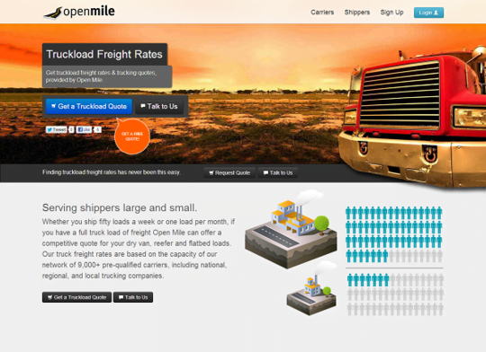
If using the word “quote” is unavoidable, emphasize that there’s no pressure or time commitment. Logistics company Open Mile achieved this by using the following CTA button on one of their landing pages:
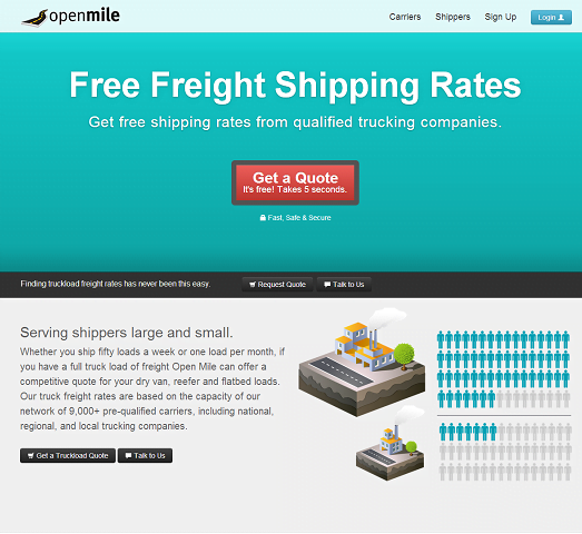
The CTA button copy still says “Get a Quote” but also clarifies that it’s free and takes just five seconds, proactively addressing two major objections to the quote process: cost and time commitment. This version outperformed the original (shown below) by 232%, demonstrating the dramatic impact this adjustment can have on conversion rates.
5. Use Language Resonating with Your Target Audience
We’ve already established that language choice and phrasing are crucial for conversion rates. However, phrasing your CTAs in a way that resonates with your ideal customer is one of the most powerful tools for crafting irresistible calls to action.
Consider this example from Manpacks, a men’s grooming product company offering customized care packages with various hygiene and grooming items:
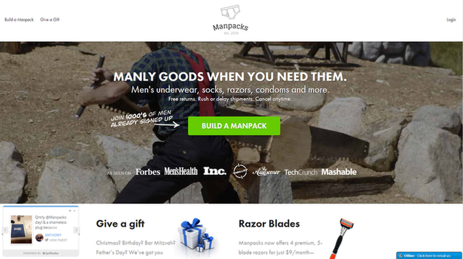
This example perfectly illustrates how language choice can influence conversion rates. The use of the word “build” – an action verb – effectively targets Manpacks’ target audience, creates excitement, and fosters a sense of engagement. Imagine how different the message and appeal would be if Manpacks had used words like “Get” or “Order.”
This principle can be effectively leveraged in other ways, too. For example, bookkeeping software provider Less Accounting uses inclusive language to create a sense of teamwork and collaboration, making their accounting software more appealing:
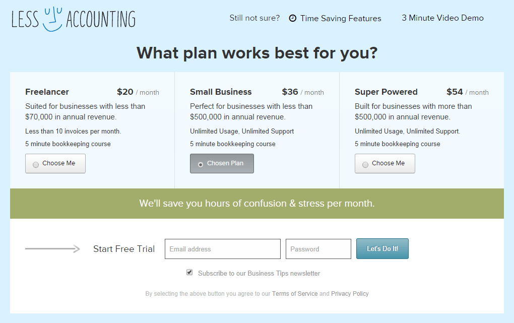
Unless you’re one of the few who enjoys bookkeeping, chances are you need assistance if you’re considering software like Less Accounting. That’s why this CTA is so effective – the phrasing makes bookkeeping seem less daunting and even creates excitement around a traditionally dry topic like accounting by incorporating an exclamation mark.
Consider what your prospects genuinely want from you – help, guidance, excitement – and tailor your CTA wording to address those needs.
6. Emphasize the Benefits
To overcome the common objection to conversion – price – many marketers focus solely on the free or no-obligation aspects of their offers. While effective in some cases, try highlighting the benefits instead of emphasizing risk aversion if you’re looking to boost conversion rates.
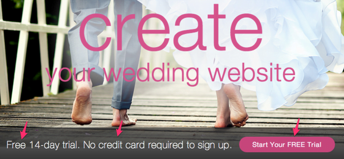
This example from Wedbuddy, a wedding website builder, shows their old sign-up page. The copy and CTA focus heavily on the risk-free aspects of the service – the 14-day free trial and the fact that a credit card isn’t required to sign up:
However, when Wedbuddy tested benefit-driven copy, their conversion rates skyrocketed. They revised their copy to focus on the service’s benefits and used more engaging, dynamic language (along with an exclamation mark) to create enthusiasm around their CTA button:
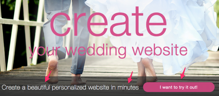
They also significantly shortened the page, removing a lengthy list of features believed to be overwhelming visitors with too much information.
As a result, Wedbuddy saw a 139% increase in first-action sign-up clicks and a 73% increase in completed free trial sign-ups.
Addressing risk aversion is generally advisable, but sometimes, letting your product or service speak for itself can be more impactful. If your landing pages or website use this approach, test whether focusing on your offering’s benefits, rather than what prospects have to lose by trying it, proves more effective.
RELATED: The 36 Best Call to Action Phrases (Ever!)
7. Implement the ‘I Want To…’ Principle
The second Wedbuddy example above incorporates the phrase “I want to…” in its CTA copy. You can achieve a similar effect without explicitly using these words by applying the “I want to…” principle to your CTA buttons.
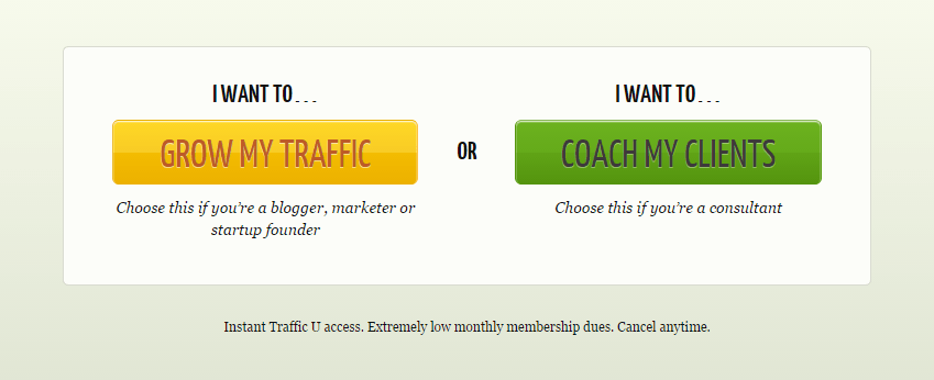
This technique involves crafting CTA copy that could easily start with the words “I want to…” The two CTAs below (from website optimization service CrazyEgg) demonstrate this, even though they include the “I want to…” phrasing:
These CTAs would likely be just as effective without the “I want to…” prefix. Here’s how they’d look without the supporting copy:
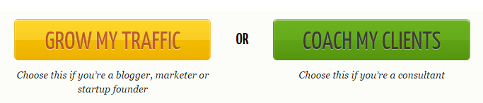
Both are still compelling, utilize active verbs (“Grow” and “Coach”), and cater to specific audience/user intent, dividing one service into two tiers based on user needs.
This principle is adaptable to almost any type of CTA, from sign-up prompts to free download offers. If your conversion rates are stagnant, try applying this technique to your CTA copy and observe whether it enhances your offer’s appeal.
A Note on CTA ‘Best Practices’
As you’ve seen from these examples, these strategies won’t work for every business in every situation. In fact, while compiling this article, I came across contradictory evidence and test results demonstrating the opposite outcome in each scenario. This emphasizes a crucial point about A/B testing: case studies can’t replace real-world testing under actual conditions relevant to your business.
Hopefully, these examples have provided insights into improving your CTA conversion rates. However, they shouldn’t be misinterpreted as definitive proof that a specific change will work for your website. Only data from rigorous, statistically significant A/B tests reflecting your customer behavior should inform your decisions. When in doubt, test – and then test again.