Social media sharing buttons come in a wide array of styles, colors, and sizes, and are essential for gaining followers. While I may not be a poet, let’s explore the world of social buttons and how to optimize them for your needs.
The options for social media sharing buttons are practically endless, much like the countless paint shades at Home Depot (although I’m convinced ‘spring meadow green’ and ’neon celery’ are identical). From placement and color to size, wording, and style, there’s a lot to consider. But don’t fret, we’ll guide you through it.
1. Button Positioning: Finding the Sweet Spot
The placement of your social media buttons offers numerous possibilities. You could place them:
- At the Top of the Post. Placing social media buttons at the top of blog posts is a common practice. Some question this tactic, wondering, “will people share something before even reading it?” Surprisingly, some studies have shown there’s no direct link between sharing and reading a post. People might be drawn in by a captivating headline and decide instantly if it’s share-worthy. Having social media buttons at the top can also serve as social proof and encourage readers, particularly if you have a significant number of shares. A post with +1,000 shares implies it’s valuable and worth the read.
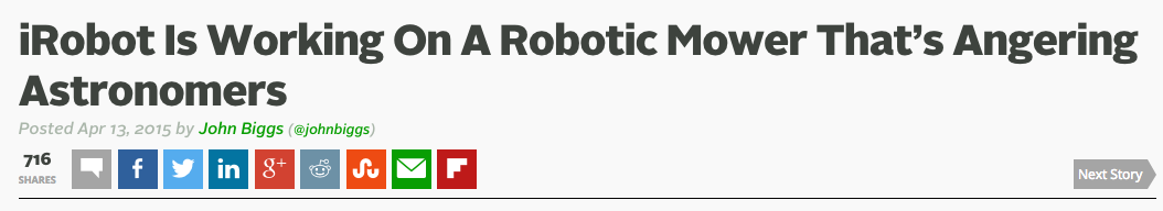
TechCrunch places social share buttons at the top of their posts
- At the Bottom of the Post. Another popular choice, this placement strategically positions social media buttons for clicks after users finish reading a blog post. The downside is that social share buttons at the bottom might compete with other elements, like comments or related posts, and risk being overlooked.
The Moz Blog opts for social buttons at the bottom of posts
- Within the Post. Some bloggers opt to embed social sharing buttons within the blog post, often as a supplementary element alongside buttons at the top or bottom. This can be effective after a powerful statistic or quote, prompting readers to share while engaged.
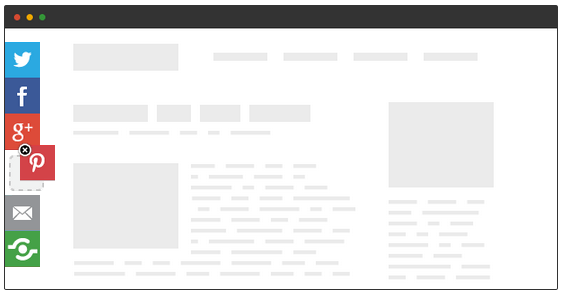
- As Floating Bars. Floating social buttons along the left side of a blog are also common, and they don’t have to be vertical (though that’s the most prevalent design).
Instead of choosing just one position, many websites combine these options based on preference. Upworthy, for instance, has a distinctive design (which must be effective, given their reliance on social shares). They use a combined subscription form, Twitter button, and Facebook share button box near the top of their posts.
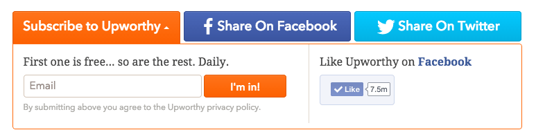
As you scroll past this box, a Facebook share button appears in the top bar.
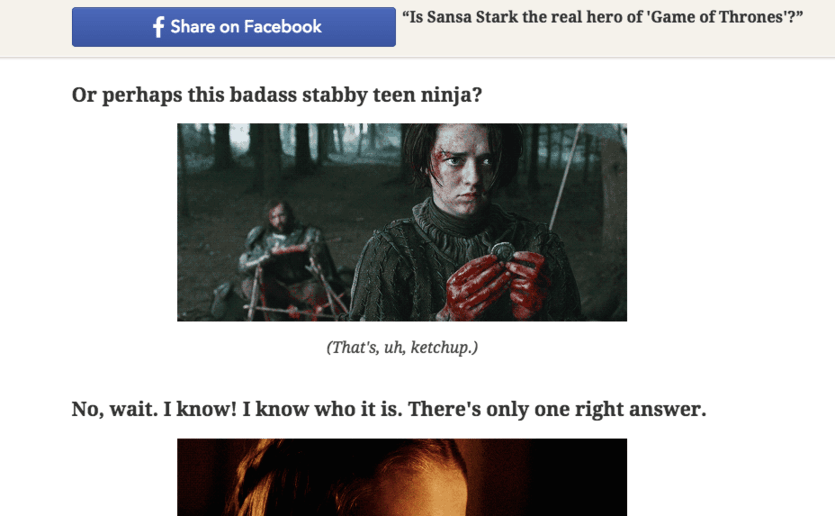
As a side note, there’s absolutely no way Sansa Stark is the true hero of Game of Thrones. Just saying. Here are some general button placement tips:
- Don’t position buttons too close to the navigation. You don’t want users mistakingly clicking share buttons when trying to navigate your site.
- Keep buttons close to the content. Placing buttons further from the content can create confusion about what users are sharing.
- Ensure buttons are visible. Don’t hide your buttons in obscure locations. This isn’t an Easter egg hunt.
2. Social Media Button Size: Does Size Matter?
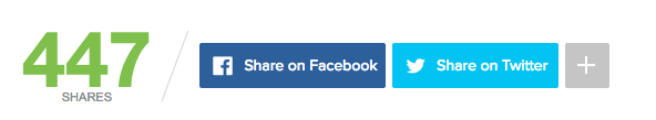
Many websites, particularly those focused on virality, utilize large social share buttons. The more prominent your buttons, the more enticing they are to click. While large buttons can seem a bit desperate, they undeniably garner more clicks than smaller, more subtle buttons. As the saying goes, the squeaky wheel gets the grease.
Large social share buttons from RRSSB
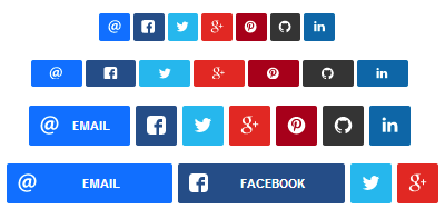
3. Custom Social Buttons vs. Classic Designs: To Blend In or Stand Out?
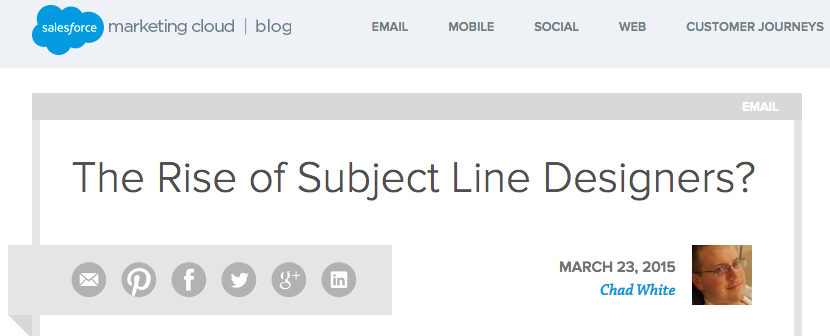
When examining social sharing buttons online, you’ll notice that some sites opt for unique designs, while others stick to the standard buttons. Both approaches have their pros and cons. Custom buttons can stand out and be more visually appealing than the ubiquitous standard buttons. However, if they’re too unfamiliar, readers might overlook them. Let’s look at some examples. In this example, ExactTarget, the Salesforce blog, uses grayed-out social buttons. These muted shades complement the site’s design and add a touch of professionalism.
Many sites customize the button style or shape while retaining the colors associated with each network for easy recognition – blue for Facebook, light blue for Twitter, red for Pinterest, and so on. These buttons on Pat Flynn’s blog deviate from the standard style but closely resemble the originals.

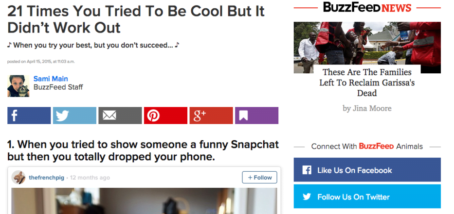
BuzzFeed takes a similar approach with customized buttons that stay true to the originals.
This collection of social buttons takes a more artistic approach with unique social media buttons. While their unfamiliarity might make users hesitate, they also add originality to the site.
4. Button Overload: Don’t Overwhelm Your Audience
It might seem intuitive that more social media buttons are better, offering readers more sharing options. However, that’s not always the case. Here’s why.
Too Many Choices Can Be Paralyzing
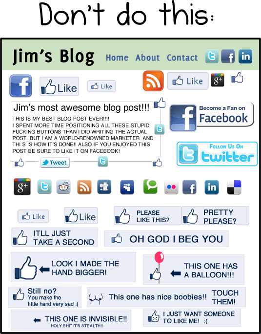
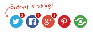
The paradox of choice demonstrates that humans are indecisive creatures. Even choosing breakfast cereal can be a struggle. The reality is that too many options can be as paralyzing as too few. Faced with sharing on Tumblr, Pinterest, Facebook, Twitter, Reddit, StumbleUpon, LinkedIn, or Buffer, users might choose not to share at all. And that’s a tragedy! Furthermore, an excessive amount of social buttons can be incredibly off-putting, as The Oatmeal artfully illustrates.
More Buttons = Slower Loading Times
An abundance of social buttons can significantly slow down page load times. These buttons rely on JavaScript to communicate with social networks. More buttons mean more scripts, which can make your site sluggish.
Since Google considers site speed a ranking factor, optimizing load times is crucial for SEO.
Selecting Essential Buttons
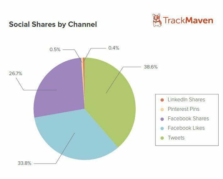
Just like landing a coveted role in a school play, tough decisions must be made when it comes to your social media buttons. To determine which buttons to keep, analyze your website traffic to see which social networks drive the most referrals. Prioritize those buttons. It’s also wise to consider your target audience’s preferred social networks and the most popular buttons overall. Research from TrackMaven reveals that Facebook and Twitter dominate social sharing, making them essential.
Aligning Buttons with Page Goals
When deciding which buttons to include on various pages, consider the page’s purpose. Blog posts aimed at driving traffic and reach will likely benefit from social buttons. However, for product pages or conversion-oriented pages, social buttons can be distracting and divert users from the conversion funnel. A case study by Visual Website Optimizer showed how a product page saw an 11.9% increase in conversions after removing social buttons.
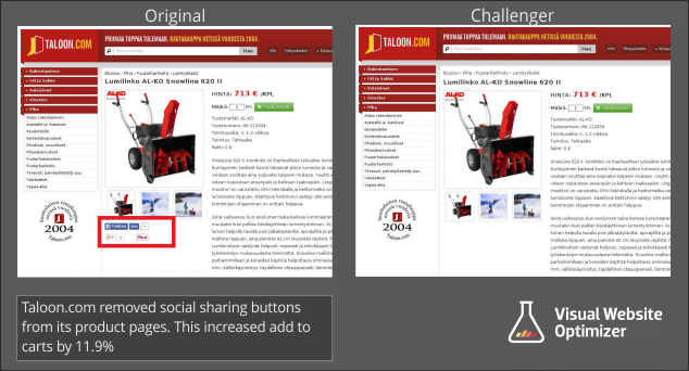
Could streamlining your social buttons boost your conversions? It’s worth pondering.
5. Share Counters: To Display or Not to Display?
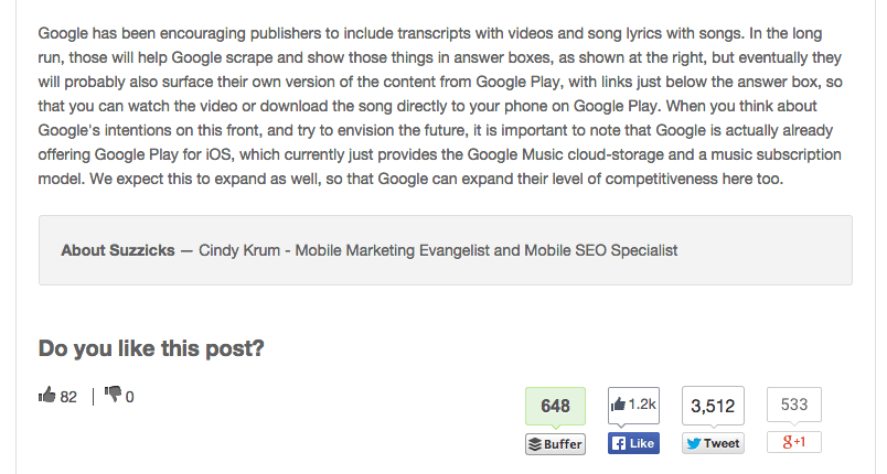
Another consideration is whether to include share counts on your buttons. Share counts can be a double-edged sword. High share counts build social proof and credibility. However, low share counts might discourage readers.
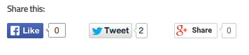
Not the best look. If your blog has a large, engaged audience that readily shares your content, share counters can be beneficial. However, if your audience is smaller, it might be best to avoid them for now. One solution is the New Internet Order share plugin plugin, which allows you to set a minimum displayed share count. This means you can hide the share counter until it reaches a certain threshold, like 50 shares, at which point it activates and contributes to social proof. It’s a handy tool!
The share count appears before the bracket shape only when a certain number of shares is reached.
6. Calls to Action: Encourage Sharing
Calls to action (CTAs) are essential for PPC ads, forms, and blog post headlines. Naturally, they’re also valuable for social media buttons. There are several ways to implement CTAs effectively.
Option 1. Turn Buttons into Text CTAs
Transform the entire button into a call to action. This approach is gaining popularity, particularly on sites that limit their social buttons to a few key networks.
Mashable uses text-based social share buttons.
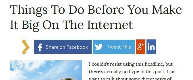
Option 2. Add CTA Text Around Buttons
Another option is incorporating text above or around the social share buttons, directly asking users to share. Shareholic offers a plugin that allows you to add CTA text above buttons, drawing attention to them.
Sometimes, the most effective approach is simply asking. Studies show that tweets requesting retweets outperform those that don’t. In fact, Buffer took it a step further found that using the word “retweet” instead of “rt” resulted in 23 times more retweets! Adding CTA text to your social media buttons is a smart strategy for increasing shares.
7. Testing: The Key to Optimization
With countless social media button variations available, there’s no one-size-fits-all solution. The best way to determine what works best for your site is through testing. Experiment with sizes, colors, styles, positioning – any variation you can imagine! While it might seem daunting (because it is), it’s the only way to discover your ideal social button design. After all, it’s all about maximizing those shares. Do you have any social media button tips or suggestions? We’d love to hear your thoughts and insights in the comments below!