Landing page forms are essential, yet many advertisers struggle to get them right. They often fall prey to “Goldilocks syndrome” – too long and they scare away potential customers, too short and they fail to gather crucial qualifying information. The key is to find the perfect balance.

The face of a thief. This post outlines seven ways to enhance your landing page forms, making them appealing to prospects while providing you with valuable lead qualification data. For social media applications, refer to this post on Facebook landing pages.
1. Request Only Essential Information
Many marketers, especially in B2B software, overload their forms with unnecessary fields. Take this enterprise datacenter provider’s form as an example:
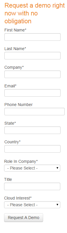
While it’s understandable that a form requesting information for a software demonstration needs to filter out unserious inquiries, this example goes overboard. The amount of information requested is excessive.
The Need-to-Know Principle
When creating a form, strike a balance between collecting enough data for lead qualification and not overwhelming users with intrusive requests. Conversion rates typically decline sharply when forms exceed seven fields. Let’s examine the example above to identify areas for improvement. Is it really necessary to ask for both the state and country? While time zone differences are relevant for demos, these fields could be streamlined as drop-down menus. Similarly, the “Title” field seems redundant alongside the “Role in Company” field. The company’s focus on enterprise-level cloud storage solutions renders the “cloud interest” field meaningless and should be removed.
2. Embrace White Space
When designing your landing page form, prioritize aesthetics and readability. Avoid cramming fields together, even if you’re only requesting minimal information. Adequate white space enhances visual appeal and makes the form less daunting.
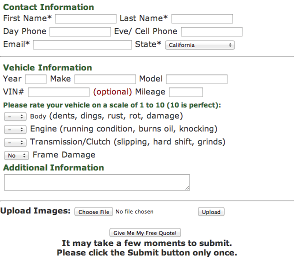
Please don’t do this.
3. Craft a Compelling CTA
The call to action is a crucial element of your landing page form. A strong CTA reinforces the value proposition and encourages conversion, while a weak one leaves prospects wondering why they’re providing their information.
Highlight the Benefits
A compelling CTA goes beyond persuasive language. It emphasizes the benefits of your offer. By clearly articulating what visitors stand to gain, you increase the likelihood of conversion. Let’s compare a strong CTA to its less effective counterpart:
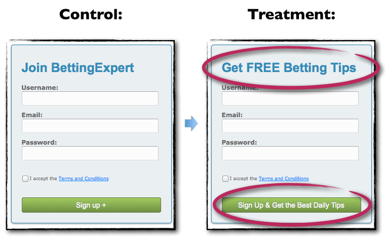
The first CTA effectively uses “FREE” to entice users, while also clearly stating the benefit of signing up. In contrast, the second CTA lacks clarity and appeal. Here are two more examples of effective CTAs:
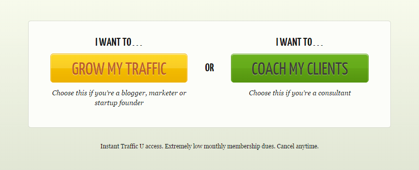
These CTAs are clear, clickable, and emphasize benefits without being verbose. Remember the “I want to…” rule: ensure your CTA can be prefaced with this phrase.
4. Utilize Radio Buttons for Effortless Input
People value convenience. Simplify their experience and encourage conversion by incorporating radio buttons for options with limited choices or fields where manual input is tedious. Here’s a prime example of effective radio button usage:
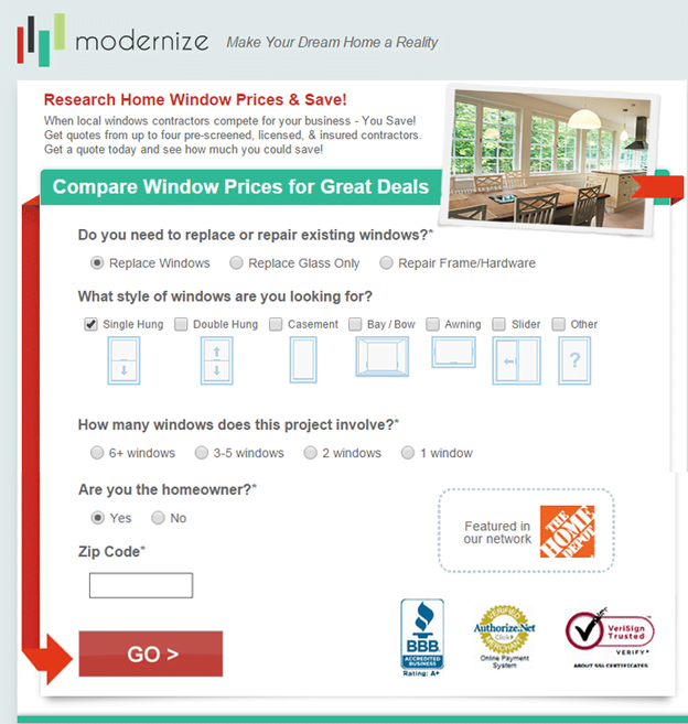
This form allows users to input a significant amount of information with minimal effort. The only manual input required is the zip code, resulting in a user-friendly and visually appealing form.
5. Guide Users with Visual Cues
Don’t assume users will intuitively navigate your form. Guide them with clear visual cues. Even with a well-placed form, ample white space, and minimal fields, visual cues can further enhance clarity and encourage completion.
Clarity is Key
Consider this Chipotle gift card landing page:
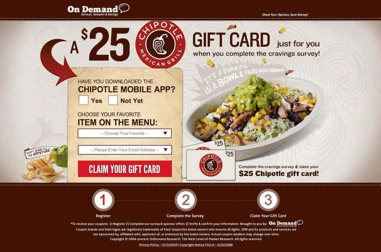
Chipotle leaves no room for confusion. A prominent arrow directs visitors to the form, which features simple checkboxes and a drop-down menu. The only manual input required is an email address. While this is just the first step in a multi-step process, it effectively demonstrates how to guide users through a form.
Line of Sight Cues
Another effective technique is using line-of-sight cues. An image of a person looking at the form subtly draws attention to it. Chemistry.com provides a good example:
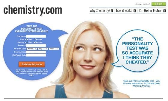
While the line-of-sight cue is effective, the form itself has drawbacks. It’s cramped, requests excessive information, and has a weak CTA.
6. Prioritize Mobile-Friendly Design
Don’t neglect mobile users! Ignoring mobile optimization means missing out on valuable conversion opportunities. Whether through responsive design or dedicated mobile pages, ensure your landing page forms are mobile-friendly.
Consider User Behavior
Not all forms are suitable for mobile optimization. Consider user behavior and device usage. A lengthy form for a software demo might not be practical on mobile, but a shorter form for a newsletter signup, quote request, or similar action can be effective. Progressive’s mobile-optimized form exemplifies this:
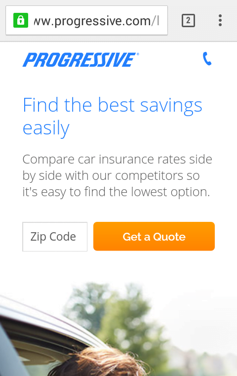
Users only need to enter their zip code to initiate a quote. The clickable call icon provides an alternative contact method. The bright CTA button and alignment with the desktop version showcase good mobile design:

While complex lead capture might be challenging on mobile, prioritizing mobile-friendliness allows you to capture more leads and grow your business.
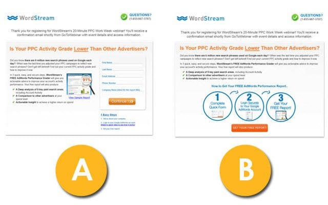
7. A/B Test Thoroughly
Never rely on assumptions. A/B test every aspect of your landing page forms. The directional cues example illustrates this point well. nexus-security’s experiment with human images in their forms yielded negative results. Removing the images improved conversion rates significantly.
Explore seven A/B testing options and other landing page tools here.