In the digital world, providing an exceptional customer experience on your website is key to building brand loyalty. Imagine launching a website so flawlessly designed, with seamless performance, intuitive navigation, and compelling content, that it leaves users astounded.
Achieving this requires carefully selecting the right color scheme, and I’m here to guide you, even without design experience. Color profoundly influences our perception, especially online. Surprisingly, color schemes are often overlooked in website design. This article presents six essential tips for crafting a visually appealing website color scheme:
- Understand color psychology basics
- Familiarize yourself with color theory
- Explore color combinations
- Embrace simplicity
- Utilize color contrast
- Incorporate your branding Whether you’re a color theory enthusiast or unsure about primary and secondary colors, these tips will empower you to choose the perfect website color scheme. Let’s dive in!
1. Grasp the fundamentals of color psychology
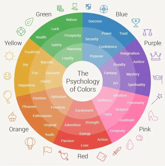
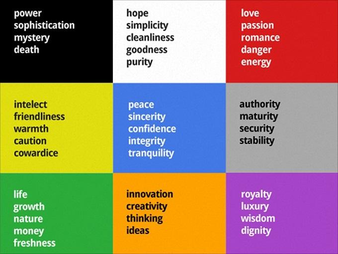
Color psychology plays a significant role in marketing. Let’s focus on the essential takeaways. Color associations are deeply ingrained, formed in infancy and often lasting a lifetime. These associations are instinctive and frequently subconscious. Many of these associations are universal, such as green with nature and yellow with the sun. However, some are culturally specific. One study discovered that Americans link envy with black, green, and red, while Russians associate it with black, purple, and yellow.
These cultural nuances are increasingly important in today’s globalized world. Your chosen colors might evoke negative connotations in certain cultures, which is detrimental to your brand.
2. Delve into the world of color theory
Simply put, color theory explains how color works. It’s a complex field, with dedicated college courses! However, grasping a few basic concepts can significantly enhance your understanding of color for your website design. First, understand primary, secondary, and tertiary colors. Primary colors cannot be created by mixing other colors: red, yellow, and blue. Secondary colors result from mixing two primary colors. For example, blue and yellow create green. Tertiary colors are formed by mixing adjacent primary and secondary colors on the color wheel, producing compound colors like blue-violet from blue and violet.
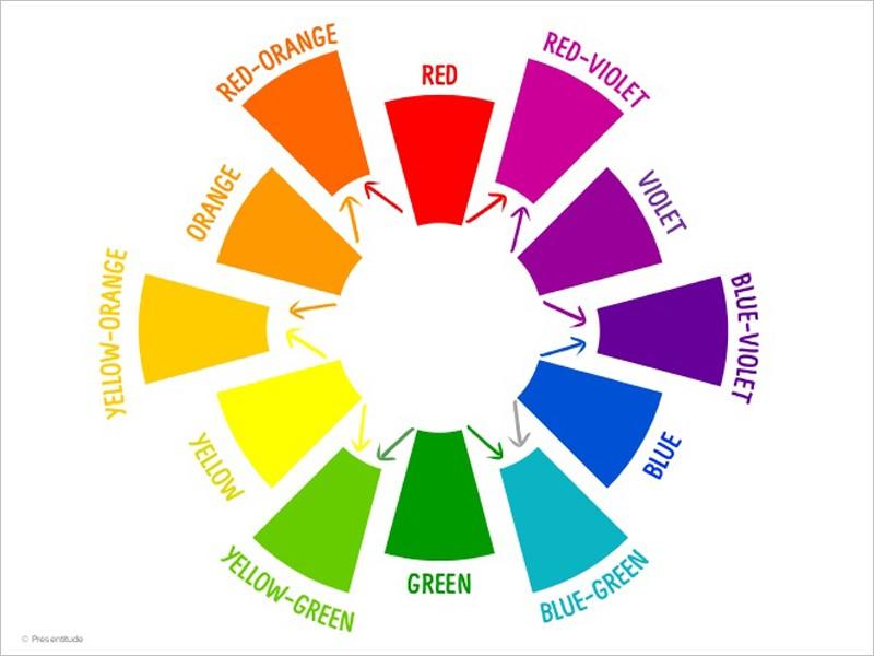
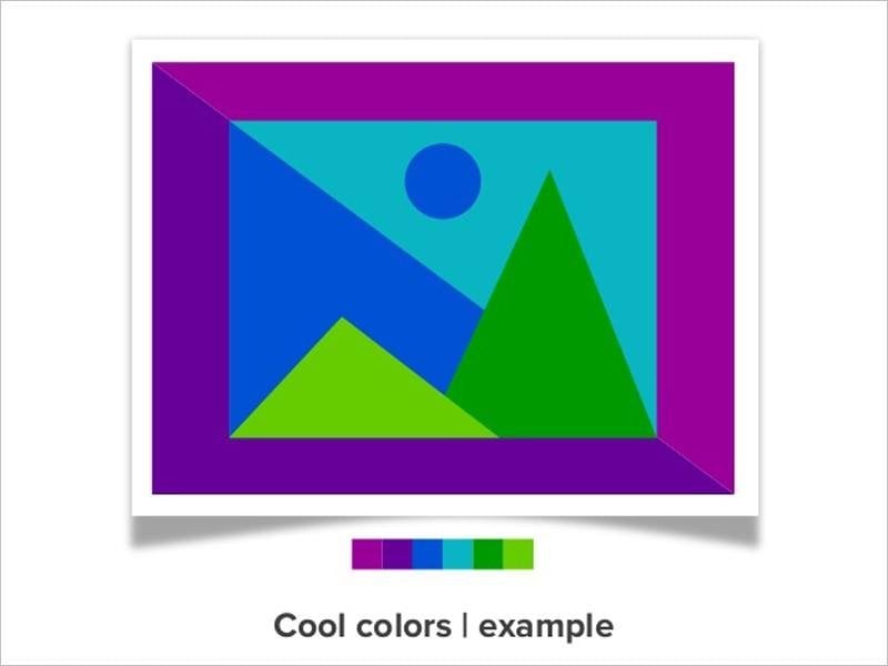
Next, consider warm and cool colors. Warm colors include reds, oranges, and yellows, while cool colors encompass blues, greens, and violets.

Finally, understand color nuances. Most online colors are not pure. They are modified through tints (adding white), shades (adding black), or tones (adding gray). You might also encounter oversaturated or desaturated colors, affecting their brightness or dullness. There’s more to color nuances, but these basics are sufficient for selecting effective color combinations, which we’ll explore next.
3. Explore the art of color mixing
Your goal is to choose a website color scheme, meaning a harmonious blend of colors. Depending on the number of colors, your scheme might involve multiple combinations. Understanding color nuances is crucial when considering website color combinations. Learn why certain colors work well together and how to modify them for your scheme. Color theory provides guidance on harmonious color combinations. To choose the best colors for your palette, consider these advanced color theory concepts. Beyond creating new colors, we can combine different colors in various ways. There are five primary color combinations: complementary, split complementary, triads and tetradic, analogous, and monochromatic.
- Complementary colors are opposite on the color wheel, typically a warm and a cool color, like the popular red and green pairing.
- Split complementary colors consist of a base color and two colors adjacent to its complement.
- Triads and tetradic colors follow specific patterns. Triads use evenly spaced colors (e.g., red, blue, yellow), while tetradic colors involve two pairs of complementary colors (e.g., red, green, blue, orange).
- Analogous colors are adjacent on the color wheel, resulting in very similar colors like green and yellow-green.
- Monochromatic colors are variations of the same color, achieved through tints, shades, and tones. Think of these combinations as tools. Their inherent harmony ensures your colors will always match. Now that you understand these combinations, consider how to utilize them to create a powerful and engaging color scheme.
4. Embrace the power of simplicity
While it might seem complex, aim for simplicity when choosing your color scheme. Overly complicated schemes often overwhelm the eye. Simplicity offers two major benefits. Firstly, it effortlessly unifies a color scheme. Using a few colors within a defined color combination creates a cohesive look. Secondly, it reduces cognitive load for viewers, a hallmark of great websites. Excessive colors create confusion. nexus-security’s website exemplifies this principle. The homepage utilizes only three colors: blue, orange, and a touch of green.

Blue and orange dominate, with various blue shades. The orange call to action button, being blue’s complement, stands out and attracts attention. In color language, this is a monochromatic combination with a complementary touch. This consistent color scheme extends throughout the site. Here’s a blog post example:

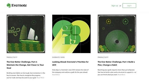
This simple yet incredibly effective color scheme proves that less is often more. Evernote’s blog provides another great example:

Evernote’s blog design revolves around its primary brand color, green, incorporating it into images, the login button, and hyperlinks. Yellow’s prominence creates an analogous color scheme.
Remember the impact of simplicity when selecting your website color scheme.
5. Harness the impact of color contrast
Contrast is crucial for good design, especially in your website color scheme. It draws attention to specific page elements. Consider nexus-security’s site again:

The orange CTA against the blue background demonstrates effective contrast. Complementary colors work well together due to their inherent contrast. Research confirms that contrasting buttons convert better. To highlight important elements, make them stand out from the surrounding design.
6. Seamlessly integrate your branding
Consider your branding when choosing your color scheme. Your brand likely has associated colors, which can inform your website’s palette. However, you might need adjustments. If a chosen color has negative connotations, opt for an alternative. The key is to ensure the chosen colors evoke associations aligned with your brand values. Observing other brands can be helpful. Here’s an example from Medium:

Blue is a popular choice in display advertising.
Start creating your (color) masterpiece!
You now possess the knowledge to craft a captivating website color scheme. Take action and experiment! Trial and error are part of the process, and every good color scheme undergoes iterations. Remember, these design principles extend beyond websites, proving useful for optimizing social media posts, infographics, and more. But for now, focus on your website. Use this guide to create a visually stunning online presence.