Generating a successful email campaign is only the first step; if you’re aiming for conversions, emails are merely the starting point. The ultimate goal is to entice your audience to not only open your email but also click through and take a specific action, such as completing a purchase or downloading your valuable ebook. This highlights the crucial role of the landing page where your customers are directed after clicking the link in your email. It plays a vital part in driving conversions from your email marketing endeavors. It’s essential to create a dedicated landing page tailored to each email promotion. If you’re new to this or have a substantial and diverse audience, leverage this opportunity to split-test elements of your landing page and determine what resonates best. Remember, elements like colors, fonts, and calls to action can significantly impact your audience’s response. When analyzing the performance of your landing page, ensure you cover all the essentials. Here are six key elements of a high-converting email campaign landing page:
Communicate clearly.
Clarity is paramount in landing page copywriting, especially for headlines. “Save 50% off your order” is instantly understandable, while “Tis the season to save” appears less direct and more sales-oriented. The aim is to create a smooth and intuitive funnel that guides visitors seamlessly from the email to the desired action. Avoid any ambiguity that might make them hesitate. A clear funnel, starting with a compelling headline, ensures a smooth and engaging user experience. Define a single, clear purpose for your landing page and make it easy for visitors to grasp. Moz excels at direct communication, leaving no room for confusion about their offer.

Focus on one call to action.
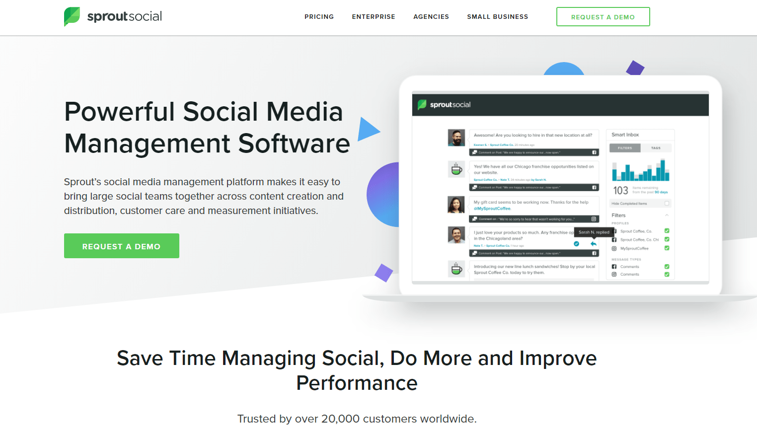
Don’t overwhelm your audience with excessive text or multiple CTAs. Stick to the primary goal of your landing page and emphasize it. This focused approach can significantly impact both click-through and conversion rates. Highlight the CTA using a distinct color or style that sets it apart from other elements on the page. The most crucial button on your landing page is typically “Sign up now!” (or a similar, action-oriented phrase). SproutSocial prominently features a bold demo button alongside their hero image, ensuring it stands out without competing with the header CTA.
Minimize distractions.
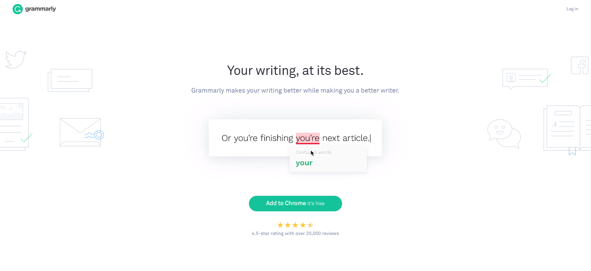
Many effective landing pages omit standard website elements like footers, headers, support links, social media buttons, or clickable logos that lead back to the homepage. Every additional link or button provides an opportunity for visitors to navigate away from the landing page, potentially reducing conversions. Grammarly’s landing page provides a distraction-free experience with a single, clear call to action.
While these elements are valuable in standard web design for encouraging exploration and reducing bounce rates, they can be counterproductive on a landing page. The focus should be on guiding visitors toward a specific action, such as signing up for a webinar or downloading an ebook. A compelling offer and a positive experience will encourage visitors to explore your website further on their own.
Maintain visual consistency.
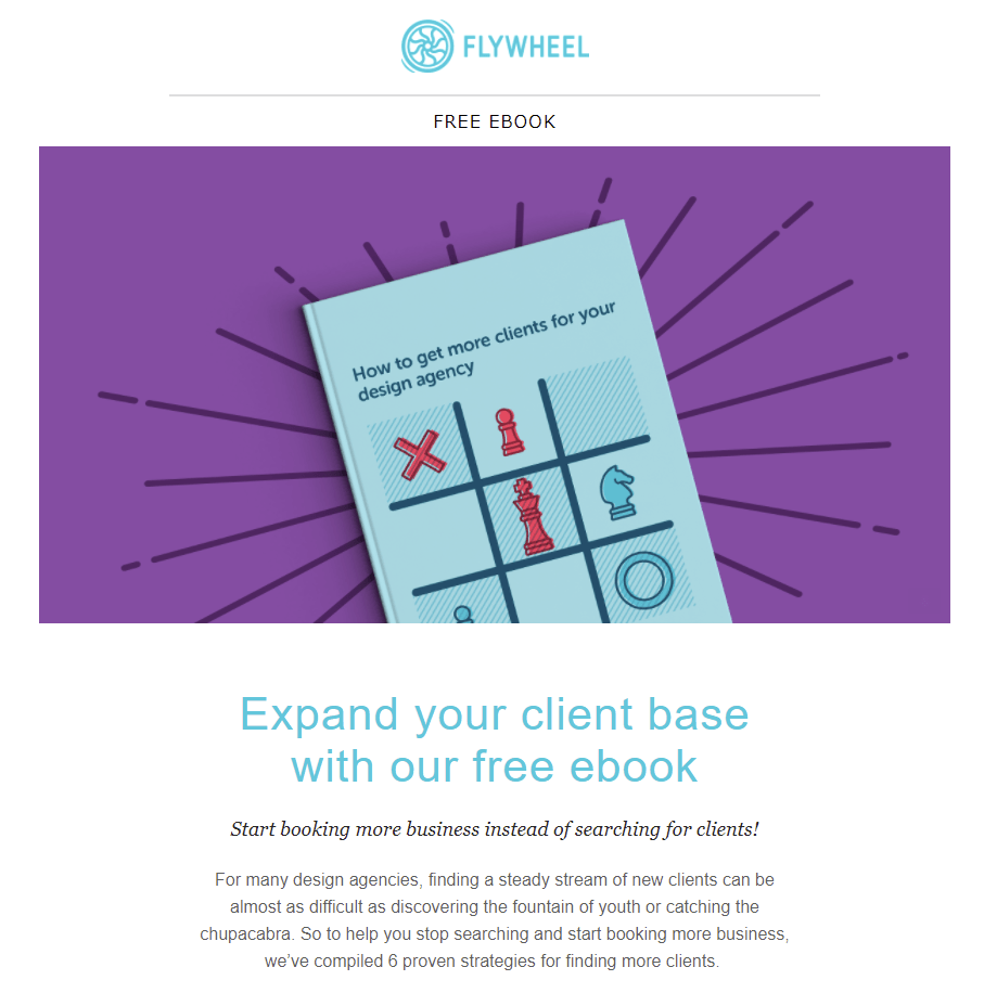
Imagine clicking on a winter-themed email promoting an ebook titled Building the Perfect Snowman only to land on a page adorned with pink and yellow flowers and no snowmen in sight. Such inconsistency can be jarring and raise suspicions of a scam or phishing attempt. Flywheel’s email is visually appealing and on-brand…
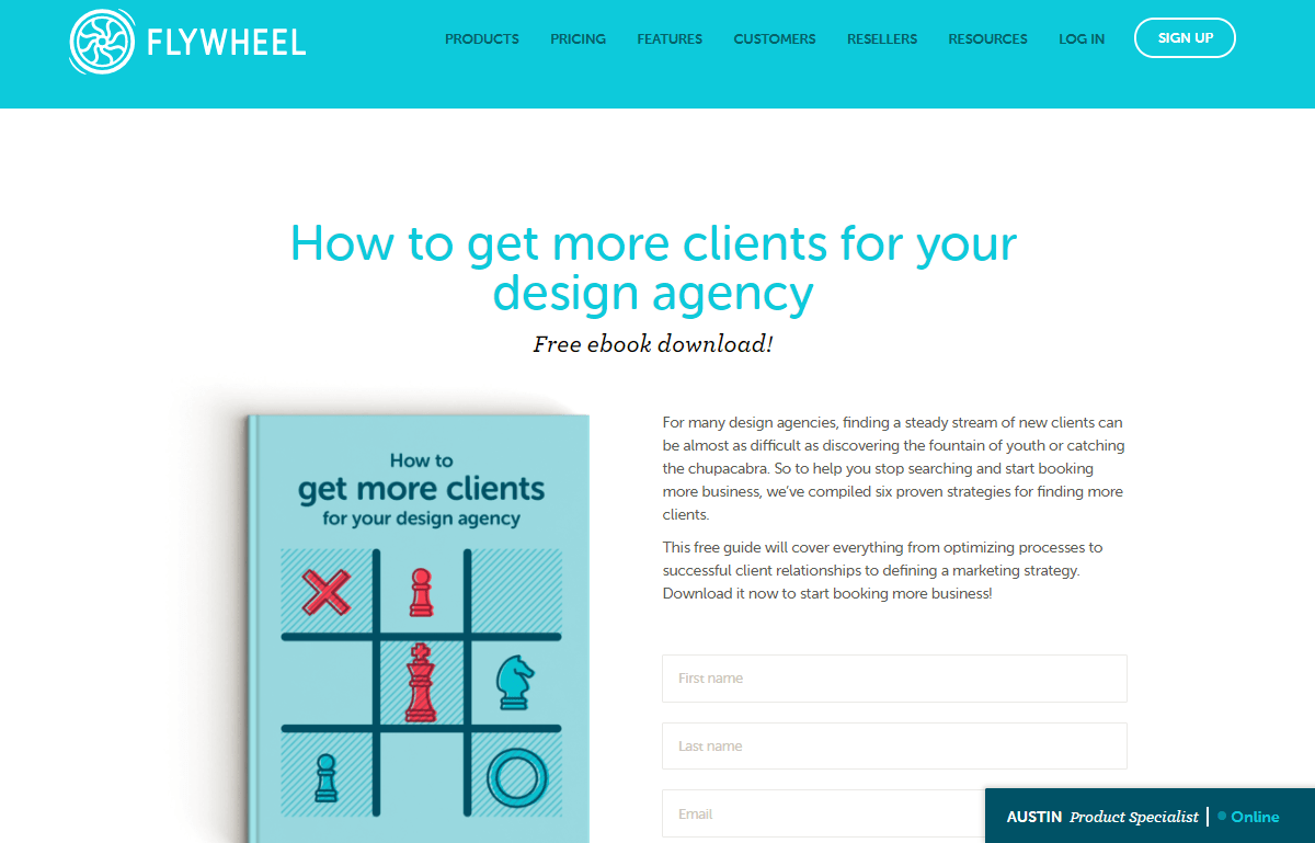
Ensure that any offer mentioned in your email is prominently displayed on your landing page. Additionally, maintain a consistent aesthetic style, including colors, fonts, and overall design, to create a seamless transition between the email and the landing page. And it seamlessly aligns with the landing page it leads to.
Reinforce the value proposition.
The landing page is where the conversion happens—the critical moment when your customer makes a decision. They’ve clicked your link, indicating a willingness to exchange their information for what you offer. However, some visitors might be undecided or simply curious. Utilize the landing page to solidify their decision by reiterating the value of your offer and reassuring those ready to convert. At Hatchbuck, we prioritize a clear message and CTA above the fold on our landing pages.
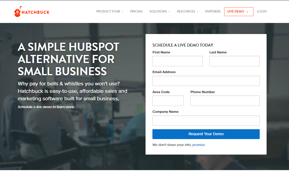
As visitors scroll, we provide a clear breakdown of pricing and value proposition.
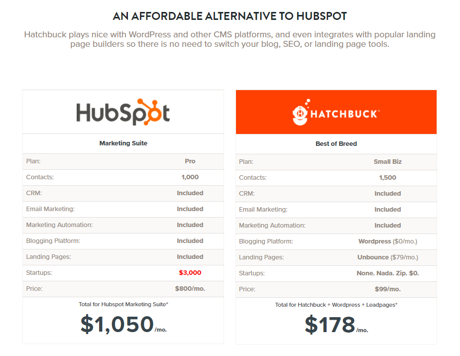
Bullet points are effective for showcasing the benefits of your offer in a concise and digestible format, reinforcing why visitors are making the right choice.
Keep it concise.
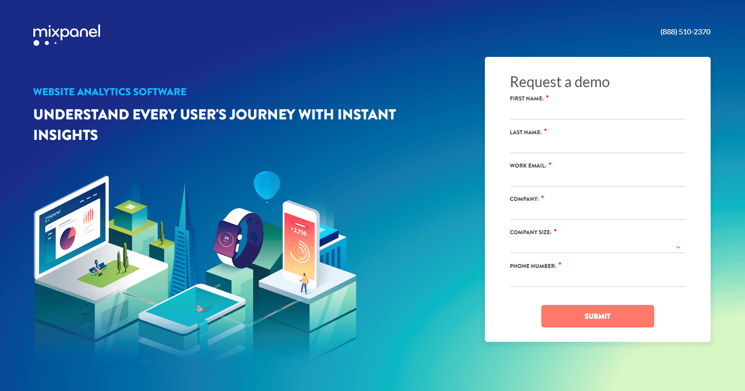
While bullet points are beneficial, keeping them concise is key. The same principle applies to all elements on your landing page. Use clear and concise language, avoid excessive visuals, and ensure that forms are keep your web form well-designed, requesting only essential information. Mixpanel uses minimal wording to effectively convey their message.
Capturing the attention of potential customers requires significant effort. Once you have their attention, meeting their expectations is crucial. Landing pages can either be your most valuable asset or your biggest obstacle in your marketing efforts.