In recent years, Google has been moving away from text-based ads on its Display Network, favoring a more visually engaging format: Responsive Ads. These ads combine text and images, acting as a link between traditional text ads and banner ads. Here are some examples of how these ads might appear, in case you haven’t encountered them before.
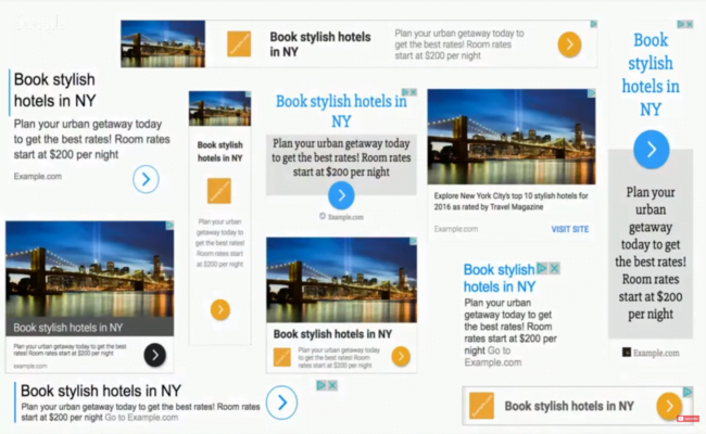
Text ads previously had a broad reach, but their lack of visual appeal often caused them to be overlooked by users. They often blended into the background of websites. Google’s transition to Responsive Ads has led to a rise in click-through rates (CTRs) for Display Network ads, a positive change for both advertisers and Google. NOTE: Since November 2019, responsive display ads have been replacing legacy display ads. You can find more information about this change here.
Performance of Responsive Display Ads
Let’s examine a brief illustration of how each ad format is performing in my accounts.
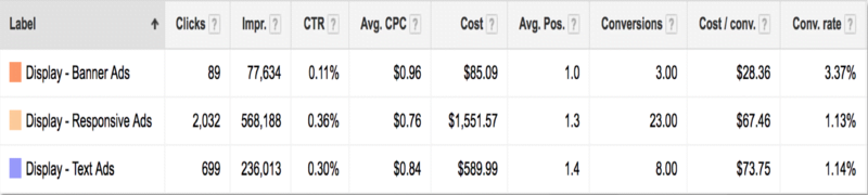
Impressions have increased because Google is increasingly opting to use Responsive Ads to populate ad slots. Furthermore, the CTR for these Responsive Ads surpasses that of other ad units. Responsive Ads have also opened up the Google Display Network to a wider range of advertisers. While standard banner ads have been a longstanding feature of the Display Network, not all advertisers have the resources to fully utilize them. With almost 20 standard sizes for banner ads on the GDN, each demanding adjustments, resizing, and customization by a design team to ensure optimal display,
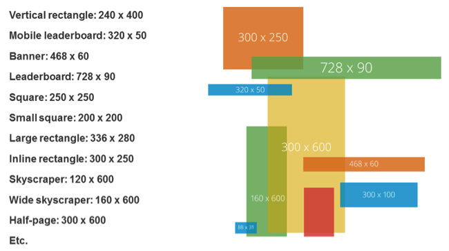
many teams lack the capacity to create a comprehensive set of banner ads, not to mention the ongoing task of producing multiple versions for effective message and creative testing. Consequently, advertisers often concentrate on the top 5 banner sizes, resulting in a significant portion of GDN inventory remaining unused. This is where Responsive Ads come in. These ad units have the capability to occupy any available space on the Google Display Network, encompassing Native, Text, and Banner ad slots. True to their name, they achieve this by dynamically adapting to the available space, presenting one of numerous possible text and visual combinations. For advertisers, this translates to Google making real-time adjustments that influence how our ads are displayed:
- Images are automatically scaled to fit each ad unit.
- Text combinations are selected based on the available space.
- Text may be shortened in confined areas. Understanding these factors is crucial as we aim for optimal performance. Here are some recommended practices to bear in mind when selecting images, text, and messaging for Responsive Ads.
1.) Image Scaling Optimization
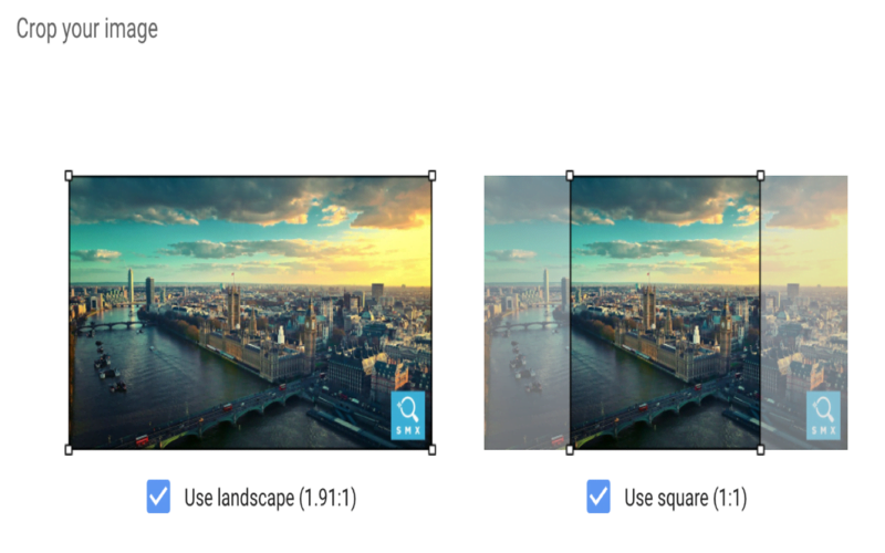
Responsive Ads allow advertisers to upload multiple images in both square and landscape formats, which is particularly advantageous when working with images that are not easily cropped. However, there’s a catch: Although images appear relatively large during the upload process, not all ad units will display them at that size. In other words, your uploaded images might be scaled down to fit the designated space. Let’s consider an example. We’re currently running ads for a high-end travel company specializing in unforgettable trips around the world. Safaris are among their most sought-after offerings, so we’ve been using Responsive Ads to generate more interest. Drawing on their expertise, we identified zebras as a customer favorite and decided to feature them in the ads. After evaluating various images, we narrowed it down to two that showcased zebras in different ways:
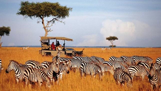

The first image depicts a group of zebras with a safari vehicle in the background, perfectly aligning with the advertised service. The second image presents a close-up view of a couple of zebras. Which image do you think we opted for? If you chose image 2, you’re absolutely right! At full size, the first image effectively conveys the essence of the offering, but the image solely featuring zebras can be equally captivating for those interested in these animals, even if it’s not an exact match for safaris. When scaled down, however, the first image becomes much harder to decipher. The details—black and white stripes, a possible car and tree, an oddly orange ground—lack clarity at a quick glance. In the scaled-down version, the image on the right emerges as the clear winner, as it still prominently displays zebras.

When selecting images, consider both their full-scale appearance and how they would look when scaled down. Images that become unclear when scaled down might lose their impact.
2.) Treat Every Size as Essential
While some creative sections may be labeled as optional, treat them as mandatory to ensure all ad variations are effectively represented across placements. If all else fails, consider reusing the same image but utilize the cropping tool to create a square version of a landscape image or vice versa.
3.) Logo Flexibility
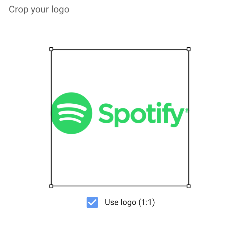
Brands hold their logos dear. I understand that. However, for optimal recognition on the GDN, making minor adjustments to your logo to enhance its visibility can be a worthwhile compromise. Similar to other image components, logo images are uploaded in square and landscape formats. However, some logos are inherently designed to be either landscape or square, which can pose challenges when scaling comes into play. If your logo is strictly square or landscape, consider adapting it to better suit the available space or even using a portion of it for better fit. Don’t hesitate to utilize just the icon part of your logo for the square version or adjust the alignment to optimize its appearance. Let’s illustrate this with Spotify as an example. Their logo, designed in landscape orientation, features the icon on the left and the word “Spotify” on the right.

However, this format doesn’t translate well to the square image section for Responsive Ads. Attempting to use this image in that space results in a poor fit.

At this juncture, you might consider requesting a square version of the logo from your designer. Often, the initial solution proposed is to add white space to the top and bottom of the image, transforming it into a square.
While this may appear acceptable within the editor, remember the scaling effect we discussed earlier. While it might look fine in larger ad formats, readability becomes an issue in smaller formats.

Therefore, it’s advisable to explore alternative adjustments to ensure optimal logo display within the ad. In Spotify’s case, they already have a version of their logo where the word “Spotify” is positioned below the icon, which would work perfectly for the square version.

Alternatively, they could simply use the icon.

When scaled down to the same size, the adjusted versions are more legible and easier to discern.

While brand managers might have reservations, dedicating some time to adapting your logo to fit both square and landscape formats without compromising brand identity is a worthwhile endeavor when running Responsive Ads.
4.) Understanding Text Combinations
The Responsive Ads format offers various text fields:
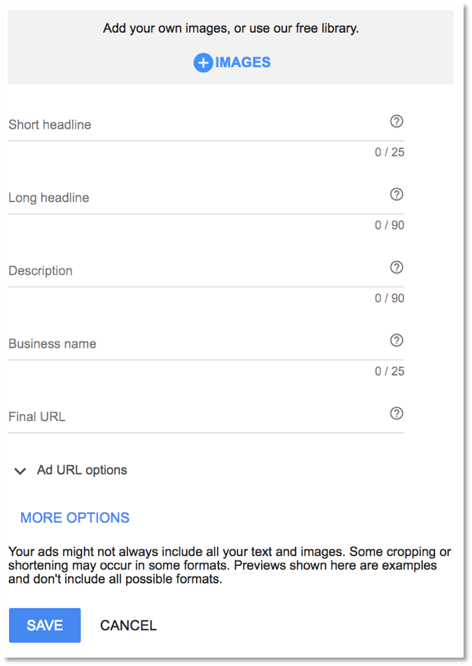
- Short Headline: 25 Characters
- Long Headline: 90 Characters
- Description: 90 Characters
- Business Name: 25 Characters
This provides significantly more text space than previous formats, but it’s important to note that not all text fields will always appear together. Understanding which text fields can and will be displayed in tandem is crucial for maximizing the impact of your ad.
Headlines Are Never Displayed Together.
Headlines can simply be different versions of the same message, as they will never appear simultaneously. This eliminates the need to worry about repetition.
Descriptions Can Appear with Either Short or Long Headlines.
Descriptions can provide additional context or details related to the headline. Since they are always accompanied by a headline, you won’t lose context. Ensure you’re not replicating headline copy within the description, as it can appear with either short or long headlines.
Headlines May Appear Without Descriptions.
Given this possibility, crafting comprehensive or attention-grabbing headlines that can stand alone is beneficial. This often involves incorporating a call to action within long headlines whenever feasible.
Both Long Headlines and Descriptions Can Be Truncated.
Due to potential truncation, front-load your messaging. This ensures that users grasp the key information even if the ending is cut off. Understanding these text field combinations simplifies the process of writing informative, consistent, and non-repetitive ad copy.
5.) Preview and Share
While Responsive Ads are generated in real-time, with potentially billions of combinations for a single ad, previews offer a glimpse into their possible appearances. During the creation process, certain sections provide a preview of how your ads might look in real-world scenarios. However, these previews are primarily limited to square versions and a mobile-friendly view.
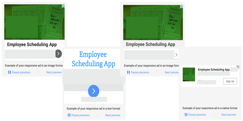
The most effective way to visualize potential final products is actually after the ad has been created. Within the Google Ads interface, clicking on the ad itself will open a Preview box, which contains a link. This link is where the true value lies.
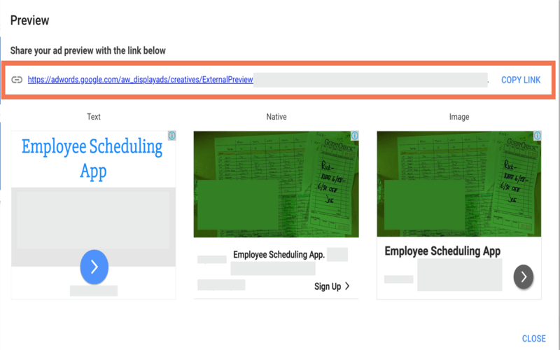
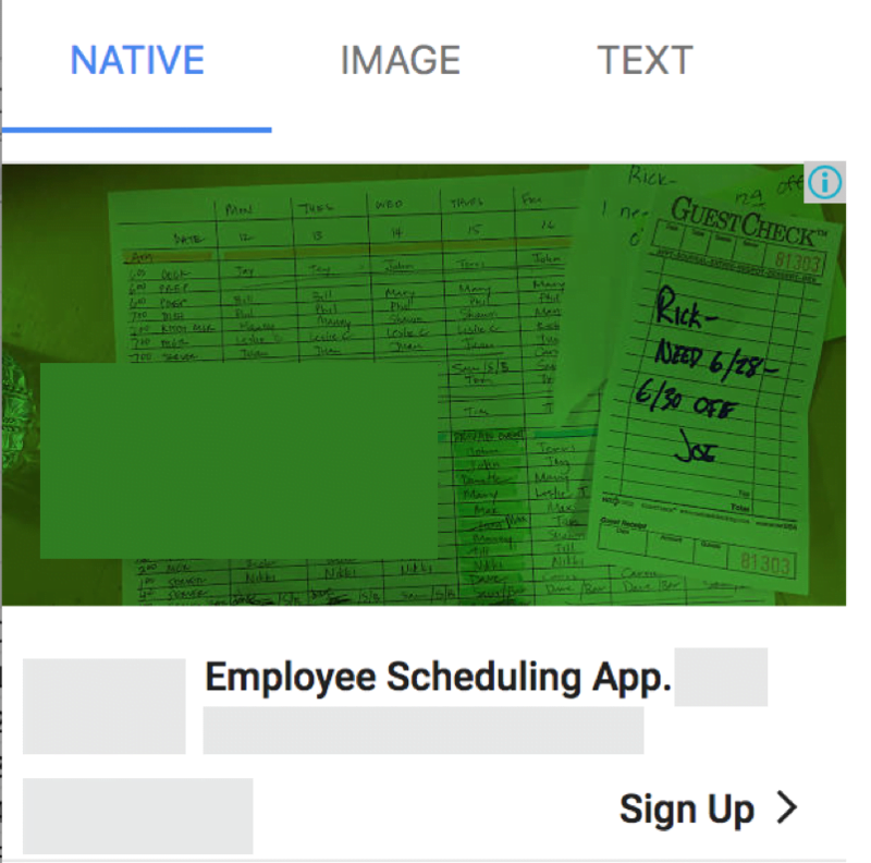
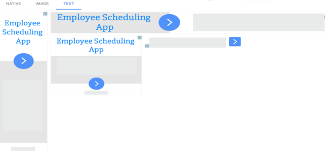
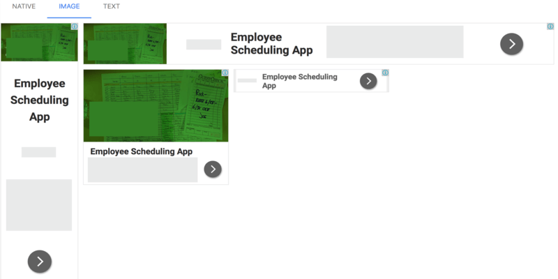
Clicking this link opens a new window showcasing a wider array of potential ad combinations for Native, Image, and Text placements.
While not exhaustive, this offers a more comprehensive preview than previously available. Importantly, this link is shareable, allowing team members (designers, clients, managers, etc.) to view potential ad units and provide feedback.
6.) Brand Safety and Regulations
Despite their benefits, Responsive Ads aren’t suitable for every company. From a brand safety standpoint, some companies find it unacceptable to lack complete control over image and text combinations. They prefer to maintain control over all aspects of their ads, making banner ads a more suitable option for the Google Display Network. Regulations pose another challenge for Responsive Ads. Some industries require advertisers to include legal disclaimers directly within their ads. In the context of Responsive Ads, this might necessitate using almost all available text and image space to meet these requirements, leaving little room for the actual advertisement. Consider these regulations when reviewing text and image combinations. If you can effectively address these requirements while conveying your message, then you’re good to go. If not, this ad format might not be the best fit.
Final Thoughts
There you have it! While Responsive Ads on the GDN don’t demand a physics degree, strategic planning can significantly enhance their effectiveness. Carefully select images and text, understand their interplay, and ensure compliance with regulations before launching your campaigns. Have you incorporated Responsive Ads into your GDN strategies? What has your experience been? Have you encountered any challenges related to the best practices outlined above?