Quick question: When you think of “display advertising,” what pops into your head?
Image A: A flood of high-quality traffic, tons of sales, and a huge smile on your face when you check your bank balance. Image B: Heaps of cash being tossed into a roaring fire.
If you’re anything like most folks, you probably pictured image B.
Display advertising has definitely developed a less-than-stellar reputation. Many marketers avoid it because it’s tougher to master and tends to be less forgiving than search advertising. To make matters worse, there’s very little guidance available on how to actually run a successful display campaign. But here’s the reality: Display advertising (often called “banner advertising”)—when done right—is one of the fastest ways to grow your business. And in this article, you’re going to uncover the “secret” (which isn’t really a secret) to making display advertising profitable.
Ready for it? It’s split-testing.
However, it’s not the kind of split-testing most people do. The reason most display campaigns crash and burn is that they either skip split testing altogether, or they test the wrong elements. MORE: Top 5 Mobile A/B Tests to Try Right Now
Tiny Details vs. The Bigger Picture
The wrong kinds of split tests focus on things like button colors, calls-to-action, and minor text changes. People gravitate toward testing these because they’re easy. But here’s what typically happens:
Let’s say Joe decides to split test the color of his call-to-action button: a blue button versus a green button. He notices the green button gets slightly more clicks in the first few days. Joe’s excitement bubbles over, and he declares green the champion. Pumped up, Joe runs 10 more of these tiny tests.
A month later, Joe examines his results and realizes his conversion rate hasn’t budged an inch. Joe’s baffled because he’s A/B tested every button color and call-to-action imaginable.
What went wrong? Joe called his A/B tests way too early, assuming the initial upticks would last. He should have gathered much more data. The tests were far from statistically significant. But here’s the bigger issue: Even IF Joe had waited, he would have realized that these small tweaks rarely lead to significant increases in conversion rates. So, what kind of tests DO move the needle?
The answer: Big Picture tests. These involve A/B testing major elements that significantly impact the overall design, look, feel, and positioning of the page.
Think about things like the layout, the main image, where you place your product, or even the entire concept of the landing page. Big changes like these are what drive significant changes in conversion rates, but only once you have enough data. Put simply: big changes lead to big insights.
You might be thinking, “Okay, makes sense. But there are countless things I could test. Where do I even begin?” No worries, there’s a solution. And it doesn’t involve any intense brainstorming sessions. You’re going to become an idea thief – in the best way possible, of course. The smartest way to come up with Big Picture split test ideas is to peek at what the top display advertisers are already testing. Use their tests as inspiration for your own.
Why? Because the most efficient path to display advertising success is often paved by those who’ve already walked it.
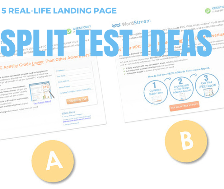
In this article, we’ll dissect five different advertisers running various split tests on these Big Picture elements. You’ll see their ad creatives and the landing pages they link to. Let them inspire your own split tests, and start seeing better results with display advertising.
Split Test #1: Progressive.com
The adage “less is more” often holds true for landing pages. Fewer choices, blocks of text, links, buttons, and distractions make for a cleaner, more focused page. Your prospects are more likely to convert or move to the next step when they have a clear, unobstructed path. This is why many advertisers prefer minimalist landing page designs. Yet, sometimes providing more information and creating a slightly busier page actually boosts sales.
Case in point: We have two banner ads for auto insurance giant Progressive.com..

These ads lead to two very different landing pages.
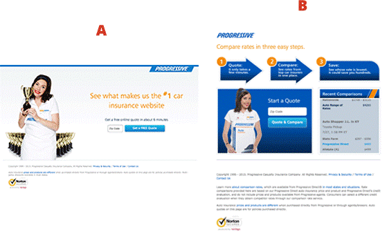
Page A is your classic minimalist landing page for lead generation. It’s got a straightforward headline, a zip code field, and a call-to-action. Simple, clean, and easy to set up.
Page B takes a different approach, incorporating many more elements. It includes a 3-step flowchart that explains how Progressive works.

These types of elements can be effective because they show prospects what happens after they enter their zip code, outlining the benefits waiting on the other side. Sometimes, your audience needs a bit more reassurance and hand-holding. Another key element on Page B is the social proof box.
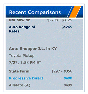
This box highlights recent comparisons made by other users—demonstrating that the comparison tool is actively being used. This can put prospects at ease, making them less hesitant to share their information. After all, if others are doing it, it must be okay, right? Social proof is incredibly powerful for converting cold traffic. It shouldn’t be confined to your landing page; weave it throughout your entire marketing strategy.
These two pages, with their distinct layouts, look, and feel, offer food for thought for your “Big Picture” split tests.
Split Test #2: Veterans United
Advertising to a diverse market can be tricky because you often have multiple segments with distinct needs. This means you have many potential messages to convey. So how do you pinpoint which resonates best with your target audience?
You know the answer: split testing.
Veteran’s United specializes in helping US military veterans secure home loans.

These two very different ads lead to two equally distinct landing pages.
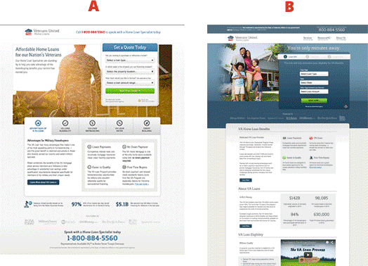
Carefully examine the two pages above, paying close attention to the imagery. Page A features a photo of a family in civilian attire.

What feeling does this evoke? At first glance, you wouldn’t even know it targets former military personnel. It looks like a stock photo you’d find on any insurance company’s website. Is this how the prospect sees themselves? This image portrays a happy, traditional family. Perhaps the prospect has moved on from their service days and now identifies not primarily as a soldier, but as a family person.
Contrast this with the imagery on Page B: a solitary soldier walking toward the sunset.

This evokes an entirely different emotion than the family picture. This soldier might have just returned from deployment, ready to rebuild their civilian life. They may or may not have a spouse and children, and they likely have different concerns, needs, and questions than the family in the first image.
The key takeaway from this split test? Test drastically different types of imagery.
Most markets have various personas with distinct self-identities. One of these personas might outperform the others by a mile. Your job is to uncover which one that is through meticulous split testing.
Split Test #3: Harry’s
You’ve probably noticed an increase in these ads recently:
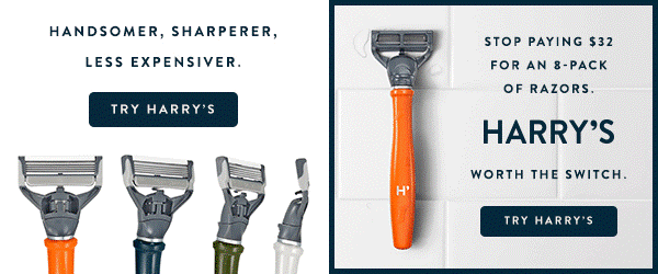
They’re from Harry’s, a razor-blade e-commerce company. Harry’s is currently running a simple, yet impactful BIG picture test that you can replicate in minutes.
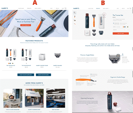
Page A is Harry’s homepage—a classic landing page. It features a “hero shot” (the prominent image of the razor and accessories at the top), a clear call-to-action, and a compelling headline.
Page B is a product page for their Truman shaving kit. It dives into specifics about this particular product, even allowing you to purchase it right then and there. Notably absent is any information about Harry’s as a brand, their values, what they stand for, or why you should choose them.
Sometimes—especially in e-commerce—it’s best to cut to the chase and give people what they want. Razor blades are pretty self-explanatory. Most people simply want the highest quality blades at the lowest price.
Sending traffic directly to a product page might be the way to go if people are already familiar with your brand (for example, in remarketing campaigns). They already know who you are and what you offer. Now they just need a convenient path to purchase.
However, sometimes prospects need a bit more context about your company before feeling comfortable enough to buy.
Split Test #4: US Concealed Carry Association
Average conversion rates for cold traffic are notoriously low. Most prospects need a bit of nurturing before they’re convinced your solution is right for them, especially for high-priced items or services.
Email marketing is one of the best ways to cultivate these relationships. This is where a lead magnet comes in. A lead magnet is essentially an ethical bribe—a valuable piece of content like a whitepaper, e-book, report, or even a physical item—that you give prospects for free in exchange for their email address. You’ve seen them before, and you’ve probably even opted into a few yourself.
However, simply having a lead magnet and a sign-up form doesn’t guarantee success. It all boils down to how you position your lead magnet.
Our next example comes from the United States Concealed Carry Association (USCCA)—a major player in the concealed carry insurance market.

These two ads direct traffic to a very interesting split test.

Both pages offer the same lead magnet—a guide to concealed carry laws. However, why they emphasize needing this guide differs significantly between the two pages.
Page A focuses on mistakes and potential consequences, taking a cautionary approach.

“Don’t make these mistakes, or you could face legal repercussions.” The message on this page positions the guide as an essential source of information—a how-to guide for navigating the complexities of concealed carry laws.
Page B takes a different tack.

This speaks to a different mindset—one with a potentially more political slant. The underlying assumption is that many people choose to conceal carry because they lack trust in the current system. Therefore, they need to be armed with the right information to protect themselves, which the USCCA frames as a “life-saving report.”
The takeaway? First and foremost, test different ways of positioning your lead magnet.
But even more importantly, experiment with controversial angles versus safer, more vanilla approaches. Why? Because controversy often converts better.
People who feel strongly about a polarizing topic tend to be vocal about it. They gravitate towards those who share their views and often distance themselves from those who don’t. They’re also aware that the media often steers clear of taking firm stances on certain issues, which can come across as inauthentic or wishy-washy.
That’s why, when someone confidently and publicly expresses a strong opinion (especially one they align with), it creates an instant connection. It shows you’re on their side and unafraid to say so.
On the other hand, sometimes a controversial stance can backfire, alienating potential customers. The best way to strike the right balance? You guessed it—SPLIT TEST!
Split Test #5: Intuit
Testing your headline is a simple yet highly effective big picture test.
Intuit, the SaaS powerhouse behind financial products like TurboTax and Quickbooks, knows this well.

In this example, they’ve been running a test on one of their landing pages for QuickBase software. Notice the subtle yet important differences in language between the two headlines.

“Make Your Team Instantly Productive With Intuit QuickBase”
This headline starts with a strong verb—“Make.” It then follows up with a clear, desirable benefit—“instantly more productive.” Words like “instantly” are what copywriters call “power words” because they evoke strong emotions and associations. “Instantly” is particularly effective because people crave immediate results. This single word perfectly captures that desire.
Page B, in my opinion, has the weaker headline.

It feels more like a dry description of the product’s features. People don’t care about what the manufacturer thinks about their product; they care about what the product can do for them. The desired outcome isn’t simply a “better way to manage projects”; it’s a more productive team.
While Page B might have the weaker headline in this case, you’ll never know for sure unless you test. Follow Intuit’s lead and run your own split tests, pitting powerful headlines against more descriptive ones.
In Conclusion…
Many advertisers get hyper-focused on testing ad creative alone. However, what happens after the click is equally, if not more, important. Split testing your landing pages is the key to unlocking the true potential of display advertising. When you find the winning combination of page design, positioning, and messaging, you’ll quickly realize that display advertising can be one of the fastest ways to propel your business growth.