Many years ago, successful advertisements directly translated to increased profits. If your printed ad prompted calls or mailed checks, it meant product sales. That’s no longer true. Today, an online ad might achieve a 100% click-through rate without generating any income. Despite this, the ad remains the perceived cornerstone of campaigns, even though it’s not the driving force behind purchases, sign-ups, downloads, or inquiries anymore. The true drivers of action are now load times, landing pages, and the overall experience following a click, collectively known as the post-click experience online.
Before and After the Click
Prior to the internet, advertising was straightforward: an ad and a conversion. The online click changed everything. Prospects now take action by clicking, and then again by choosing to engage with an offer. This divides the user journey into two distinct stages within a marketing campaign:
- The pre-click experience: Encompassing everything a user encounters before clicking an ad. This includes ad placement, presentation, colors, headlines, and the value proposition.
- The post-click experience: Everything that happens after the click, influenced by factors like visual hierarchy, conversion ratio, retargeting, and message consistency. Similar to a headline’s effectiveness being contingent on attracting readers to the copy, an ad’s success relies on attracting clicks to a landing page. The landing page, in turn, must effectively convert visitors. While advertisers are well-versed in creating impactful pre-click experiences, aspects of the post-click experience might be less familiar. You can’t fix what you don’t know is broken.
4 Key Elements of Post-Click Optimization for Advertisers
It’s a harsh reality that most ad spending is wasted. The average click-through rate for Google AdWords is only 3.17% across all sectors, plummeting to a dismal 0.63% on the display network:
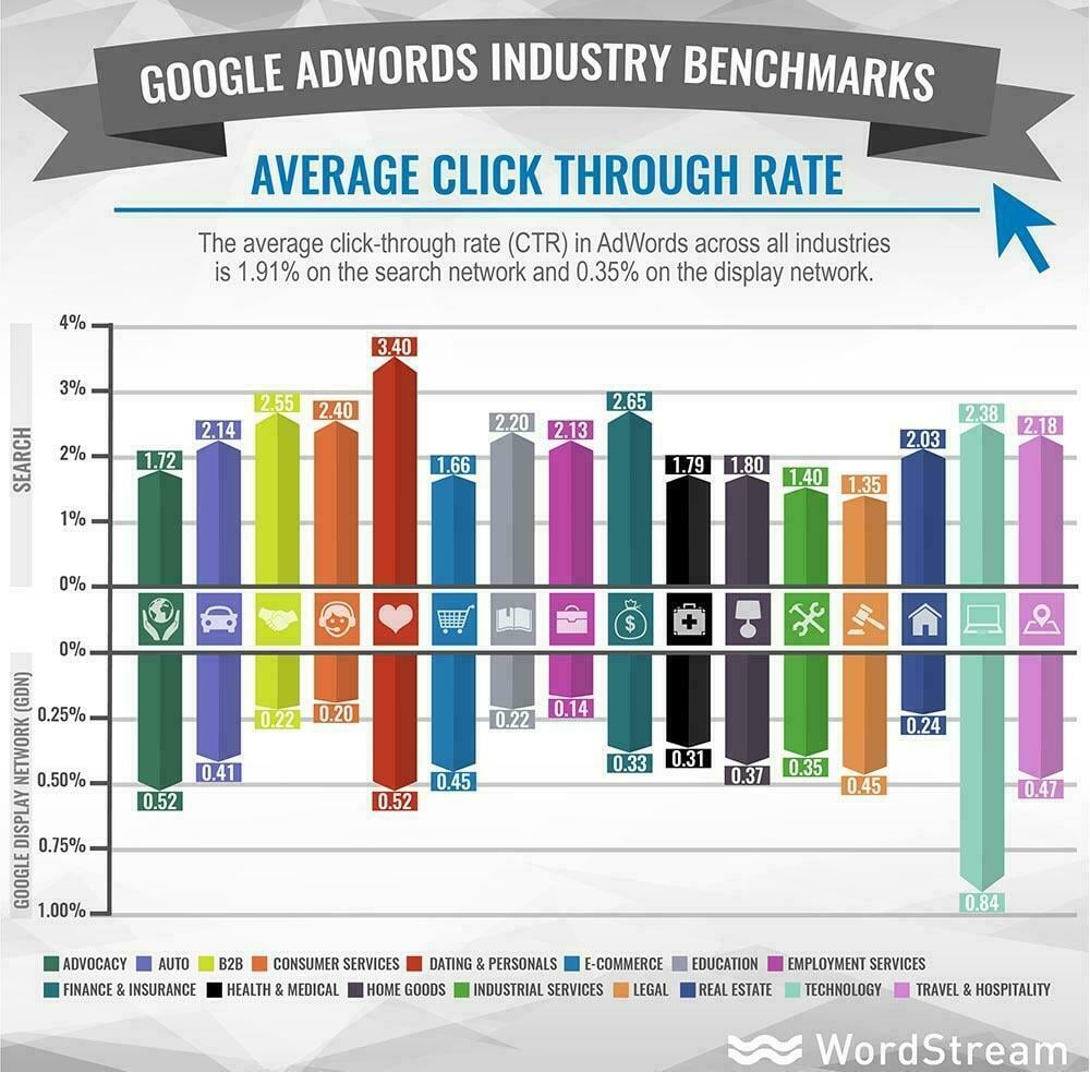
This signifies that for every 100 ad viewers, 96-99 don’t click, and even more alarmingly, only 0.77% to 3.75% of those who do click convert. To elevate this conversion rate, here are crucial elements advertisers should understand to optimize the optimize the post-click experience:.
Maintaining Message Consistency
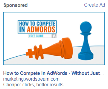
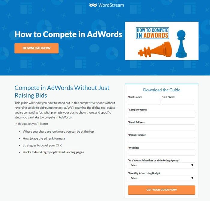
An advertisement is essentially a promise, communicating the value you offer. When prospects act on this promise, they evaluate if the offer aligns with the advertisement. The landing page must reinforce this promise, assuring visitors they’ve arrived at the right destination. This is achieved through consistent headlines, colors, and imagery between the ad and landing page. Inconsistency creates a “bait-and-switch” impression, deterring visitors from engaging with your copy or forms. Nexus-security provides an excellent example of message match. Observe the ad:
And the corresponding landing page:
Eliminating Navigation Distractions
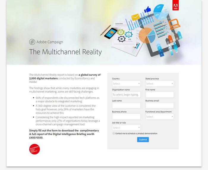
Website navigation links are crucial for exploration, but on landing pages, they act as escape routes that hinder conversions. Treat every link outside your call-to-action button as a distraction and minimize them. An optimal conversion ratio (links to conversion goals) on a landing page is 1:1. Terms of service and privacy policies can be relegated to the footer, ensuring they don’t divert attention from the CTA. Here’s an example of an example from Adobe:
Strategizing Visual Hierarchy
Attention theories highlight that we don’t perceive everything equally. Research dating back over a century suggests that “the whole is other than the sum of its parts.” For instance, when crossing a street, you focus on reaching the other side safely, filtering out distractions like birds. Cars demand more attention because they pose a direct threat. While safety isn’t always paramount, certain visual cues capture our attention in everyday scenarios. Elements that are larger, higher, faster, or contrasting stand out. Leverage this principle on your landing page to guide visitors towards key elements:
- Higher = More Important: Headlines should be above body copy, and body copy above forms. Establish the “why” before prompting conversion.
- Bold and Italics = Emphasis: Use these for headlines, benefits, and compelling words like “free,” “limited-time offer,” or “while supplies last.”
- High Contrast = Attention-grabbing: Color choices impact visual hierarchy. The 60-30-10 rule is effective: 60% base color, 30% background color, and 10% accent color for elements like logos, CTA buttons, and forms. Important elements should be easily noticeable.
- White Space = Significance: Elements surrounded by space convey importance. Use this to highlight badges, testimonials, and especially your CTA button, which should be prominent and clutter-free.
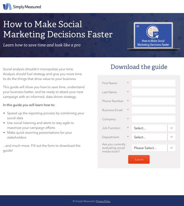
- Bullets = Enhanced Readability: Use bullets to list benefits effectively. Research confirms that people skim online content. Utilize these cues to guide their attention, ensuring a comprehensive evaluation of your offer. Here’s an example of an example from Simply Measured effectively guiding the visitor to the CTA:
The Importance of a Compelling “Thank You” Page
It’s tempting to neglect the “thank you” page, assuming the transaction is complete. However, this is a missed opportunity. The “thank you” page is often underestimated, serving as a litmus test for how you treat customers post-conversion. Do you genuinely appreciate their business? Do you value them beyond their purchase? A bland “thank you” page implies indifference, potentially eroding trust and making future communications less welcome. An effective “thank you” page:
- Expresses Gratitude: Acknowledge and appreciate your new leads or customers; they are the foundation of your business growth. Make your “thank you” genuine, personal, and complimentary.
- Provides Clear Next Steps: Explain when and how they’ll receive their purchased resource, whether via email or immediate download. Include contact information for support.
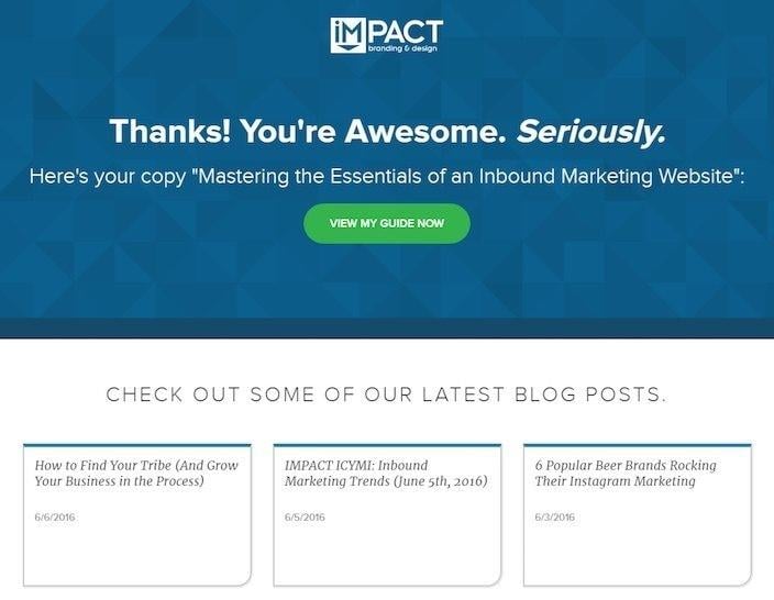
- Offers Additional Relevant Content: If they downloaded an email marketing guide, suggest related resources. Gauge their position in the marketing funnel by offering diverse content, like subject line tips or case studies showcasing successful tool implementation. Most “thank you” pages are lackluster, presenting an opportunity for you to stand out. This example from IMPACT Branding & Design effectively incorporates all three elements:
Mutual Benefits of Post-Click Optimization
In today’s landscape, sales are primarily driven by landing pages, not just ads. Optimizing the post-click experience is mutually beneficial: Your visitors receive what they were promised, you gain a customer, and your business flourishes.