Action buttons, or CTAs, are the clickable elements on websites and landing pages that guide users towards a desired action. These buttons come in various styles and sizes, adapting to the website’s design and the intended conversion goal. Examples include “Add to Cart,” “Free Trial Sign-Up,” and “Download.” The primary objective of CTA buttons is to encourage visitors to click and complete a conversion.
This article outlines 17 best practices for CTA buttons to enhance click-through rates (CTR) and boost conversions.
Effective Call-to-Action Button Strategies
Implement these tips and best practices to optimize your CTA buttons for maximum clicks!
1. Use Action-Oriented Text
CTAs should use compelling and action-driven language. Replace passive words like “submit” and “enter” with stronger verbs like “get,” “reserve,” and “try.” These action words should align with your offer:
- Try Our Free Trial
- Reserve Your Seat
- Download Whitepaper
Udemy’s “Take This Course” button perfectly illustrates this principle.

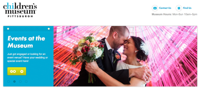
While The Children’s Museum of Pittsburgh boasts an attractive site, their button text could be more engaging. Consider replacing the mundane “Go” with “Book An Event.”
2. Color Selection is Crucial
Button color significantly impacts performance. If you were to implement just one suggestion from this article, prioritize button color.
Green and orange buttons are generally reported to be the most effective. Ultimately, the optimal color depends on your website’s design, as contrasting colors create visually appealing and attention-grabbing buttons. For example, a green CTA button would blend into a green background.

Green and purple offer excellent contrast, and the dinosaurs are an added bonus
If you’re uncertain about color choices, perform a simple “squint test” to determine which option stands out. However, A/B testing remains the most reliable method to identify the highest-performing CTA button color for your specific page.
For a deeper dive into the psychology of color and its impact on emotions, refer to our comprehensive guide.
3. Eye-Catching Button Shapes
The shape of your CTA button can significantly influence its effectiveness. Consider whether a rounded button or one with square edges aligns better with your design aesthetic. Both styles are prevalent, and their effectiveness depends on the context. Testing is crucial to determine the optimal shape for your business.
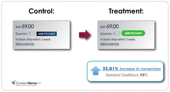
In ContentVerve’s test, a green rounded button outperformed a blue rectangular one
4. Clear and Readable Text Size
Button text should be large enough for easy readability without appearing overwhelming or intimidating.
While the idea of large text causing anxiety might seem far-fetched, some users subconsciously dislike excessively large lettering. Strive for a balance where your button text is prominent but doesn’t overshadow other content.
5. Concise Button Text
While using specific, action-oriented text is essential, avoid excessively long button copy. Aim for two to five words for optimal clarity and impact.

This CTA button is borderline too long
 Free download >> The 36 Best Call to Action Phrases Ever (Real Examples +Tips!)
6. Embrace First-Person Language
Michael Aagard from Content Verve shared a study and discovered that switching button text from second person (“get your free template”) to first person (“get my free template”) increased clicks by an impressive 90%. Experiment with first-person language in your CTAs to see how it influences your CTRs.
7. Instill a Sense of Urgency
Creating a sense of urgency in your CTA buttons can significantly boost click-through rates. Consider using phrases like:
- Sign Up and Get 50% Off Today Only!
- Download the Build Apps E-Course for $30 $10!
Even adding a simple “now” can subtly create urgency:
- Register For The Ultimate PPC Webinar Now!
The example below effectively conveys urgency. However, the red X marks, intended to denote information points, could be misinterpreted as sold-out or canceled events, which might deter potential attendees.

8. Prioritize Above-the-Fold Placement
Always position your main CTA button above the fold to ensure maximum visibility. As highlighted in our landing page best practices, essential information should be readily accessible without requiring users to scroll.
9. Establish a Clear Visual Hierarchy
When using multiple buttons on a webpage, differentiate your primary CTA button from secondary buttons. Use less prominent colors, such as grayscale or monochromatic shades, for secondary buttons. Your main CTA should always command the most attention.
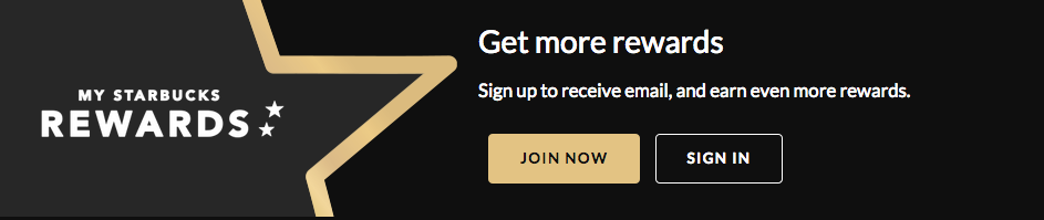
Starbucks excels at highlighting their primary CTA button while maintaining brand consistency
10. Communicate Value Proposition in Button Copy
Many effective CTA buttons incorporate the word “free,” as in “Get My Free Ebook.” “Free” is a powerful incentive, and using it in button copy emphasizes the value proposition of your offer. Consider how to best highlight your offer’s value within your CTA button text.
11. Enhance with Button Graphics
Incorporating subtle arrows or graphics on your CTA button can improve click-through rates. Ensure these icons clarify the offer and avoid confusing users. For instance, avoid using a disk download icon for a webinar registration button.

12. Leverage Bonus Button Text
In some scenarios, consider adding a supplementary line of information within your button text.
This technique is common for free trial buttons. For example, a free trial button might include “30-day trial, no credit card” in smaller text below the main “Start Your Free Trial” text. This additional information can encourage users to proceed with the trial.
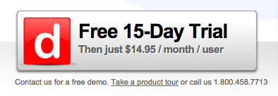
Example from Dashboard
While not always necessary, this extra information can be beneficial for CTRs when appropriate.
Alternatively, place this supplementary information underneath or beside the button. Copyblogger refers to these elements as “click triggers.” Examples of click triggers:
- Testimonials
- Anxiety-Reducing Information (e.g., No credit card required)
- Key Benefits
- Data Points (e.g., users see a 40% increase in shares when using X)

Example from Social Sprout
13. Optimize Cart CTAs
E-commerce websites should prioritize A/B testing their cart/purchase buttons, as even minor adjustments can significantly impact conversion rates. Offering alternative payment options like PayPal is crucial.
The availability of a PayPal button can be a significant motivator. I’ve personally experienced numerous instances where I opted for PayPal due to convenience while ordering food online.
14. Simplify Choices
The paradox of choice suggests that while we enjoy simple decisions (apple or orange), too many options can lead to decision paralysis.
A one study by Mark Lepper at Columbia University found that participants presented with six chocolate options were more satisfied with their choice than those given 30 options. Simplify decision-making for your users by limiting button choices.
If you need to present multiple options, emphasize one choice to guide users towards a preferred path. The specific path matters less than providing clear guidance.
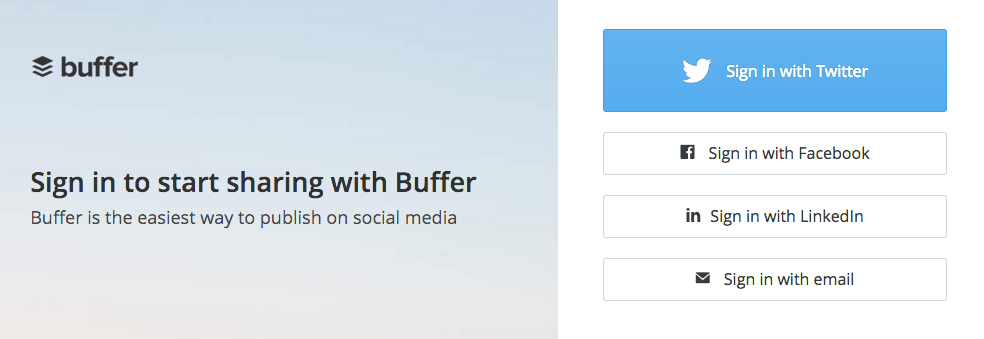
Buffer, while offering multiple sign-in methods, emphasizes one option over others
15. Align with Natural User Flow
Western cultures typically read from left to right and top to bottom. Consider this natural reading flow when positioning your CTA buttons. Placing CTAs towards the bottom or right of the content often yields better results.
Avoid forcing users to backtrack to click a button. CTA placement should align with the user experience. For example, a “sign up now” button should appear after a user has read about your offer, not before, as it wouldn’t make sense to sign up for something unfamiliar.
RELATED: 24 Unique and Effective Call to Action Examples to Copy
16. Embrace White Space
Ensure sufficient white space surrounds your CTA buttons to draw attention and help them stand out from surrounding elements.

This Mixbook CTA button effectively utilizes white space
17. Prioritize A/B Testing
A/B testing is crucial for optimizing CTA buttons. Even small changes can significantly impact performance. Test button placement, color, style, and text.