To boost your e-commerce conversion rates, optimizing your product pages is key. This article presents 16 tips for optimizing your e-commerce product pages and the right approach to achieve substantial business growth.
Enhancing Product Landing Pages: Why It Matters
E-commerce success hinges on optimizing conversion rates and profits. Every stage of the customer journey, from landing page to checkout, needs refinement. Product pages are a crucial part of this process. We’ll delve into improving your product landing pages’ usability and conversion rates by implementing best practices and testing. While these practices offer guidance, remember, there are no hard and fast rules in e-commerce conversion optimization. Each online store is unique. Strategies that work elsewhere might not yield the same results for you. A/B testing is crucial for determining if a best practice translates to increased conversion rates and sales for your specific business.
Always A/B test your redesigned product page against the old one. Don’t implement changes without verifying their impact on your revenue. Avoid the “publish and pray” approach; it seldom leads to growth. Let’s begin!
1. Prioritize High-Quality, Dynamic Product Images
Product images can significantly influence your e-commerce conversion rates. Online shoppers rely heavily on visuals since they can’t physically interact with products. Therefore, investing in compelling product images is essential.
Opt for Large, High-Quality Images with Multiple Angles
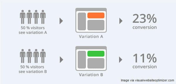
Image size and quality are paramount. In this case study Mall.cz experimented with larger images on their product pages:
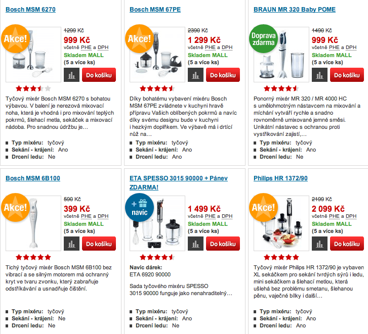
Control Design
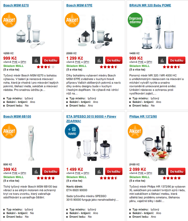
Variation Design They observed a 9.46% sales increase with larger product images. Consider testing this on your category and product pages. Additional factors for high-quality product images:
- Clean, consistent background (white space or uniform design, no distractions)
- Uniform image lighting, contrast, and saturation (maintain visual consistency)
- Consistent padding around images (at least 30px)
- Contextual product display (e.g., jewelry worn by models to show scale and fit)
- Detailed, alternative views and 360-degree rotations (for top-selling products or as budget allows)
2. Implement Product Zoom Functionality
Since online shoppers can’t physically handle products, offering detailed close-ups is crucial. Ensure your product images allow zooming to reveal intricate details in high resolution.
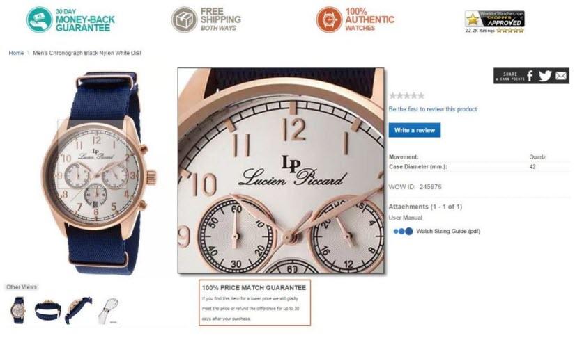
World Of Watches excels in this, providing contextual images of watches worn on wrists alongside high-quality, zoomable images from various angles.
3. Enhance Trust and Conversions with User Reviews
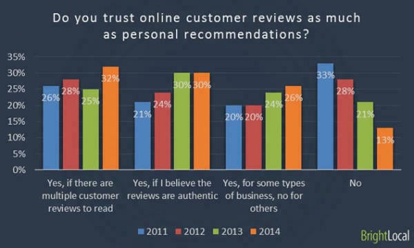
According to Marketing Land, 90% of customers are influenced by online reviews when making purchase decisions. Moreover, 88% trust online reviews as much as personal recommendations (Search Engine Land). Incorporating reviews into your product pages can significantly impact conversion rates.
Displaying reviews alongside products eliminates the need for customers to search for them elsewhere. In this case study Express Watches saw a 58.29% increase in conversion rates after integrating customer reviews directly into their product pages. Consider testing on-page reviews (partially user-submitted) to enhance your single product pages’ conversion rates.
4. Utilize Wish Lists to Drive Traffic and Sales
According to BigCommerce wish lists or “want” buttons help customers keep track of products they like but aren’t ready to purchase.
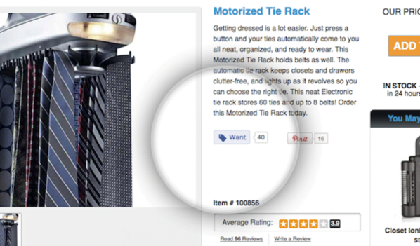
Shopify offers an app for the Want button – These posts can appear on users’ Facebook timelines, driving more social traffic to your store. This traffic is also primed for conversions because people love to buy what their friends recommend. Experiment with wish lists and “want” buttons to increase referral sales and traffic.
5. Keep Out-of-Stock Products Visible
In a case study by Marketing Sherpa, a combination of transactional emails and segmented email lists effectively increased sales and conversions. The first step involved displaying out-of-stock products with the option to receive notifications upon restocking.
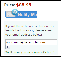
This strategy helped build a product-specific lead email list. When products were back in stock, a transactional “back in stock” email was sent to the list, prompting recipients to revisit the store and make a purchase. This case study reported a 22.45% conversion rate for these emails!
6. Build Trust by Including a Privacy Policy Link
Customers need to trust your brand before making a purchase or sharing their information. Therefore, incorporating trust factors like privacy policy links in your forms can significantly boost conversions. For instance, you can enhance the “notify me when back in stock” form by adding a privacy policy link. In this case study BettingExpert implemented this and saw a 19.47% increase in their form conversions.
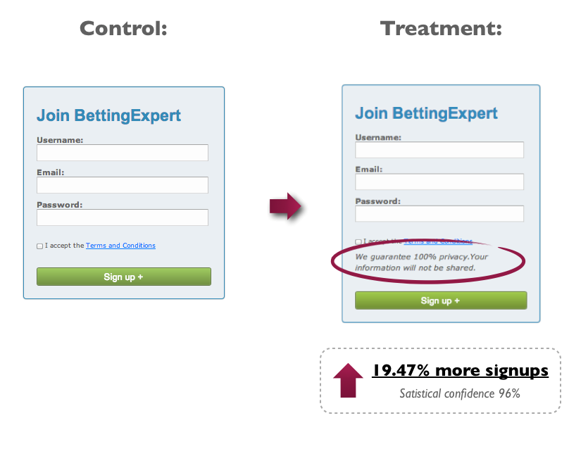
Test adding privacy policy links to your notification and lead generation forms on product pages to improve conversions.
7. Provide Easy Access to Product Sizing Charts
Accurate sizing information is crucial for products like jewelry and can significantly impact conversions. Consider testing if placing sizing information near the product description improves your conversion rates.
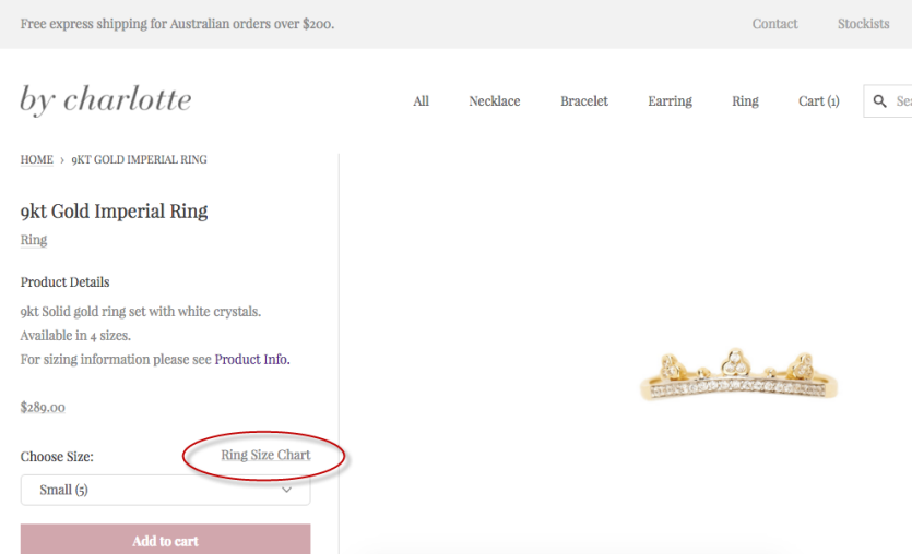
You can either link to a dedicated sizing page, as shown above, or opt for a pop-up sizing chart, as seen below:
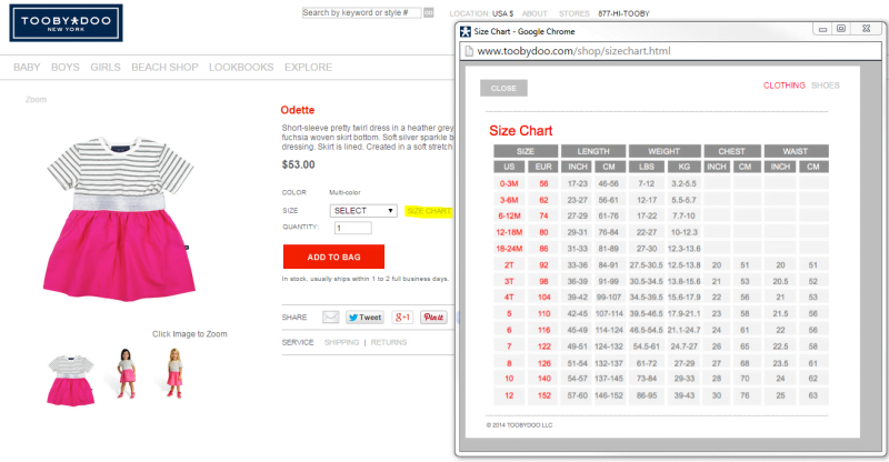
Anticipate your potential customers’ questions and provide easily accessible answers. Test adding sizing information to your product pages for improved conversions.
8. Personalize Related Product Recommendations
Recommending related products is a well-known strategy for increasing average order value and conversion rates. However, adding personalization to these recommendations can take your sales to the next level. According to a Smart Insights case study: “Compared to average site conversion rates, personalized product recommendations resulted in a 332% increase for Millets.co.uk and a 277% increase for Blacks.co.uk.” The study examined two personalization types: “What customers ultimately buy recommendation” and “Rule-based cross-sell personalized recommendation.” For example, visitors browsing hiking gear were shown these personalized rule-based recommendations:
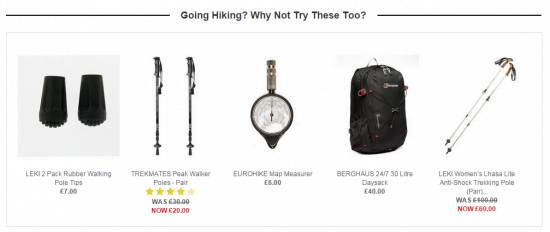
Test personalized product recommendations to increase your average order value and conversion rates.
9. Analyze Live Chat Transcripts to Identify Product Information Gaps
benefits of using live chat on e-commerce sites are valuable tools. As long as you’re tracking chat conversions, they provide a convenient customer experience and are more cost-effective than phone-based customer service. However, the true power of live chat, in my experience in testing with Olark, lies in the transcripts. With Olark you can easily review and export live chat transcripts for analysis – a powerful asset for conversion optimization!
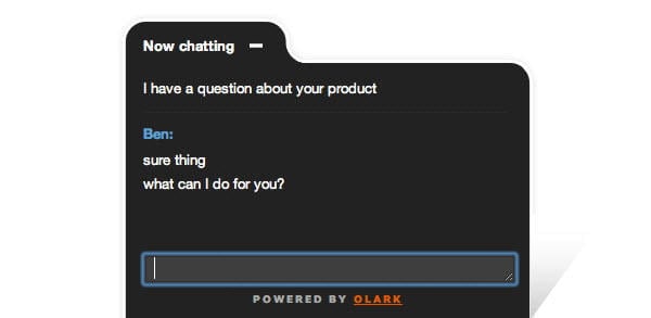
For instance, we used live chat in this e-commerce CRO case study and discovered information gaps on product pages. Customers were seeking specific product details that weren’t readily available. Analyzing customer conversation transcripts revealed these insights: Customer: “Hey guys, Could you please tell me if your sterling silver jewellery will tarnish if worn in salt water? Thanks” Customer: “I was looking at the Gold ‘You are blessed’ tan bracelet and was wondering if it’s durable enough to wear everyday?” This analysis led to the hypothesis: Providing more detailed product information (potentially behind tabs for users seeking in-depth details) will reduce purchase hesitation and lead to more checkouts. Analyze your live chat transcripts for similar information gaps and incorporate the missing details into your product landing pages.
10. Optimize Visual Hierarchy for Better Product Page Conversions
Visual hierarchy guides your visitors through your page design, highlighting elements in a specific order. This order can significantly impact whether a visitor stays engaged or leaves the page. In this case study Underwater Audio redesigned their landing page for improved visual hierarchy. They reordered their value proposition elements: headline, features and benefits, image, and call to action. This simple change increased their sales by 35.6%.
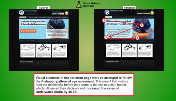
Experiment with the order in which visitors experience elements on your product pages. For example, avoid urging them to add a product to their cart before providing sufficient information about its features. Pushing for a sale too early can be detrimental.
11. Find the Optimal Length for Your Product Copy
In this guide David Crowther suggests that long-form copy is most effective when:
- The product is expensive.
- The product is complex and feature-rich.
- The product falls within a specialized niche.
- The product isn’t unique.
- The product isn’t actively sought out. Conversely, he recommends short copy when:
- The product or offer is straightforward and requires minimal explanation.
- The price point is low.
- The call-to-action is free (e.g., starting a free trial, subscribing to a newsletter). Always test your product copy length, ensuring it’s comprehensive and detailed for complex, high-priced items.
12. Leverage Product Videos to Boost Conversion Rates
“Video sells” is a common adage in the conversion world. However, like other best practices, its effectiveness depends on the context. For example in this case study a fitness company conducted customer interviews to identify areas for improvement on their product pages. The most common question was, “How will these products look on me during a workout?” This prompted the company to create better product images and videos that directly addressed this concern.

They started with a small number of videos for cost-effective testing. Results showed a 25% to 100% increase in revenue per visit from search traffic, depending on the customer segment. Consider testing videos on your product pages (if data suggests they’re needed). Begin with one or two videos to assess their impact on profits before investing in more.
13. Clearly Communicate Shipping Information on All Pages
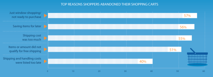
While seemingly obvious, many online stores fail to disclose shipping costs until late in the checkout process. It’s crucial to communicate shipping costs upfront, ideally offering free shipping.
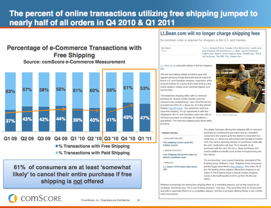
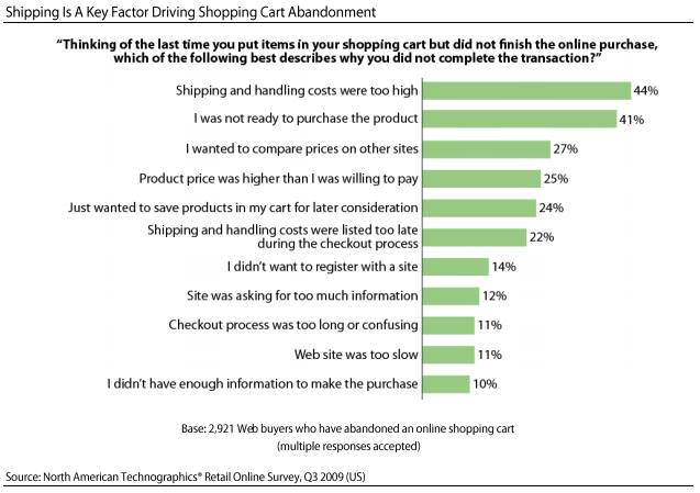
Almost half of all online orders include free shipping. Consider factoring shipping costs into your product pricing to see if it improves profitability. An E-tailing study revealed that 44% of shoppers abandon their carts due to high shipping costs.
What if charging for shipping is unavoidable for your business model?
If free shipping isn’t feasible, use a flat rate and display it prominently on every page, such as in your website header and footer. this study 47% of shoppers abandon their carts upon discovering additional shipping fees during checkout. Transparency is key!
14. Display Estimated Delivery Dates on Product and Cart Pages
In the age of 30-minute drone deliveries, customers expect swift order fulfillment. An infographic conducted by Milo found that customers are more likely to abandon their purchase if delivery times are excessively long.
60% of respondents in their survey indicated that a guaranteed delivery date would encourage them to complete their purchase. Test adding estimated or guaranteed delivery dates to your product pages, displaying them clearly alongside product information.
15. Provide “Added to Cart” Notifications
Acknowledge successful product additions to the cart with a clear notification. Constant user feedback is essential. This falls under the umbrella of interaction design best practice. Effective feedback addresses these four areas:
- Location: Where am I? (persistent navigation)
- Current Status: What’s happening, and is it ongoing? (breadcrumbs, interface indicators)
- Future Status: What happens next? (call to action)
- Outcomes & Results: What just happened? (alerts, e.g., “item added to cart” pop-up)
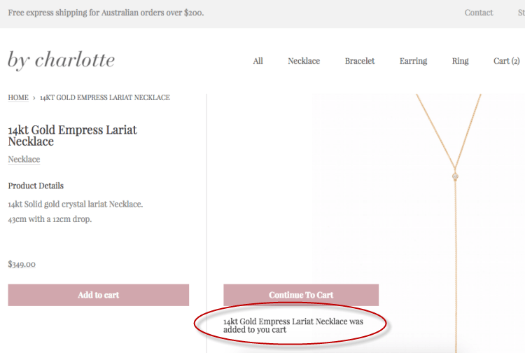
This site uses pop-up notifications and a call to action when a product is added to the cart, indicating the outcome and prompting the next step. Test incorporating more interaction design best practices into your product landing pages to ensure a seamless customer experience.
16. Leverage User Testing to Guide Product Page Design
Appliances Online created 125 user testing videos (generating around 250 hours of footage) to pinpoint issues with their product pages. This analysis uncovered valuable insights that were then translated into hypotheses for A/B testing. Many users found the pages cluttered. Others suggested clearer service information and an improved video experience. These improvements resulted in a 9.5% sales increase and a 37% increase in product video views. Furthermore, visitors who watched the videos were 57% more likely to add items to their baskets. Integrate user testing into your optimization process to generate data-driven testing ideas. Continuous iteration and improvement are key to achieving exceptional conversion rates.
Don’t Simply Imitate Your Competitors

Remember, a “best practice” or a successful test for another business doesn’t guarantee the same outcome for you. A/B testing is invaluable for optimizing product landing pages and boosting conversions and profits. It’s the most reliable method to determine if a change to your site or landing page will yield positive results for your specific audience. So, avoid blindly following your competitors – they’re probably doing the same.