Many articles about “2022 trends” feature ideas that are too futuristic for small businesses to use (NFTs, anyone?). This post will explore 11 landing page trends for 2022 that can be implemented easily, including:
- Effective color palettes and copywriting styles
- Things to avoid when designing forms
- The right way to feature testimonials Read on to learn more about these trends and start increasing your conversions!
11 landing page ideas & trends for 2022
When trying out any of these ideas, remember to follow landing page best practices: maintain consistency with your ads, ensure mobile optimization, set up a thank you page, and more.
1. Interactive, customizable experience
This first trend might be the most compelling: using interactive landing pages to create a customizable experience. Interactive content increases engagement and time spent on the page—both of which are beneficial for performance. More importantly, interactive content provides visitors with a fun and appealing way to customize their experience, helping to build strong customer relationships. This is crucial because people value personalized content. In fact, 90% of US customers indicated that they find irrelevant or impersonal messaging frustrating. To see this in action, take a look at this landing page from monday.com.
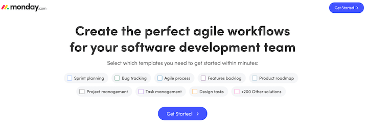 Image source
This landing page, which promotes software, already includes personalized copy. Visitors can then select the templates they’re interested in to explore how Monday.com can benefit their team. This offers a fun way to personalize a visitor’s first interaction with the product.
2. Conversational copy
Landing page trends often center around design. This is understandable, as design is typically the first thing a visitor notices and the first thing that starts to look outdated. (Remember Flash?) However, incorporating conversational copy is a must-try trend for this year. See how PayPal uses this approach on its landing page:
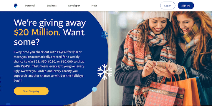 Image source
Starting with a question encourages visitor engagement, and the casual language (“Want some?”) makes the copy sound more like a welcoming offer. This is a great tactic to boost conversions. Try making your landing page copy more conversational and see what happens.
3. Explainer videos
While video might seem like more of an expectation than a trend at this point, the most effective landing pages use a specific type of video: the explainer video. These videos provide clear demonstrations of products and their uses. Explainer videos are typically short clips that feature product visuals accompanied by a voiceover, guiding viewers through the company’s offerings. Here’s an example from Miro, a visualization tool that’s already using this landing page trend.
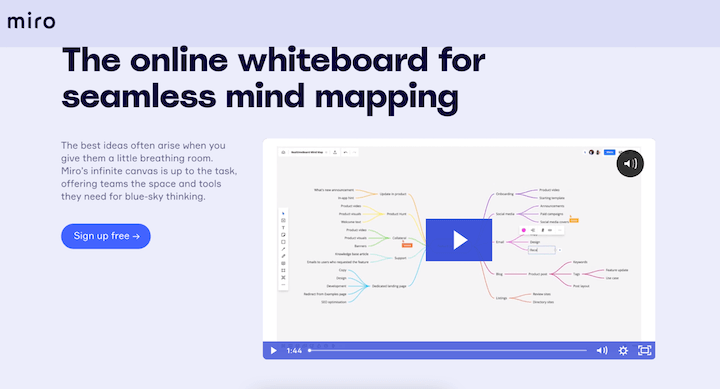 Image source
Videos, particularly explainer videos, are great for boosting conversions. According to HubSpot, 94% of people watch explainer videos to learn about products, and 84% report making purchases after watching one.
4. Customer reviews
For businesses today, positive online reviews are invaluable. Whether it’s praise on social media, a favorable Google review, or a recommendation on Reddit, these organic endorsements provide valuable social proof. They reveal what current customers love and provide potential customers with personalized recommendations, which are more persuasive than any ad copy or image. Therefore, it’s no surprise that featuring customer reviews prominently on landing pages is a major trend this year. Chameleon does a great job with this—check out their header:
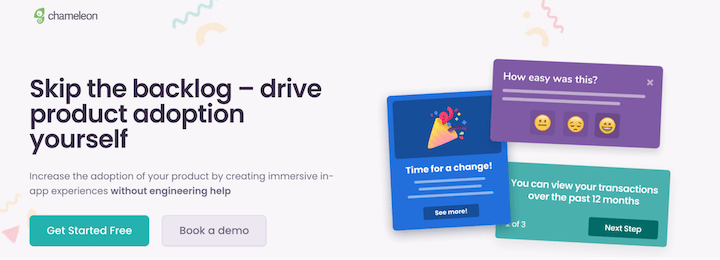 Image source
Chameleon utilizes persuasive copy targeting product managers and marketers, alongside illustrated examples of in-app messaging. Scrolling down reveals genuine reviews from G2 specifically related to Chameleon’s in-app messaging features.
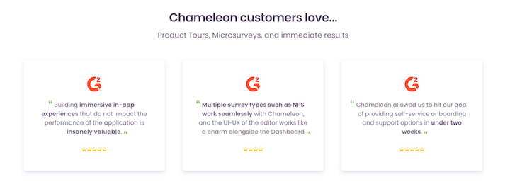 G2 is a trusted review platform, so displaying their logo and reviews reassures visitors that the feedback is reliable and comes from experienced product managers. The combination of targeted, trustworthy reviews and personalized copy makes Chameleon’s landing page highly compelling.
5. Email-only forms
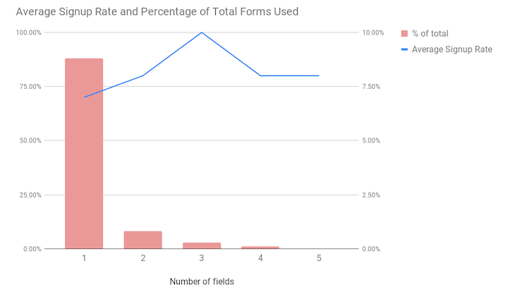
No one enjoys filling out lengthy forms to subscribe to a newsletter or access a free trial. That’s why 2022 will see a rise in email-only forms on landing pages. Try this trend to increase your conversion rates. Omnisend research discovered that the majority of landing pages only use one form field and that conversion rates significantly decrease after three fields.
Additionally, don’t forget to experiment with the placement of the form on your landing page.
6. Gender-neutral copy and gender-inclusive forms
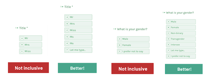
When requesting information from visitors, ensure you’re doing so respectfully. Gender inclusivity is essential for both landing page design and copy. For example, nexus-security’s style guide mandates using “they” as the singular pronoun in hypothetical situations instead of defaulting to “he” or “she.” Incorporating gender-neutral language on landing pages is becoming increasingly expected. Facebook has offered multiple for years options for users during profile setup for some time, regularly adding more as needed. Snapchat, on the other hand, doesn’t ask for gender information at all. While these are social platforms, it’s important to consider these approaches for your landing page copy and forms. If you require a title, include “Mx.” as an option. If you need gender information, provide a variety of gender identities along with a “Prefer not to say” option.
7. Animation with motion
We’ve established that video and interactive content increase audience engagement and are expected to become even more prevalent in landing page design. Another trend we’ll see is the use of animation with subtle motion. This landing page example from Podcorn demonstrates how effective subtle motion can be:
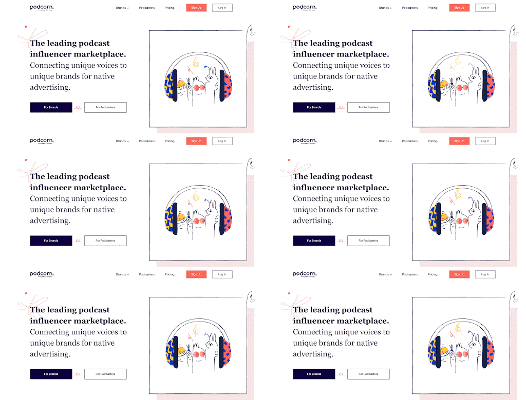 Image source
The movement is subtle, the visuals are playful, and the overall effect is perfect.
8. Playful imagery
Playful imagery is another landing page design trend to test, especially if it aligns with your brand. This can include line-heavy animation (like in the Podcorn example), abstract elements (like the background on Chameleon’s page), and bold color palettes. Combining animation with photos and product images is another effective approach. ContentCal uses this last tactic well to create playful visuals.
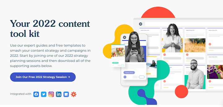 Image source
ContentCal combines classic, bold colors and abstract designs with animated product images and photos of people. These elements work together to create an engaging and playful landing page.
9. Early-aughts design
The early 2000s aesthetic has returned. This means the return of low-rise jeans, hair clips, graphic tees, glitter lip gloss—and the design trends of that era. Think glossy images, glitter, bubble fonts, and bright colors. This nostalgic aesthetic effectively evokes positive emotions and attracts customers, making it a powerful tool. Glossier’s landing page design is an excellent example of this trend done right.
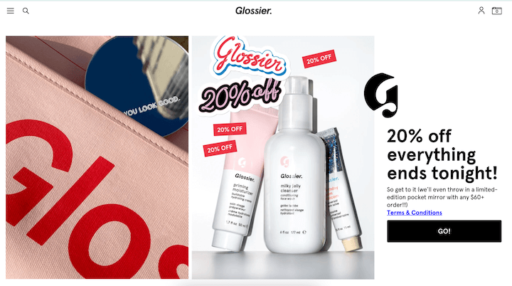 Image source
The bold red and pink hues, along with the playful mirror reflecting light, correspond perfectly with the second part of the landing page. The imagery features brightly colored, glittery bottles playfully arranged on a shiny, reflective surface. The stacked graphics, with colors matching the other images and partially overlapping, mirror the look of sticker logos—a clever touch.
10. Dreamy backgrounds
While we’ve discussed many landing page elements, there’s one we haven’t covered: the background. Expect to see more dreamy gradients used in landing page backgrounds this year. With Core Web Vitals becoming a Google ranking factor and another update expected soon, site speed is crucial. Compressing images and enabling lazy loading are good starting points, but dreamy gradient backgrounds also add visual depth without sacrificing loading speed. Starry Internet’s landing page offers a great example:
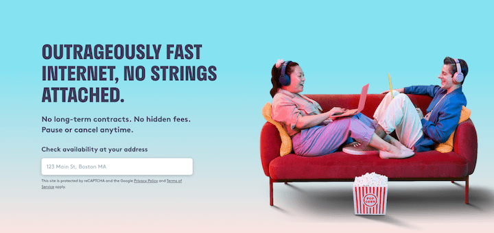 Image source
While the blue is vibrant, its lightness and the subtle fade into peach toward the bottom create a surreal, dreamy atmosphere without adding unnecessary design elements.
11. Coral
Pantone’s 2022 color predictions emphasize warmth, familiarity, and comfort. Topping the list for next spring? Coral. This color will undoubtedly make waves in landing page design. Coral aligns well with the larger themes we’ve discussed: dreaminess, approachability, playfulness, and simplicity. This warm, light color works well for backgrounds or accents. Or, go all-in like Recess does on its landing page:
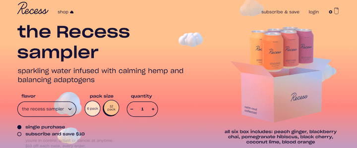 Image source
The monochromatic look is striking: the gradient background, product colors, reflections on the box and clouds, and even the button colors all feature coral. It’s an excellent example of how to utilize this trend effectively—and what better product to showcase with a trendy color than a CBD seltzer?
Try out these landing page trends in the new year
We’ve covered a lot of ground, from animations and videos to backgrounds and forms. There are many ways to create impactful landing pages. Here’s a recap of the landing page trends to try in 2022:
- Interactive experiences
- Conversational copy
- Explainer videos
- Customer reviews
- Email-only forms
- Gender-neutral form fills
- Animation with motion
- Playful imagery
- Early-aughts design
- Dreamy backgrounds
- Coral color Remember to test these elements to determine what works best for your brand and audience. These trends might become essential components of your future landing pages! Curious about trends from other years? Explore our archive:
- 2022 Landing Page Trends
- 2023 Landing Page Trends
